How to influence user behavior towards taking meaningful action

.png)

.png)
Can you think of all the steps a user has to take before they start benefiting from your product?
Installing, granting permissions, creating an account—these actions don’t provide immediate benefits, but are often necessary burdens to reaching a meaningful product experience.
To motivate users along the way and ensure that they stick around long enough to get value, there’s one incredibly easy tactic that’s always worth trying: explain why each action is important.
It’s stupid simple, but the power of “because” is so great that it can change user behavior even when the reason given isn’t particularly compelling. Just including a reason can be enough.
“A well-known principle of human behavior says that when we ask someone to do us a favor we will be more successful if we provide a reason,” wrote Robert Cialdini in Influence: The Psychology of Persuasion. “People simply like to have reasons for what they do.”
Here are three use cases for explaining why something in your product matters. While relatively easy to implement, they can be the difference between continuous engagement and churn.
There’s often a few steps that users have to complete before they can even start accessing your product. In these cases, the best explanations hint at value down the line or point to additional benefits of the product.
Enabling location is necessary to using Yik Yak. But instead of using the standard location prompt and heavy-handed language, Yik Yak creates a beautiful onboarding screen that explains why enabling location is important.
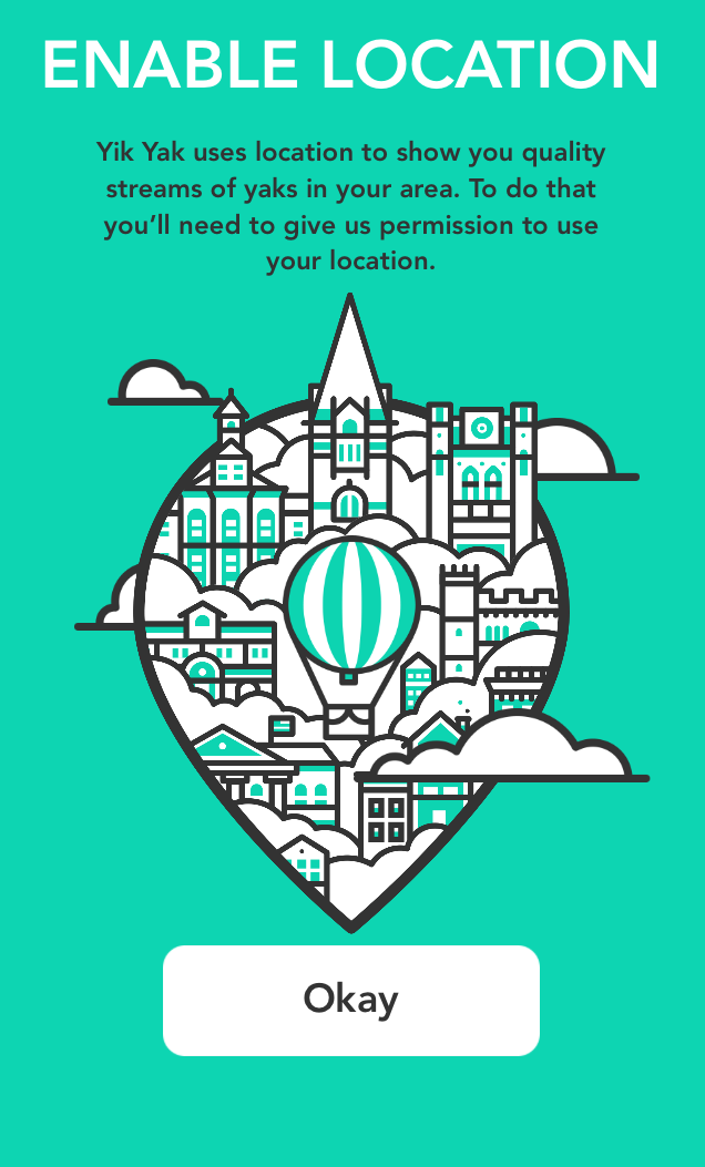
Users know that they’re getting “quality yaks in your area” as a result. The pretty graphic and no-nonsense “Okay” CTA also add some delight.
Gmail accounts that require 2-factor authentication create a substantial burden. Since accessing email is usually necessary, Gmail doesn’t risk losing users by not explaining why, but as masters of user experience, they still do it anyways.
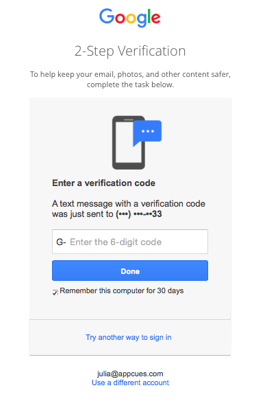
It’s annoying to reach for the phone in order to check email on a computer, but Gmail tells us it’s to “keep your email, photos, and other content safer,” a mission that most of us can get behind.
Terms and privacy policy agreements are rarely-read but legally required. To make the action more bearable, WhatsApp nests a reminder about new features when asking users to agree to new terms of services:
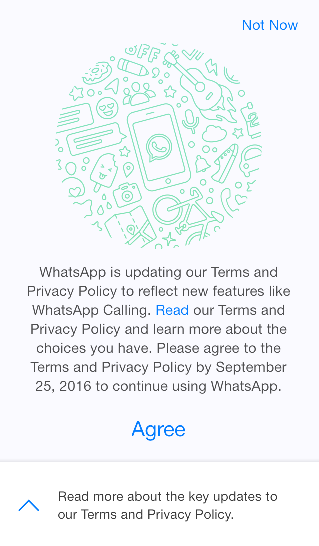
Most users probably only agree so that they can continue texting their friends, but being reminded about “new features like WhatsApp Calling” is helpful, especially if users didn’t pay attention to the new feature announcement.
Explaining why still applies to steps that aren’t necessary but helpful to driving deeper engagement. In these cases, noninvasive UI patterns and clear options for opting out are key.
HotelTonight lets users browse and book hotels without creating an account upfront. There is always the option to create an account or sign in on the last tab.
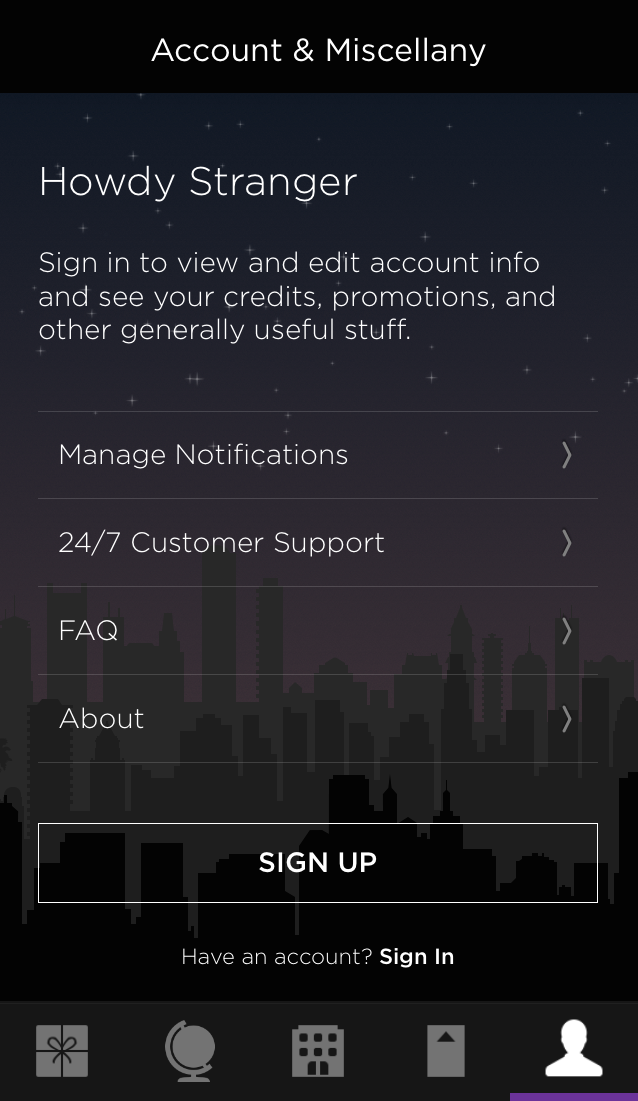
With an account, users can “see your credit, promotions, and other generally useful stuff.” Since the value is presented first, this casual and friendly language makes the ask feel more like a warm welcome.
GoDaddy asks new users to answer a few questions in a modal window series to get a more personalized experience.
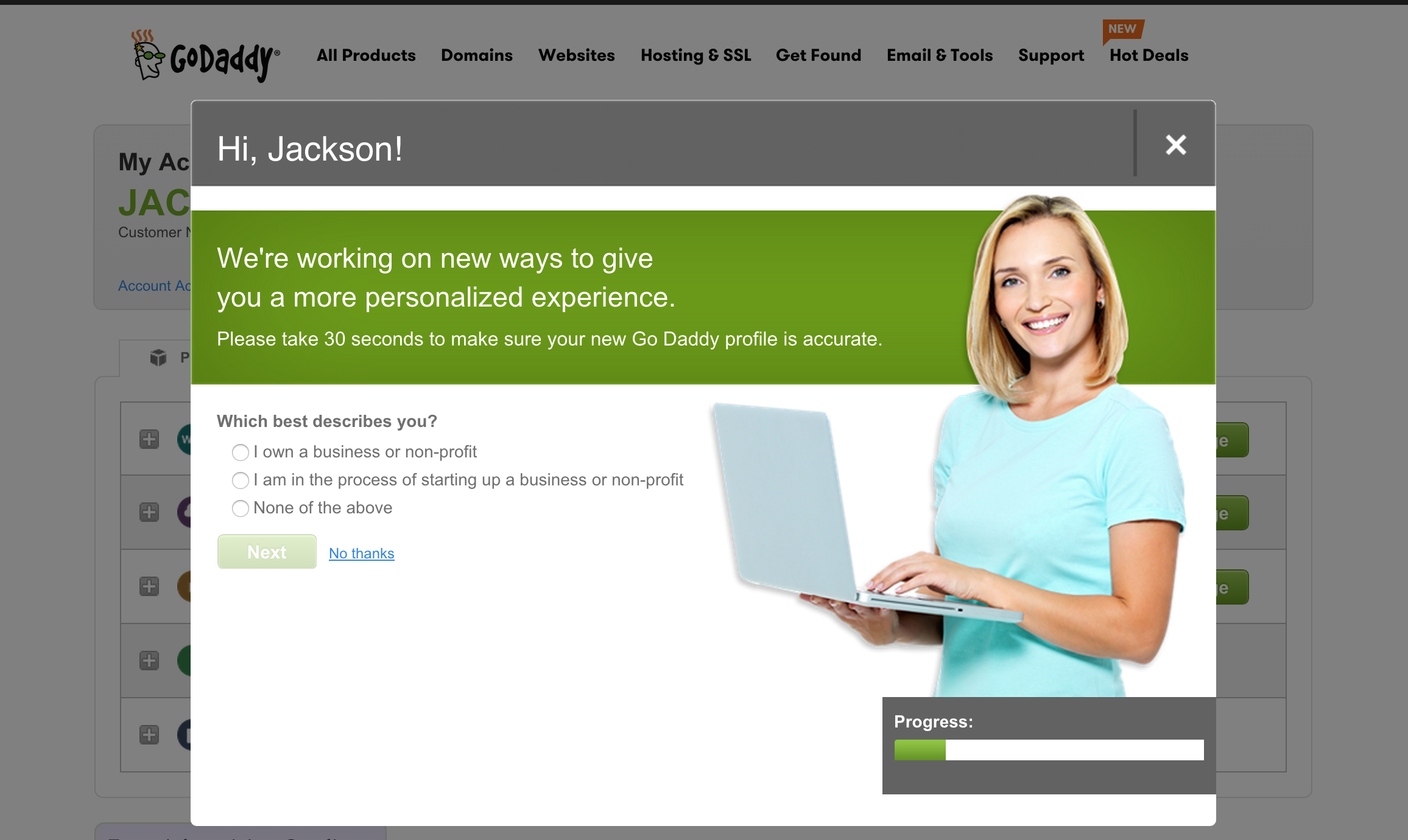
By including the caveat “we’re working on new ways,” GoDaddy also garners more patience from users who are primed to view the survey as an experiment.
AdRoll uses an Appcues-built slideout to announce a change in their product and gives a great reason as to why the change will benefit users.
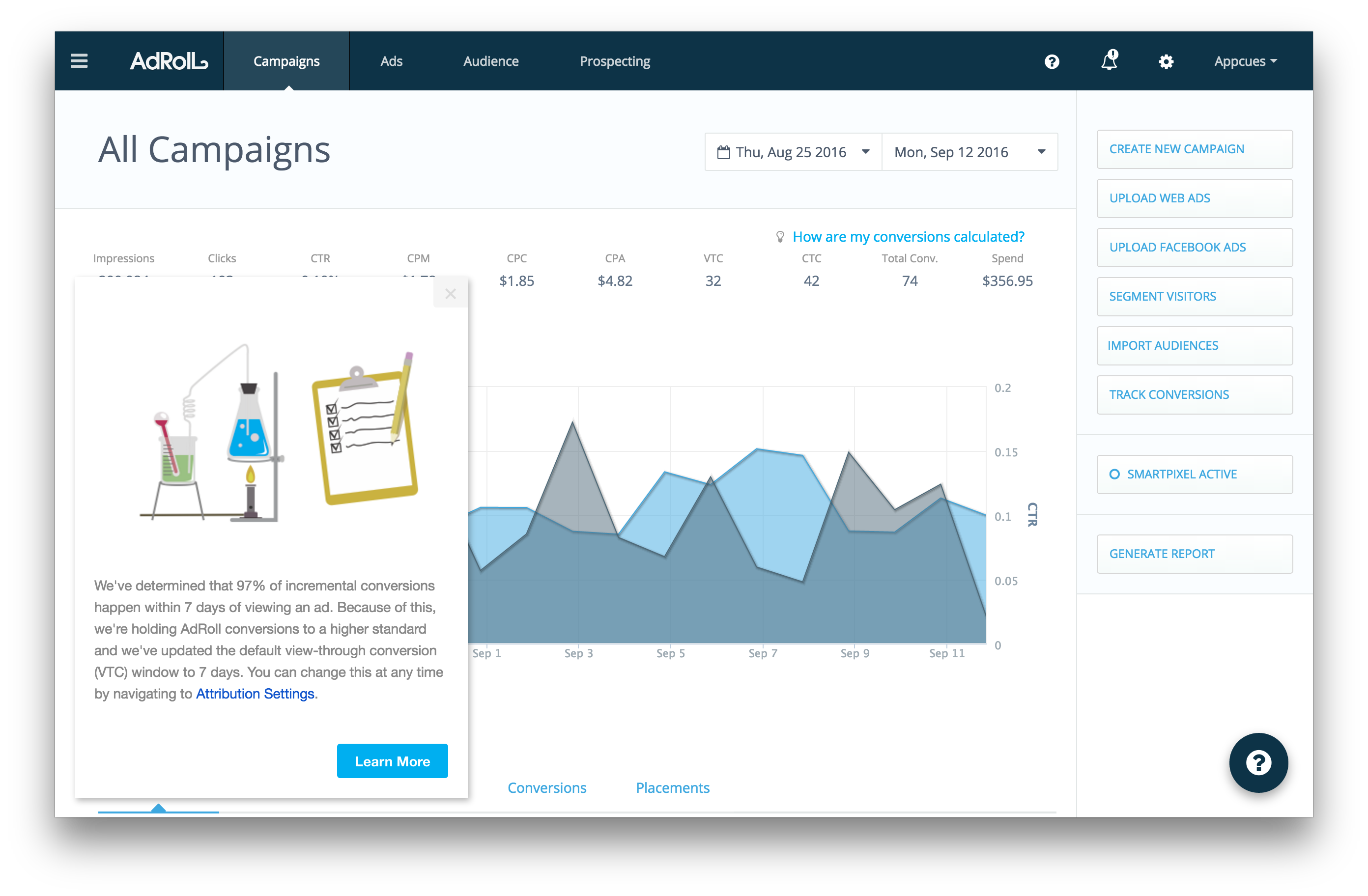
Users will probably be impressed that AdRoll discovered a new way to increase conversions and proactively implemented the practice to their accounts. Just as importantly, AdRoll gives users the options to learn more and reverse the change if desired.
Giving a reason why something went wrong helps mend an unfavorable customer experience. When done well, it can still prompt users to complete an action.
Henry Miller furniture uses a straightforward, somewhat cheeky message to apologize for their servers being busy.
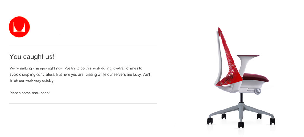
While there’s no immediate action to take, users know that the website isn’t down without cause and are asked to come back soon.
After an issue with placing orders, Uniqlo apologizes and announces that the problem is fixed in one clean sweep via email.
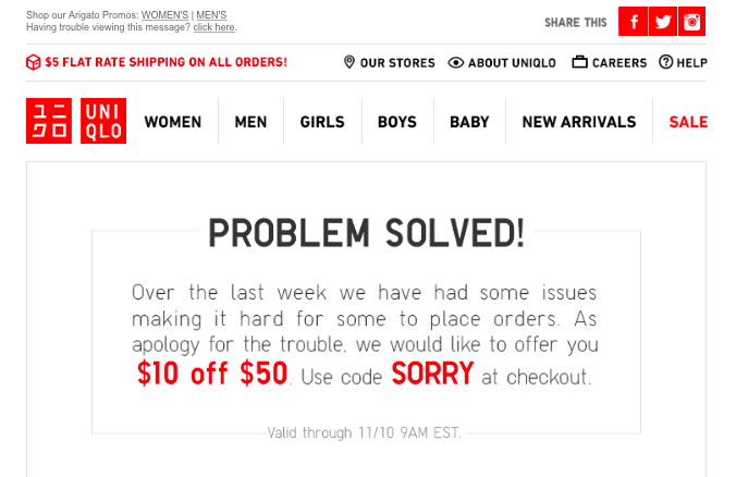
The reason provided, “we have had some issues,” gives little real explanation, but the apology and the discount steer users directly into making another purchase.
Providing a simple explanation, regardless of how informative or compelling, can do wonders in encouraging user action. This tactic can be applied to encourage activation steps, drive deeper engagement, or smooth over a product hiccup later on in the user journey.
Regardless of when you’re trying to get users to do something, giving a reason why is an easy and immediate way to increase the likelihood of completion.