.png)
Your users are drowning in notifications. Between email, push alerts, Slack pings, and SMS, the average person is bombarded with dozens of messages every single day. Most get ignored, some get blocked, and the worst ones drive people away entirely.
If you're a product manager trying to improve activation rates, a growth marketer looking to boost trial-to-paid conversion, or a customer success leader scaling onboarding beyond 1:1 calls, in-app notifications deserve a prominent spot in your strategy. They're a core part of your broader in-app messaging toolkit. In this article, you'll learn what in-app notifications are, why they matter, the 8 types you should know, best practices for getting them right, and common mistakes to avoid.
In-app notifications are messages displayed to users while they're actively using your web or mobile application. They appear inside the product interface itself - not in an email inbox, not as a phone lock-screen alert, and not in a notification tray outside your app.
Think of them as your product's voice. They can welcome a new user, announce a feature release, nudge someone toward a key action, or collect feedback through a quick survey. The defining characteristic is context: the user is already engaged with your product when the message appears.
You'll sometimes hear these called "in-product notifications" or "in-app messages." The terms overlap significantly. In general, "in-app notification" refers to any message surfaced inside the app, while "in-app messaging" is the broader discipline of designing, targeting, and optimizing those messages as part of a communication strategy. For this article, we'll use the terms interchangeably.
Here's the stat that makes the case: apps that use in-app messages see up to 3.5x higher user retention than those that don't. That's a fundamentally different retention curve - driven by the simple fact that reaching users at the right moment, in the right place, with the right message changes behavior.
In-app notifications are a growth lever, and the data backs that up across three critical outcomes.
The 3.5x retention stat from Localytics reflects a consistent pattern: users who receive relevant, well-timed in-app messages build stronger habits and stick around longer. That's because in-app notifications can re-surface value at the moment a user might otherwise drift. A well-placed tooltip reminding someone about an underused feature, a checklist tracking their setup progress, or a banner announcing a capability they've been waiting for - these small interventions compound into dramatically better retention rates.
Consider this: the average mobile app loses 77% of its daily active users within the first three days after install. In-app notifications give you a direct channel to intervene during that critical window.
%20(1)%20(1).png)
New users churn before they discover why the product is worth keeping. In-app notifications bridge the gap between signup and that "aha moment" by surfacing the right next step at the right time.
Slack, for example, uses a combination of tooltips and checklists to walk new users through creating their first channel, inviting teammates, and sending a message. These contextual nudges reduce the cognitive load of figuring out a new product, which directly shortens time to value. Companies that invest in guided activation flows consistently see higher conversion from free trial to paid.
Most new features go undiscovered because users never encounter the right prompt at the right moment. That's the discovery problem in-app notifications are built to solve.
Targeted in-app notifications solve the discovery problem. Instead of hoping users stumble onto a new capability, you can announce it with a slideout, highlight it with a hotspot, or walk users through it with a tooltip tour. Spotify does this particularly well, using personalized in-app hints to surface features like Discover Weekly or collaborative playlists based on a user's listening behavior. The result: higher engagement with new features without relying on email campaigns that may never get opened.
In-app notifications are powerful on their own, but they reach their full potential as part of an omnichannel messaging strategy. A user who sees an in-app tooltip about a new feature, receives a follow-up email with a deeper tutorial, and gets a push notification to re-engage users when the feature is relevant to their workflow is far more likely to adopt it than someone who receives any one of those messages in isolation. The key is coordination, not duplication - each channel should advance the narrative, not repeat it.
To measure whether your in-app notifications are actually moving the needle, keep an eye on these metrics:
Not all in-app notifications are created equal. Each type has a specific strength, and choosing the right format for the right moment is what separates effective product communication from noise. Here's a quick-reference comparison of the eight most common types, followed by a deeper look at each one.
Modals are full-screen or centered overlay windows that demand the user's attention. They typically darken the background and require the user to take an action (close, confirm, or proceed) before continuing.
When to use them: Modals are best for high-priority announcements, critical onboarding steps, or moments where you need a decision. Use them sparingly - because they interrupt the user's flow, overuse breeds frustration.
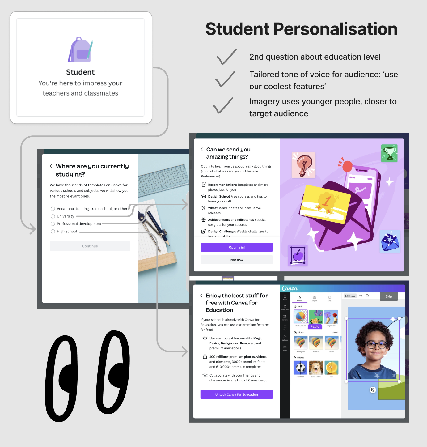
Example: Canva uses a modal to welcome new users and ask them to select their primary use case (student, teacher, small business, etc.). This single interaction personalizes the entire downstream experience.
Slideouts are panels that slide in from the side or bottom of the screen. They're less intrusive than modals because the user can often continue interacting with the product behind them.
When to use them: Slideouts work well for feature announcements, contextual tips, or secondary actions that don't require an immediate response. They're a good middle ground between "we need your attention" and "here's something useful."
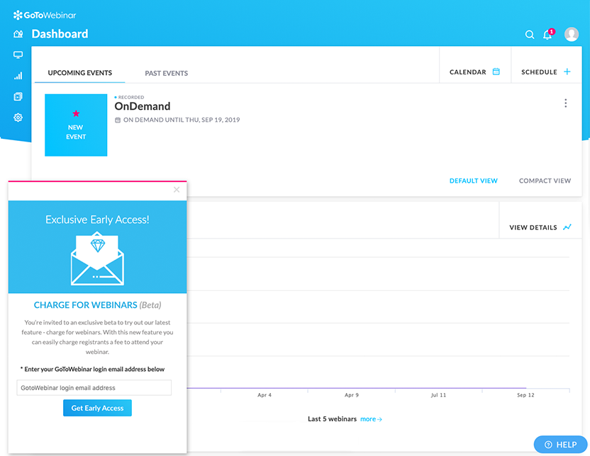
Banners are thin, persistent bars that typically appear at the top or bottom of the interface. They're the least disruptive notification type and can remain visible across multiple pages or sessions.
When to use them: Banners are ideal for system-wide announcements (maintenance windows, pricing changes), ongoing promotions, or gentle nudges that don't require immediate action.
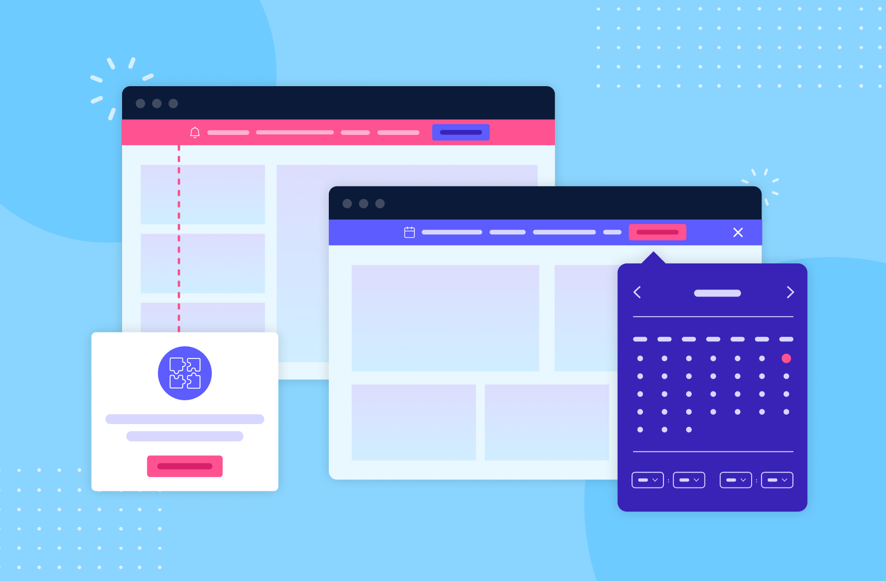
Tooltips are small, contextual popups anchored to a specific UI element. They appear when a user hovers over, clicks, or reaches a particular part of the interface.
When to use them: Tooltips shine for feature education, step-by-step guided tours, and providing additional context on complex features. They're one of the most effective types for progressive disclosure - revealing information exactly when it's relevant.
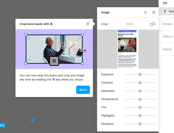
Hotspots are small, pulsing indicators (usually circles or dots) placed on specific UI elements to draw attention to them. They signal "something new here" without interrupting the experience.
When to use them: Hotspots are perfect for subtly drawing attention to new features, updated menu items, or underused functionality. They let curious users explore on their own terms.
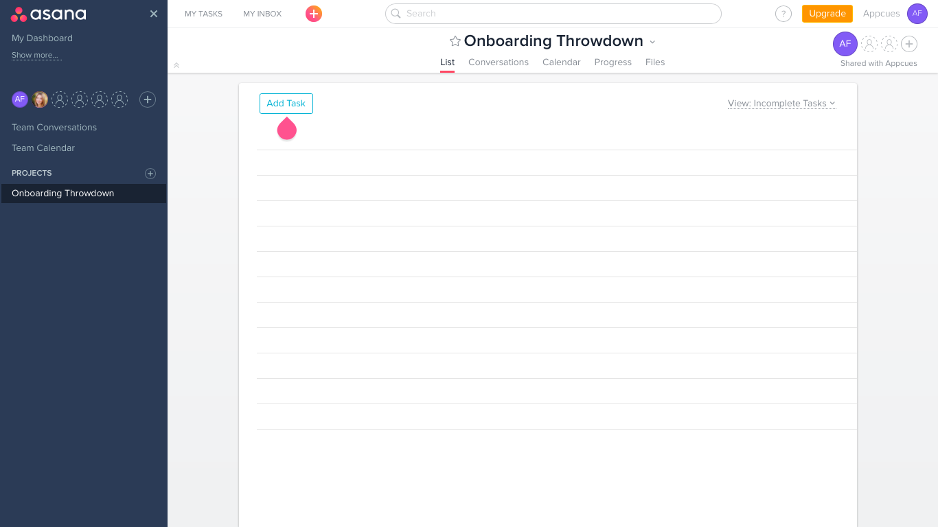
Checklists are persistent, trackable lists of tasks that guide users through a series of steps - usually during onboarding or setup. They create a sense of progress and give users a clear path forward.
When to use them: Checklists are most effective during onboarding, account setup, or any multi-step process where completion matters. The visual progress indicator taps into the endowed progress effect, motivating users to finish what they started.

Microsurveys are short, in-app questionnaires (usually 1-3 questions) that collect feedback at specific moments in the user journey. They often use NPS, CSAT, or multiple-choice formats.
When to use them: Microsurveys are ideal for capturing feedback after key interactions (completing onboarding, using a new feature, finishing a workflow) when the experience is fresh. They're also useful for segmenting users based on their goals or preferences.

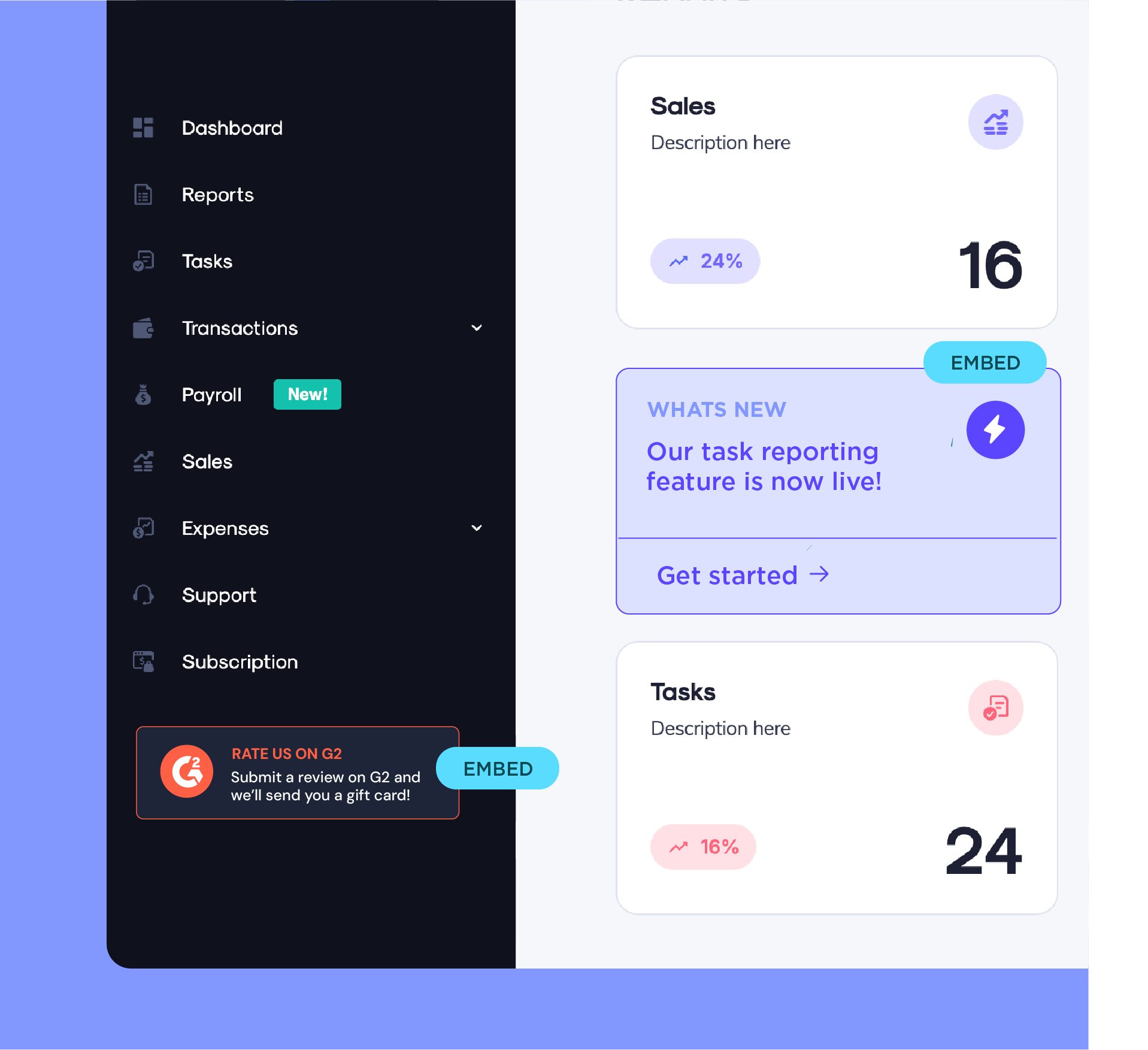
Embeds are inline content blocks placed directly within your product's UI layout - not layered on top of it. Unlike modals or tooltips that overlay the interface, embeds live inside the page as native-feeling elements like cards, banners, or callout sections.
When to use them: Embeds are ideal for persistent, contextual guidance that shouldn't interrupt the user's flow. Think onboarding checklists that live in a sidebar, feature recommendations within a dashboard, or contextual help cards anchored to a specific page section. Because they blend into the existing layout, users engage with them naturally rather than dismissing them reflexively.
These two notification types get confused constantly, but they serve fundamentally different purposes.
The simplest way to think about it: in-app notifications talk to users who are already engaged, while push notifications try to bring users back. Both are essential for user retention, but they play different roles.
Use in-app notifications when context matters - when the message is most useful because of what the user is doing right now. Use push notifications when timing matters - when you need to re-engage someone who hasn't been active or alert them to something urgent outside the app.
The best product teams don't choose one over the other. They orchestrate both as part of a cohesive messaging strategy.
Effective in-app notifications come down to six practices, each backed by a real-world example.
First impressions set the tone for everything that follows. The most effective onboarding notifications don't treat every user the same - they ask a few quick questions and adapt the experience based on the answers.
Mailchimp is a textbook example. Their original onboarding was a one-size-fits-all flow that dropped every user into the same dashboard.
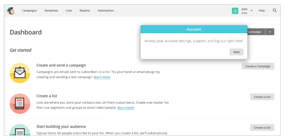
They redesigned it with empathy at the center. The new experience opens with a personalized welcome message on the dashboard, then guides users through a personalized, low-friction signup flow that adapts based on what the user wants to accomplish.
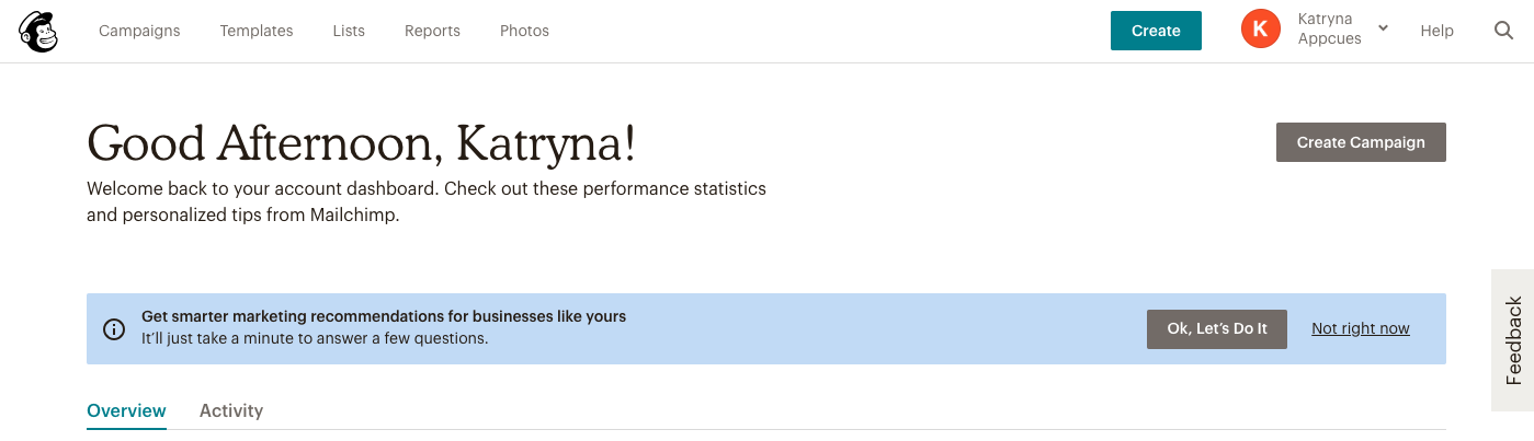
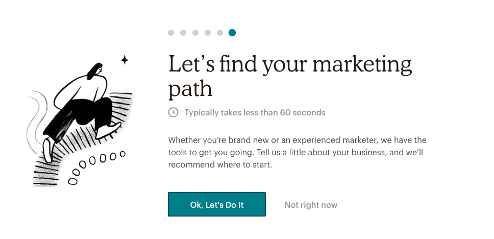
The takeaway: use your first in-app notification to learn something about the user, then tailor what comes next. Even a simple "What's your primary goal?" microsurvey can dramatically improve user onboarding outcomes.
The best in-app notification is one that arrives at the exact moment the user needs it. That means triggering messages based on behavior, not just schedules.
Skyscanner does this well. After a user searches for a flight, Skyscanner uses a well-timed push notification to ask if they'd like price alerts for that route. The ask is perfectly contextual - the user just demonstrated intent, so the notification feels helpful, not intrusive.
.png)
The principle applies to any SaaS product. Don't ask users to grant permission before they've seen value. Don't announce a feature before they've encountered the problem it solves. Use data to identify the right behavioral triggers, and let those triggers determine when the notification fires.
Not every user needs the same message. Power users who've been in your product for months don't need the same tooltip tour you show to someone on day one. Segmentation is what makes in-app notifications feel personal instead of generic.
Spotify segments aggressively. When they roll out new feature announcements, they target users based on listening behavior and usage patterns. A listener who creates playlists regularly might see a modal about collaborative playlists, while someone who primarily uses Discover Weekly gets a hint about podcast recommendations.
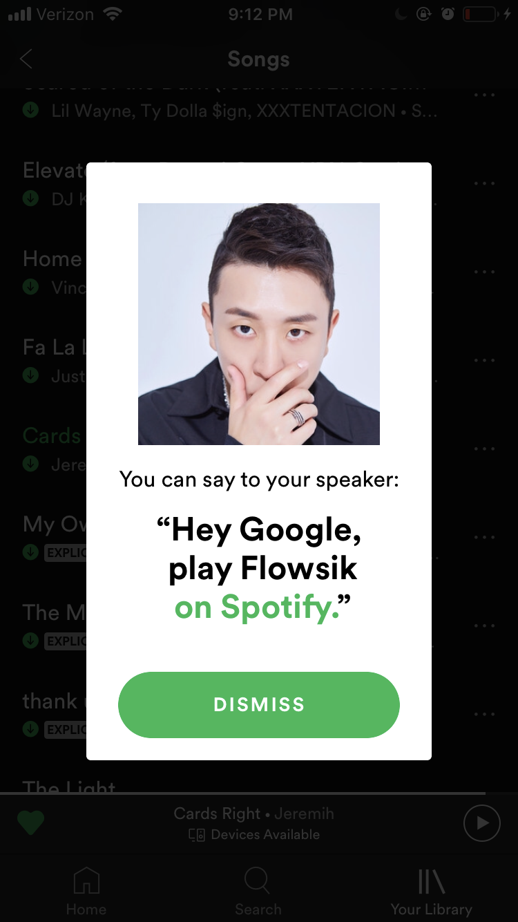
Segment by user lifecycle stage (new, activated, power user, at-risk), by role or persona, by plan type, and by behavioral patterns. The more specific your segments, the more relevant your notifications become, and relevance is what separates engagement from annoyance.
Even well-targeted notifications can backfire if there are too many of them. Notification fatigue is cumulative - each additional message lowers the perceived value of the next one.
Set frequency caps so no user sees more than one or two notifications per session. Build user preference controls that let people choose what types of messages they receive and how often. And test your cadence: run experiments to find the sweet spot where engagement stays high without tipping into annoyance. Some teams find that reducing notification volume by 30-40% actually increases overall click-through rates because the remaining messages carry more weight.
The goal is to make every notification count. When you reinforce the messaging across channels rather than repeating it within one, you can stay present without being overwhelming.
Your notification copy has about two seconds to earn the user's attention. Vague, jargon-filled, or passive messages get dismissed instantly. Every notification should answer one question: "What should I do next?"
Compare these two approaches:
Before: "We've updated our analytics capabilities with enhanced reporting functionality. Click here to learn more about the new features available in your account."
After: "Your dashboard now shows real-time conversion data. Check it out."
The second version is shorter, specific, and tells the user exactly what's different and what to do. When writing notification copy, lead with the benefit (not the feature), use active verbs, keep it under 40 words when possible, and always include a clear call to action.
Launching an in-app notification isn't the finish line. It's the starting point. Every notification you ship should be measured, analyzed, and improved.
Track these key metrics:
Run A/B tests on copy, design, timing, and targeting. Even small changes - like adjusting when a tooltip appears or rewriting a CTA button - can meaningfully move the needle. The teams that treat in-app notifications as a living system rather than a "set and forget" tool consistently outperform.
Even well-intentioned notification strategies can backfire. Here are five of the most common pitfalls and how to steer clear of them.
This is the most common and most damaging mistake. When users feel overwhelmed by notifications, they don't just ignore them - they develop blanket distrust for anything your product surfaces. That's notification fatigue, and it's incredibly hard to reverse.
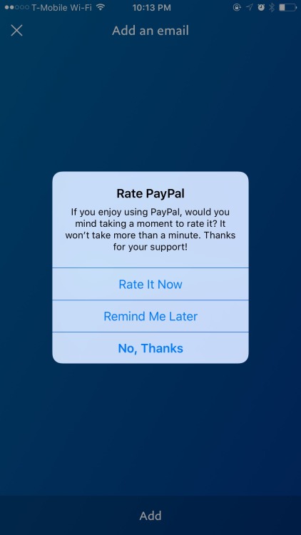
PayPal's aggressive rating request is a case study in what not to do. Popping up a request to rate the app at an unrelated moment feels pushy and self-serving. The fix: set frequency caps, prioritize your messages by impact, and never show more than one notification at a time.
One-size-fits-all notifications signal that you don't understand your users. A first-time visitor and a power user with 200 sessions have completely different needs, and treating them identically wastes both your messaging opportunity and their patience.
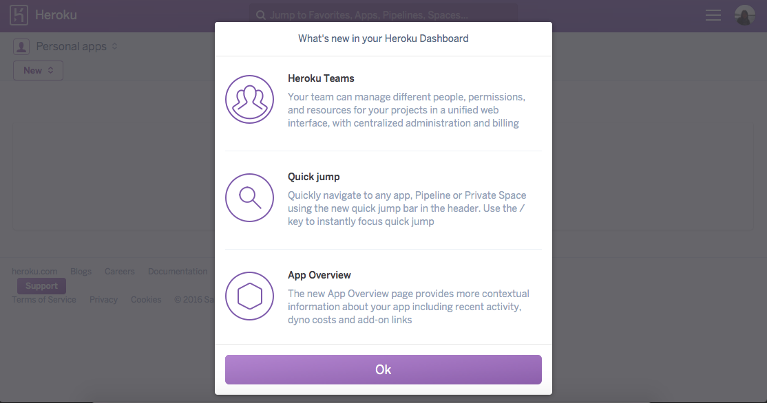
Heroku's generic feature announcement modal is an example. It tells every user about a new capability with no personalization, no context about whether it's relevant to their workflow, and no clear reason to care right now. The fix: segment your audience, personalize the message, and target based on behavior.
Timing isn't just about when users are active. It's about what they're doing. Dropping a survey modal on someone in the middle of a checkout flow or a complex data entry task is a recipe for frustration (and abandoned sessions).
The fix: map your critical user flows and set exclusion rules. If a user is mid-task in a high-stakes workflow, hold the notification until they reach a natural pause point.
A modal that looks great on a desktop dashboard can completely block the interface on a mobile screen. Screen real estate, interaction patterns, and user context are fundamentally different between platforms.
The fix: design notifications for each platform independently. Use banners or small slideouts on mobile where full modals would be too disruptive, and test on actual devices before shipping.
If you're not tracking how your notifications perform, you're guessing. And guessing at scale means compounding bad decisions - sending more of what doesn't work and missing opportunities to double down on what does.
The fix: treat every notification as an experiment. Set a baseline, track engagement and conversion, and retire underperformers. The goal isn't to send more notifications. It's to send better ones.
Let's look at three companies that use in-app notifications effectively, each demonstrating a different strategic approach.
Mailchimp's redesigned onboarding flow (covered in detail in the best practices section) is a masterclass in using in-app notifications for activation. By replacing a generic dashboard experience with a personalized welcome sequence - asking users about their goals, then adapting the interface and suggested next steps accordingly - Mailchimp made the path from signup to first email campaign dramatically shorter. The approach demonstrates a key principle: the best in-app notifications don't just inform, they adapt.
Skyscanner's price alert flow shows what happens when you align notifications with user intent. By asking about price alerts immediately after a flight search (not before, not three days later), Skyscanner turns a permission request into a service. Users don't feel interrupted. They feel supported. The result is higher opt-in rates for push notifications and stronger engagement with the price tracking feature.
Duolingo has built one of the most effective notification systems in consumer software. Their in-app approach combines multiple notification types - checklists for daily goals, banners for streak milestones, microsurveys for lesson feedback, and tooltips for new features - all orchestrated around a single objective: keeping users coming back daily.
What makes Duolingo's system stand out is the sophistication of their behavioral targeting. Users who are about to break a streak get a different message than users who just completed a milestone. The copy is playful but specific ("You're 1 lesson away from a 7-day streak!"), and every notification ties directly to a measurable engagement metric. The outcome: Duolingo consistently reports some of the highest retention rates in consumer mobile apps.
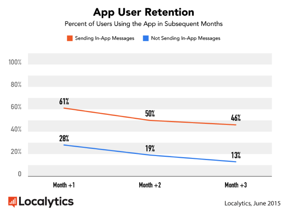
The data backs up what these examples demonstrate: in-app messages don't just improve individual metrics. They fundamentally change the shape of your retention curve.
Ready to put this into practice? Start by auditing your current in-app notification strategy against the best practices above. Identify one area - personalization, timing, segmentation, or measurement - where you can make an immediate improvement, and build from there.
Start with clear goals, segment your audience, time notifications to user behavior and context, write concise action-oriented copy, and measure results. The most effective notifications are personalized, contextually relevant, and tied to a specific desired outcome.
Appcues makes it easy to create, target, and optimize in-app notifications with a low-code builder. From personalized onboarding flows to feature announcements and microsurveys, you can build experiences that reach the right users at the right moment - and measure every interaction along the way.
Book a demo to see how Appcues can help you turn in-app notifications into a growth engine for your product.
Lifecycle Marketing
Retention & Churn
In-App Messaging
Email Marketing
TL;DR
Your users are drowning in notifications. Between email, push alerts, Slack pings, and SMS, the average person is bombarded with dozens of messages every single day. Most get ignored, some get blocked, and the worst ones drive people away entirely.
If you're a product manager trying to improve activation rates, a growth marketer looking to boost trial-to-paid conversion, or a customer success leader scaling onboarding beyond 1:1 calls, in-app notifications deserve a prominent spot in your strategy. They're a core part of your broader in-app messaging toolkit. In this article, you'll learn what in-app notifications are, why they matter, the 8 types you should know, best practices for getting them right, and common mistakes to avoid.
In-app notifications are messages displayed to users while they're actively using your web or mobile application. They appear inside the product interface itself - not in an email inbox, not as a phone lock-screen alert, and not in a notification tray outside your app.
Think of them as your product's voice. They can welcome a new user, announce a feature release, nudge someone toward a key action, or collect feedback through a quick survey. The defining characteristic is context: the user is already engaged with your product when the message appears.
You'll sometimes hear these called "in-product notifications" or "in-app messages." The terms overlap significantly. In general, "in-app notification" refers to any message surfaced inside the app, while "in-app messaging" is the broader discipline of designing, targeting, and optimizing those messages as part of a communication strategy. For this article, we'll use the terms interchangeably.
Here's the stat that makes the case: apps that use in-app messages see up to 3.5x higher user retention than those that don't. That's a fundamentally different retention curve - driven by the simple fact that reaching users at the right moment, in the right place, with the right message changes behavior.
In-app notifications are a growth lever, and the data backs that up across three critical outcomes.
The 3.5x retention stat from Localytics reflects a consistent pattern: users who receive relevant, well-timed in-app messages build stronger habits and stick around longer. That's because in-app notifications can re-surface value at the moment a user might otherwise drift. A well-placed tooltip reminding someone about an underused feature, a checklist tracking their setup progress, or a banner announcing a capability they've been waiting for - these small interventions compound into dramatically better retention rates.
Consider this: the average mobile app loses 77% of its daily active users within the first three days after install. In-app notifications give you a direct channel to intervene during that critical window.
New users churn before they discover why the product is worth keeping. In-app notifications bridge the gap between signup and that "aha moment" by surfacing the right next step at the right time.
Slack, for example, uses a combination of tooltips and checklists to walk new users through creating their first channel, inviting teammates, and sending a message. These contextual nudges reduce the cognitive load of figuring out a new product, which directly shortens time to value. Companies that invest in guided activation flows consistently see higher conversion from free trial to paid.
Most new features go undiscovered because users never encounter the right prompt at the right moment. That's the discovery problem in-app notifications are built to solve.
Targeted in-app notifications solve the discovery problem. Instead of hoping users stumble onto a new capability, you can announce it with a slideout, highlight it with a hotspot, or walk users through it with a tooltip tour. Spotify does this particularly well, using personalized in-app hints to surface features like Discover Weekly or collaborative playlists based on a user's listening behavior. The result: higher engagement with new features without relying on email campaigns that may never get opened.
In-app notifications are powerful on their own, but they reach their full potential as part of an omnichannel messaging strategy. A user who sees an in-app tooltip about a new feature, receives a follow-up email with a deeper tutorial, and gets a push notification to re-engage users when the feature is relevant to their workflow is far more likely to adopt it than someone who receives any one of those messages in isolation. The key is coordination, not duplication - each channel should advance the narrative, not repeat it.
To measure whether your in-app notifications are actually moving the needle, keep an eye on these metrics:
Not all in-app notifications are created equal. Each type has a specific strength, and choosing the right format for the right moment is what separates effective product communication from noise. Here's a quick-reference comparison of the eight most common types, followed by a deeper look at each one.
Modals are full-screen or centered overlay windows that demand the user's attention. They typically darken the background and require the user to take an action (close, confirm, or proceed) before continuing.
When to use them: Modals are best for high-priority announcements, critical onboarding steps, or moments where you need a decision. Use them sparingly - because they interrupt the user's flow, overuse breeds frustration.
Example: Canva uses a modal to welcome new users and ask them to select their primary use case (student, teacher, small business, etc.). This single interaction personalizes the entire downstream experience.
Slideouts are panels that slide in from the side or bottom of the screen. They're less intrusive than modals because the user can often continue interacting with the product behind them.
When to use them: Slideouts work well for feature announcements, contextual tips, or secondary actions that don't require an immediate response. They're a good middle ground between "we need your attention" and "here's something useful."
Banners are thin, persistent bars that typically appear at the top or bottom of the interface. They're the least disruptive notification type and can remain visible across multiple pages or sessions.
When to use them: Banners are ideal for system-wide announcements (maintenance windows, pricing changes), ongoing promotions, or gentle nudges that don't require immediate action.
Tooltips are small, contextual popups anchored to a specific UI element. They appear when a user hovers over, clicks, or reaches a particular part of the interface.
When to use them: Tooltips shine for feature education, step-by-step guided tours, and providing additional context on complex features. They're one of the most effective types for progressive disclosure - revealing information exactly when it's relevant.
Hotspots are small, pulsing indicators (usually circles or dots) placed on specific UI elements to draw attention to them. They signal "something new here" without interrupting the experience.
When to use them: Hotspots are perfect for subtly drawing attention to new features, updated menu items, or underused functionality. They let curious users explore on their own terms.
Checklists are persistent, trackable lists of tasks that guide users through a series of steps - usually during onboarding or setup. They create a sense of progress and give users a clear path forward.
When to use them: Checklists are most effective during onboarding, account setup, or any multi-step process where completion matters. The visual progress indicator taps into the endowed progress effect, motivating users to finish what they started.
Microsurveys are short, in-app questionnaires (usually 1-3 questions) that collect feedback at specific moments in the user journey. They often use NPS, CSAT, or multiple-choice formats.
When to use them: Microsurveys are ideal for capturing feedback after key interactions (completing onboarding, using a new feature, finishing a workflow) when the experience is fresh. They're also useful for segmenting users based on their goals or preferences.
Embeds are inline content blocks placed directly within your product's UI layout - not layered on top of it. Unlike modals or tooltips that overlay the interface, embeds live inside the page as native-feeling elements like cards, banners, or callout sections.
When to use them: Embeds are ideal for persistent, contextual guidance that shouldn't interrupt the user's flow. Think onboarding checklists that live in a sidebar, feature recommendations within a dashboard, or contextual help cards anchored to a specific page section. Because they blend into the existing layout, users engage with them naturally rather than dismissing them reflexively.
These two notification types get confused constantly, but they serve fundamentally different purposes.
The simplest way to think about it: in-app notifications talk to users who are already engaged, while push notifications try to bring users back. Both are essential for user retention, but they play different roles.
Use in-app notifications when context matters - when the message is most useful because of what the user is doing right now. Use push notifications when timing matters - when you need to re-engage someone who hasn't been active or alert them to something urgent outside the app.
The best product teams don't choose one over the other. They orchestrate both as part of a cohesive messaging strategy.
Effective in-app notifications come down to six practices, each backed by a real-world example.
First impressions set the tone for everything that follows. The most effective onboarding notifications don't treat every user the same - they ask a few quick questions and adapt the experience based on the answers.
Mailchimp is a textbook example. Their original onboarding was a one-size-fits-all flow that dropped every user into the same dashboard.
They redesigned it with empathy at the center. The new experience opens with a personalized welcome message on the dashboard, then guides users through a personalized, low-friction signup flow that adapts based on what the user wants to accomplish.
The takeaway: use your first in-app notification to learn something about the user, then tailor what comes next. Even a simple "What's your primary goal?" microsurvey can dramatically improve user onboarding outcomes.
The best in-app notification is one that arrives at the exact moment the user needs it. That means triggering messages based on behavior, not just schedules.
Skyscanner does this well. After a user searches for a flight, Skyscanner uses a well-timed push notification to ask if they'd like price alerts for that route. The ask is perfectly contextual - the user just demonstrated intent, so the notification feels helpful, not intrusive.
The principle applies to any SaaS product. Don't ask users to grant permission before they've seen value. Don't announce a feature before they've encountered the problem it solves. Use data to identify the right behavioral triggers, and let those triggers determine when the notification fires.
Not every user needs the same message. Power users who've been in your product for months don't need the same tooltip tour you show to someone on day one. Segmentation is what makes in-app notifications feel personal instead of generic.
Spotify segments aggressively. When they roll out new feature announcements, they target users based on listening behavior and usage patterns. A listener who creates playlists regularly might see a modal about collaborative playlists, while someone who primarily uses Discover Weekly gets a hint about podcast recommendations.
Segment by user lifecycle stage (new, activated, power user, at-risk), by role or persona, by plan type, and by behavioral patterns. The more specific your segments, the more relevant your notifications become, and relevance is what separates engagement from annoyance.
Even well-targeted notifications can backfire if there are too many of them. Notification fatigue is cumulative - each additional message lowers the perceived value of the next one.
Set frequency caps so no user sees more than one or two notifications per session. Build user preference controls that let people choose what types of messages they receive and how often. And test your cadence: run experiments to find the sweet spot where engagement stays high without tipping into annoyance. Some teams find that reducing notification volume by 30-40% actually increases overall click-through rates because the remaining messages carry more weight.
The goal is to make every notification count. When you reinforce the messaging across channels rather than repeating it within one, you can stay present without being overwhelming.
Your notification copy has about two seconds to earn the user's attention. Vague, jargon-filled, or passive messages get dismissed instantly. Every notification should answer one question: "What should I do next?"
Compare these two approaches:
Before: "We've updated our analytics capabilities with enhanced reporting functionality. Click here to learn more about the new features available in your account."
After: "Your dashboard now shows real-time conversion data. Check it out."
The second version is shorter, specific, and tells the user exactly what's different and what to do. When writing notification copy, lead with the benefit (not the feature), use active verbs, keep it under 40 words when possible, and always include a clear call to action.
Launching an in-app notification isn't the finish line. It's the starting point. Every notification you ship should be measured, analyzed, and improved.
Track these key metrics:
Run A/B tests on copy, design, timing, and targeting. Even small changes - like adjusting when a tooltip appears or rewriting a CTA button - can meaningfully move the needle. The teams that treat in-app notifications as a living system rather than a "set and forget" tool consistently outperform.
Even well-intentioned notification strategies can backfire. Here are five of the most common pitfalls and how to steer clear of them.
This is the most common and most damaging mistake. When users feel overwhelmed by notifications, they don't just ignore them - they develop blanket distrust for anything your product surfaces. That's notification fatigue, and it's incredibly hard to reverse.
PayPal's aggressive rating request is a case study in what not to do. Popping up a request to rate the app at an unrelated moment feels pushy and self-serving. The fix: set frequency caps, prioritize your messages by impact, and never show more than one notification at a time.
One-size-fits-all notifications signal that you don't understand your users. A first-time visitor and a power user with 200 sessions have completely different needs, and treating them identically wastes both your messaging opportunity and their patience.
Heroku's generic feature announcement modal is an example. It tells every user about a new capability with no personalization, no context about whether it's relevant to their workflow, and no clear reason to care right now. The fix: segment your audience, personalize the message, and target based on behavior.
Timing isn't just about when users are active. It's about what they're doing. Dropping a survey modal on someone in the middle of a checkout flow or a complex data entry task is a recipe for frustration (and abandoned sessions).
The fix: map your critical user flows and set exclusion rules. If a user is mid-task in a high-stakes workflow, hold the notification until they reach a natural pause point.
A modal that looks great on a desktop dashboard can completely block the interface on a mobile screen. Screen real estate, interaction patterns, and user context are fundamentally different between platforms.
The fix: design notifications for each platform independently. Use banners or small slideouts on mobile where full modals would be too disruptive, and test on actual devices before shipping.
If you're not tracking how your notifications perform, you're guessing. And guessing at scale means compounding bad decisions - sending more of what doesn't work and missing opportunities to double down on what does.
The fix: treat every notification as an experiment. Set a baseline, track engagement and conversion, and retire underperformers. The goal isn't to send more notifications. It's to send better ones.
Let's look at three companies that use in-app notifications effectively, each demonstrating a different strategic approach.
Mailchimp's redesigned onboarding flow (covered in detail in the best practices section) is a masterclass in using in-app notifications for activation. By replacing a generic dashboard experience with a personalized welcome sequence - asking users about their goals, then adapting the interface and suggested next steps accordingly - Mailchimp made the path from signup to first email campaign dramatically shorter. The approach demonstrates a key principle: the best in-app notifications don't just inform, they adapt.
Skyscanner's price alert flow shows what happens when you align notifications with user intent. By asking about price alerts immediately after a flight search (not before, not three days later), Skyscanner turns a permission request into a service. Users don't feel interrupted. They feel supported. The result is higher opt-in rates for push notifications and stronger engagement with the price tracking feature.
Duolingo has built one of the most effective notification systems in consumer software. Their in-app approach combines multiple notification types - checklists for daily goals, banners for streak milestones, microsurveys for lesson feedback, and tooltips for new features - all orchestrated around a single objective: keeping users coming back daily.
What makes Duolingo's system stand out is the sophistication of their behavioral targeting. Users who are about to break a streak get a different message than users who just completed a milestone. The copy is playful but specific ("You're 1 lesson away from a 7-day streak!"), and every notification ties directly to a measurable engagement metric. The outcome: Duolingo consistently reports some of the highest retention rates in consumer mobile apps.
The data backs up what these examples demonstrate: in-app messages don't just improve individual metrics. They fundamentally change the shape of your retention curve.
Ready to put this into practice? Start by auditing your current in-app notification strategy against the best practices above. Identify one area - personalization, timing, segmentation, or measurement - where you can make an immediate improvement, and build from there.
Start with clear goals, segment your audience, time notifications to user behavior and context, write concise action-oriented copy, and measure results. The most effective notifications are personalized, contextually relevant, and tied to a specific desired outcome.
Appcues makes it easy to create, target, and optimize in-app notifications with a low-code builder. From personalized onboarding flows to feature announcements and microsurveys, you can build experiences that reach the right users at the right moment - and measure every interaction along the way.
Book a demo to see how Appcues can help you turn in-app notifications into a growth engine for your product.

Sign up for Quickcues and get our monthly updates!
.svg)