How to use in-app messaging to boost user retention
.png)

.png)
Users sign up for your product with the best intentions—but are you designing your welcome experience with their best intentions in mind? Too many companies distract new app users with bells and whistles before they’ve got a basic understanding of how to use their product in the first place.
Enter in-app messaging: your handy solution to save users from themselves (and churn), while helping to provide a great app experience.
In-app messages (also known as in-product messages) are the different ways you communicate with app users while they’re using your product. Ever receive a welcome message after you signed up for something? Then you’ve seen an in-app message. In-app messages are handy because they’re hard to ignore—and because users don't have to opt in to view them. Product teams integrate app messages into the entire app experience so they're not left wondering how users engage with specific features.
You’d be hard-pressed to find a quality product nowadays that doesn’t use in-app messaging. Users appreciate product guidance that answers their questions without leaving an app—and product teams love having versatility in customer communication.
In-app messages are delivered to active users inside your application. When the user clicks on the in-app message, it can provide a deep link to redirect the user to the specific destination in the application. In-app messages can also be used for other purposes, such as prompting users to share the app with their friends through social media.
In-app messaging doesn’t really differ much between iPhone and Android devices. However, there may be some differences in terms of the specific tools and technologies used to implement in-app messaging on each platform, as well as any platform-specific considerations that app developers need to take into account.
For example, on iPhone, in-app messaging may be implemented using the iOS SDK and APIs with the help of swift or objective C programming language. On Android, in-app messaging could be implemented using the Android SDK and APIs with the help of the Firebase in-app messaging API.
Additionally, app developers may need to consider any platform-specific requirements or best practices for implementing in-app messaging, such as guidelines for user privacy and data protection.
Overall, the key differences between in-app messaging on iPhone and Android are likely to be related to the specific tools and technologies used, rather than any fundamental differences in how the feature works on each platform.
Push notifications and in-app messages are two different tools that app developers can use to communicate with users, and which one is more appropriate will depend on the specific needs of the app and the type of information or interaction being delivered.
Push notifications are messages that are sent from a server to a user's device, typically to alert the user to something or to provide information. Push notifications can be sent to the user even if the app is not in use, often via email or SMS. They are generally used as part of a messaging campaign to bring the user back to use the app and increase engagement.
In contrast, in-app messages are only displayed when a user is actively using the application. They can have a variety of sizes, and they can be customized for every user to increase conversion in the application.
A peek under your product data-hood should reveal where new users drop off during onboarding, where they experience friction in your UI, and what features they have trouble finding or figuring out. Once you identify where you're losing users, you can leverage an in-app messaging strategy to save them. Let's dive into different in-app messaging approaches to help you determine which one is right for your customer:
Product tours educate new users about the functionality of your app while highlighting useful features. You can think of them like the out-of-the-box instruction manual that shows you how to get started with a new product.
These patterns are especially helpful for notifying users of product updates, providing upsell prompts, and encouraging referrals.
A contextual tooltip can provide much-needed info to create a smoother customer experience—without feeling overly disruptive to users. Use them to draw attention to a specific part of the page.
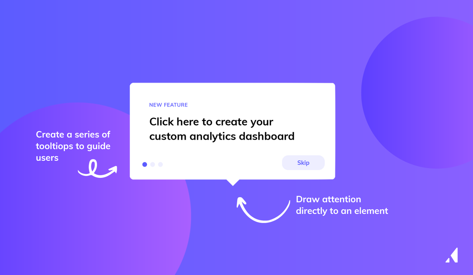
In Appcues, you can add Tooltips directly from the Builder.
You can start from a template for inspiration. Or upload content like images, gifs, or custom text to create something unique. From there, target and publish your flow to bring it live.
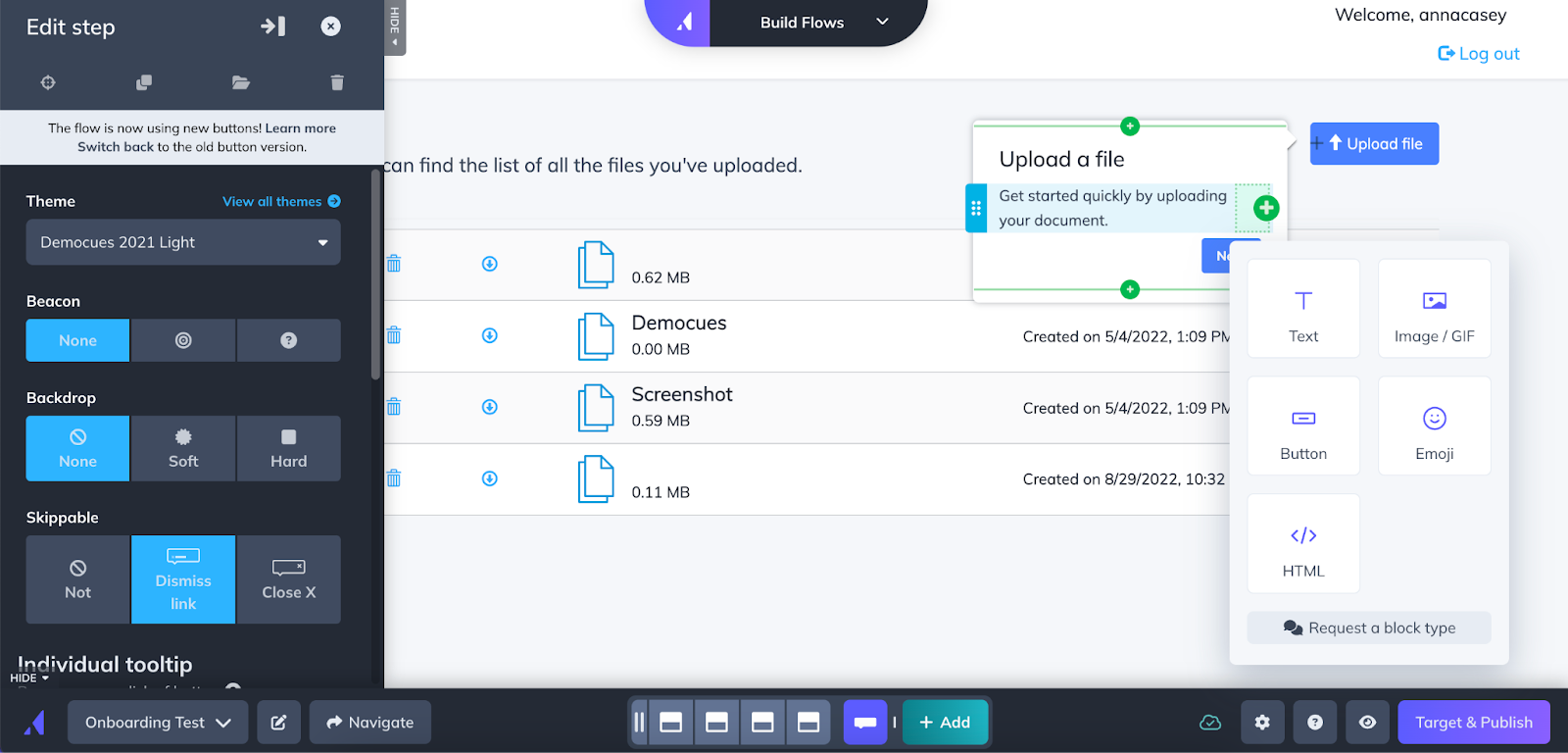
For step-by-step guidelines to build a Tooltip with Appcues, click here.
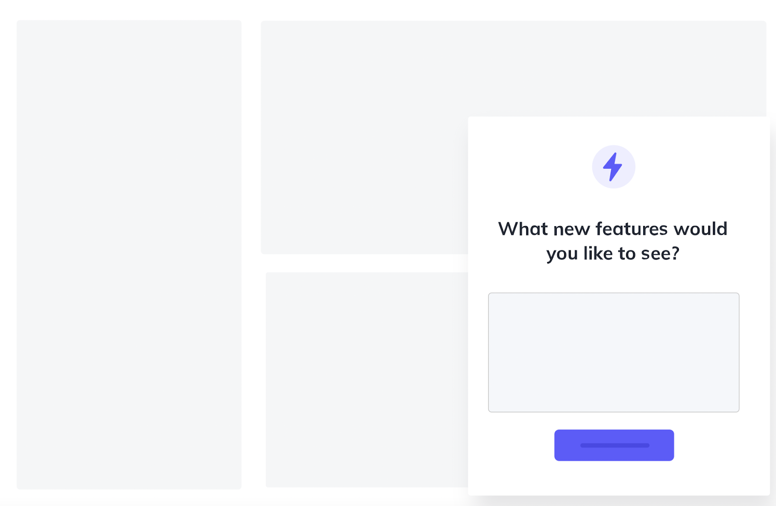
Much as their name would suggest, slideouts are medium-sized UI elements that slide out from the side of your screen.
Slideouts serve a number of use cases. For example, you can deploy them to augment the impact of an existing campaign. You can also use them like forms to collect user feedback, or prompt users to schedule a call with your sales or customer success team.
Modal windows are another way to fast track users from your home screen to your most valuable feature.
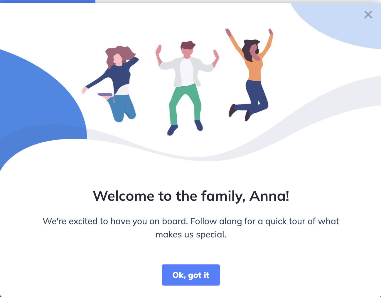
Because they take up more real estate on the screen, modal windows are perfect for:
The Appcues builder makes it easy to create native-like, on-brand Modals without typing a line of code.
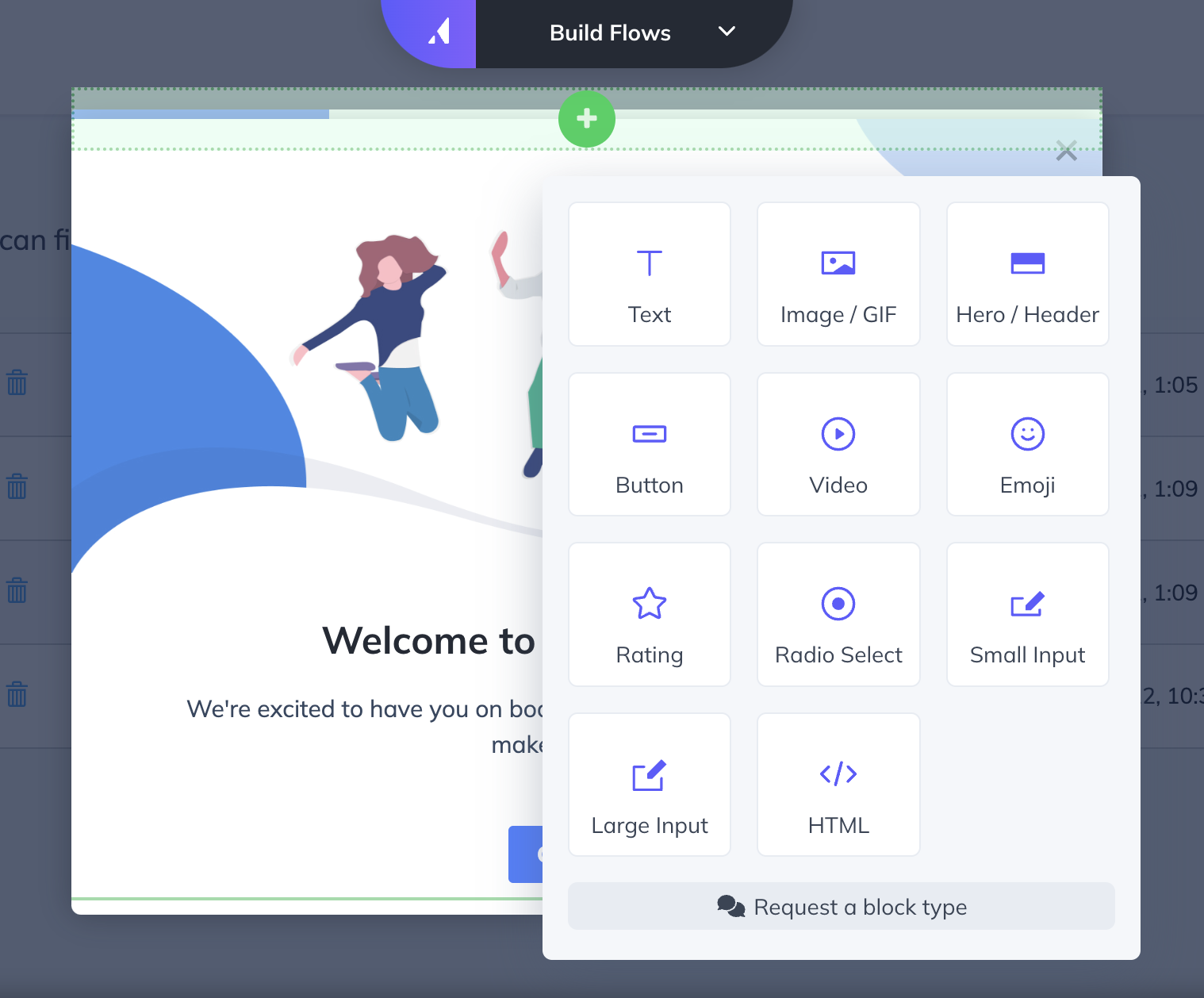
Banners make it easy to share time-sensitive or other important information without intruding on your users work.
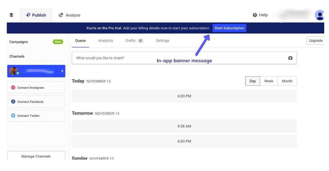
Chats give users the opportunity to get real-time customer support and quick access to information. Not every company has the bandwidth to keep up with real-time chat, so keep that in mind before deploying this approach (or the AI).
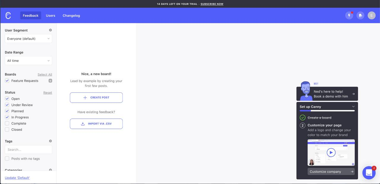
Notes are great for longer text announcements—providing feature releases, bug fixes, and product improvements the real estate they need. Their versatility makes them primed for pop-up modals or full-screen experiences.
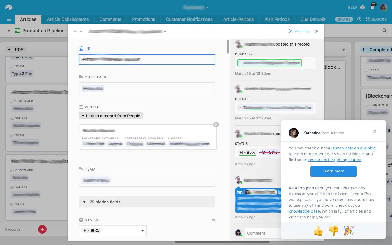
There’s nothing but upside to consistently delivering a stellar product experience. Happy users stick around, reduce churn, and give you more opportunity for upsell. Used wisely, in-app messages will:
77% of users churn from mobile apps within three days of installation. This means you can’t afford to just hope first-time users will find their aha moment on their own without driving specific actions. In-product messaging provides a simple and scalable solution for ongoing product adoption. It helps you connect with users more consistently in a way that feels more natural. One-off marketing pushes can seem forced, but in-app messages serve like a native extension of the product experience.
New features pack more value into your product and can keep long-time users coming back for more. However, releasing a new feature doesn’t guarantee users will adopt it (or know how to use it).
Using in-app messages for feature announcements guarantees you users' eyeballs (because their eyeballs are already using your app). Your most value-laden. game-changing feature might call for an all-caps, fill-up-your-home-screen modal window. Alternatively, you might opt for a less disruptive tooltip UI pattern to call out a new feature that’s relevant to a few niche users.
Discover more ways to improve feature adoption rates using in-app messaging
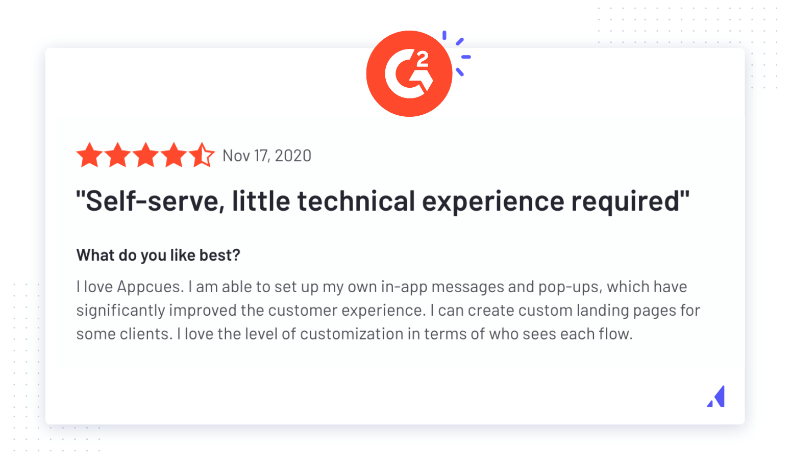
Be honest, how often does your team seek out user feedback? We get it, it can be a huge chore! But an in-app message can make it easier to survey your users while they're already using the app.
In-app messages are a great vehicle to provide users with valuable product tips and reminders. Users aren't just going to adopt every new feature—you've got to show them why they should opt-in. Being proactive with your in-app messages can also help you get ahead of bad user feedback by addressing common questions while they're mid-experience.
There’s a delicate balance between helping users and bothering them with too much information. But the more relevant your in-app messages are, the less likely users will dismiss them as SPAM.
Follow these tips to craft a thoughtful in-app communication strategy:
Keep user’s attention by keeping it simple. Craft messages that get to the point. Share relevant information when it's needed, so you don't distract (read: annoy) them when using your product. The less text users have to sift through, the more they'll retain your messaging.
It doesn’t make sense to take a power user through an onboarding walkthrough or display an upsell prompt to a newly onboarded user. In both scenarios, your message isn’t relevant to your audience.
Instead, target the appropriate audience through user segmentation to deliver personalized messages. Group your customers based on their in-app behaviors, and then send tailored messages that address their needs.
The right message at the wrong time is almost as bad as never getting the message at all. Only send messages in the middle of a user’s experience to offer assistance or to smooth out points of friction within your product. If you're introducing a new feature, debuting it to users when they log in minimizes the risk of disruption once they get deeper into your product.
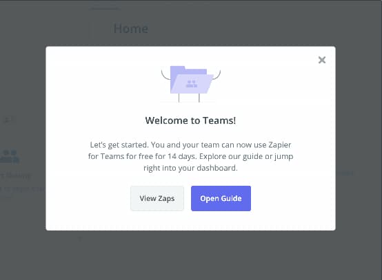
Your in-app messages should always end with a call to action (CTA) that lets users know what to do next. Clear CTA's give users an opportunity to re-engage with features you showed off in your product tour. In the below example, Zapier includes two CTA's—giving users the option to learn more about its Teams feature, or get started with an in-app guide. Both actions push users deeper into the product (and closer to finding its value).
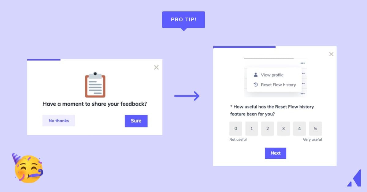
In-app messages aren’t just a way for you to share updates. You can (and should) use them get feedback from your customers, too. Want to know what your customers think about your product's new mobile experience? Send 'em an in-app survey that asks them to rate their experience. In-app surveys get higher response rates compared to surveys delivered via email.
Solid communication is foundational to a good relationship—and the same goes for your product's relationship with your users. Both parties benefit from clear and effective communication, which is why we're breaking down the 4 most common in-product messaging use cases:
User onboarding helps users receive value from a product as quickly as possible. Your user onboarding process should accomplish 2 things:
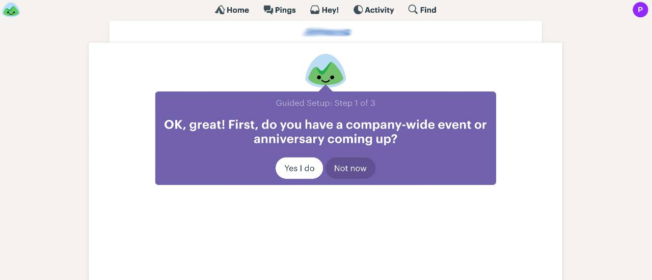
Let's examine Basecamp. It greets users with a simple, informative welcome message and a brief product walkthrough. Basecamp keeps the walkthrough focused on a few critical tasks to ensure speedy and easy adoption. Additionally, the conversational tone and cheerful logo make for a more positive user experience.
Many SaaS companies offer a free trial or freemium version of their product, which initiates user onboarding long before someone forks over their credit card information. These models allow users to experience value before making a financial commitment—and it's one of the primary aspects of any product-led go-to-market motion. But that also puts the onus on product teams to demonstrate relentless proof of value right out of the gate alongside continuous soft sells.
For example, Slack uses in-app messaging to encourage users to upgrade to a paid plan. This messaging is seamless and crazy effective, with paid membership increasing by 25% between 2019 and 2020. This is one of the first prompts that users see once their team hits the 10k searchable message limit for free plans:

Similar messages appear as users navigate through the product and take relevant actions, like browsing through channels and performing a search:
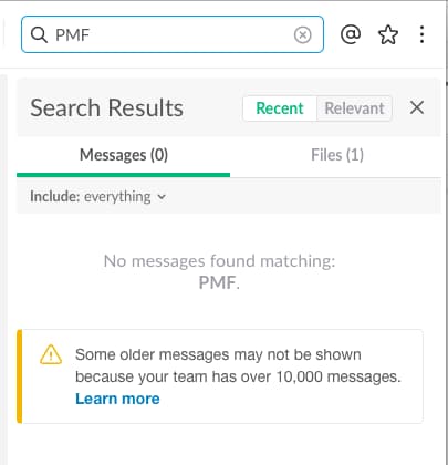
Slack does an excellent job of showing these upgrade prompts in the right places and at the right times. The messages manage to come off as both persuasive to the users who are ready to upgrade and unobtrusive to those who aren’t.
It’s never too early to start sowing the seeds of long-term engagement. The all-important aha moment is a worthy goal post for user onboarding. However, it often takes a series of subsequent wins before customers consider your product truly indispensable.
Once users complete core actions and understand your product’s value, you should help them stay successful (and loyal!) with lifecycle nudges. Quora uses in-app messaging to organically guide newbies toward power-user status. As user engagement ramps up, the messaging changes. Each message asks users to perform just one action, but clearly, Quora aims to get its users addicted.
Quora displays a visual progress bar early on in the journey that’s never quite full. Most users will want to fill in the rest of the progress bar and discover some top-notch answers from the community. Quora uses a message to let users know that updating their interests will give them access to more personalized content:

Quora then prompts users to integrate the platform with other social media sites. Soon afterward, Quora gives users even more control and influence over how they shape the platform to their needs by inviting them to take questions from their followers.
You need constant value delivery to keep your customers happy. Referral programs engage regular users, increase customer loyalty, and grow your user base. Caviar cleverly integrates a referral prompt into a slideshow on its homepage. The slideshow grabs a user’s attention without interfering with their browsing experience.

Upsells and referrals are often best served by subtle UX patterns. These are not core actions, and you'll achieve better results with unobtrusive but enticing messaging rather than disruptive modals.
Quality messaging improves UX at every stage of the customer journey. Your product constantly evolves, so you’ll need to build and iterate your messages throughout your product’s lifetime. Take a look at some of the best resources for honing your in-product messaging skills, straight from the Appcues archives:
The companies featured in these articles are in the trenches, testing and learning and iterating on what works best for their users. Even though every product is different, these best practices hit on principles that can be applied to almost any SaaS company:
Product update announcements are tricky. You want to inform your users of the new features that your team has been working on. However, you don’t want to annoy them or give them extra work. These resources are from SaaS experts on how to use in-app messaging for product updates that will excite your users without driving them bonkers:
In-app messages might look simple by design, but some of the most helpful formats can require a good deal of coding to construct. Some companies use in-house engineers to build them from scratch. Resource-constrained businesses might hire third-party developers to build their UI patterns—which can get expensive depending on how many messages you need.
Luckily, there’s an easier way to do it. No-code tools exist to provide you with hassle-free methods for building in-app messaging. Appcues enables you to create seamless in-app messaging experiences that appear native to your app. Whether you’re streamlining your user onboarding process or promoting your latest feature, Appcues will help you build in-app messages that will help retain users and boost product adoption.