← Visit Appcues.com
×
×

5 ways PMs can improve product adoption today

Improving product adoption has an outsized impact on retention, engagement, and revenue. Here are 5 proven strategies to move the needle.
Skip to section:

Skip to section:

At the beginning of this year, Slack celebrated its fifth birthday with more than 10 million daily active users (DAUs). That’s over 10 million people who log in to their Slack account, each and every day. And on their first day of public trading this June, the SaaS darling was valued at a whopping $19.5 billion. How did they get there?

Slack's team—and its investors—understand the power of product adoption. They know that product adoption is a prerequisite for every performance metric that matters in the long run—think customer retention, user engagement, and revenue. They also work hard to get new users to their aha moment quickly with best-in-class onboarding—something that takes Slack from a nice-to-have edition to a user’s tech stack to a staple of their daily routine. 

Improving product adoption results in higher retention and lower churn, which translates to more consistent and predictable revenue. It can also help you unlock new growth opportunities, as users who have fully bought into your product evangelize your solution to others. 

Given its outsized impact on both the user experience and your company, product adoption should really be a top priority. To that end, here are 5 proven strategies for improving adoption and helping all of your users—from new signups to old hands—use your product more effectively.

1. Create an unforgettable first-time user experience

Your customer's first experience sets the tone for every experience that comes after. With so much at stake, it's your job to demonstrate the usefulness of your product as quickly as possible—whether that means helping users to schedule their first social media post or run their first analytics report. 

Smart companies use welcome messages, in-app tutorials, and tooltips to create a clear path to value—no matter how complex their product. They do this by defining their core value proposition and streamlining their onboarding to get users to realize that value as early in their experience as possible.

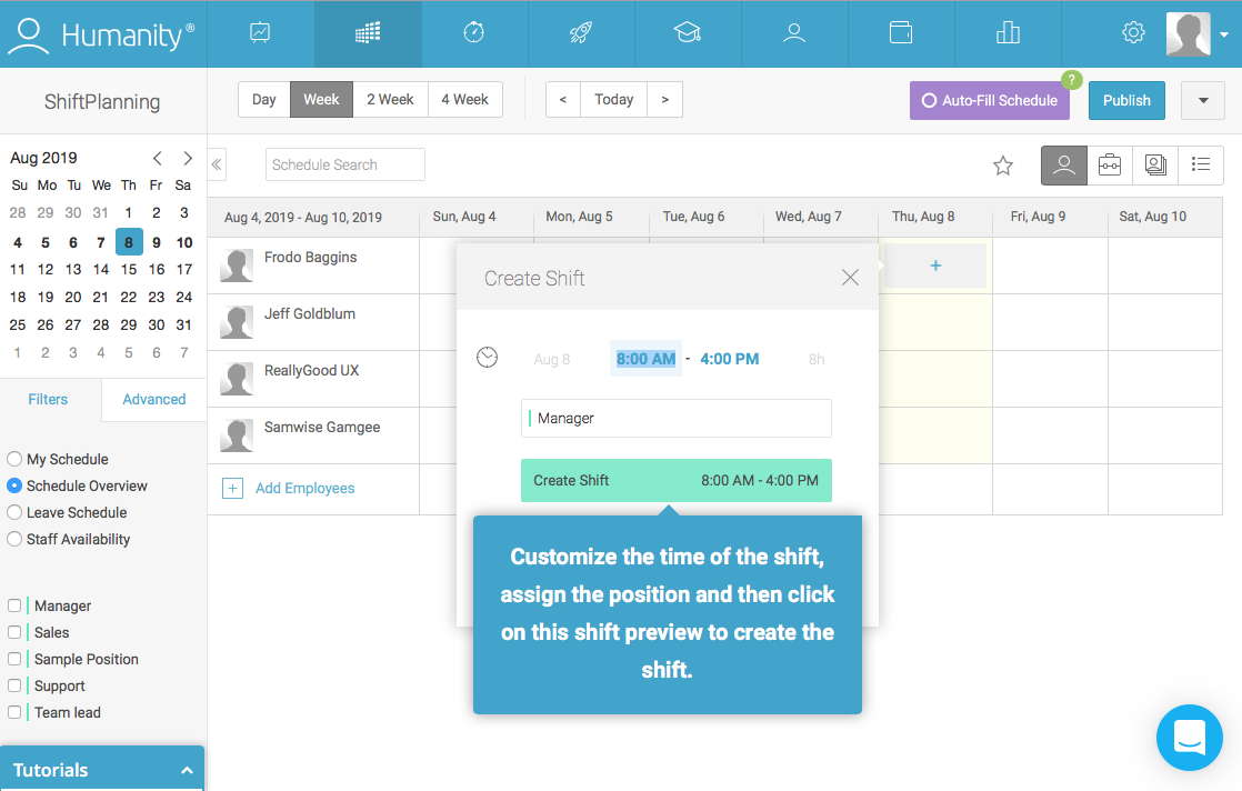
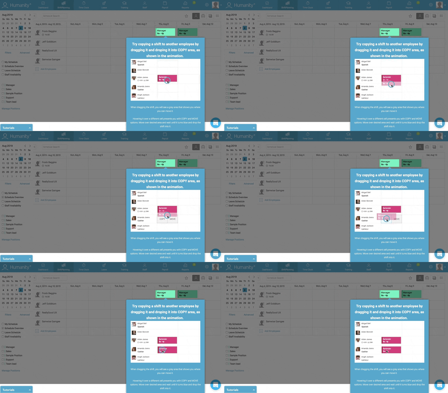
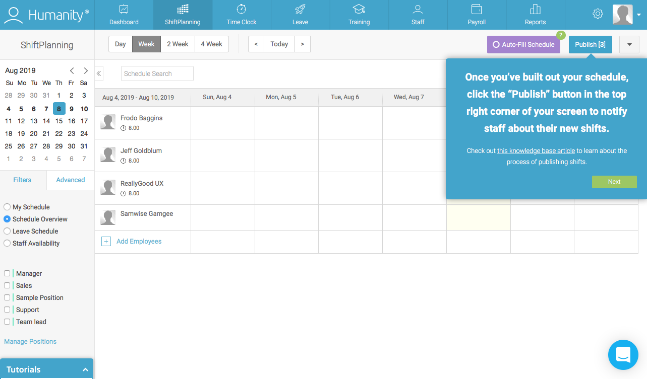
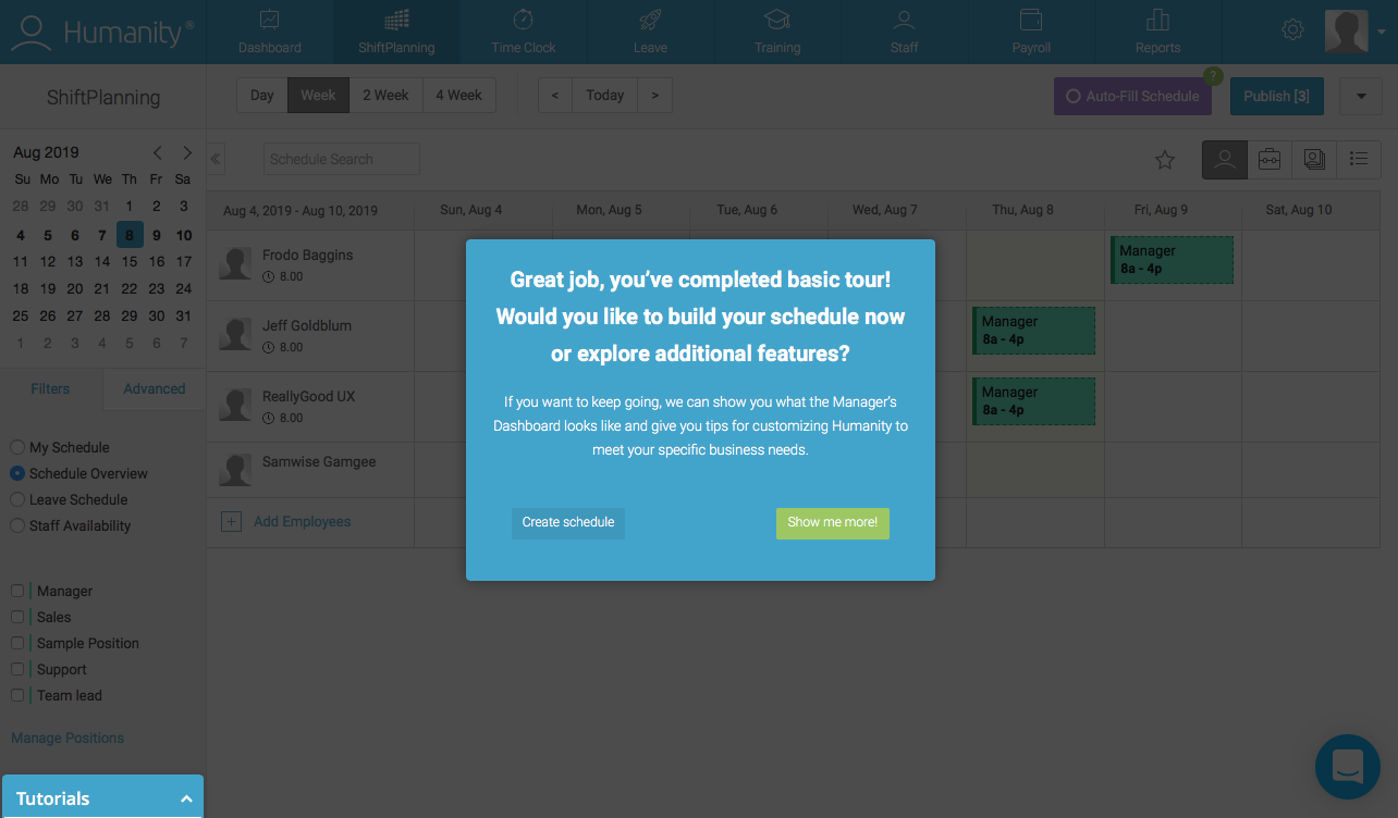
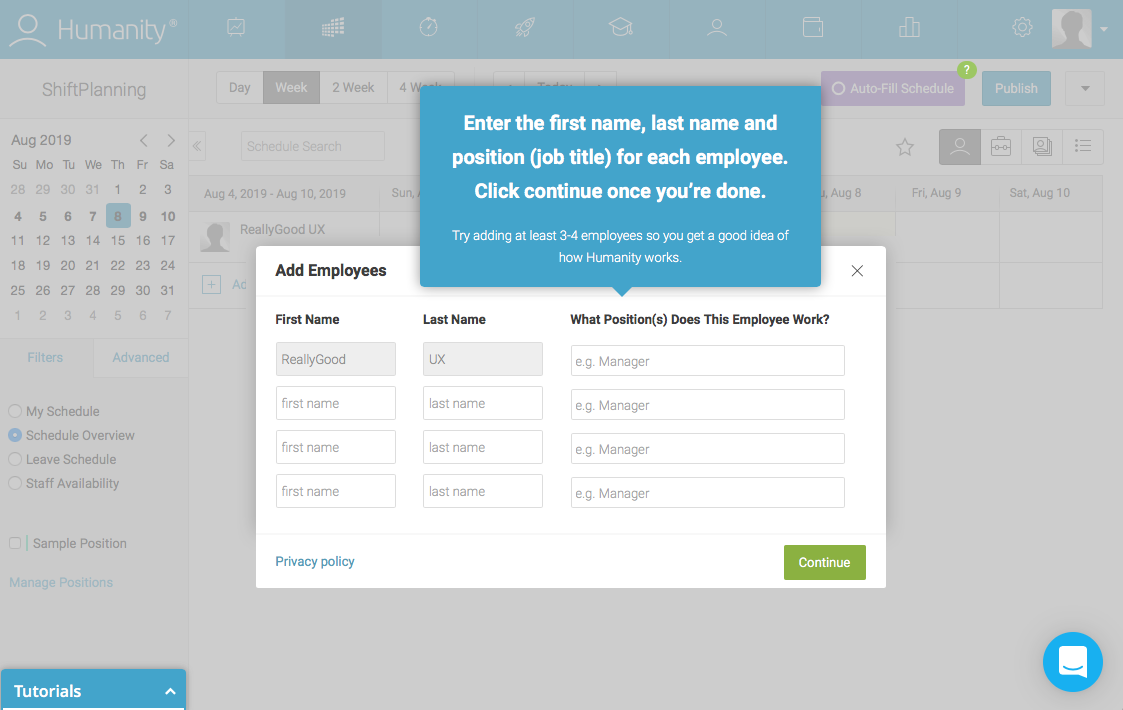
Take a look at how employee management platform Humanity focuses its new user onboarding on their product’s core functionality: scheduling. They use a prescriptive action-driven tooltip tour to sequentially guide users through the actions they need to take to achieve value—in this case, building an employee schedule.
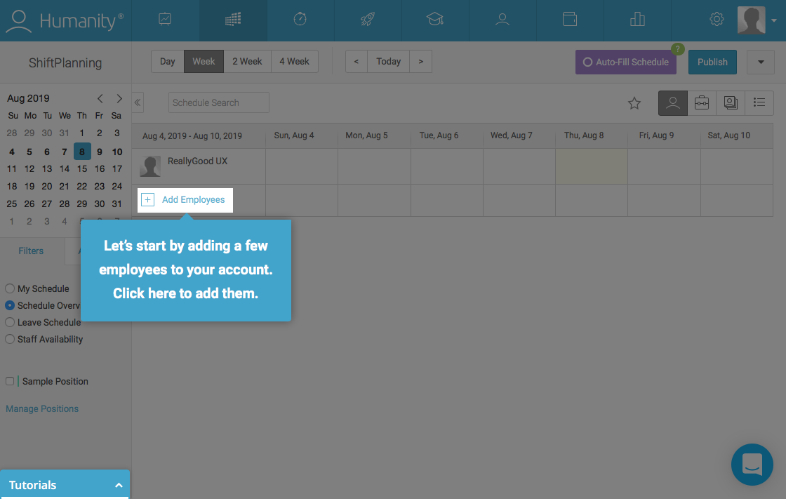
humanity new user onboarding product tour walkthrough tooltip with spotlight
humanity new user onboarding product tour walkthrough tooltip and modal
humanity new user onboarding product tour walkthrough tooltip with spotlight
humanity new user onboarding product tour walkthrough tooltip and modal
humanity new user onboarding product tour walkthrough tooltip gif
humanity new user onboarding product tour walkthrough tooltip
humanity new user onboarding product tour walkthrough confirmation modal

There are a lot of steps involved here (and as a rule, less is more when it comes to in-app messaging), but requiring user action helps the walkthrough feel thorough, rather than monotonous.  And Humanity has kept a beginner mindset in mind—spotlights, gifs, and clear supporting copy take the guesswork out of the process.

Another approach to onboarding is to offer users different onboarding experiences, according to selections they make during signup. Segmenting users according to experience level, job title, goals, etc. allows you to deliver more personalized (read: relevant) first-time experiences that will resonate with an individual user’s needs.

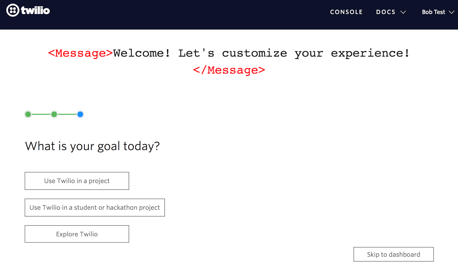
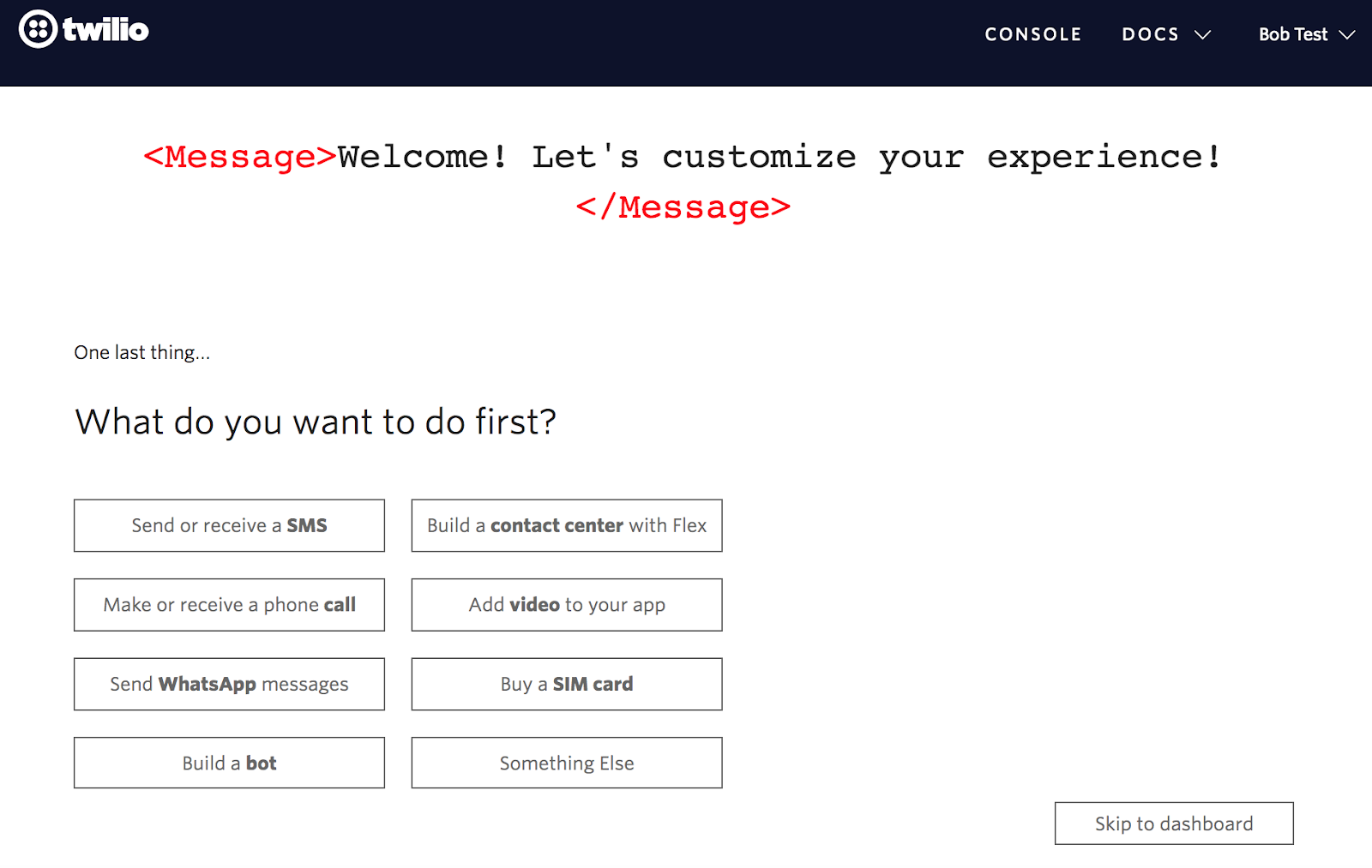
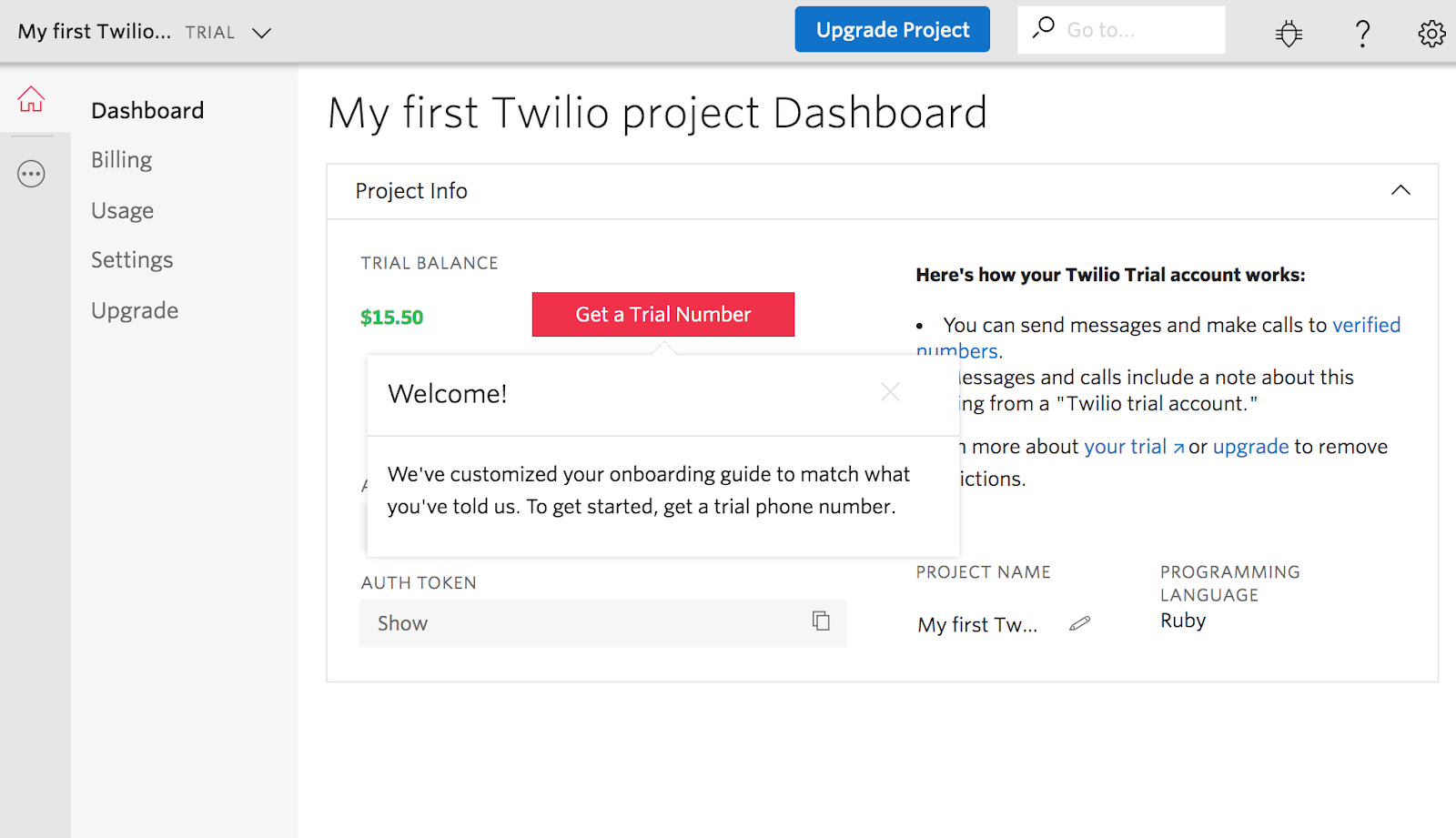
Twilio, for example, asks a series of personalizing questions during onboarding in order to shepherd new users to the features that they’ll find most useful for their immediate needs. And by giving new users a specific goal to work towards during their first session, Twilio increases users’ motivation to complete the onboarding sequence.

twilio new user onboarding personalization. segmenting users with declared data example
twilio new user onboarding personalization question 2
twilio new user onboarding personalization question 3 user goals
twilio new user onboarding personalization question user goals
twilio first dashboard customized based on user inputs

If people are coming to you for a variety of reasons, don’t make the mistake of offering a single onboarding experience for all. Fast-track product adoption by using declared data to tailor your onboarding to users’ specific needs. Remember: while your tool’s myriad capabilities may be a subject of pride, to new users with a specific goal in mind, irrelevant functionality is a distraction on the path to activation.

Read more: User onboarding best practices 

2. Treat new features like mini product launches

Products evolve over time. We learn which parts of our products drive engagement and which get overlooked. We update existing features and release brand-new functionality. Each one of these changes has the potential to impact product adoption, for better or worse.

To maximize product adoption, treat each new feature announcement like a mini product launch. Remember, even veteran users of your product are inexperienced when it comes to a new feature. Not only will these existing users benefit from new feature onboarding—but celebrating new features keeps regular users excited about your product and lets them know that it’s evolving to meet their needs.

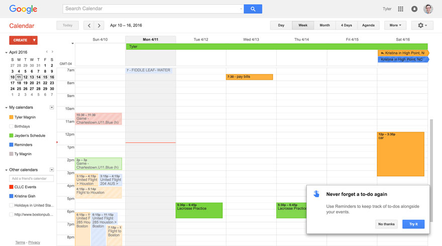
Google took this approach back in 2016 when they added the Reminders feature to their Calendar app. Instead of assuming that users would know how and why to use the new feature, they used a small modal to briefly explain the value of Reminders, along with an opt-in feature walkthrough.

google calendar new feature 2016 reminders feature introduction tour popup

In-app walkthroughs like this—which are both contextual and timely—maximize the number of users who are made aware of a release and minimize the effort required to actually get started with a new feature. Importantly, Google included a “No thanks” opt-out option, making it easy for users to dismiss the message and carry on with their work.

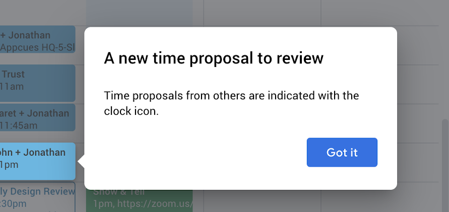
Sometimes, a full feature tour isn’t necessary. For smaller feature releases, a single tooltip strikes the right balance of informative yet casual, easy-to-spot yet unobtrusive. For example, Google used a solitary tooltip (plus a spotlight) with minimal copy to let existing Calendar users know about the time proposal functionality. 

google calendar feature announcement tooltip new time proposal icon

Read more: How Google improves their user experience with the HEART framework

3. Support the in-app experience with behavioral emails

Optimizing product adoption is the pursuit of a habitual user experience. You want people to use your product in a way that's consistent and automatic. For a social media management tool, you want your users to log in every time they share a post to LinkedIn, for example. 

But like any habit, product adoption needs to be reinforced through repetition

Emails can be an easy way to achieve that repetition and leverage the mere-exposure effect. By sending emails that echo the advice offered in your in-app tutorials, you can increase the likelihood that a user will take action—whether that means trying out a new feature or finishing setup by connecting a social account. As with in-app communications, the key to successful behavioral emails is relevancy and timeliness.

Use behavioral triggers to engage users when they're at their most receptive and engaged. For instance, Yotpo created a series of emails designed to nudge users closer to their moment: 

diagram showing how yotpo used behavioral triggers based on actions taken in an appcues flow to send emails

Each email was triggered in response to a relevant in-app action: When a user signed up for the product, they received an email explaining how to install the company's widget on their website. Then, when the widget was installed, the user receive tips on using the widget to generate customer reviews. 

For the customer, this creates a seamless flow through the product. They receive clear, timely guidance at every step of setup, and each successful action is immediately followed up by a logical next step. 

Read more: How Yotpo used Appcues to improve product adoption

4. Use targeting to boost feature adoption

It's likely that most of your app's value will come from a handful of key features—it's the 80/20 principle in action. Some features might be too advanced for the average user (how many Excel users can create macros?), while others—like integrations with third-party tools—might only appeal to a certain subset of customers.

But great product adoption means fixing these “weak spots” and finding ways to boost engagement with your entire product—no matter how complex or niche the feature. 

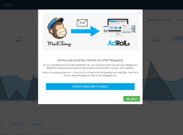
Segmentation provides the solution. When AdRoll released an integration with MailChimp, it knew it had a limited audience: MailChimp customers. Triggering a mass onboarding tutorial would alienate as many users as it would help, so the company used a data analysis tool to identify users with active subscriptions to both AdRoll and MailChimp. 

mailchimp adroll integration modal dialog announcement made with appcues

AdRoll then developed a pop-up modal promoting the integration. Users saw the modal when they logged into their dashboard—but only if they belonged to the segment of users with active subscriptions to both products.  

The modal explained the benefits of the integration in clear, concise terms (“retarget your email contacts in AdRoll”), and an in-modal CTA made it quick and easy for users to get started.

Instead of hoping that MailChimp users would stumble on the new release, understand the benefits, and know how to get started, it made the process as direct as possible. It worked: one of its most “niche” features netted a staggering 60% adoption rate. 

Read more: How AdRoll's growth team drives conversions

5. Find, fix, and repeat

Sometimes, product adoption is hindered by a specific, acute problem. Your latest feature might seem too complex to use. Your app’s navigation might be making other features hard to find. You might even be signing up poor-fit leads. With thousands of users, finding and fixing these problems isn't always straightforward. 

This is where product analytics and KPIs can come in handy:

  • Aggregated user data provides insight into macro-level problems, whether it's a drop in daily active users (DAUs) or a decline in customer retention rates.

  • User behavior shines a light on micro-level problems, showing which features are being underused.

While quantitative data can show you that a problem exists, it can’t always tell you why. To fix a problem's root cause, you need to dig into your qualitative data—live chats, user sessions, help tickets, and surveys. After a few conversations with customers, it's easier to form a hypothesis about your problem. For example:

  • A drop in DAUs is caused by a small subset of users having trouble logging in to you app, or

  • A cluttered navigation bar is making your latest feature release hard to find

Together, these data sources create a “flywheel of continuous improvement”: 

flywheel of continuous improvement for optimizing product adoption

Continually collecting data and feeding into this flywheel (not to be confused with Appcues’ Product-Led Growth Flywheel), you can create a systematic framework for improving product adoption metrics. 

Read more: Diagnosing your user engagement problem

Make product adoption a top priority

It's time to stop paying lip service to the importance of product adoption and to start really treating it as the foundation of a healthy, sustainably growing software company. After all, there can be no product-led growth without product adoption. 

But product adoption isn’t a one-time problem that can be solved like flipping a switch. It’s a metric that you’ll need to revisit and reinvigorate time and time again—which is why it should be a top priority for everyone in your company, from your C-Suite to your engineers to your marketers. 

And as a product manager, you should be leading the charge to evangelize the importance of product adoption throughout your organization. In the words of Scott Belsjky, CPO and Executive VP at Adobe:

Obsess over the first mile of the product dev experience–it’s woefully neglected.
Katryna Balboni
Content and Community Director at User Interviews
Katryna is the Content and Community Director at User Interviews. Before User Interviews, she made magic happen with all things content at Appcues. Her non-work time is spent traveling to new places, befriending street cats, and baking elaborate pies.
Skip to section:

Skip to section:

At the beginning of this year, Slack celebrated its fifth birthday with more than 10 million daily active users (DAUs). That’s over 10 million people who log in to their Slack account, each and every day. And on their first day of public trading this June, the SaaS darling was valued at a whopping $19.5 billion. How did they get there?

Slack's team—and its investors—understand the power of product adoption. They know that product adoption is a prerequisite for every performance metric that matters in the long run—think customer retention, user engagement, and revenue. They also work hard to get new users to their aha moment quickly with best-in-class onboarding—something that takes Slack from a nice-to-have edition to a user’s tech stack to a staple of their daily routine. 

Improving product adoption results in higher retention and lower churn, which translates to more consistent and predictable revenue. It can also help you unlock new growth opportunities, as users who have fully bought into your product evangelize your solution to others. 

Given its outsized impact on both the user experience and your company, product adoption should really be a top priority. To that end, here are 5 proven strategies for improving adoption and helping all of your users—from new signups to old hands—use your product more effectively.

1. Create an unforgettable first-time user experience

Your customer's first experience sets the tone for every experience that comes after. With so much at stake, it's your job to demonstrate the usefulness of your product as quickly as possible—whether that means helping users to schedule their first social media post or run their first analytics report. 

Smart companies use welcome messages, in-app tutorials, and tooltips to create a clear path to value—no matter how complex their product. They do this by defining their core value proposition and streamlining their onboarding to get users to realize that value as early in their experience as possible.

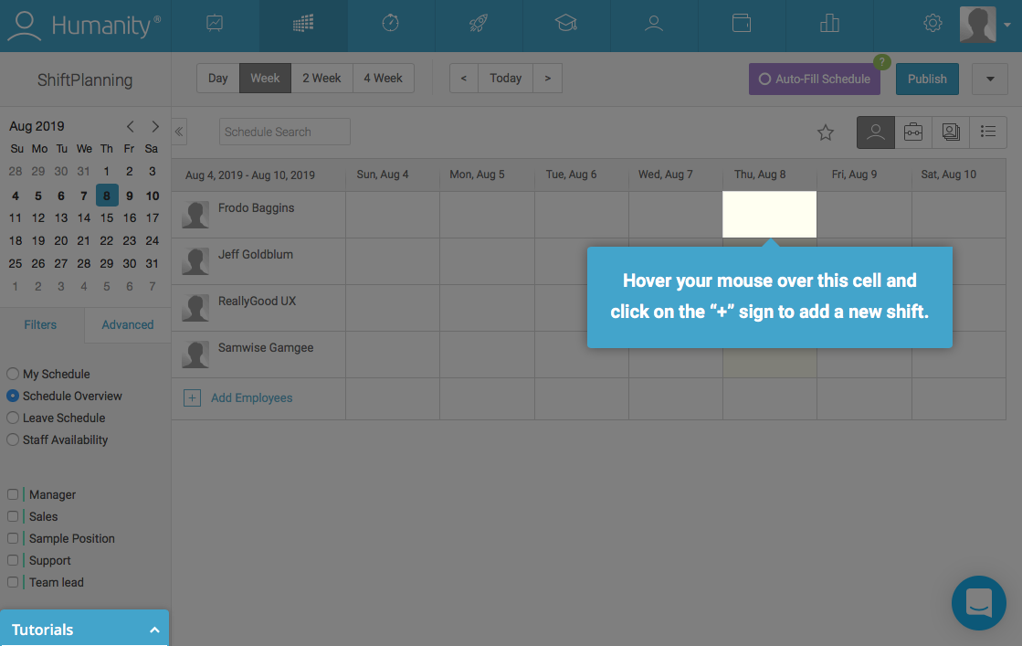
Take a look at how employee management platform Humanity focuses its new user onboarding on their product’s core functionality: scheduling. They use a prescriptive action-driven tooltip tour to sequentially guide users through the actions they need to take to achieve value—in this case, building an employee schedule.
humanity new user onboarding product tour walkthrough tooltip with spotlight
humanity new user onboarding product tour walkthrough tooltip and modal
humanity new user onboarding product tour walkthrough tooltip with spotlight
humanity new user onboarding product tour walkthrough tooltip and modal
humanity new user onboarding product tour walkthrough tooltip gif
humanity new user onboarding product tour walkthrough tooltip
humanity new user onboarding product tour walkthrough confirmation modal

There are a lot of steps involved here (and as a rule, less is more when it comes to in-app messaging), but requiring user action helps the walkthrough feel thorough, rather than monotonous.  And Humanity has kept a beginner mindset in mind—spotlights, gifs, and clear supporting copy take the guesswork out of the process.

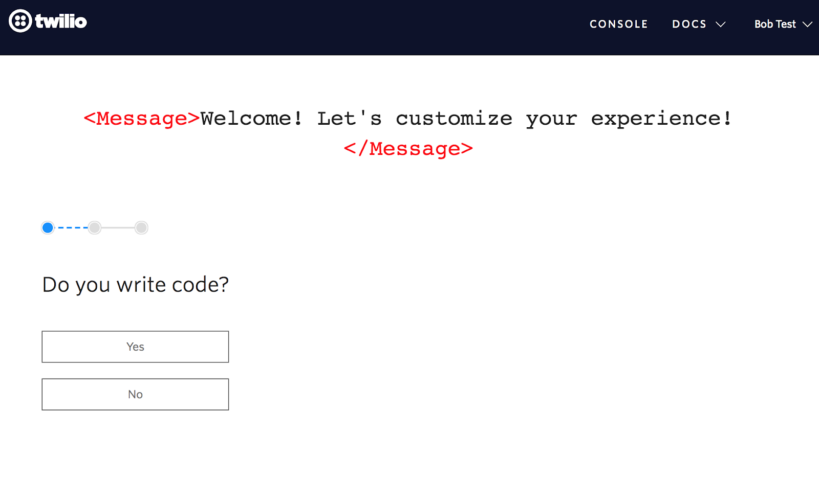
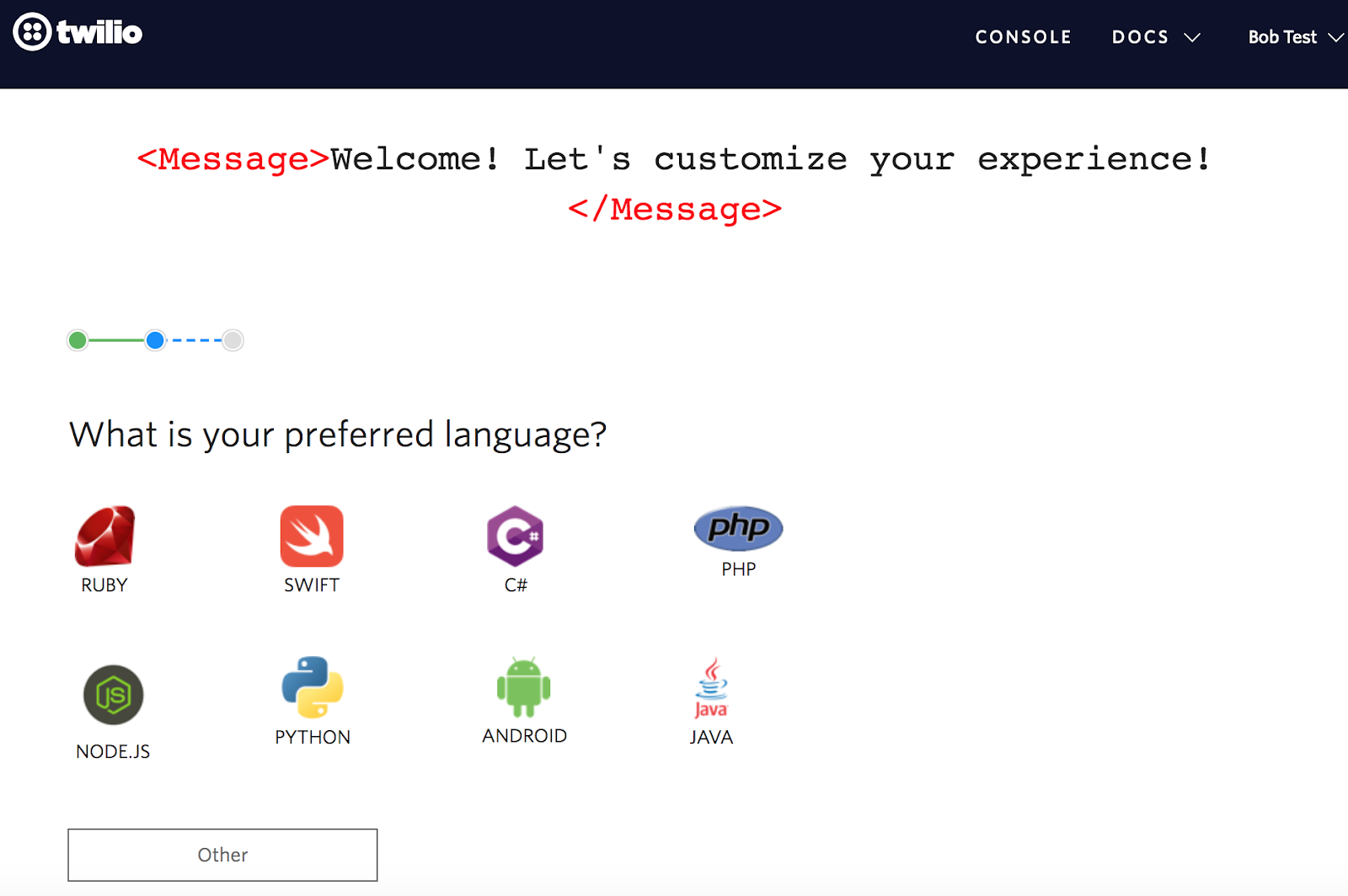
Another approach to onboarding is to offer users different onboarding experiences, according to selections they make during signup. Segmenting users according to experience level, job title, goals, etc. allows you to deliver more personalized (read: relevant) first-time experiences that will resonate with an individual user’s needs.

Twilio, for example, asks a series of personalizing questions during onboarding in order to shepherd new users to the features that they’ll find most useful for their immediate needs. And by giving new users a specific goal to work towards during their first session, Twilio increases users’ motivation to complete the onboarding sequence.
twilio new user onboarding personalization. segmenting users with declared data example
twilio new user onboarding personalization question 2
twilio new user onboarding personalization question 3 user goals
twilio new user onboarding personalization question user goals
twilio first dashboard customized based on user inputs

If people are coming to you for a variety of reasons, don’t make the mistake of offering a single onboarding experience for all. Fast-track product adoption by using declared data to tailor your onboarding to users’ specific needs. Remember: while your tool’s myriad capabilities may be a subject of pride, to new users with a specific goal in mind, irrelevant functionality is a distraction on the path to activation.

Read more: User onboarding best practices 

2. Treat new features like mini product launches

Products evolve over time. We learn which parts of our products drive engagement and which get overlooked. We update existing features and release brand-new functionality. Each one of these changes has the potential to impact product adoption, for better or worse.

To maximize product adoption, treat each new feature announcement like a mini product launch. Remember, even veteran users of your product are inexperienced when it comes to a new feature. Not only will these existing users benefit from new feature onboarding—but celebrating new features keeps regular users excited about your product and lets them know that it’s evolving to meet their needs.

Google took this approach back in 2016 when they added the Reminders feature to their Calendar app. Instead of assuming that users would know how and why to use the new feature, they used a small modal to briefly explain the value of Reminders, along with an opt-in feature walkthrough.
google calendar new feature 2016 reminders feature introduction tour popup

In-app walkthroughs like this—which are both contextual and timely—maximize the number of users who are made aware of a release and minimize the effort required to actually get started with a new feature. Importantly, Google included a “No thanks” opt-out option, making it easy for users to dismiss the message and carry on with their work.

Sometimes, a full feature tour isn’t necessary. For smaller feature releases, a single tooltip strikes the right balance of informative yet casual, easy-to-spot yet unobtrusive. For example, Google used a solitary tooltip (plus a spotlight) with minimal copy to let existing Calendar users know about the time proposal functionality. 
google calendar feature announcement tooltip new time proposal icon

Read more: How Google improves their user experience with the HEART framework

3. Support the in-app experience with behavioral emails

Optimizing product adoption is the pursuit of a habitual user experience. You want people to use your product in a way that's consistent and automatic. For a social media management tool, you want your users to log in every time they share a post to LinkedIn, for example. 

But like any habit, product adoption needs to be reinforced through repetition

Emails can be an easy way to achieve that repetition and leverage the mere-exposure effect. By sending emails that echo the advice offered in your in-app tutorials, you can increase the likelihood that a user will take action—whether that means trying out a new feature or finishing setup by connecting a social account. As with in-app communications, the key to successful behavioral emails is relevancy and timeliness.

Use behavioral triggers to engage users when they're at their most receptive and engaged. For instance, Yotpo created a series of emails designed to nudge users closer to their moment: 
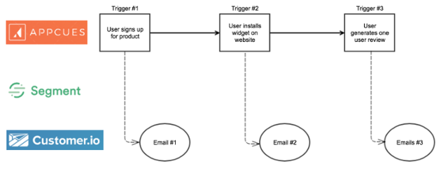
diagram showing how yotpo used behavioral triggers based on actions taken in an appcues flow to send emails

Each email was triggered in response to a relevant in-app action: When a user signed up for the product, they received an email explaining how to install the company's widget on their website. Then, when the widget was installed, the user receive tips on using the widget to generate customer reviews. 

For the customer, this creates a seamless flow through the product. They receive clear, timely guidance at every step of setup, and each successful action is immediately followed up by a logical next step. 

Read more: How Yotpo used Appcues to improve product adoption

4. Use targeting to boost feature adoption

It's likely that most of your app's value will come from a handful of key features—it's the 80/20 principle in action. Some features might be too advanced for the average user (how many Excel users can create macros?), while others—like integrations with third-party tools—might only appeal to a certain subset of customers.

But great product adoption means fixing these “weak spots” and finding ways to boost engagement with your entire product—no matter how complex or niche the feature. 

Segmentation provides the solution. When AdRoll released an integration with MailChimp, it knew it had a limited audience: MailChimp customers. Triggering a mass onboarding tutorial would alienate as many users as it would help, so the company used a data analysis tool to identify users with active subscriptions to both AdRoll and MailChimp. 
mailchimp adroll integration modal dialog announcement made with appcues

AdRoll then developed a pop-up modal promoting the integration. Users saw the modal when they logged into their dashboard—but only if they belonged to the segment of users with active subscriptions to both products.  

The modal explained the benefits of the integration in clear, concise terms (“retarget your email contacts in AdRoll”), and an in-modal CTA made it quick and easy for users to get started.

Instead of hoping that MailChimp users would stumble on the new release, understand the benefits, and know how to get started, it made the process as direct as possible. It worked: one of its most “niche” features netted a staggering 60% adoption rate. 

Read more: How AdRoll's growth team drives conversions

5. Find, fix, and repeat

Sometimes, product adoption is hindered by a specific, acute problem. Your latest feature might seem too complex to use. Your app’s navigation might be making other features hard to find. You might even be signing up poor-fit leads. With thousands of users, finding and fixing these problems isn't always straightforward. 

This is where product analytics and KPIs can come in handy:

  • Aggregated user data provides insight into macro-level problems, whether it's a drop in daily active users (DAUs) or a decline in customer retention rates.

  • User behavior shines a light on micro-level problems, showing which features are being underused.

While quantitative data can show you that a problem exists, it can’t always tell you why. To fix a problem's root cause, you need to dig into your qualitative data—live chats, user sessions, help tickets, and surveys. After a few conversations with customers, it's easier to form a hypothesis about your problem. For example:

  • A drop in DAUs is caused by a small subset of users having trouble logging in to you app, or

  • A cluttered navigation bar is making your latest feature release hard to find

Together, these data sources create a “flywheel of continuous improvement”: 
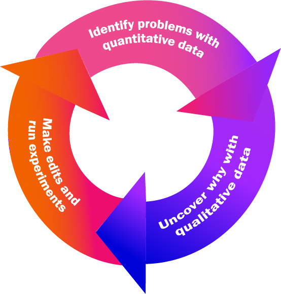
flywheel of continuous improvement for optimizing product adoption

Continually collecting data and feeding into this flywheel (not to be confused with Appcues’ Product-Led Growth Flywheel), you can create a systematic framework for improving product adoption metrics. 

Read more: Diagnosing your user engagement problem

Make product adoption a top priority

It's time to stop paying lip service to the importance of product adoption and to start really treating it as the foundation of a healthy, sustainably growing software company. After all, there can be no product-led growth without product adoption. 

But product adoption isn’t a one-time problem that can be solved like flipping a switch. It’s a metric that you’ll need to revisit and reinvigorate time and time again—which is why it should be a top priority for everyone in your company, from your C-Suite to your engineers to your marketers. 

And as a product manager, you should be leading the charge to evangelize the importance of product adoption throughout your organization. In the words of Scott Belsjky, CPO and Executive VP at Adobe:

Obsess over the first mile of the product dev experience–it’s woefully neglected.
Katryna Balboni
Content and Community Director at User Interviews
Katryna is the Content and Community Director at User Interviews. Before User Interviews, she made magic happen with all things content at Appcues. Her non-work time is spent traveling to new places, befriending street cats, and baking elaborate pies.
You might also like...