An essential guide to designing products for global users

.png)

.png)
One of the most exciting things about working in SaaS is the promise of rapid, limitless growth. As product people in technology today, we embrace this potential and tend to overlook things that might divide us, believing that technology has broken all barriers.
So when something that we’ve built starts to expand outside the confines of our own norms and viewpoints, we’re caught off guard. Our beliefs are tested. Our assumptions—the ones that we didn’t even know we had—are brought to light.
This often happens, in a big way, when products start gaining traction with global users.
To create a product that succeeds across borders, cultures, and markets, we need to get back to the basics of product management and evaluate what we’ve built against a new user paradigm. And while we don’t have to throw out everything we’ve created, there are certain areas that require revisiting with extra scrutiny (and some that you don’t have to worry about).
Without a clearly defined problem, a product will struggle in its local market, much less on a global scale. Carolina Franco, a digital marketer at IBM with extensive experience managing products across Latin America, says that defining the problem is the first step in designing a global product:
"While it seems basic, it’s one of the main problems we do over and over as product developers, product managers or product marketers. We don’t define the problem well."
Many teams tend to view a problem based on the user behaviors they know, which can inadvertently include a local perspective. As your user base broadens, the problem you set out to solve can take on new flavors and lose relevancy for a larger, more diverse user base.
To hone in on the right problem, you’ll have to take a step back, widen your scope of potential problems, and prioritize with global users in mind.

Don’t just focus on size and frequency of problems. Also weigh in problems’ potential to scale your business.
Categorizing problems by the size and frequency is a good tactic for prioritization, but achieving global growth is not as simple as tackling the biggest, most frequent problem. Carolina explains that you have to think about helping your business, not just your product, scale:
“We always tend to think in terms of the product for scaling up but, it’s not just the product. It’s the business model and the monetization behind the problem we’re choosing to solve."
Sharply defining your problem and ensuring that it will help your business scale is the first challenge to designing a global product.
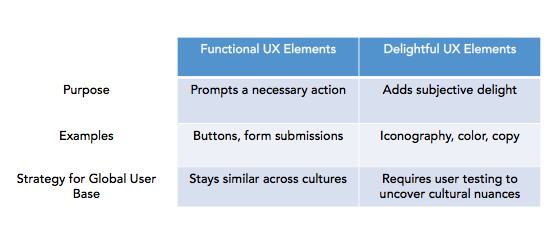
Revamping your entire product for global users may seem daunting, but Jessica Lee, product manager at Jana, says that basic functionality tends to stay the same:
“Human perception and cognition is generally similar across cultures when it comes to usability. If a button has no indicator that it can be clicked, it does not matter what kind of background the user has, the user will not know that it can be clicked.”
A button is a button. But things start to get tricky when you consider iconography, color, numbers, and all those little things meant to delight users.

For elements that fall outside of functionality, Jessica stresses the importance of user tests:
“Outside of pure functionality, parts of the app that are subjective and add delight to the user experience, like colors, copy, and illustrations, can benefit a lot from user testing with users from targeted demographics.
A handful of users is generally sufficient to give you an idea if anything is really wrong or if something particularly resonates.”
Without testing elements of delight, you could risk discovering new things about global users further down the road.
One of our Appcues engineers previously worked on a project in which his team assigned randomized profile icons, consisting of an animal icon and a color, to a global user base. Soon enough, they started receiving support tickets and learned that pigs didn’t really jive with users in certain regions (and that overweight clients didn’t take too kindly to being assigned elephants)!
Translating seems like an obvious first step in adapting content for global users, but it’s often really hard, if not impossible, to understand all the nuances inherent in language.
Think of all the colloquialisms you use on a daily basis. He’s been feeling blue. I call shotgun. We’ve just been shooting the breeze. Would any of them readily make sense when translated into another language?
Before attempting to translate, scrub for idioms and simplify your language. Help Scout provides a helpful example:
Instead of plugging heavily idiomatic language into your translation tool (“Yikes! Sorry to hear you're running into trouble — let me see what I can do to help!”), choose short, clear sentences (“I’m sorry. I am happy to help fix this problem.”). Otherwise, you run the risk of the translation turning into gibberish ("That's it! Sorry, that the problem goes — let's see what you can do to help!").
Sometimes, simplification still won’t resurface the intricacies of slang, which is why talking to users is so important. “Most companies can easily do translations and some localization, but the only way to know for sure what users think of it is have them talk through how they perceive the product,” says Jessica.
By talking to and learning from Jana’s users, Jessica found out that the term “referrals” in Indonesia meant something along the lines of “when someone gets divorced but wants to get back together again.” This kind of insight could have been difficult for even a non-native speaker to spot (and could have potentially prevented certain users from taking a meaningful action).
Perhaps the most important part of designing for global users comes down to user onboarding. Carolina describes how crucial onboarding is to retaining users:
"Onboarding is the new conversion language. Onboarding is not just about helping the user find an easy 2-second sign-up with Facebook. It’s about helping them go from the sign up to 'what the hell is this product?' to 'wow, this is quite a product.'"
A good user onboarding experience builds retention directly into your business, ensuring that customers understand how the product works and why it’s worth learning.
There are several approaches you could take to create an effective onboarding experience. Product tours using tooltips and welcome modals are two popular ways of introducing new users to your product. Just make sure you adjust your content for users in different regions and target accordingly, like Casengo has done with their welcome messages.


Built with Appcues
To fine tune your onboarding for a global user base, cohort analysis is crucial. Analytics software like Amplitude can help you segment your onboarding steps by different user properties, such as geography and language, and see where users are churning.
When your product is taking off in a new market, excitement is high, but it’s important to set realistic expectations and metrics.
Matt Hurley, co-founder of Dat Ventures, has worked with many startups that want to apply the same customer retention benchmark they’ve identified in their home country to other regions. As Matt explains, home-grown metrics often don’t properly account for ramping up time:
"I think it's pretty common for any startup to see retention fall a bit when they expand into any new geography. It is a brand new audience, after all."
Most products gain global attention because they’ve achieved a certain level of success in their home countries. Applying the same metrics to a brand new market can set unrealistic standards and may hinder your ability to be bold in experimentation. As Matt says,
“The key is to approach every expansion as an experiment and make sure you conduct excessive user testing, surveys, and focus groups so that you can quickly iterate and release a new version.”
Designing a global product is a no easy task. Many multinational brands often still make blunders when it comes to designing and marketing products for global users.
Global product design involves greater complexity, but that’s not always a bad thing. Carolina describes the excitement in building constantly evolving products:
“Within complexity, there’s a lot of fun. A product is a thing that is alive. You’re always making it, tweaking it, redesigning it when you encounter new habits or problems. What is fun is catching those changes really fast with a team that’s willing to bring them into reality.”
In the fast-moving SaaS space, designing products for global users has become more of a necessity than a choice. Great rewards can come with the challenge though, especially for teams who enjoy experimentation and discovery.