← Visit Appcues.com
×
×

How Google measures and improves UX with the HEART framework

Google's beloved HEART framework continues to offer fresh UX insights for product-led teams.
Skip to section:

Skip to section:

Almost a decade after it was first published, Google’s HEART framework continues to offer valuable insights for measuring and improving the user experience. 

The HEART acronym stands for 5 different UX metrics: happiness, engagement, adoption, retention, and task success. Together, these metrics create a unique connection between UX and revenue-driving metrics, helping to ground designers, researchers, and product teams in quantifiable results. 

What is Google’s HEART framework and how does it help UX?

The Google HEART framework is a method for measuring UX, developed based on Google’s user experience research.

Google first devised the framework after internal teams realized that UX wasn’t being effectively measured. At the time, there were plenty of efficient ways to measure user experience on a micro-level—like time-on-task and task completion rate—but UX designers weren’t being held to the macro business metrics that their work directly influences.

The HEART framework filled this gap in 2010. And even today, with dozens of tools and best practices to measure UX efforts, the HEART framework still provides an easy-to-understand process to help UX teams identify concrete goals and gauge success. 

How is HEART measured?

The HEART framework is flexible: It can be applied to a handful of features in your app or to your whole product design process. And it’s important to note that not all projects will require all 5 metrics—the metrics you choose to track will depend on your end goal. For example, if you want to improve product stickiness, you might focus on engagement and task success.

The 5 elements of the HEART framework are as follows: 

Happiness

A measure of users' attitudes or satisfaction. Happiness is most often measured by user surveys and NPS responses.

Engagement

The level of use an average customer is getting from your product. Engagement is most often measured by looking at in-product analytics—including time spent in-app, number of sessions, or number of shares.

Adoption

The percent of users that adopt your product after signing up and/or the percent of users that adopt a specific feature. Adoption is also measured by in-product analytics, but this time, looking at upgrades, new subscriptions, and new purchases.

Retention

The rate of total users that are returning to your product. Retention is most often measured by looking at churn.

Task Success

The ability of users to complete a task. Task success can be measured by looking at error rates and in-app task completion.
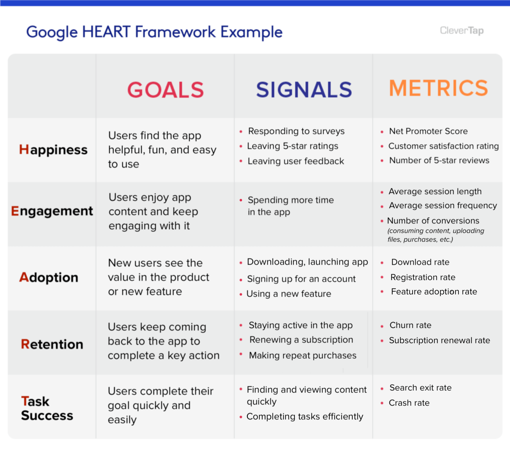
google heart framework example chart with goals, signals, and metrics for measuring UX
Image source

What makes the HEART framework so effective is that it encompasses both micro and macro measurements to help determine the impact of a product’s user experience. Retention has the most direct relationship with current and future revenue, while the other UX metrics have influence over value.

Learn more about how to connect product decisions to revenue with this article from our CPO and co-founder, Jonathan Kim.

How Google uses HEART to improve user happiness

Happiness is a calculation of emotion, which makes it difficult to optimize. But, it can be easy to measure that emotion through NPS and user surveys. By tracking happiness over time, you can better understand if the direction of your product is meeting your users’ needs.

Here’s one way Google captures happiness data from its users:
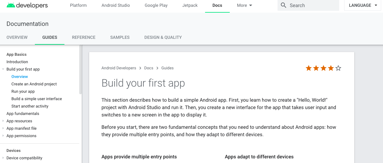
google developer site star rating to improve happiness as part of google heart framework

Google’s developer site is full of guides, resources, and tutorials on how to build apps on their platform. These are important, high-stakes pieces of content—a few mistakes can ruin a developer’s experience. 

To catch any early indications of negative sentiment, Google embeds a star rating directly in their documentation so developers can provide real-time feedback.  This on-page rating most likely captures more accurate and thoughtful feedback than if Google had sent the same star rating mechanism via email. 

How Google improves user engagement 

Google defined user engagement in their original user experience research report as, “the user’s level of involvement with a product.” Another way to think about engagement is as a measure of habit or habitual usage, which comes after a user adopts a product.

Creating and increasing habitual use of a product is hard to do in a distracted world. Google, however, is a master of habit creation (think of how many Google products we all use on a regular basis). 

Here are a couple strategies Google uses to increase user engagement.

Cross-platform promotion

Google often encourages desktop users to download the mobile version of their products. It’s fair to assume this behavior increases engagement since users have Google products on multiple devices. 

After signing up for Google Photos on desktop, for example, users receive a welcome email prompting them to download the mobile app. Rather than use the standard messaging of “Find us on Google Play and the App Store,” Google focuses on the user benefit: backing up all the photos on their phone. This messaging directly relates the action (downloading the app) to value (saving smartphone photos).

google photos cross platform promotion prompt to download google mobile apps

Cross-product promotion

Another way Google increases user engagement is by tightening the integration between their products. 

Gmail is one of Google’s most popular products and is arguably the hub of their business tool suite. Here’s an example of how Google pushes their existing user base of engaged Gmail users to download their other apps: 
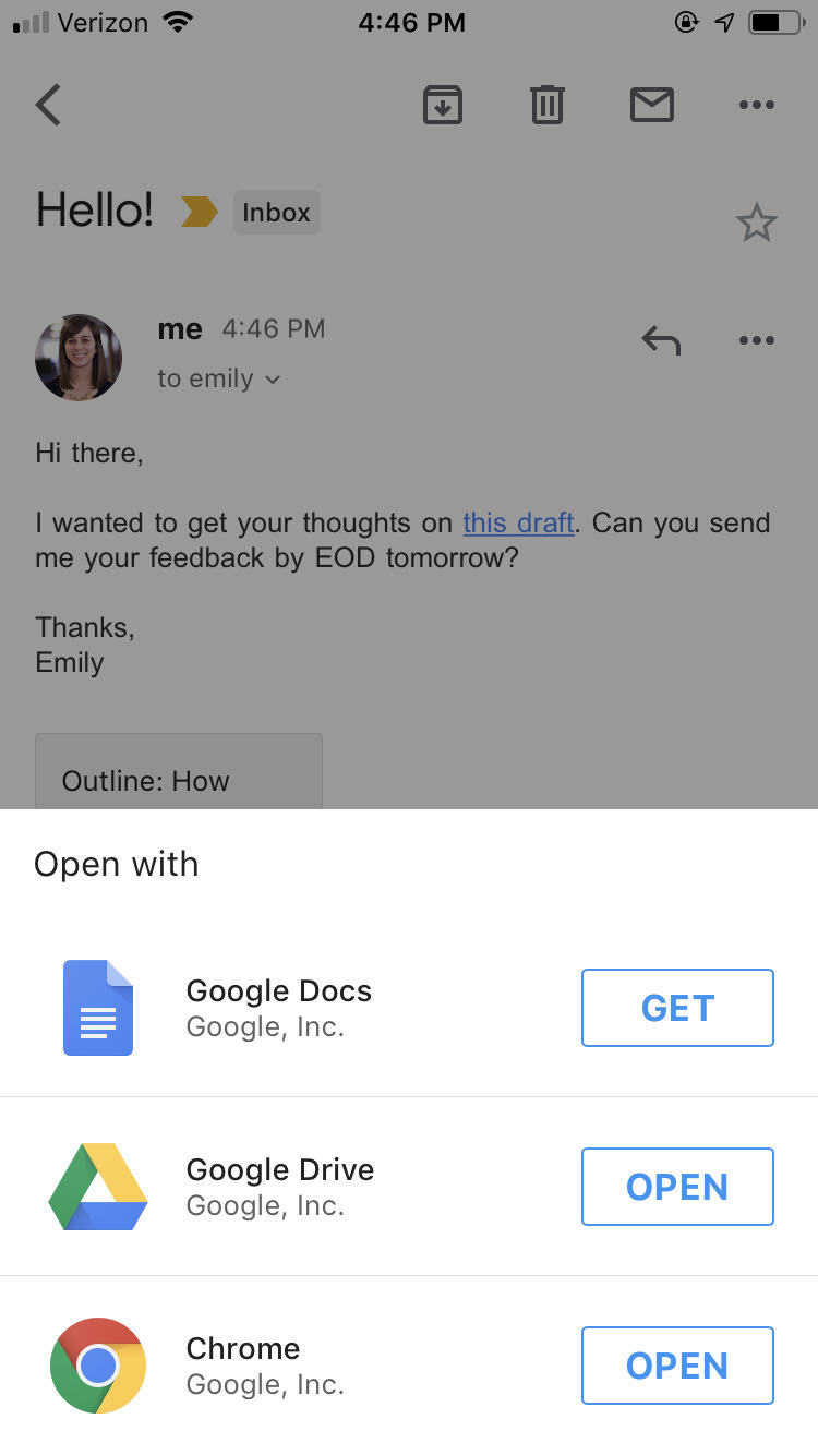
google cross-product promotion example of heart framework to improve product adoption

This slideout shows Gmail users how easy it is to open a Google Docs link in 3 different apps. Google could have easily opened the link automatically with an already-downloaded, compatible app. Instead, they use this real estate to show users which apps they already have—and which ones they could download for an optimal experience. 

How Google improves user adoption

Product adoption can apply to a single feature or feature set, or to new users adopting a product as a whole. Although those instances may seem different, there’s a lot in common with the way users are introduced to a new feature and the way they are onboarded to a new product.

User onboarding

Google applies a variety of techniques—ranging from tooltips to an email onboarding series—to increase adoption in their products. Here’s how one of their products, Google Forms, onboards new users with a guided tour: 
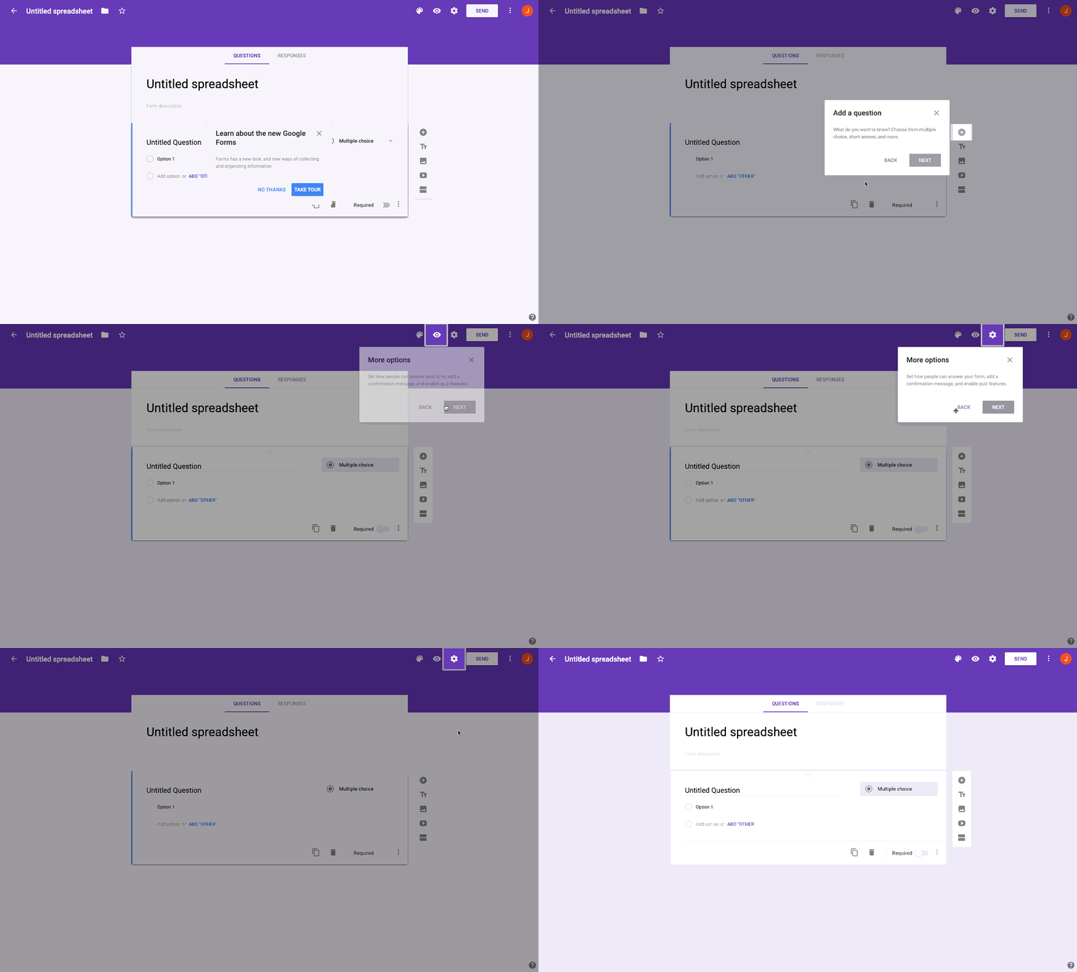
google forms user onboarding walkthrough tooltip tour example

This walkthrough introduces users to the UI and shows them what actions to take and where to click  when building a form for the first time. The Google Forms experience is fairly simple and it’s safe to say that most users would figure out the steps after a few minutes of tinkering.

But, remember: This tour isn’t just about onboarding new users. It’s also about adoption, so Google is sure to point out the more subtle Google Forms features, like customizing a theme or enabling quiz features.

New feature releases and product redesigns

Google follows a similar approach to improve feature adoption. They use everything from modals to slideouts to tooltips to announce new features to existing users. 

When feature releases are especially drastic, Google even uses full-screen takeovers like they did with the updated Google Earth experience: 

google earth redesign new feature announcement fullscreen modal
google earth redesign new feature announcement fullscreen modal with map
google earth redesign new feature announcement fullscreen modal terrain map

When users launch the updated Google Earth experience for the first time, they can either skip the walk-through or click through 5 screens with videos that describe the new changes. 

The full-screen approach is rare for Google—they typically use modals and tooltips to subtly draw users’ attention to the new feature. However, in this case, major Google Earth features had been added and updated, so Google wanted to both alert and educate users. 

LEVEL UP YOUR USER EXPERIENCE

Onboard users like a pro, no coding required

  • Build in-app walkthroughs in minutes using a no-code builder
  • Easily add modals, tooltips, and slideouts to introduce new features
Charts and graphs

How Google improves user retention

Retention is an important driver of revenue for any business, so it’s no wonder that Google invests heavily in retention efforts. When they acquired Nest in 2014, Google also acquired its users—and the need to retain them month over month.

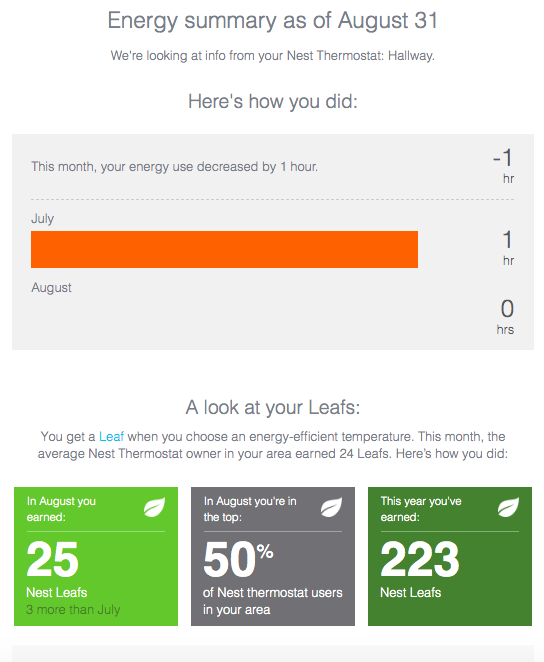
One way they do this is by sending Nest Thermostat users a monthly data summary of their energy usage:  

nest home energy stats retention engagement email

At the most basic level, this email updates users on how much energy their smart thermostat used in the last month. At a deeper level, this email reminds users of the product’s value. It’s validating and rewarding to see that usage number decrease month over month. 

Nest also shows users how they compare in energy efficiency to other users in their area, which adds an element of competition to the update and motivates users to earn even more “leaves” (an indication of energy-efficient temperature) next month.

How Google improves task success 

There are several things a user experience designer can do to increase task success— such as enabling or surfacing common flows so users can execute faster on a given task. Although efforts to increase task success can be difficult to spot, Google does incorporate subtle UI patterns to guide users to useful features and functionalities that improve efficiency.

Take this example from Google Docs: 

google docs tooltip pointing out grammar suggestions to improve feature awareness as part of google's heart framework

Google was probably aware that its customers were using third-party grammar assistants to edit their work in Google Docs. Knowing that this experience could be streamlined, they introduced built-in grammar suggestions that appear as users type. 

Google used a tooltip to do 2 things: alert users of this feature and show them where the functionality lives (under the “Tools” menu), so they can edit the settings whenever they want.

Creating a product-led UX with HEART

Google takes advantage of many means of communication to engage their users. They combine email, feedback forms, tooltips, and modals to increase the HEART of their products and drive even more revenue into one of the most valuable companies in the world.

The underlying success of the HEART framework comes from its ability to help businesses focus on creating a product-led user experience. A product-led approach shifts the balance in favor of the user by focusing company efforts on improving the product experience, instead of over-relying on sales, marketing, and support to scale. 

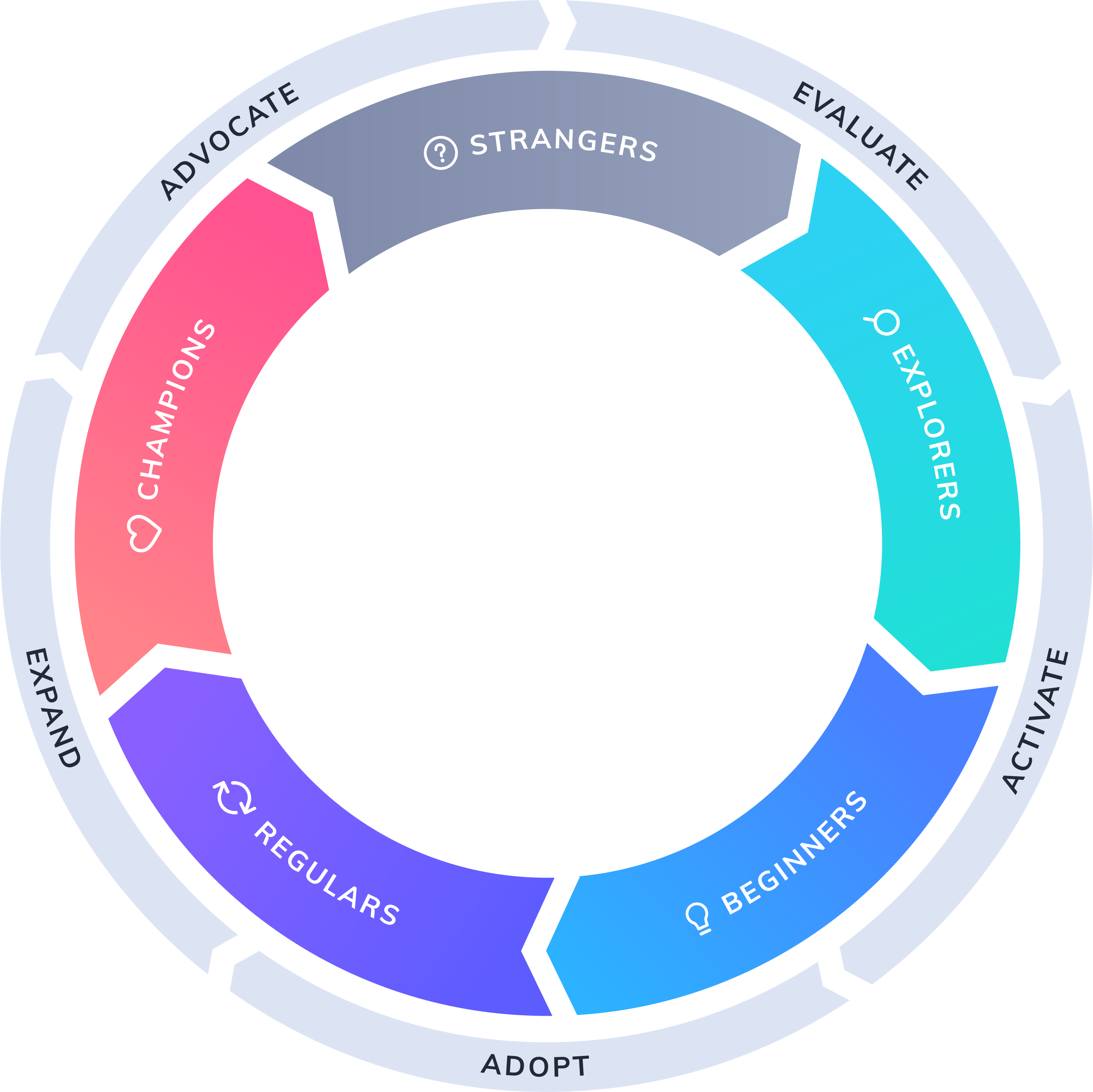
product-led growth flywheel

It takes time, energy, and commitment to embrace this new mindset That’s part of the reason we created the Product-Led Growth Flywheel—a framework for growing your business by investing in the user experience. The Flywheel is wholly compatible with Google’s HEART framework—adopting the principles of one framework will help you achieve success with the other. 

Because the fact is, companies don’t become product-led overnight. But by following Google's HEART framework along with the Appcues Product-Led Growth Flywheel, you can be one important step closer to delivering the product experience your users (and your business) deserve. 

Author's picture
Katryna Balboni
Content and Community Director at User Interviews
Katryna is the Content and Community Director at User Interviews. Before User Interviews, she made magic happen with all things content at Appcues. Her non-work time is spent traveling to new places, befriending street cats, and baking elaborate pies.
Skip to section:

Skip to section:

Almost a decade after it was first published, Google’s HEART framework continues to offer valuable insights for measuring and improving the user experience. 

The HEART acronym stands for 5 different UX metrics: happiness, engagement, adoption, retention, and task success. Together, these metrics create a unique connection between UX and revenue-driving metrics, helping to ground designers, researchers, and product teams in quantifiable results. 

What is Google’s HEART framework and how does it help UX?

The Google HEART framework is a method for measuring UX, developed based on Google’s user experience research.

Google first devised the framework after internal teams realized that UX wasn’t being effectively measured. At the time, there were plenty of efficient ways to measure user experience on a micro-level—like time-on-task and task completion rate—but UX designers weren’t being held to the macro business metrics that their work directly influences.

The HEART framework filled this gap in 2010. And even today, with dozens of tools and best practices to measure UX efforts, the HEART framework still provides an easy-to-understand process to help UX teams identify concrete goals and gauge success. 

How is HEART measured?

The HEART framework is flexible: It can be applied to a handful of features in your app or to your whole product design process. And it’s important to note that not all projects will require all 5 metrics—the metrics you choose to track will depend on your end goal. For example, if you want to improve product stickiness, you might focus on engagement and task success.

The 5 elements of the HEART framework are as follows: 

Happiness

A measure of users' attitudes or satisfaction. Happiness is most often measured by user surveys and NPS responses.

Engagement

The level of use an average customer is getting from your product. Engagement is most often measured by looking at in-product analytics—including time spent in-app, number of sessions, or number of shares.

Adoption

The percent of users that adopt your product after signing up and/or the percent of users that adopt a specific feature. Adoption is also measured by in-product analytics, but this time, looking at upgrades, new subscriptions, and new purchases.

Retention

The rate of total users that are returning to your product. Retention is most often measured by looking at churn.

Task Success

The ability of users to complete a task. Task success can be measured by looking at error rates and in-app task completion.

google heart framework example chart with goals, signals, and metrics for measuring UX
Image source

What makes the HEART framework so effective is that it encompasses both micro and macro measurements to help determine the impact of a product’s user experience. Retention has the most direct relationship with current and future revenue, while the other UX metrics have influence over value.

Learn more about how to connect product decisions to revenue with this article from our CPO and co-founder, Jonathan Kim.

How Google uses HEART to improve user happiness

Happiness is a calculation of emotion, which makes it difficult to optimize. But, it can be easy to measure that emotion through NPS and user surveys. By tracking happiness over time, you can better understand if the direction of your product is meeting your users’ needs.

Here’s one way Google captures happiness data from its users:

google developer site star rating to improve happiness as part of google heart framework

Google’s developer site is full of guides, resources, and tutorials on how to build apps on their platform. These are important, high-stakes pieces of content—a few mistakes can ruin a developer’s experience. 

To catch any early indications of negative sentiment, Google embeds a star rating directly in their documentation so developers can provide real-time feedback.  This on-page rating most likely captures more accurate and thoughtful feedback than if Google had sent the same star rating mechanism via email. 

How Google improves user engagement 

Google defined user engagement in their original user experience research report as, “the user’s level of involvement with a product.” Another way to think about engagement is as a measure of habit or habitual usage, which comes after a user adopts a product.

Creating and increasing habitual use of a product is hard to do in a distracted world. Google, however, is a master of habit creation (think of how many Google products we all use on a regular basis). 

Here are a couple strategies Google uses to increase user engagement.

Cross-platform promotion

Google often encourages desktop users to download the mobile version of their products. It’s fair to assume this behavior increases engagement since users have Google products on multiple devices. 

After signing up for Google Photos on desktop, for example, users receive a welcome email prompting them to download the mobile app. Rather than use the standard messaging of “Find us on Google Play and the App Store,” Google focuses on the user benefit: backing up all the photos on their phone. This messaging directly relates the action (downloading the app) to value (saving smartphone photos).

google photos cross platform promotion prompt to download google mobile apps

Cross-product promotion

Another way Google increases user engagement is by tightening the integration between their products. 

Gmail is one of Google’s most popular products and is arguably the hub of their business tool suite. Here’s an example of how Google pushes their existing user base of engaged Gmail users to download their other apps: 

google cross-product promotion example of heart framework to improve product adoption

This slideout shows Gmail users how easy it is to open a Google Docs link in 3 different apps. Google could have easily opened the link automatically with an already-downloaded, compatible app. Instead, they use this real estate to show users which apps they already have—and which ones they could download for an optimal experience. 

How Google improves user adoption

Product adoption can apply to a single feature or feature set, or to new users adopting a product as a whole. Although those instances may seem different, there’s a lot in common with the way users are introduced to a new feature and the way they are onboarded to a new product.

User onboarding

Google applies a variety of techniques—ranging from tooltips to an email onboarding series—to increase adoption in their products. Here’s how one of their products, Google Forms, onboards new users with a guided tour: 

google forms user onboarding walkthrough tooltip tour example

This walkthrough introduces users to the UI and shows them what actions to take and where to click  when building a form for the first time. The Google Forms experience is fairly simple and it’s safe to say that most users would figure out the steps after a few minutes of tinkering.

But, remember: This tour isn’t just about onboarding new users. It’s also about adoption, so Google is sure to point out the more subtle Google Forms features, like customizing a theme or enabling quiz features.

New feature releases and product redesigns

Google follows a similar approach to improve feature adoption. They use everything from modals to slideouts to tooltips to announce new features to existing users. 

When feature releases are especially drastic, Google even uses full-screen takeovers like they did with the updated Google Earth experience: 

google earth redesign new feature announcement fullscreen modal
google earth redesign new feature announcement fullscreen modal with map
google earth redesign new feature announcement fullscreen modal terrain map

When users launch the updated Google Earth experience for the first time, they can either skip the walk-through or click through 5 screens with videos that describe the new changes. 

The full-screen approach is rare for Google—they typically use modals and tooltips to subtly draw users’ attention to the new feature. However, in this case, major Google Earth features had been added and updated, so Google wanted to both alert and educate users. 

LEVEL UP YOUR USER EXPERIENCE

Onboard users like a pro, no coding required

  • Build in-app walkthroughs in minutes using a no-code builder
  • Easily add modals, tooltips, and slideouts to introduce new features
Charts and graphs

How Google improves user retention

Retention is an important driver of revenue for any business, so it’s no wonder that Google invests heavily in retention efforts. When they acquired Nest in 2014, Google also acquired its users—and the need to retain them month over month.

One way they do this is by sending Nest Thermostat users a monthly data summary of their energy usage:  
nest home energy stats retention engagement email

At the most basic level, this email updates users on how much energy their smart thermostat used in the last month. At a deeper level, this email reminds users of the product’s value. It’s validating and rewarding to see that usage number decrease month over month. 

Nest also shows users how they compare in energy efficiency to other users in their area, which adds an element of competition to the update and motivates users to earn even more “leaves” (an indication of energy-efficient temperature) next month.

How Google improves task success 

There are several things a user experience designer can do to increase task success— such as enabling or surfacing common flows so users can execute faster on a given task. Although efforts to increase task success can be difficult to spot, Google does incorporate subtle UI patterns to guide users to useful features and functionalities that improve efficiency.

Take this example from Google Docs: 

google docs tooltip pointing out grammar suggestions to improve feature awareness as part of google's heart framework

Google was probably aware that its customers were using third-party grammar assistants to edit their work in Google Docs. Knowing that this experience could be streamlined, they introduced built-in grammar suggestions that appear as users type. 

Google used a tooltip to do 2 things: alert users of this feature and show them where the functionality lives (under the “Tools” menu), so they can edit the settings whenever they want.

Creating a product-led UX with HEART

Google takes advantage of many means of communication to engage their users. They combine email, feedback forms, tooltips, and modals to increase the HEART of their products and drive even more revenue into one of the most valuable companies in the world.

The underlying success of the HEART framework comes from its ability to help businesses focus on creating a product-led user experience. A product-led approach shifts the balance in favor of the user by focusing company efforts on improving the product experience, instead of over-relying on sales, marketing, and support to scale. 
product-led growth flywheel

It takes time, energy, and commitment to embrace this new mindset That’s part of the reason we created the Product-Led Growth Flywheel—a framework for growing your business by investing in the user experience. The Flywheel is wholly compatible with Google’s HEART framework—adopting the principles of one framework will help you achieve success with the other. 

Because the fact is, companies don’t become product-led overnight. But by following Google's HEART framework along with the Appcues Product-Led Growth Flywheel, you can be one important step closer to delivering the product experience your users (and your business) deserve. 

Author's picture
Katryna Balboni
Content and Community Director at User Interviews
Katryna is the Content and Community Director at User Interviews. Before User Interviews, she made magic happen with all things content at Appcues. Her non-work time is spent traveling to new places, befriending street cats, and baking elaborate pies.
You might also like...