← Visit Appcues.com
×
×

Designing points of user friction for delight

Every word and UI element in your product is an opportunity to make a good impression and deliver value to your users.
Skip to section:

Skip to section:

Every word and UI element in your product is an opportunity to make a good impression and deliver value to your users.

But some experiences—loading screens, 404 pages, form submission prompts, and email confirmations—seem to do the opposite. They just get in the way.

While these elements cause friction in the user experience, they're often necessary. Presenting them with an apologetic “bear with me” mindset only reinforces the sense of burden.

That’s where designing for delight can help. By turning traditional points of user friction into opportunities for delightful UX design, you can easily surprise and woo users with a little personality.

Teach users while they wait

We’ve seen some pretty delightful loading pages, but ProdPad goes a step further and uses the loading page as an opportunity to teach users something about the product. Upon login, users receive pro tips while waiting for the dashboard to load.
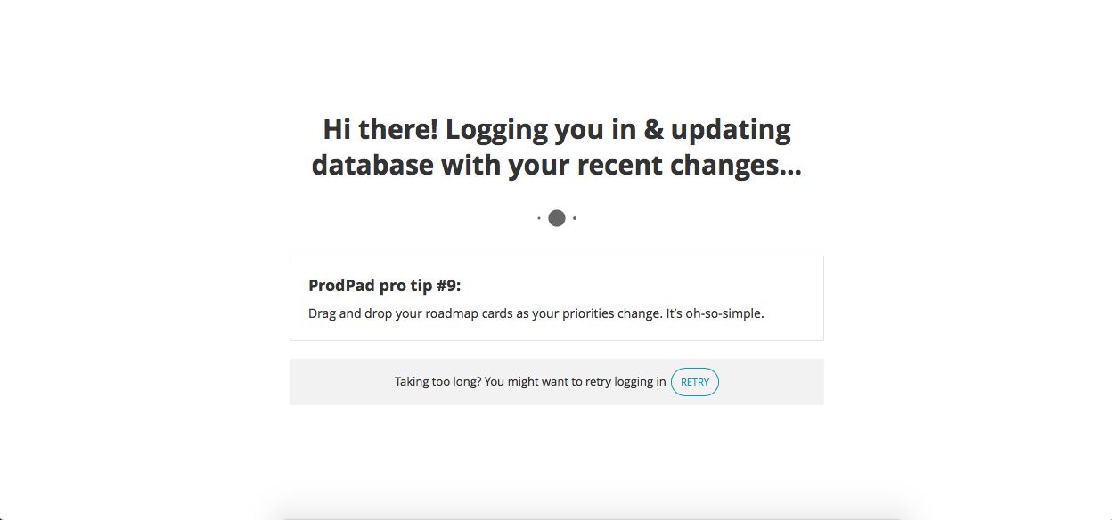
ProdPad's loading page gives a helpful product tip

ZenHub also gives users tips with a small modal window as the board loads. This shortcut reminds users of how to get to their board anytime. By placing this modal where users are already performing the instructed action, ZenHub reinforces the shortcut as a regular step in the user’s workflow. 
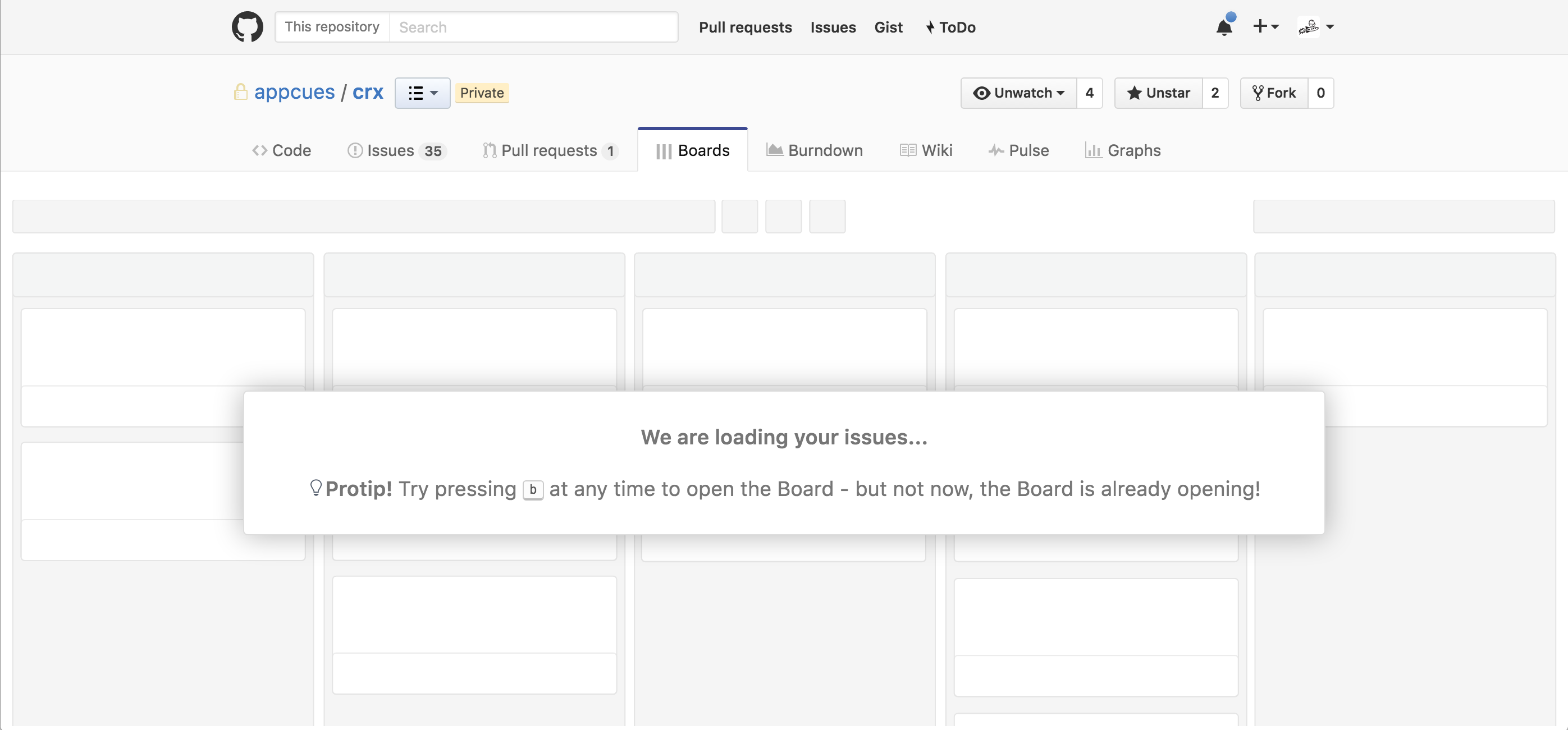
ZenHub's loading page

Design forms with focused error prompts

Sign-up and login forms are the gatekeepers to your product, and bad form design is one of the most surefire ways to prevent users from accessing your product.

What’s worse for users than having to fill out a form is doing it incorrectly and seeing a list of error messages in return.

MailChimp’s initial sign-up form is already short and sweet, and it uses the errors-only approach for form-field validation to take some of the pain out of choosing a username. The error copy below exemplifies MailChimp’s fun, informal, and weird voice

MailChimp error submission

Zapier indicates incorrect login information with a cute, and slightly sad, rocket coming back down from launch. The graphic provides nice visual relief to a mundane and annoying task. The rocket theme also ties back to Zapier’s core value around making users more productive. 

Zapier form submission error

Make the trip to the inbox worth it

If users can’t get through a login form, they’re usually prompted to reset their passwords by checking their emails. 

And while it’s no fault of your product’s, people hate forgetting their passwords, as the term “password rage” suggests.

To overcome this common source of friction, Designer News pokes fun at users for forgetting their passwords. The result is a clever and unique twist on an otherwise dreadful task. 
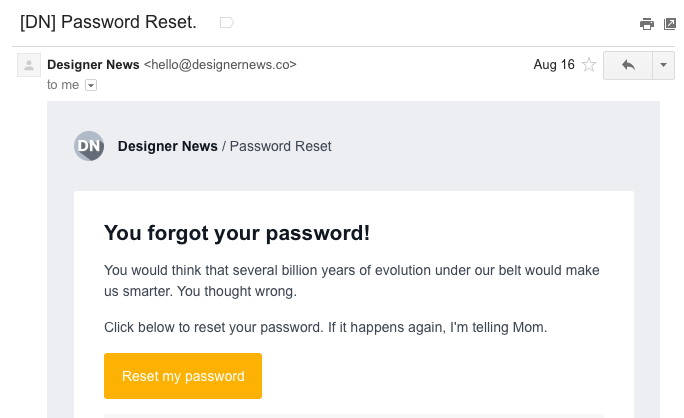
Designer News password reset email

While less frustrating than the password reset, email confirmations still force users out of the product and introduce them to a world of distractions in their inboxes.

By intentionally sending a plain-looking email, Really Good Emails does an excellent job of reinforcing their service, which is to showcase, you guessed it, really good emails.

really good emails email confirmation

Help users find their way back

Product tours with action-driven tooltips can be helpful for complex products, but there’s always the risk that users will get overwhelmed or lost along the way. To account for the length of their product tour, Google AdWords gives the option of going back a step when users seem to veer off course.

This tooltip has a dual purpose: getting users back on track with the product tour and showing users where the undo button is. 
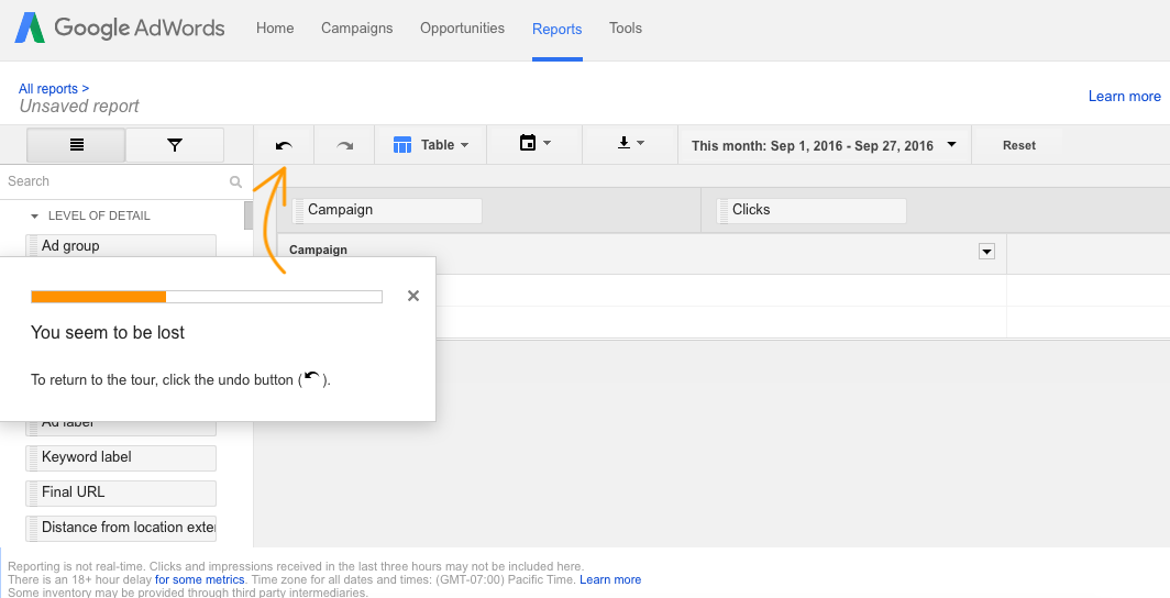
google adwords product tour tooltip

Set expectations for support

Maintenance issues stress out product teams and users alike. Clear communication is crucial so that users understand what is happening and what to expect.  

Wholesale In a Box uses a modal window to explain what they're doing to fix the issue and set clear expectations, down to exact times. The contact information and personal signoff reassure users that they're still fully supported even when the app is down. 
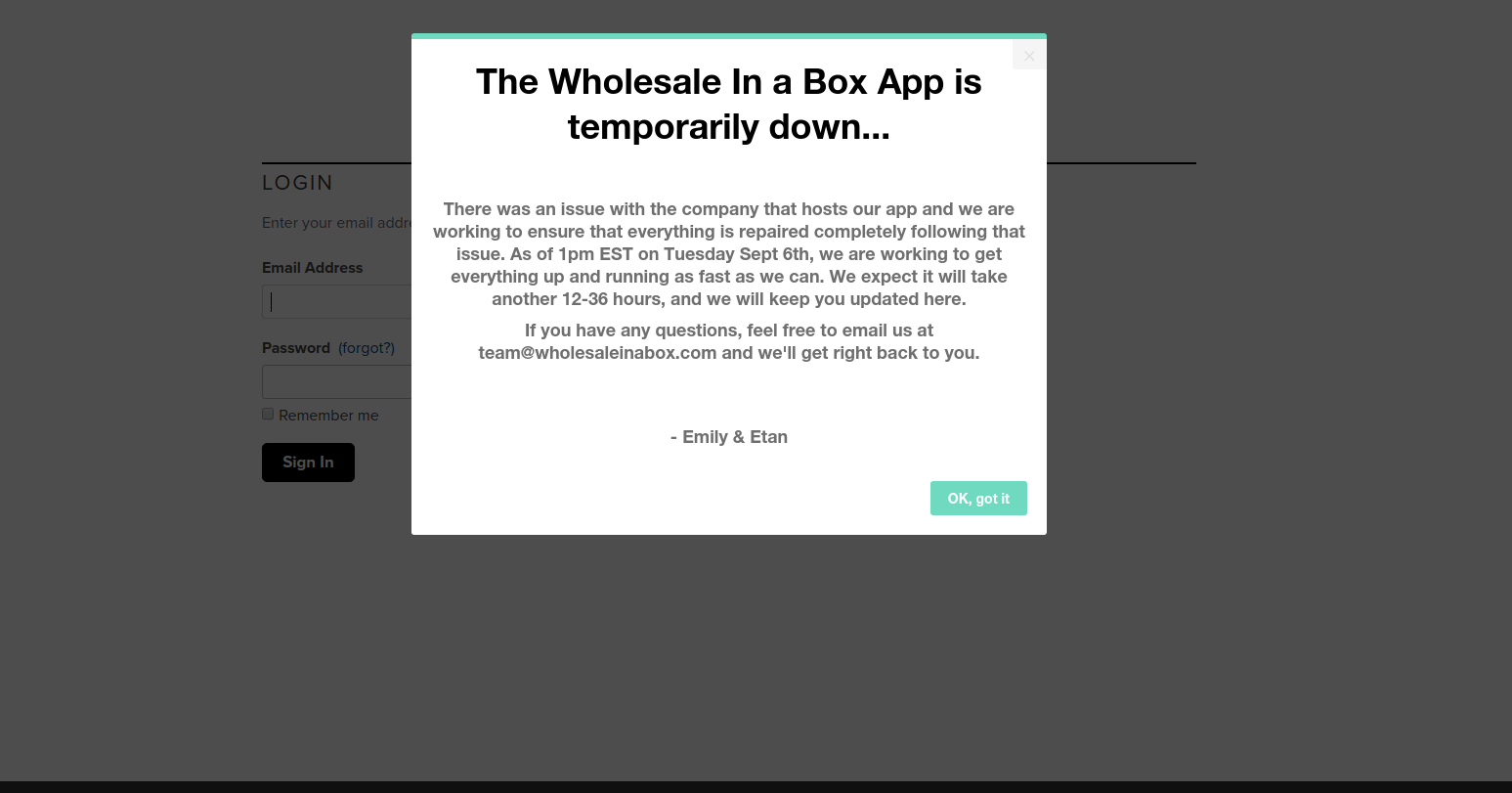
wholesale in a box maintanence modal window
AppcuesBuilt with 

Quick win for delighting users

Delight is often thought of as something extra, the icing on the cake of your product’s core functionality. 

But experiences like loading pages and error prompts are existing, and often inevitable, points of user friction. 

They may be small details in the grand scheme of building products, but they often come about when users are most frustrated and most likely to become disengaged. Making these experience more pleasant is a relatively easy win in creating a memorable user experience.

Users who are accustomed to dreading these frustrating product interactions will be all the more wowed.

Julia Chen
Skip to section:

Skip to section:

Every word and UI element in your product is an opportunity to make a good impression and deliver value to your users.

But some experiences—loading screens, 404 pages, form submission prompts, and email confirmations—seem to do the opposite. They just get in the way.

While these elements cause friction in the user experience, they're often necessary. Presenting them with an apologetic “bear with me” mindset only reinforces the sense of burden.

That’s where designing for delight can help. By turning traditional points of user friction into opportunities for delightful UX design, you can easily surprise and woo users with a little personality.

Teach users while they wait

We’ve seen some pretty delightful loading pages, but ProdPad goes a step further and uses the loading page as an opportunity to teach users something about the product. Upon login, users receive pro tips while waiting for the dashboard to load.

ProdPad's loading page gives a helpful product tip

ZenHub also gives users tips with a small modal window as the board loads. This shortcut reminds users of how to get to their board anytime. By placing this modal where users are already performing the instructed action, ZenHub reinforces the shortcut as a regular step in the user’s workflow. 

ZenHub's loading page

Design forms with focused error prompts

Sign-up and login forms are the gatekeepers to your product, and bad form design is one of the most surefire ways to prevent users from accessing your product.

What’s worse for users than having to fill out a form is doing it incorrectly and seeing a list of error messages in return.

MailChimp’s initial sign-up form is already short and sweet, and it uses the errors-only approach for form-field validation to take some of the pain out of choosing a username. The error copy below exemplifies MailChimp’s fun, informal, and weird voice

MailChimp error submission

Zapier indicates incorrect login information with a cute, and slightly sad, rocket coming back down from launch. The graphic provides nice visual relief to a mundane and annoying task. The rocket theme also ties back to Zapier’s core value around making users more productive. 

Zapier form submission error

Make the trip to the inbox worth it

If users can’t get through a login form, they’re usually prompted to reset their passwords by checking their emails. 

And while it’s no fault of your product’s, people hate forgetting their passwords, as the term “password rage” suggests.

To overcome this common source of friction, Designer News pokes fun at users for forgetting their passwords. The result is a clever and unique twist on an otherwise dreadful task. 

Designer News password reset email

While less frustrating than the password reset, email confirmations still force users out of the product and introduce them to a world of distractions in their inboxes.

By intentionally sending a plain-looking email, Really Good Emails does an excellent job of reinforcing their service, which is to showcase, you guessed it, really good emails.

really good emails email confirmation

Help users find their way back

Product tours with action-driven tooltips can be helpful for complex products, but there’s always the risk that users will get overwhelmed or lost along the way. To account for the length of their product tour, Google AdWords gives the option of going back a step when users seem to veer off course.

This tooltip has a dual purpose: getting users back on track with the product tour and showing users where the undo button is. 

google adwords product tour tooltip

Set expectations for support

Maintenance issues stress out product teams and users alike. Clear communication is crucial so that users understand what is happening and what to expect.  

Wholesale In a Box uses a modal window to explain what they're doing to fix the issue and set clear expectations, down to exact times. The contact information and personal signoff reassure users that they're still fully supported even when the app is down. 

wholesale in a box maintanence modal window
AppcuesBuilt with 

Quick win for delighting users

Delight is often thought of as something extra, the icing on the cake of your product’s core functionality. 

But experiences like loading pages and error prompts are existing, and often inevitable, points of user friction. 

They may be small details in the grand scheme of building products, but they often come about when users are most frustrated and most likely to become disengaged. Making these experience more pleasant is a relatively easy win in creating a memorable user experience.

Users who are accustomed to dreading these frustrating product interactions will be all the more wowed.

Julia Chen
You might also like...