We leveraged the design sprint to define our new frontier: Appcues for Mobile
.png)
.png)
A look into the process of designing Appcues's new mobile product.
As a customer-first company, we wanted to ensure that the development of our new mobile product was set up for success right from the start. And as a growing team, what better way to get everyone excited and working together than to engage Appcues employees (aka Appcuties) both in and outside of product? Enter: the design sprint.
You're probably already familiar with the basics of the design sprint, developed by Jake Knapp at Google Ventures. But as a quick refresher: It's a really effective process designed to allow teams to define, storyboard, and validate a working design hypothesis that's grounded in research—all within 5 days.
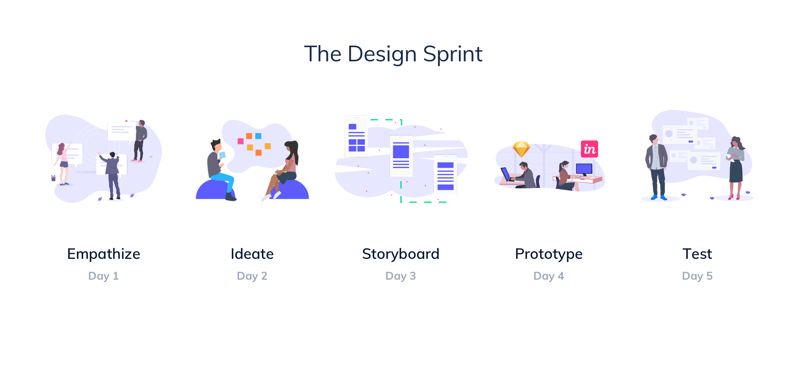
A design sprint is useful when your idea for a new product area is unvalidated, the cost of failure is high, there is significant complexity involving multiple departments, and there is limited prior knowledge about feasible solutions and the competitive space.
Full confession: We stretched our sprint over 7 days (you all know how long prototyping and testing can take!). Otherwise, we followed the schedule pretty well—and we'd love to share how it went!
What is Appcues? Appcues is an experience layer that rests over your own product to provide simple, measurable and targeted onboarding, feature adoption, and surveying to your users.
Currently, we are only available on web ... but that's about to change.
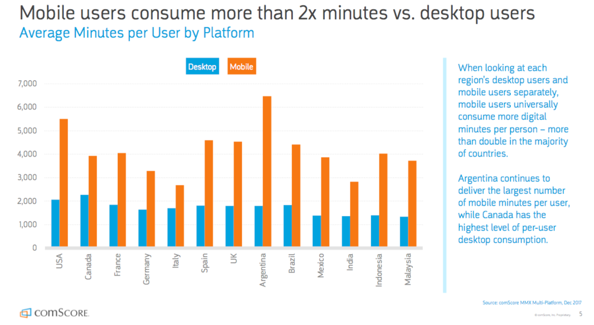
According to a report by comScore—which appeared alongside some other great mobile stats in a recent SmartsInsight article—of the total time spent on devices, users spend twice as much time on mobile as they do on desktop.
Never ones to be left behind, we knew we had a lot of opportunity to help customers on mobile too.
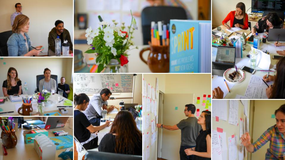
First off, here's the core sprint team who contributed throughout each session:
And of course, we had Appcuties from the support, product design, marketing, sales and engineering teams who contributed throughout the sprint as well.
The sprint process kicked off by defining a long-term goal. This step was the cornerstone for the rest of our sprint; it ensured that we were aligned as a group, and helped stay on track throughout the week.
The goal for our design sprint was to determine the following:
How can we make a product that helps our customers create more intuitive, engaging, and delightful mobile adoption experiences?
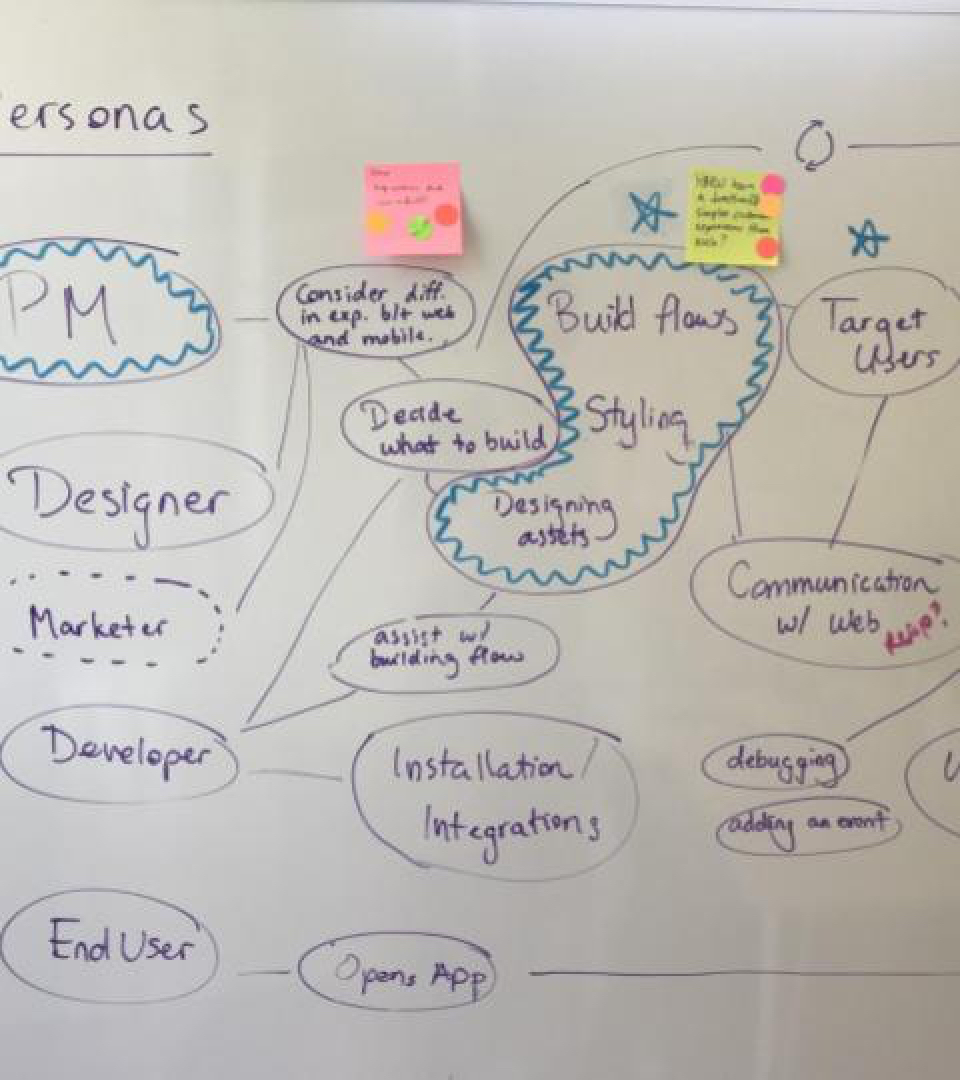
Goal in hand, we pressed onwards toward Journey Mapping, which is all about honing in on a particular target persona and a point in their journey through the product. Since we had exactly 0% of our mobile product built and didn't want to bite off too much to chew, narrowing our focus was key.
Our prior contextual research for mobile had uncovered the same personas as our web product: product managers (PMs), designers, marketers, developers, and end users. We selected the PM and the Build experience—how a user makes any kind of in-app messaging in our product—as our target point in their journey.
With lots of personas and points in their journey, we had to select a target persona and point.
Why did we select the PM as our target? For one, the product manager is someone who will frequently build, target, and analyze any flows made within Appcues. And as the bridge between the designers, developers, and key business stakeholders on their teams, they are the ones most heavily involved in the decision to buy Appcues in the first place.
And why the Build experience? Well, because this was a unique area with the most unknowns and design and tech challenges. We'll get into those later when we talk about the competitive landscape.
.jpeg)
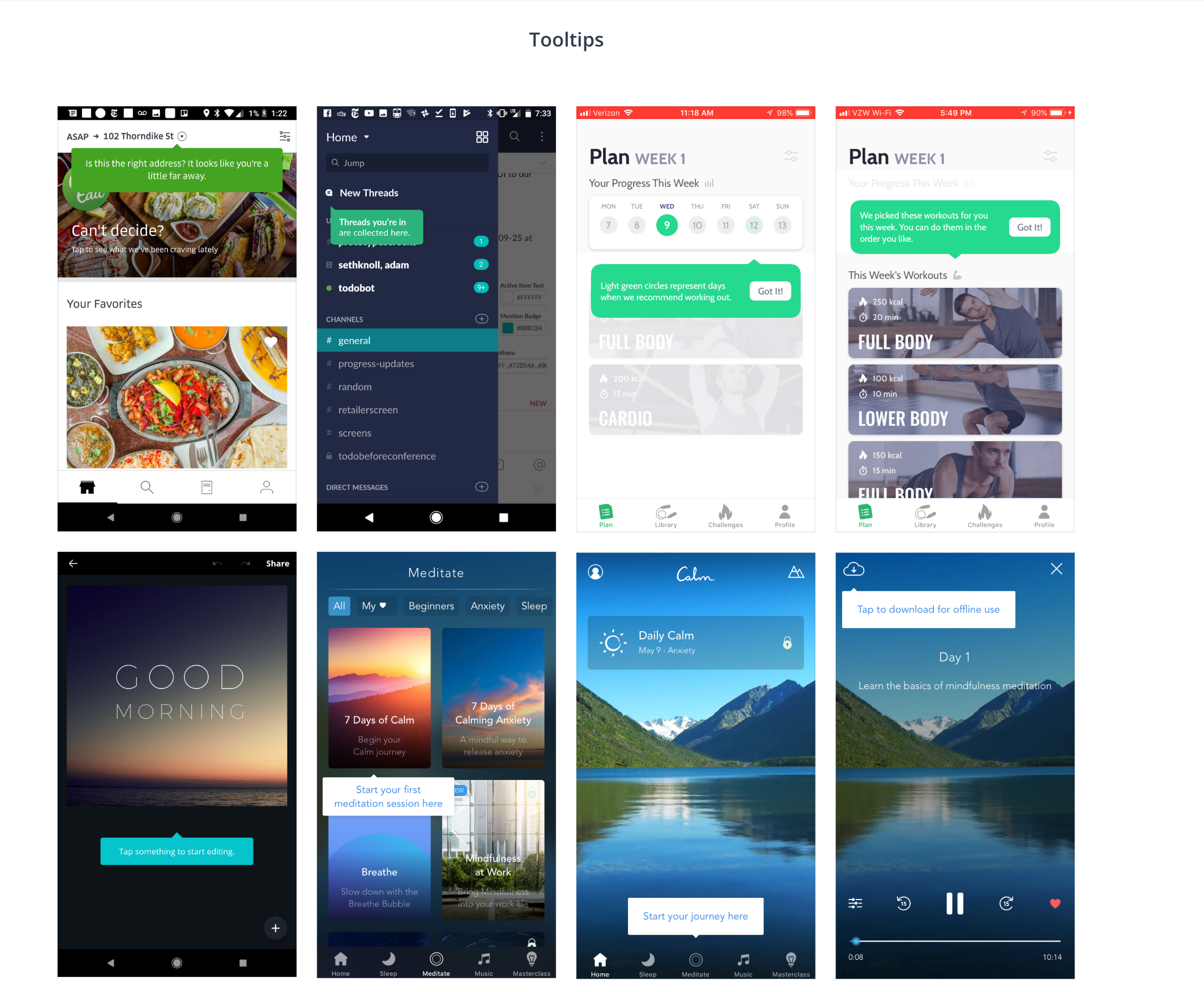
The second day of our design sprint was when we started becoming a bit more concrete. First we took a look at design inspiration and how competitors have solved similar problems, and then we got into sketching up ideas of our own.
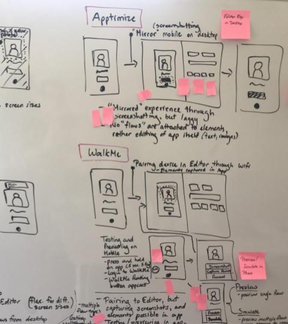
As always, doing prep work in advance of this exercise comes in handy. We had already compiled screenshots and written notes on how other companies like Elasticode, Walkme, Apptimize and Appetize, and Pendo were handling communication between mobile and desktop devices. This meant that we were able to easily sketch out the key points in their workflows and their technical solutions on a whiteboard for the group.
Questions abounded about how we would get our customers' app screens into the desktop editor—where we assumed, from prior contextual interviews with customers, that all of the building of their flows would take place—so that they could effectively target screens and elements for their modals, tooltips, and so on: Would we send screenshots only or use some kind of emulator? What about for previewing on the web? Or would users want an editor experience on the mobile device itself?
We also took a look at user-friendly editing platforms, like Typeform and Squarespace, to see how they had handled their editing workflows. Editors that offer a range of templates, text & color styles, and element behavior need to be intelligently organized but still fun to work with.
A quick plug for Invision Boards: We designers love tools that make our workflows easier, since we frequently have to record and communicate a ton of ideas that come to us in an effective and visual way. One of the tools that the Appcues team loves to use is Invision Boards. Similar to Pinterest, it allows you to compile images in a condensed card format for a one-stop shop of your favorite ideas. Since we use Invision for our prototyping as well, it just made sense for us to utilize Boards, where we could also use the commenting system to communicate internally.
We used one Board to compile images of competitor and inspirational screenshots, and another for all of the first-time onboarding experiences that we had collected. (We had to download a LOT of apps to get these screenshots. It's a good thing we had newer phone models with lots of storage! 😉)
All through Day 1 and up to this point in Day 2, the team had been jotting down their "How Might We" (HMW) statements—ideas about how we might improve some aspect of our product and our users' journey through it. Any time we heard or saw an interesting idea or formed a key question in our minds, we wrote it down on a sticky note. By the time we had gotten midway through the second day, we already had a fair number of HMWs.
We devoted some time to sitting quietly and generating as many ideas as we could, stuck them on the wall, and categorized them by themes, grouping any duplicates together. (By the way, duplicates are great indications of convergent thinking and should be paid special attention!) After categorizing and discussing as a group, we got to voting on our top HMWs:
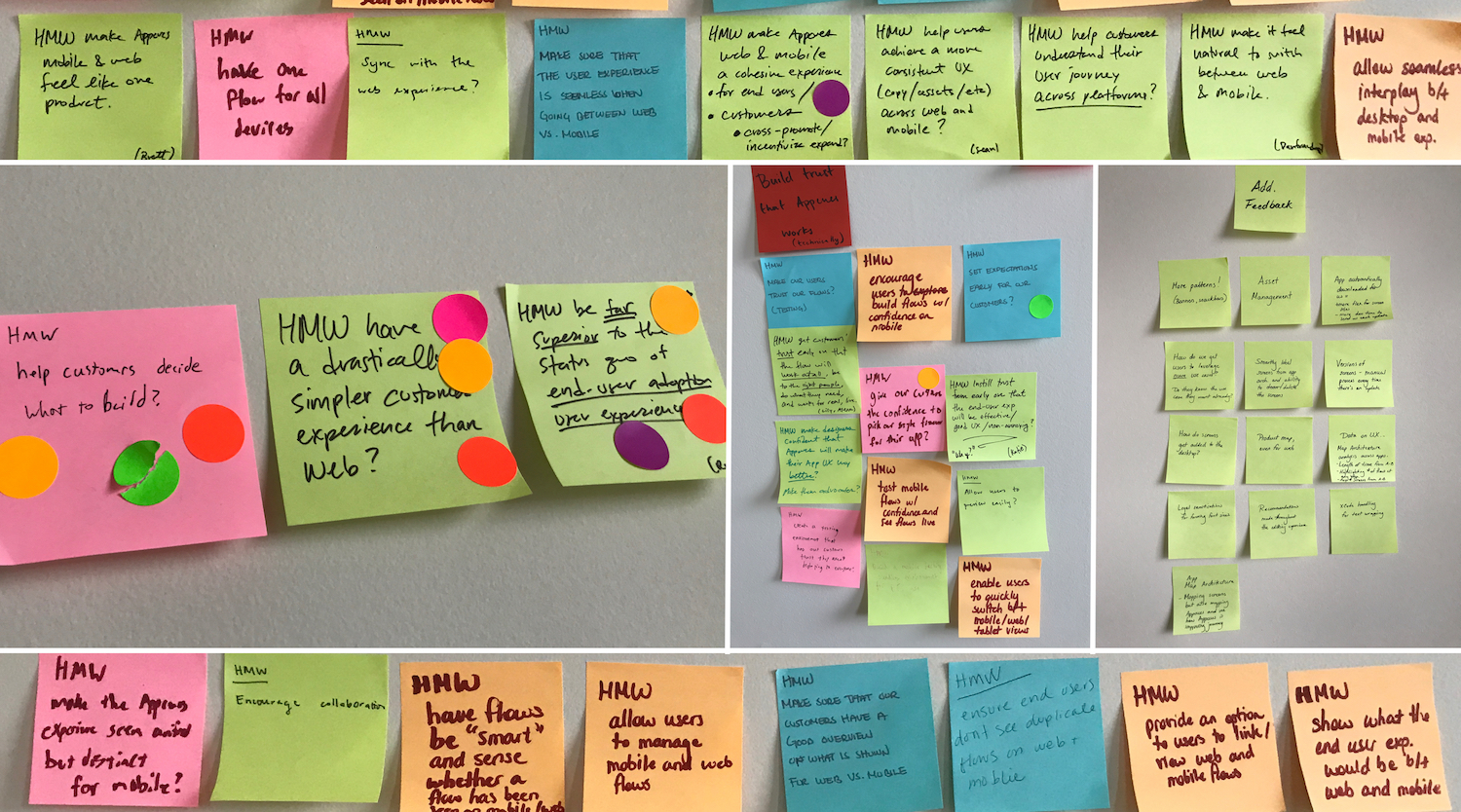
Our Key HMWs:
Some other themes:
Annddddd sketch, sketch, sketch away!
Next, we got to the fun, hands-on part: sketching.
With blank sheets of paper and lots of sharpies, everyone was encouraged to sketch as many concepts as possible, with the aim to center each sketch on a particular HMW statement. We encouraged the shyer members among us to sketch their ideas out, with the option to fall back on written explanations if they wanted. In the end, there were lots of pictures from us all!
A small sample of the many excellent and innovative ideas we sketched up. This was a favorite exercise of everyone in the group, even the non-designers! Pro tip: Having colorful markers and taking turns between Taylor Swift and Chopin seems to keep spirits high.
Just like with the HMWs, we then voted on our favorite ideas:
Top-Voted Sketches:
Some other themes:
Phew! By Day 3 in a sprint, you already feel exhausted. But you've got to keep the momentum going since this storyboarding step sets the foundation for the remaining steps: prototyping and testing.
Beginning with 15 empty boxes on a whiteboard, we mapped out—screen by screen and state by state—the journey that we wanted to take users through in a prototype. This might look simple and quick since it's so low-fidelity, but it actually takes a good few hours: We went back and forth on the order of screens, got into philosophical discussions about our life company purpose, and went back and referenced the sketches from the previous day. We knew that getting consensus on the order and content of these screens would make prototyping so much easier, so we made sure not skimp on this step.
After many hours, our beautiful, very very low fidelity workflow, emerged!
Once we had our storyboard mapped out, we started on the next steps: prototyping and script writing. (Note: The design sprint is officially a 5-day process, but we gave ourselves an extra day for this phase.)
This part of the sprint mostly falls on the designer's shoulders (in this case, me), so this step allowed the rest of the sprinters to scurry back to their desks and take a bit of a breather. Meanwhile, I holed myself up in the same sprint room for focused time and cranked through the sketches and storyboard screens. I followed our usual workflow: design in Sketch and prototype with Invision.
Screens from our early prototype, featuring the "App Map," where users would select the screen for their flow, and the Editor, where they could style it. While received well by users during the sprint, the App Map did not make it into the MVP, due to technical and time constraints.
(By the way, it's super helpful to have working style guide components at a time like this, when all you're focused on is building a working prototype. Being able to pull assets from a component library instead of fussing about building new ones just for your prototype is a lifesaver.)
The team and I checked in together throughout the day(s) to make sure that we were on track. I took breaks from pixel-pushing to work on our research script and shared it with the team once major chunks of it were done.
Finally, it was time to show our work to the judges (aka our users)! We gave ourselves an extra day for this part of the sprint, too.
Our goal for user testing was to answer several key questions:
Thankfully, recruiting for this test had been a breeze and we had 8 willing participants (and since 80% of usability issues are discovered after 5 users, this was plenty). It turns out that customers were dying to get a first peek at what we were cooking up!
Overall, the tests went extremely well. Most users said that they would definitely buy a product like this, and the rest said that they "probably" would (though of course, the actual purchasing decision is always predicated on more variables like pricepoint, timeline, internal ownership, and other factors down the line).
Users found the editing experience quite straightforward—aside from having some questions about how we would scrape their app to allow them to target particular screens and elements.
And for the ones who had previously used our web editor, they even preferred it to the web overall since it seemed both more "intuitive" (we guided uses through the process of creating a flow more), and "clean and friendly" (had a refreshed and lighter feeling than our current web editor).
We were surprised that feedback was so positive, and excited to learn so much about how users would get value from a product like this and what our next steps might be.
A retrospective of our testing with key findings for each part of the prototype, as well as a look at things we did well and what we could improve for the testing process itself.
Remember, a design sprint is useful when: your idea for a new product area is unvalidated, the cost of failure is high, there is significant complexity involving multiple departments, and there is limited prior knowledge about feasible solutions and the competitive space.
For us, gazing upon uncharted product territory, it was the perfect tool to use in our toolkit—great for rallying our team and producing a focused and validated prototype in a quick turnaround time. Its sequential process, where each step—Empathize, Ideate, Storyboard, Prototype, and Test—smoothly transitions into the next, is a perfect structure to guide the thought process and keep the team engaged and productive.
Of course, though, sprints only test simple user flows—there are a lot more variables to consider to develop a real, whole, product. For the rest of the design and development process, entire sprints may be overkill—you can still do competitive analysis, user journey mapping, design iterations, and testing, but with smaller teams, or solo, and for shorter spans of time. The same conceptual approaches of the sprint apply to other design challenges, but the scale may not.
We'd love to show you how those post-design sprint iterations came out, so be sure to check back soon (or better yet—sign up for our newsletter!)