← Visit Appcues.com
×
×

How to choose the right UI pattern for your next product update

The wrong UI pattern can turn a useful product update into an annoyance. This simple guide will help you get it right.
Skip to section:

Skip to section:

Shipping a product update may result in a mini celebration for the dev and product teams who worked on the feature (office donuts anyone?), but not all your users will be as thrilled.

If you send an update every time you make a fix or create full-screen takeovers to announce every new feature, you can actually end up harming the overall user experience—not improving it. 

But while you want to avoid bombarding users with unwanted, frequent announcements, you also don’t want to undersell an important feature that could increase adoption rates and deepen user engagement. It’s a delicate balance.

If you announce your product updates correctly—to the right users at the right time—it can be a win-win for everyone. From subtle tooltips to attention-grabbing modals, the right UI pattern can ensure you help users learn, adopt, and benefit from new features over time. 

We examined hundreds of UI patterns and created this guide to help you decide which approach will work best for your next product update announcement

Evaluate the noteworthiness of your product update

You probably have a gut feeling about how significant your product launches and feature releases are. But your personal connection to the product can skew your perception. If you know how many development hours went into building the feature, you may subconsciously want a splashier product announcement. 

Think through the following questions to remove bias and help you better plan your product updates: 

  1. How many of your users will the product update affect? Will the update impact all of your users or primarily users in specific job roles? Will new users and power users find and take advantage of the product update equally? Identifying how much of your user base is affected can help you shape your product update announcement and target it to the right audience. 
  2. How user-facing is the change? A back-end optimization that dramatically improves the product experience affects all users, but it may not be evident to most of them. On the other hand, a small UI change is more user-facing, even if it only appeals to a subset of users.
  3. How much immediate revenue is the product update expected to drive? Some updates, like pricing changes, have an immediate impact on the bottom line. Significant new features could also impact revenue, like features added to an enterprise plan to drive upgrades or new functionality priced as a stand-alone offering to create a new product line. Thinking through how much revenue you expect to see from the change could help quantify how big the announcement should be.
  4. How much time was spent updating the product? While time spent on a project is never a perfect indication of its value or success, it’s helpful to consider the resources that went into developing the update. This could reveal the internal value your team places on the update and help calculate ROI.
  5. How do users engage with your product (compared to other products)? Consider how much time your users spend in your product compared to other tools. For example, sales teams spend hours a day in a CRM, so for them, a new reporting feature makes a much bigger difference than a new feature in Kayak or Gusto.  

For significant product updates: Grab your users’ attention

Product launches and big feature releases can affect all users. They are also a powerful way to attract new users or convert your inactive users into brand advocates. On top of that, major changes might get picked up by the press or by other companies’ blogs, so it’s important to go big, own the messaging, and emphasize the value that users will receive.

Here are 3 UI pattern examples  for your most noteworthy product updates.

1. Engage users with a modal right after login 

Klaviyo, an email and social marketing tool, needed a way to communicate a major feature release that would benefit all users. To ensure they wouldn’t miss anyone, Klaviyo used a big modal window that pops up right after login.  
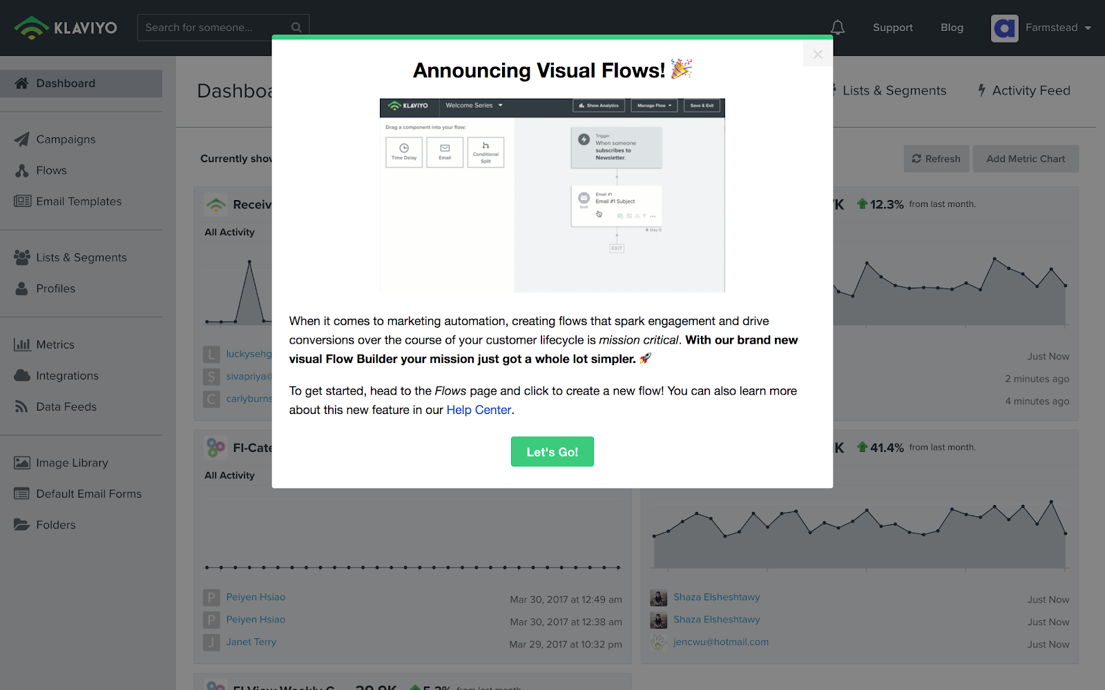
new product feature announcement modal window with image, title, copy, and CTA. Made with Appcues.
Built with Appcues

The modal window clearly addresses the who, what, where, and why of the new feature, without going overboard. Users can choose to exit out of the window or click the green button to learn more at their own pace. 

2. Tease a big redesign to build excitement

A total design overhaul can easily shock customers who are used to a certain look and feel. So, when Feefo redesigned their functionality and navigation, they wanted to both mitigate disruption and build excitement for the upcoming changes. 

The customer review and insights platform took a multi-step approach. Using modal windows, they communicated with their users throughout the transition.

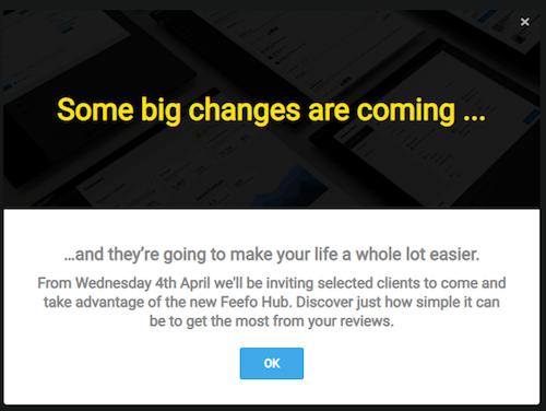
First, users were shown teaser modals to raise awareness of upcoming changes.
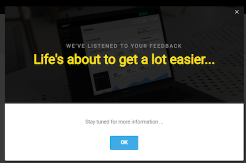
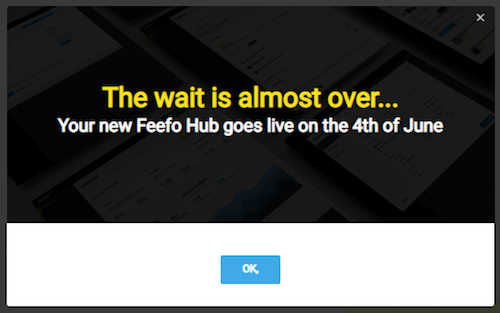
product redesign announcement teaser modal window made with Appcues.

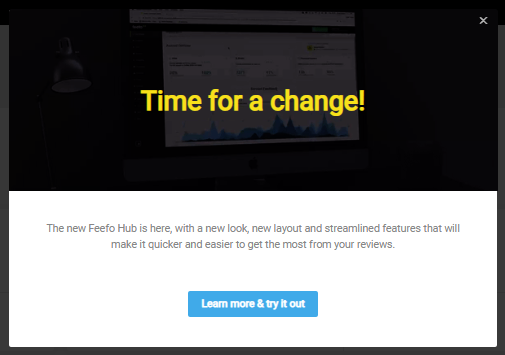
Then, when the launch date arrived, customers were introduced to the new environment. By this point, they had received enough updates about the changes that no one was caught off-guard.

product redesign announcement modal window made with Appcues.
Built with Appcues

3. Add playfulness with an animated slideout

You don’t always need to use a modal window to announce a product update. If you want to add variety, look for UI patterns that stand out in other ways, like color or motion. 

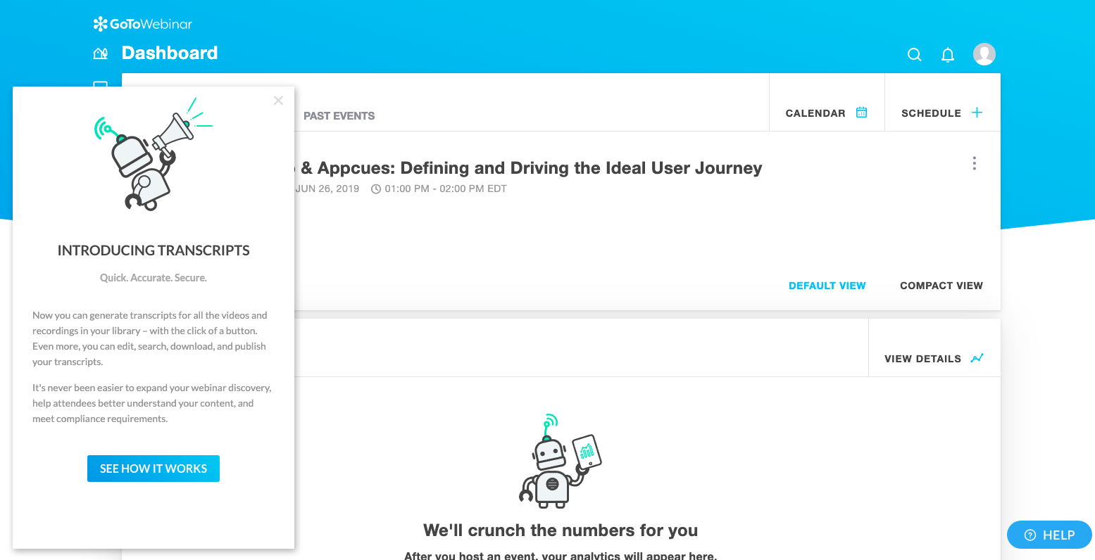
GoToWebinar, for example, used an animated slideout to communicate a new transcript feature for the webinar hosting tool. When repeat users logged in, the box slowly moved into the frame. Thanks to the traditional, static dashboard page, even a small amount of motion easily caught users’ attention. 

customized new product feature update announcement slideout made with
Built with Appcues

For smaller product updates: Give a tip at the right time

While major product updates may only happen a few times a year, medium-sized changes could be a monthly occurrence. They are significant, but don’t require as big of a splash. 

For these, more subtle UI patterns can strike the right mix of considerate and assertive. Some users will be grateful for the tip, while others can easily dismiss the announcement with a click.

Here are 3 examples of how to highlight an important, but not essential, feature update: 

1. Make a tooltip pop with visual contrast

There are times when all you really need is a single well-placed, prominent tooltip to get your produce update across.

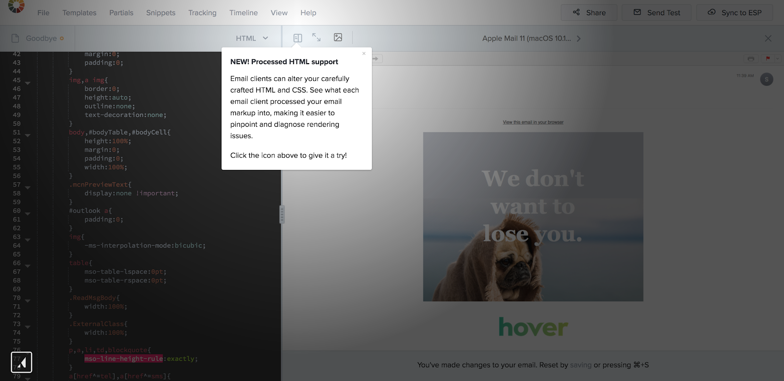
When email marketing provider Litmus released new functionality, they displayed a tooltip to promote a new icon on the top navigation of the email editing page. The small, white box could have easily got lost on the page, but Litmus overlaid the tooltip onto a dark gradient background to improve visibility. 

new feature announcement tooltip with spotlight made with appcues
Built with Appcues

2. Highlight new features onscreen

Tooltips can also call attention to a more complex feature or highlight a large area in your app. For example, operations automation platform Accelo upgraded the Gantt charts within their project plans. Gantt charts are a robust feature and it would have been challenging to identify a single place to display the tooltip. 

Instead, when someone opened a project plan, Accelo highlighted the entire feature area and showed a tooltip at the same time. This way, the tooltip encompassed the whole Gantt chart instead of just one section.

new feature announcement tooltip made with appcues
Built with Appcues

3. Color-code a new feature walk-through

What if your newest feature needs a bit more context and explanation? Tooltips can also be combined to give users a brief feature tour that points outs out different elements. 

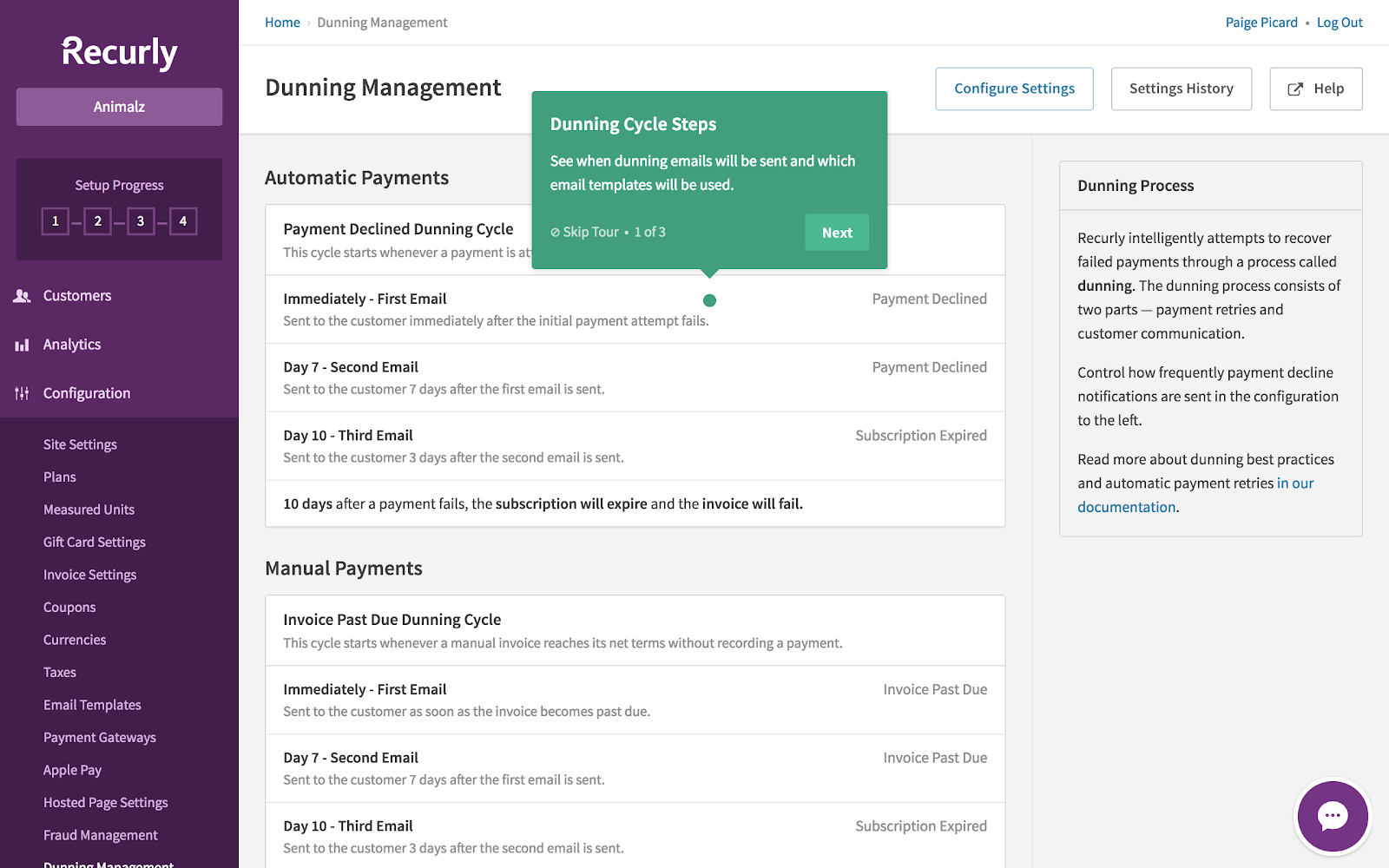
Take Recurly’s dashboard upgrade. The subscription management tool used a series of tooltips to walk users through the changes. The green boxes against the purple and white background pop without being too flashy or disruptive. Importantly, Recurly also gives users the option to skip the tour. 

product update feature tour tooltip made with appcues
Built with Appcues

For minor product updates: Let users explore on their own

Modal windows and tooltips both communicate information outward: They appear automatically when users visit a page or interact with a feature. Hotspots, on the other hand, are a subtle UI pattern that invite users inward to learn more. 

The small icons, usually in the form of animated, pulsing circles, can be strategically placed on certain elements to indicate that more information is available—users then have to click on the hotspots to engage. 

Here are 2 ways to use hotspots to promote smaller, less noteworthy product updates: 

1. Unveil more details with actionable hotspots

AdRoll, a retargeting advertising platform, frequently releases new features to existing users. These features don’t apply to every single person and even if they did, users wouldn’t want to be bombarded with pop-up windows explaining every new change.

Instead, AdRoll used a yellow hotspot in the upper-right hand corner. The yellow circle appears on top of a microphone icon, indicating that AdRoll has something to say. When users click on the hotspot, a drop-down menu outlines each new feature and the date it was released.

new feature announcement web notification icon hotspot
Built with Appcues

2. Incorporate unique icons to stand out

While hotspots are traditionally circular icons, there is no rule that says you can’t use a different shape. In fact, mixing up your icons can help your message stand out, especially if your app has a colorful or busy interface.

For example, Slack is full of emojis, colors, and notifications. In order for their in-app updates to stand out, they used a little red gift icon in the top-right corner. When users clicked on the red box, a sidebar would appear with the most relevant product updates (like a new video calling feature or threaded-messaging). 

Because products are always evolving, Slack has since moved this icon—it now lives with several other features in a dropdown menu indicated by 3 dots in the same top-right corner. 

slack product update gift icon old version of slack

Above all, be considerate

When done well, product updates can help improve the your numbers throughout the flywheel. They can keep repeat customers engaged, boost user satisfaction in the long run, and continuously let everyone know that your product is improving. 

Regardless of which UI pattern you choose, remember that a product update isn’t about your internal teams or even your product. It’s about your users. After all, you gathered feedback, developed the feature, iterated on the concept, and shipped it—all with the goal of making your users’ lives a little bit easier.

Keep this in mind when announcing product updates. Will a full-screen takeover clearly communicate an awesome new feature? Or, will it distract users from their regular activity in your app? 

Let the noteworthiness of your product update guide the UI pattern and you’re more likely to complement the user experience and add value. 

Syed Ali Haris
Principal Product Marketing Manager at Zendrive
Ali is the Princpal Product Marketing Manager at Zendrive, with almost a decade of experience in marketing roles at startups, corporations, and government organizations.
Skip to section:

Skip to section:

Shipping a product update may result in a mini celebration for the dev and product teams who worked on the feature (office donuts anyone?), but not all your users will be as thrilled.

If you send an update every time you make a fix or create full-screen takeovers to announce every new feature, you can actually end up harming the overall user experience—not improving it. 

But while you want to avoid bombarding users with unwanted, frequent announcements, you also don’t want to undersell an important feature that could increase adoption rates and deepen user engagement. It’s a delicate balance.

If you announce your product updates correctly—to the right users at the right time—it can be a win-win for everyone. From subtle tooltips to attention-grabbing modals, the right UI pattern can ensure you help users learn, adopt, and benefit from new features over time. 

We examined hundreds of UI patterns and created this guide to help you decide which approach will work best for your next product update announcement

Evaluate the noteworthiness of your product update

You probably have a gut feeling about how significant your product launches and feature releases are. But your personal connection to the product can skew your perception. If you know how many development hours went into building the feature, you may subconsciously want a splashier product announcement. 

Think through the following questions to remove bias and help you better plan your product updates: 

  1. How many of your users will the product update affect? Will the update impact all of your users or primarily users in specific job roles? Will new users and power users find and take advantage of the product update equally? Identifying how much of your user base is affected can help you shape your product update announcement and target it to the right audience. 
  2. How user-facing is the change? A back-end optimization that dramatically improves the product experience affects all users, but it may not be evident to most of them. On the other hand, a small UI change is more user-facing, even if it only appeals to a subset of users.
  3. How much immediate revenue is the product update expected to drive? Some updates, like pricing changes, have an immediate impact on the bottom line. Significant new features could also impact revenue, like features added to an enterprise plan to drive upgrades or new functionality priced as a stand-alone offering to create a new product line. Thinking through how much revenue you expect to see from the change could help quantify how big the announcement should be.
  4. How much time was spent updating the product? While time spent on a project is never a perfect indication of its value or success, it’s helpful to consider the resources that went into developing the update. This could reveal the internal value your team places on the update and help calculate ROI.
  5. How do users engage with your product (compared to other products)? Consider how much time your users spend in your product compared to other tools. For example, sales teams spend hours a day in a CRM, so for them, a new reporting feature makes a much bigger difference than a new feature in Kayak or Gusto.  

For significant product updates: Grab your users’ attention

Product launches and big feature releases can affect all users. They are also a powerful way to attract new users or convert your inactive users into brand advocates. On top of that, major changes might get picked up by the press or by other companies’ blogs, so it’s important to go big, own the messaging, and emphasize the value that users will receive.

Here are 3 UI pattern examples  for your most noteworthy product updates.

1. Engage users with a modal right after login 

Klaviyo, an email and social marketing tool, needed a way to communicate a major feature release that would benefit all users. To ensure they wouldn’t miss anyone, Klaviyo used a big modal window that pops up right after login.  

new product feature announcement modal window with image, title, copy, and CTA. Made with Appcues.
Built with Appcues

The modal window clearly addresses the who, what, where, and why of the new feature, without going overboard. Users can choose to exit out of the window or click the green button to learn more at their own pace. 

2. Tease a big redesign to build excitement

A total design overhaul can easily shock customers who are used to a certain look and feel. So, when Feefo redesigned their functionality and navigation, they wanted to both mitigate disruption and build excitement for the upcoming changes. 

The customer review and insights platform took a multi-step approach. Using modal windows, they communicated with their users throughout the transition.

First, users were shown teaser modals to raise awareness of upcoming changes.
product redesign announcement teaser modal window made with Appcues.

Then, when the launch date arrived, customers were introduced to the new environment. By this point, they had received enough updates about the changes that no one was caught off-guard.
product redesign announcement modal window made with Appcues.
Built with Appcues

3. Add playfulness with an animated slideout

You don’t always need to use a modal window to announce a product update. If you want to add variety, look for UI patterns that stand out in other ways, like color or motion. 

GoToWebinar, for example, used an animated slideout to communicate a new transcript feature for the webinar hosting tool. When repeat users logged in, the box slowly moved into the frame. Thanks to the traditional, static dashboard page, even a small amount of motion easily caught users’ attention. 
customized new product feature update announcement slideout made with
Built with Appcues

For smaller product updates: Give a tip at the right time

While major product updates may only happen a few times a year, medium-sized changes could be a monthly occurrence. They are significant, but don’t require as big of a splash. 

For these, more subtle UI patterns can strike the right mix of considerate and assertive. Some users will be grateful for the tip, while others can easily dismiss the announcement with a click.

Here are 3 examples of how to highlight an important, but not essential, feature update: 

1. Make a tooltip pop with visual contrast

There are times when all you really need is a single well-placed, prominent tooltip to get your produce update across.

When email marketing provider Litmus released new functionality, they displayed a tooltip to promote a new icon on the top navigation of the email editing page. The small, white box could have easily got lost on the page, but Litmus overlaid the tooltip onto a dark gradient background to improve visibility. 
new feature announcement tooltip with spotlight made with appcues
Built with Appcues

2. Highlight new features onscreen

Tooltips can also call attention to a more complex feature or highlight a large area in your app. For example, operations automation platform Accelo upgraded the Gantt charts within their project plans. Gantt charts are a robust feature and it would have been challenging to identify a single place to display the tooltip. 

Instead, when someone opened a project plan, Accelo highlighted the entire feature area and showed a tooltip at the same time. This way, the tooltip encompassed the whole Gantt chart instead of just one section.
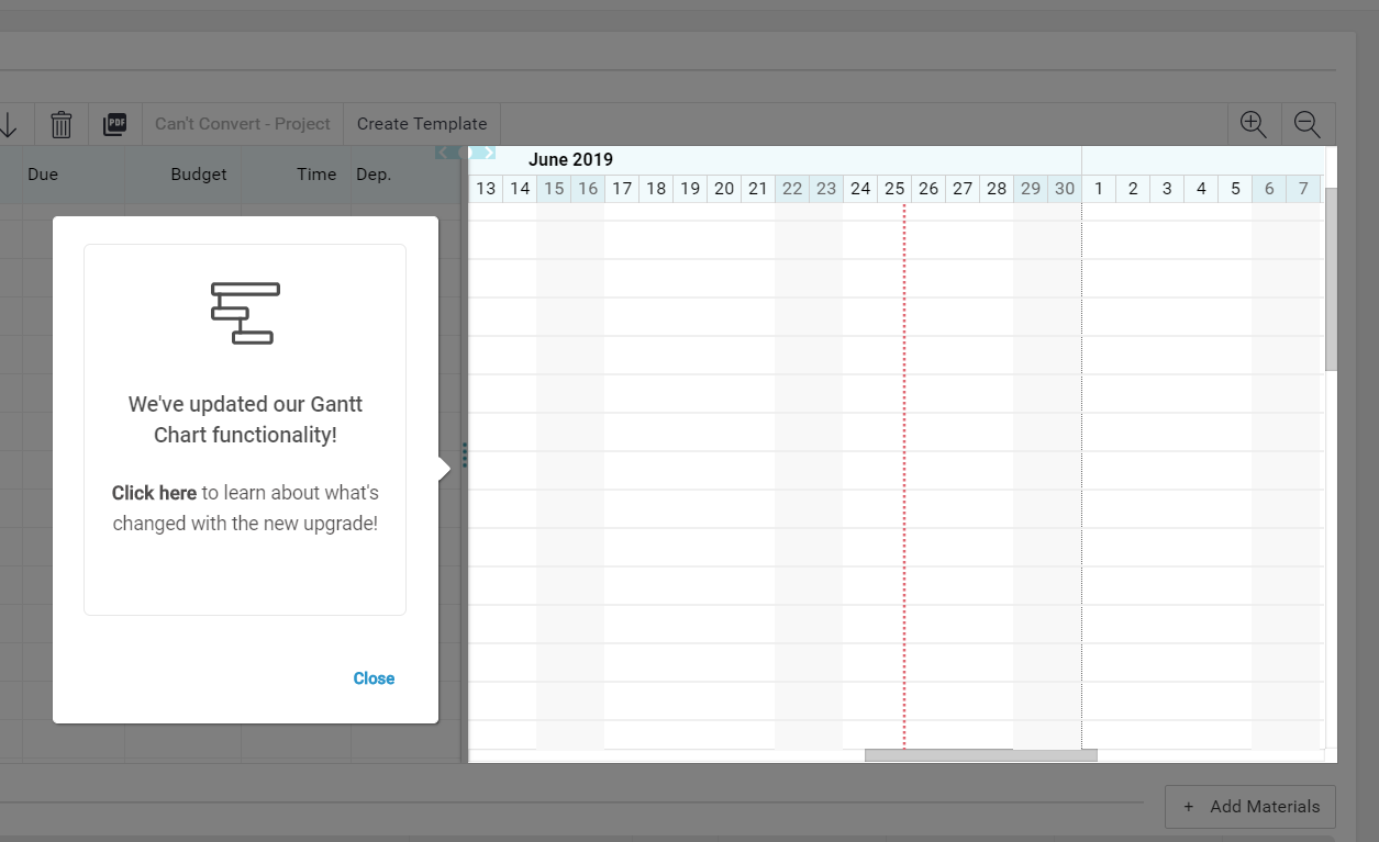
new feature announcement tooltip made with appcues
Built with Appcues

3. Color-code a new feature walk-through

What if your newest feature needs a bit more context and explanation? Tooltips can also be combined to give users a brief feature tour that points outs out different elements. 

Take Recurly’s dashboard upgrade. The subscription management tool used a series of tooltips to walk users through the changes. The green boxes against the purple and white background pop without being too flashy or disruptive. Importantly, Recurly also gives users the option to skip the tour. 
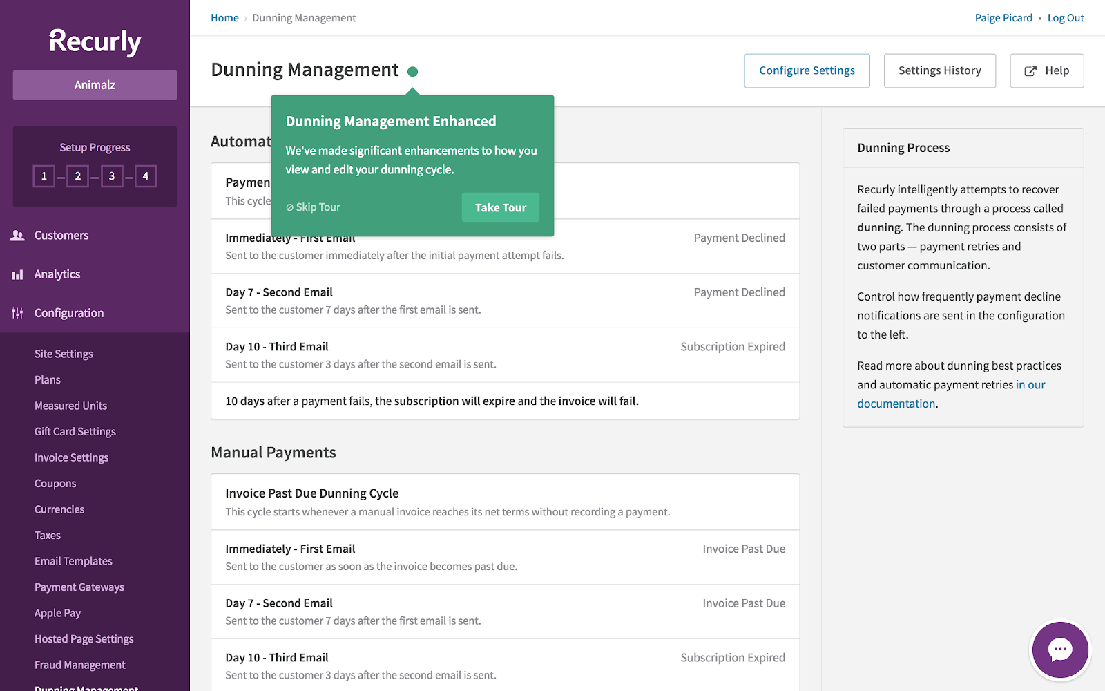
product update feature tour tooltip made with appcues
Built with Appcues

For minor product updates: Let users explore on their own

Modal windows and tooltips both communicate information outward: They appear automatically when users visit a page or interact with a feature. Hotspots, on the other hand, are a subtle UI pattern that invite users inward to learn more. 

The small icons, usually in the form of animated, pulsing circles, can be strategically placed on certain elements to indicate that more information is available—users then have to click on the hotspots to engage. 

Here are 2 ways to use hotspots to promote smaller, less noteworthy product updates: 

1. Unveil more details with actionable hotspots

AdRoll, a retargeting advertising platform, frequently releases new features to existing users. These features don’t apply to every single person and even if they did, users wouldn’t want to be bombarded with pop-up windows explaining every new change.

Instead, AdRoll used a yellow hotspot in the upper-right hand corner. The yellow circle appears on top of a microphone icon, indicating that AdRoll has something to say. When users click on the hotspot, a drop-down menu outlines each new feature and the date it was released.

new feature announcement web notification icon hotspot
Built with Appcues

2. Incorporate unique icons to stand out

While hotspots are traditionally circular icons, there is no rule that says you can’t use a different shape. In fact, mixing up your icons can help your message stand out, especially if your app has a colorful or busy interface.

For example, Slack is full of emojis, colors, and notifications. In order for their in-app updates to stand out, they used a little red gift icon in the top-right corner. When users clicked on the red box, a sidebar would appear with the most relevant product updates (like a new video calling feature or threaded-messaging). 

Because products are always evolving, Slack has since moved this icon—it now lives with several other features in a dropdown menu indicated by 3 dots in the same top-right corner. 
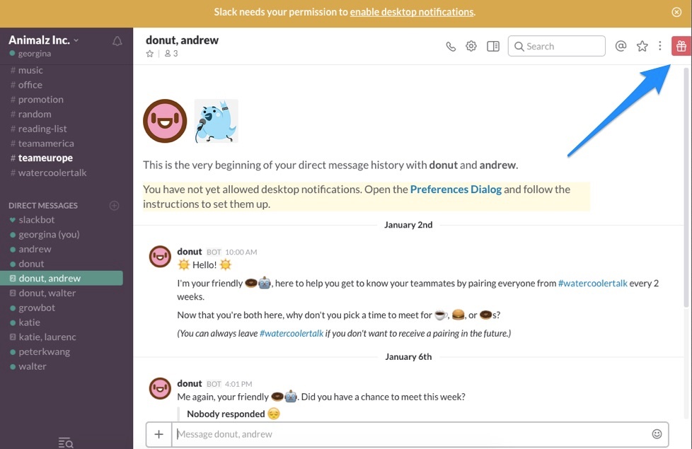
slack product update gift icon old version of slack

Above all, be considerate

When done well, product updates can help improve the your numbers throughout the flywheel. They can keep repeat customers engaged, boost user satisfaction in the long run, and continuously let everyone know that your product is improving. 

Regardless of which UI pattern you choose, remember that a product update isn’t about your internal teams or even your product. It’s about your users. After all, you gathered feedback, developed the feature, iterated on the concept, and shipped it—all with the goal of making your users’ lives a little bit easier.

Keep this in mind when announcing product updates. Will a full-screen takeover clearly communicate an awesome new feature? Or, will it distract users from their regular activity in your app? 

Let the noteworthiness of your product update guide the UI pattern and you’re more likely to complement the user experience and add value. 

Syed Ali Haris
Principal Product Marketing Manager at Zendrive
Ali is the Princpal Product Marketing Manager at Zendrive, with almost a decade of experience in marketing roles at startups, corporations, and government organizations.
You might also like...