How Pinterest perfected user onboarding

.png)

.png)
Pinterest has one of the most effective user onboarding experiences around—and have for years. So how did they do it?
Casey Winters was a member of the team behind Pinterest's onboarding as the product experienced rapid growth. During Casey’s tenure, the team ran hundreds of experiments to improve their activation rate.
In 2017, Casey shared his onboarding secrets on Greylock Partners’ podcast, Greymatter.
We listened in, took notes, and broke the interview down with screenshots to give you a better idea of how Pinterest perfected user onboarding by balancing give and take and how, several years and a $12 billion IPO valuation later, this approach is still going strong.
First impressions matter. In Casey’s words, “you really need to accomplish showing the main value in the first session. Or else there’s no guarantee there will be a next session.”
Showing initial value is as difficult to execute as it is critical to your success. It takes a deep understanding of what a new user wants from your product.
You probably have an idea of what new users want, but the more you can zero in on this need and focus on delivering value, the more leverage you’ll have in improving your activation rate.
Pinterest has a clear understanding of what their new users want, which, according to Casey, “is [to see] cool topics that [they’re] interested in.” This value is reinforced through its initial signup screen:
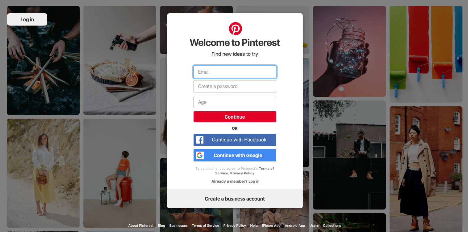
Reinforcing your value with images and words is the easy part. Delivering on that value early on is where it gets tricky.
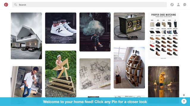
Pinterest delivers on its value promise by giving new users contextual help that gets them to engage with the product in a meaningful way.
This blue banner tells readers exactly what to do. There is little room to get lost or confused.
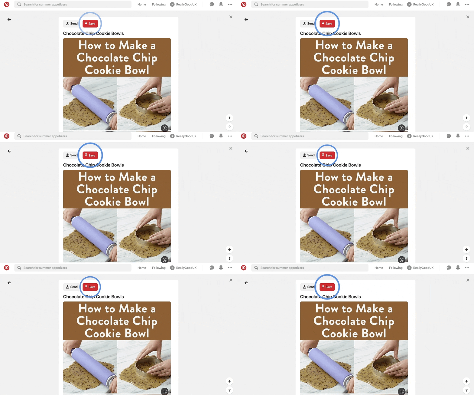
Clicking a pin brings users to a closeup of their selected image. A pulsing hotspot hovers over the save button, again making it clear what to do next.:
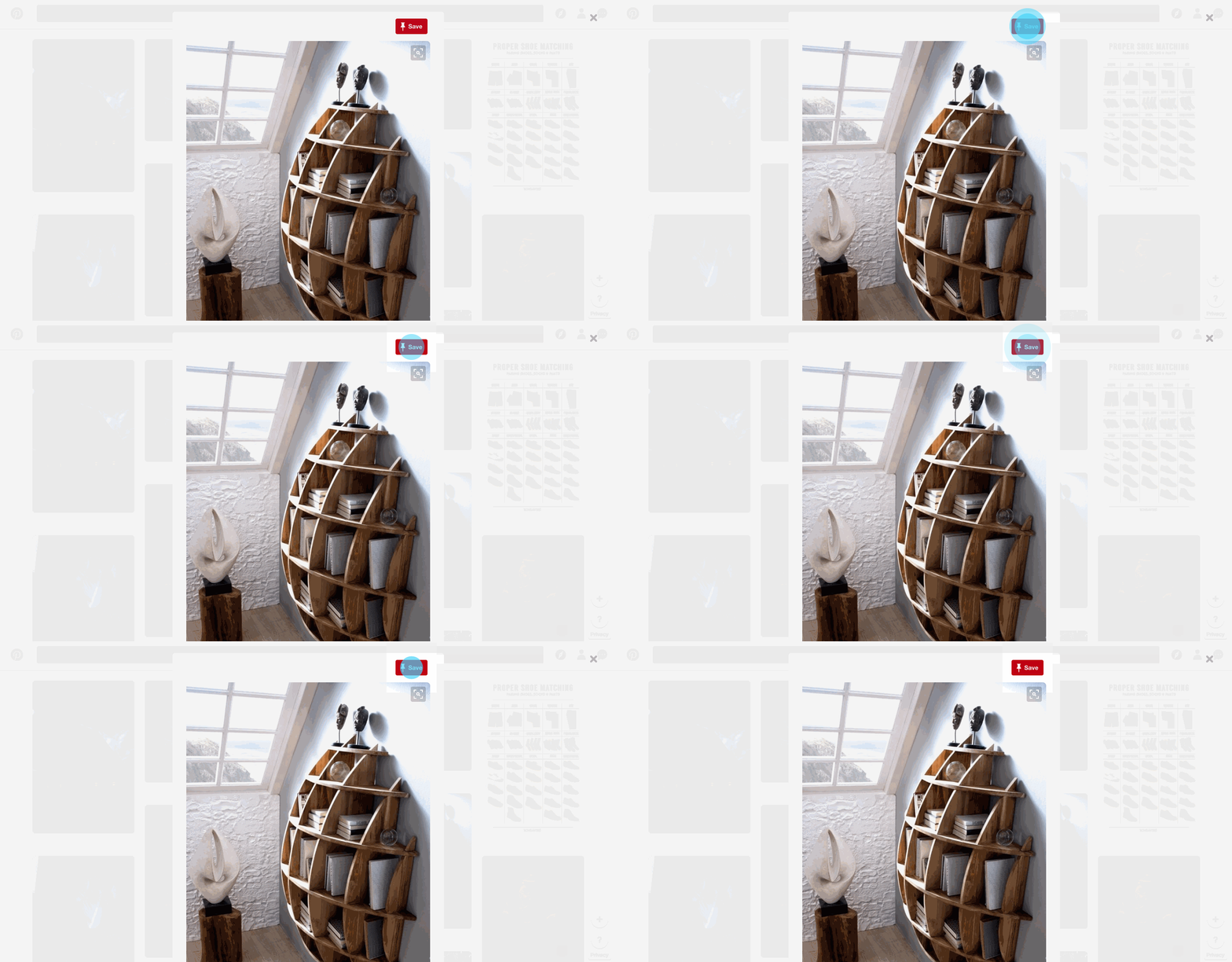
The tooltip message that appears upon clicking the hotspot contextualizes the button further.
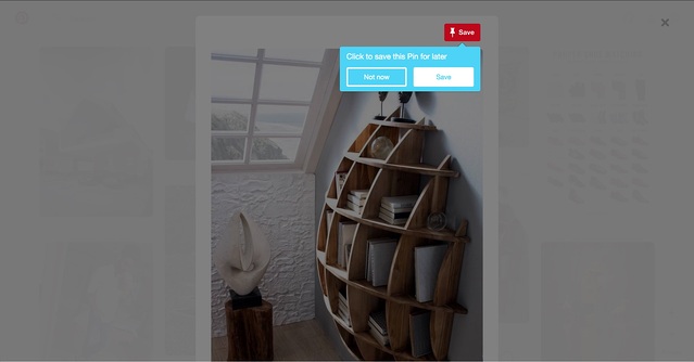
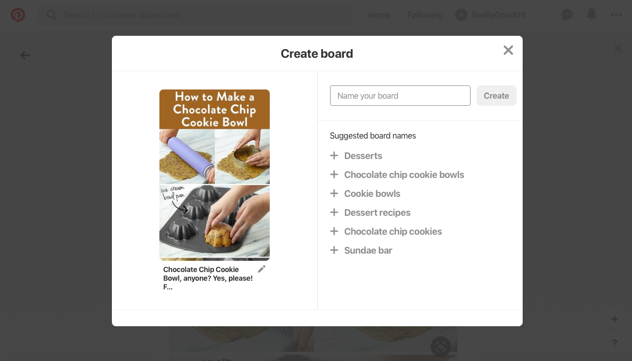
From here, users are given more context:
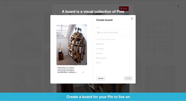
Contextual help in the banner below this modal is aimed to prompt action. The copy above—”A board is a visual collection of Pins”—helps a user understand the product.
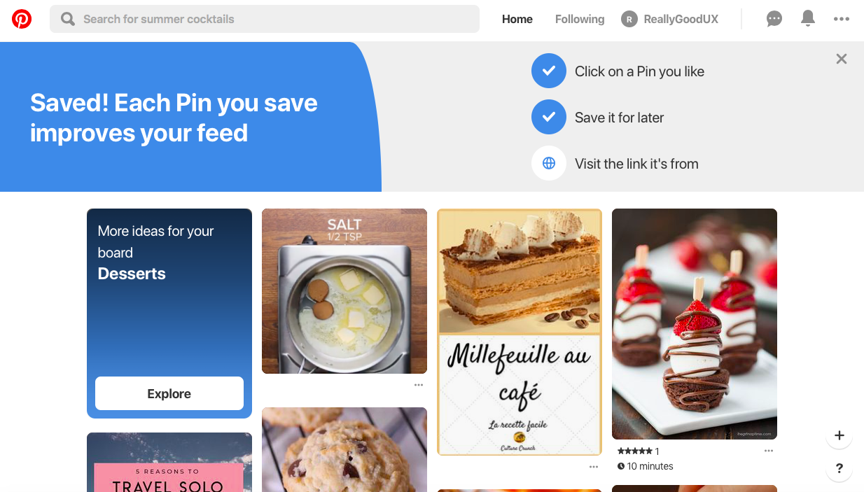
Upon clicking save, the blue banner turns green:
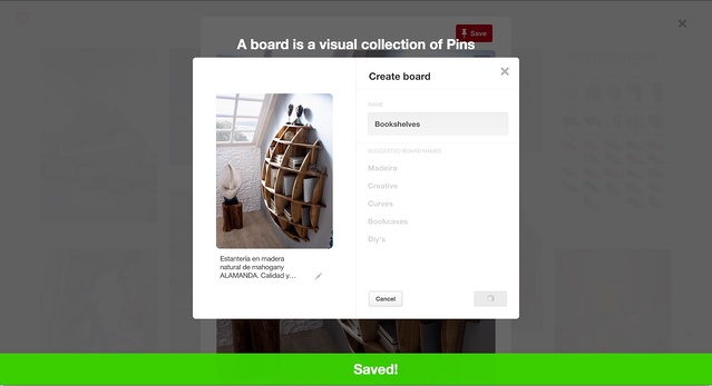
This confirmation message helps a user know they’re on the right track. By this time, first-time users navigating Pinterest have a pretty good idea of what it is and does.
Level 1 complete.
Pinterest's 2017 product was a best-in-class example of user onboarding done right. But because great products are always evolving, things have changes a little over time. Pinterest’s onboarding experience is now simpler, more streamlined—but the core actions remain the same.
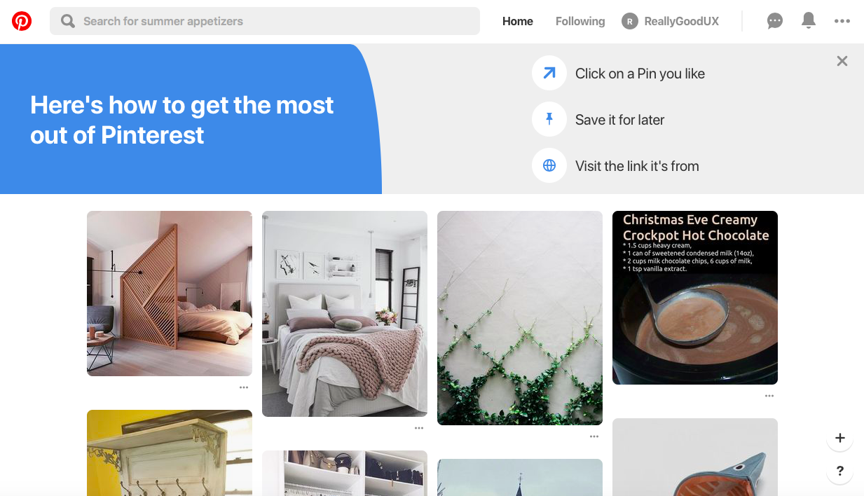
By the end of the onboarding experience users have experienced 1 or 2 significant aha moments. They understand the value of the product, and are ready to explore more on their own.
Most of the best user onboarding experiences use dome form of personalization.
Personalized onboarding works by allowing you to give users a more personalized, relevant experience that is more closely aligned to their individual needs.
This approach requires you to either ask for data from your users or obtain it through a third-party source such as a user’s browser. Pinterest does both.
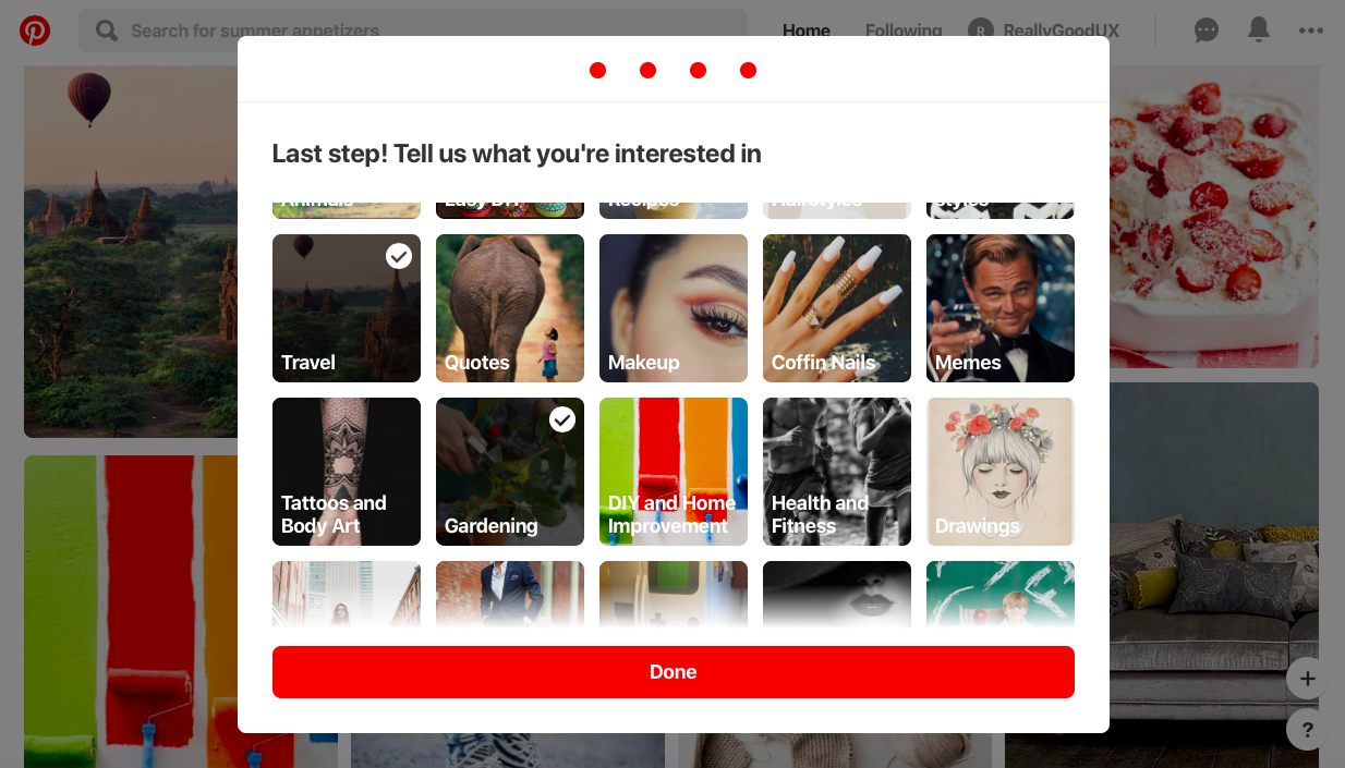
When a user signs up, Pinterest quickly asks them to define their interests in order to customize their home feed:
Casey explains:
“You really need to make sure the user understands why you’re asking these questions. That it’s going to help them get value. And you need to strike the balance of how long you’re going to ask them questions before you try and deliver value. Because it is a funnel, right? And the more questions you ask the more there will be drop off. And that’s something something that the Pinterest activation team has played with a lot between level of specificity and yet time to value.”
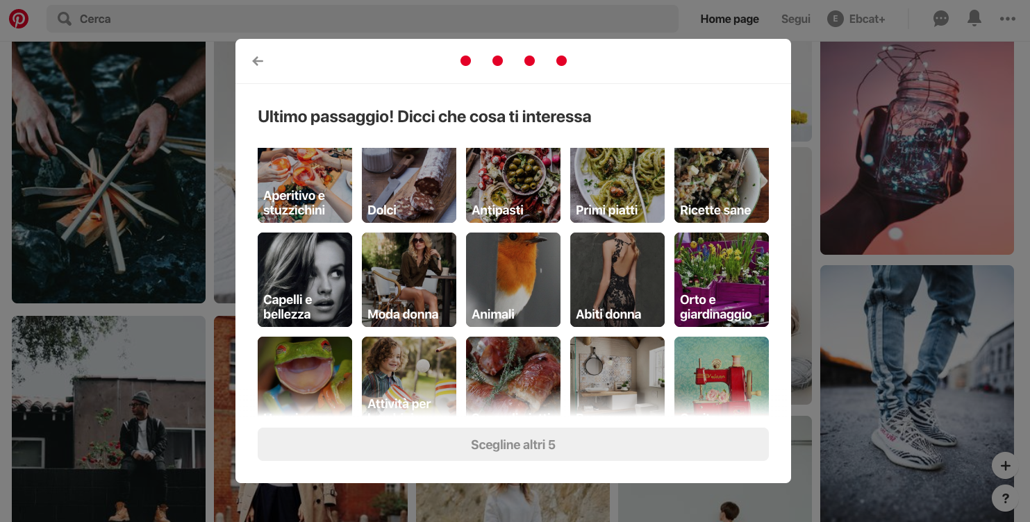
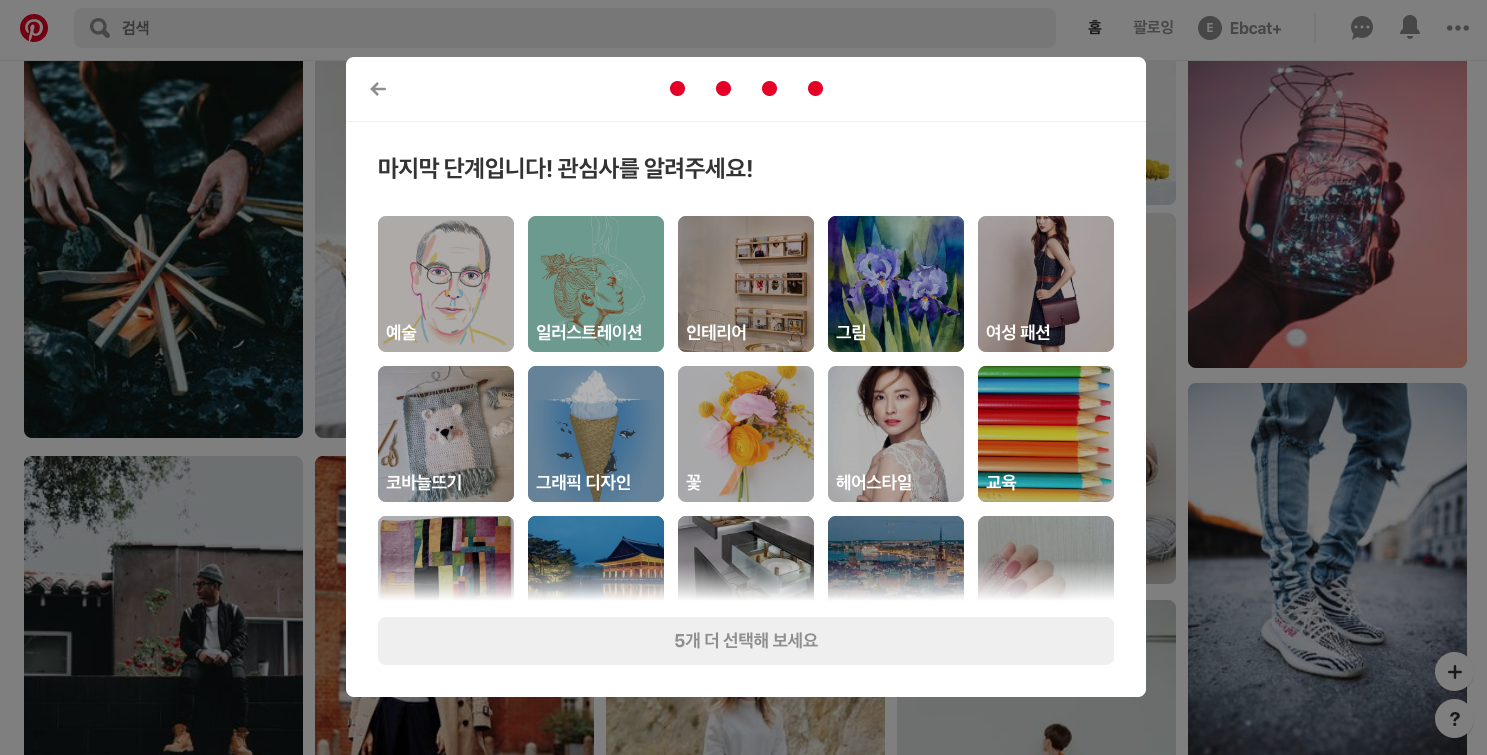
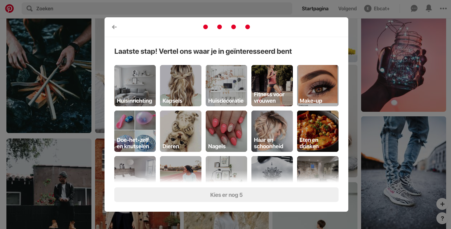
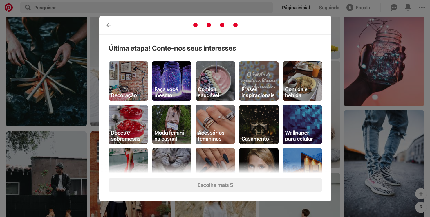
Years back, Pinterest users used to see the same onboarding experience, regardless of where they lived in the world. And users in certain countries were bouncing at higher rates.
When Pinterest’s team sat down to draw up some onboarding experiments, they hypothesized that the interests of users abroad were different than those in the U.S., resulting in home feeds that didn’t resonate as deeply and users missing the aha moment.
By identifying local interests, and pairing that with a user’s country—found within the browser data—Pinterest was able to offer much more relevant topic suggestions for new users around the world.
Their initial experiment with localization improved Pinterest’s activation rate abroad by 5- to 10%, depending on the country and demographic. You can see exactly how Pinterest ran this experiment on their engineering blog.
Take a look at how suggested topics and cover images for a woman in her late 20s vary by country:
Knowing what your users want from their first session goes hand in hand with understanding what users don’t want out of their first-time experience.
To this end, Casey had the Pinterest activation team ”invest in removing a lot of the complexity of the product over time, so we got people to the core value of the product as soon as possible.”
In other words, Pinterest hid elements of their user interface for first-time users.
“Everything about where the Pins come from, how to add your own Pin, that you can share boards with other people...all of that is removed from the early product until we can make sure that you understand the really important parts of getting value...and then we can slowly start reintroducing those features later on.”
Pinterest has since streamlined their feed for returning users, too—less seems to be more in this case. But the approach of gradual onboarding—also called the ladder of engagement—can be an excellent strategy for introducing users to a complex product, without overwhelming them early on.
All in all, Pinterest remains an excellent example of personalization and customization done right. We’re excited to see how their onboarding experience evolves in the future—and what lessons we might learn from the next iteration!
