← Visit Appcues.com
×
×

How to design more effective product tours and walkthroughs

Turns out that nice, leisurely 32-step product tour wasn't such a good idea… here's how to make it more effective.
Skip to section:

Skip to section:

Product tours do the important job of introducing users to your product or new feature. When done well, they improve UX, motivate users to take key actions, and shorten new users’ time to value—improving activation, conversion, and retention rates. Really, what’s not to love?

Quite a bit, actually.

When they’re used with a heavy hand, product tours can quickly start to feel overbearing and annoying. The additional friction could even block users from discovering your product's aha moment. (Turns out that nice, leisurely 32-step walkthrough wasn't such a good idea!)

And if users don’t find your product tour valuable, you don’t just have a product tour problem—you have the beginnings of a much larger user engagement problem.

That's why it’s so important to continuously monitor the performance of your product tour, analyze your data, and repeatedly iterate on the experience to make sure you’re not just educating users, but also steering them toward desired actions. Without clear goals for your product tour in place, you risk squandering your users' attention and motivation—which, once lost, can be almost impossible to regain.

But don’t despair just yet! The following guide will help you diagnose common product tour issues and give you actionable next steps for fixing each problem and turning your product tour into the effective user onboarding experience it should be.

Read on to learn about what to do if users:

  • Dismiss your product tour immediately
  • Start a tour but don't finish
  • Finish a product tour but don't take action

What to do if users dismiss your product tour immediately

If your users saw your product tour but didn’t opt in, there could be problems with the targeting or design.

Note that opting in can mean slightly different things for different UI patterns. For tooltips, modals, and slideouts that are triggered by landing on the page, this means that the user clicked out of the first element immediately. For hotspots, which are opt-in by nature, it means that the user never clicked the hotspot.

If you’ve set up analytics to track your product tour, you’ll see a drop-off after the initial product tour prompt.

this is a bar graph showing the analytics result of an example product tour in which users abandon the product tour flow after seeing the first prompt

How to make your product tours more effective:

1. Improve targeting

Consider where your product tour appears and why users are navigating there.

New feature announcements are often targeted to appear upon login, when users expect to see their dashboard. If users log into your product regularly to perform specific and quick tasks—such as looking up a customer’s phone number in a CRM—a product tour prompt at login may get in the way.

If the product tour is triggered by an action, it’s worth questioning whether or not that action—visiting a certain page or clicking a button—is meaningful enough or shows enough intent to warrant a product tour.

2. Motivate the right users

If your product tour’s goal is to onboard new users, it’s clear who you should target. But what about improving feature adoption for all users? New users may not know your product enough to care about new features in the same way that power users would.

For example, this new feature walkthrough was shown to returning GoToWebinar users, which makes plenty of sense. But if this message had town to new users who don’t yet know their way around the core UI, his information may not provide the same value and might actually overwhelm and deter action.
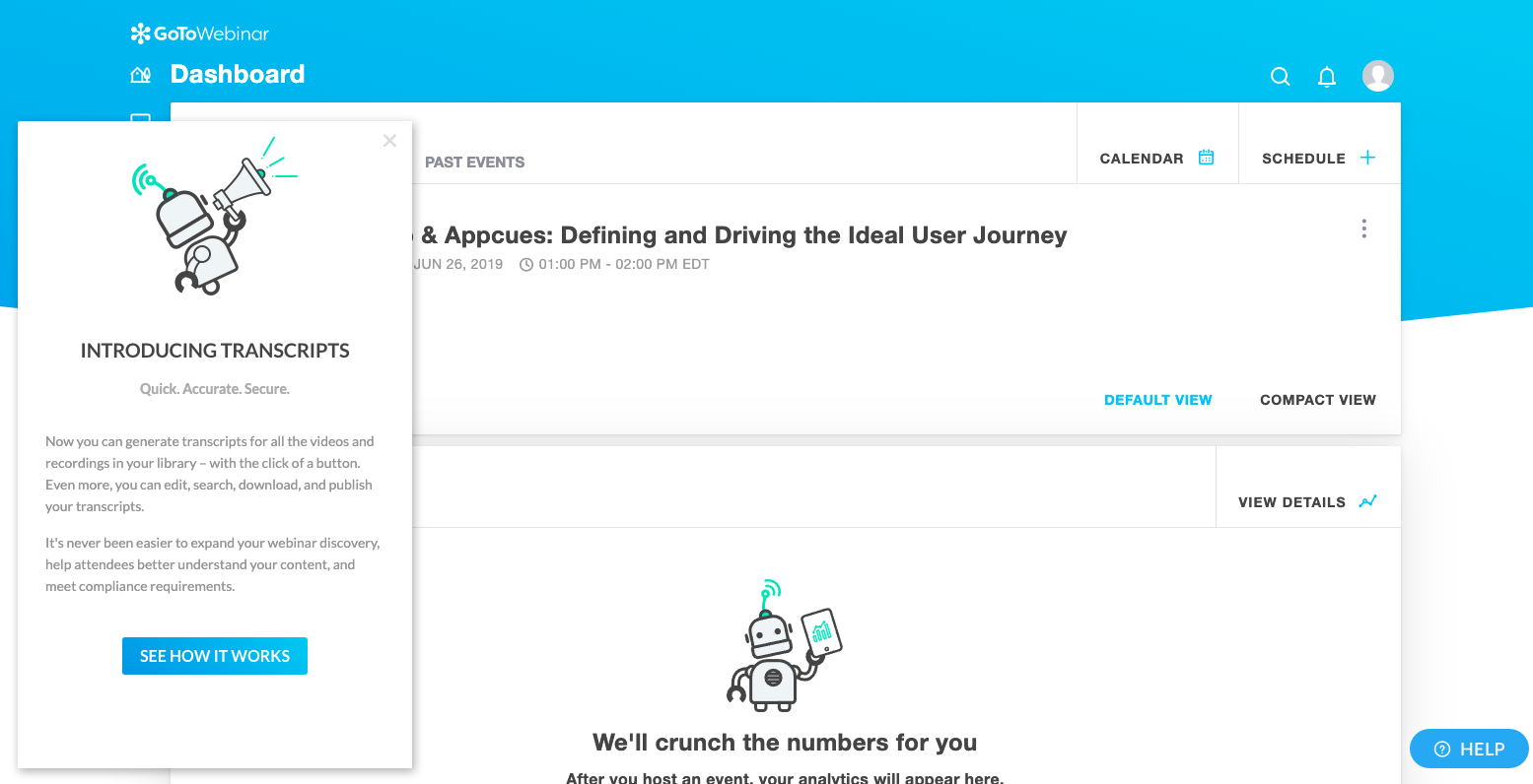
go to webinar new feature walkthrough

3. Choose the best UI pattern for the job

The most well-intended product tours can fall flat because they use the wrong UI pattern. A less invasive slideout or a series of well-placed hotspots may be more effective than an attention-grabbing modal window, especially if your users are trying to perform an important task.

If you are going to monopolize users' attention, be quick about it. LinkedIn used a hard spotlight and a single tooltip to effectively draw attention to their new reaction feature. They were walking a fine line, though— any more than one step like this would have felt jarring.
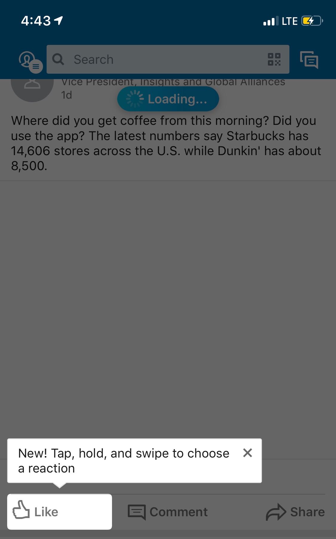
this is a mobile screenshot of linkedIn's new reaction feature being highlighted by a spotlight and tooltip on a mobile device

(Psst: We actually wrote up a whole guide to choosing the right UI pattern for your product tour. Check it out.)

4. Improve design and copy

Users are people and people like pretty things. Folks are more likely to engage with your product tour if it’s well-designed and looks native to your product (as opposed to an obvious third-party integration). If you’re building in-house, that won’t be an issue. Appcues also allows you create native-looking onboarding flows like Qordoba's. (Just sayin’. )
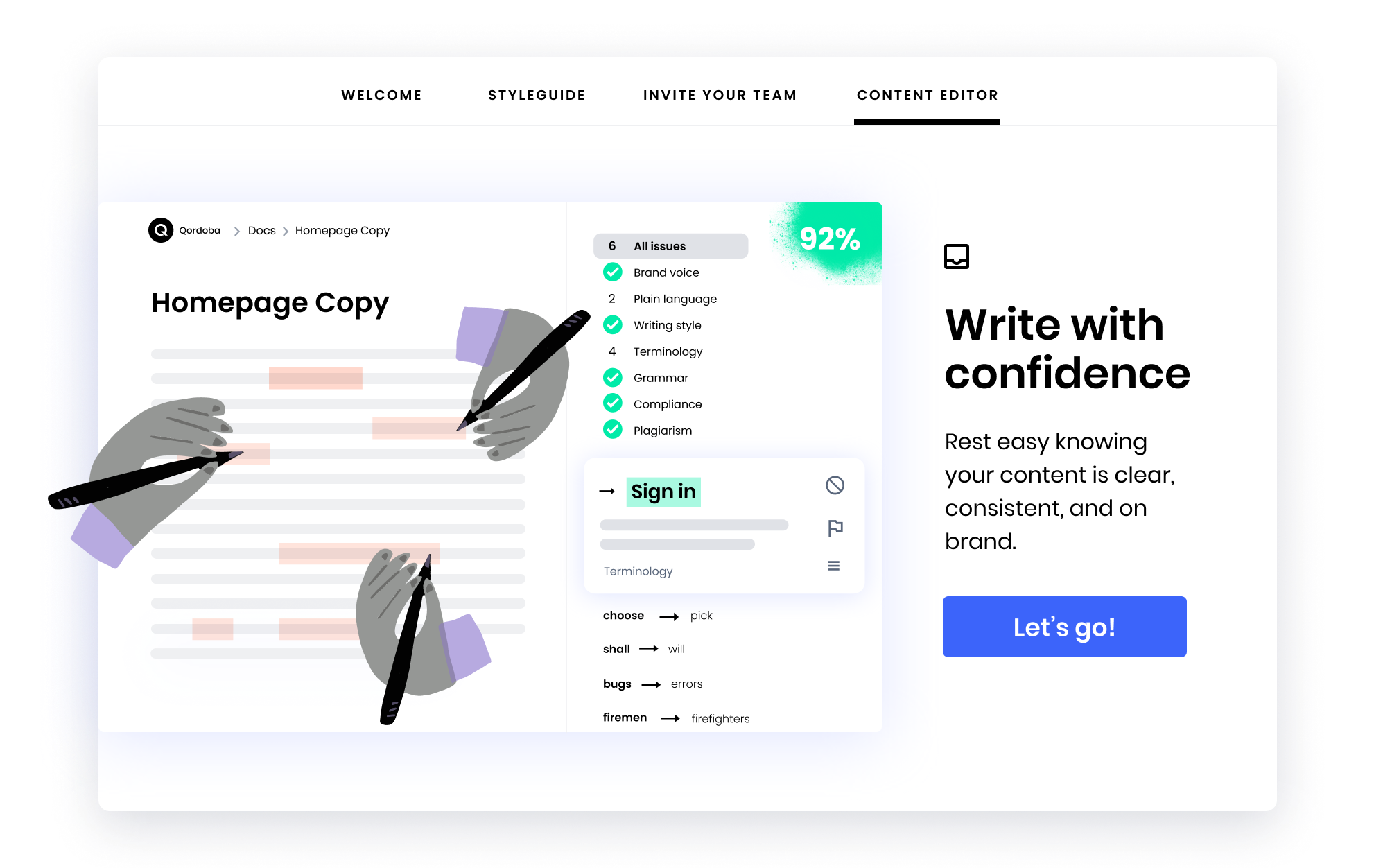
qordoba user onboarding modal made with Appcues

And the importance of good UX copy can’t be overstated. Put some thought into how you’re communicating with users during your product tours. Use clear, concise copy and try to integrate UX power words wherever possible.

What to do if users start a product tour but don’t finish

Your users started a product tour but dropped off somewhere in the middle. This means that your first step was intriguing enough for users to opt in, but the next few steps couldn’t hold their attention.

If this is the case, your user data will show a dip somewhere in the middle of your product tour:
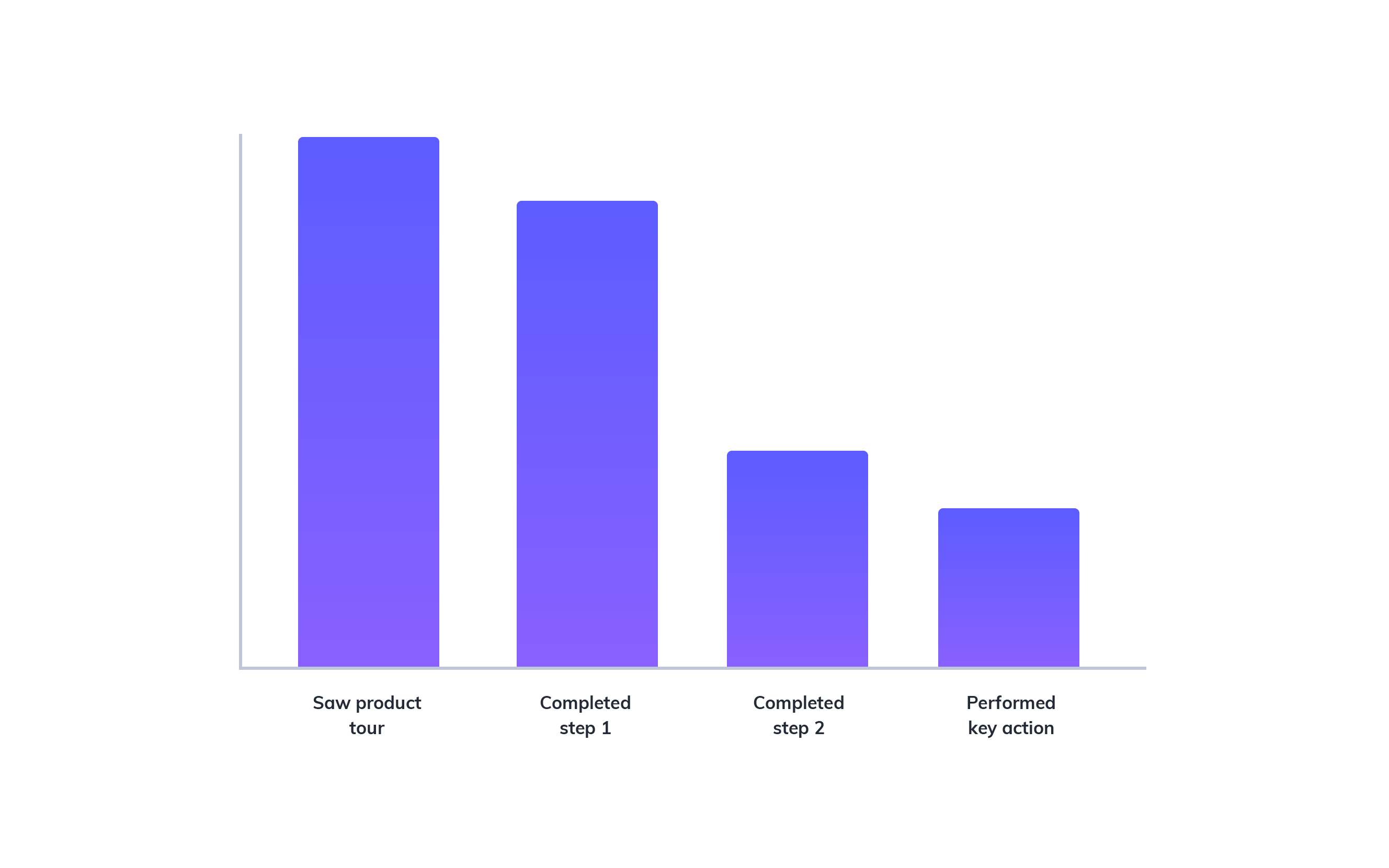
this is a bar graph showing the analytics result of an example product tour in which users abandon the product tour flow after completing the first step

How to make your product tours more effective:

5. Reduce the number of steps

The more steps your product tour contains, the more drop-off points users have.

While some users will surely enjoy the guidance, it’s worth testing different product tour lengths if you do see a dip in the middle of the product tour. Hone in on your product’s core value and eliminate steps that users can discover for themselves at a later time. Remember, effective product tours should reduce time to value, not “time to discovering every feature.”

InVision does a good job of limiting the number of steps in their product tour to 6, even though their toolbar is packed with features. The result is focused onboarding that gives new users the essential information without exhausting their patience:
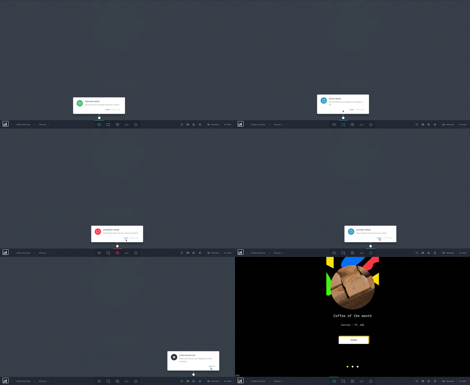
invision product tour number of steps

6. Avoid information overload

If you read the last point and thought “oh great, I’ll just smush all the information in my 9-step product tour into 3 tooltips”—think again! Condensing a ton of information into a short amount of space puts cognitive strain on your users.

Remember back in grade school, when your creative writing teacher told you to “show, not tell” with your writing? Well, the same goes for product tours.

7. Hook users in with upfront value

Your users might have dropped off during the product tour because you didn’t hook them in with a convincing narrative at the start.

For instance, Slack kicked off it's brief product redesign tour with a compelling, straight-forward modal. In 3 short lines, the modal lets users know exactly what kind of information they stand to learn by completing the tour.
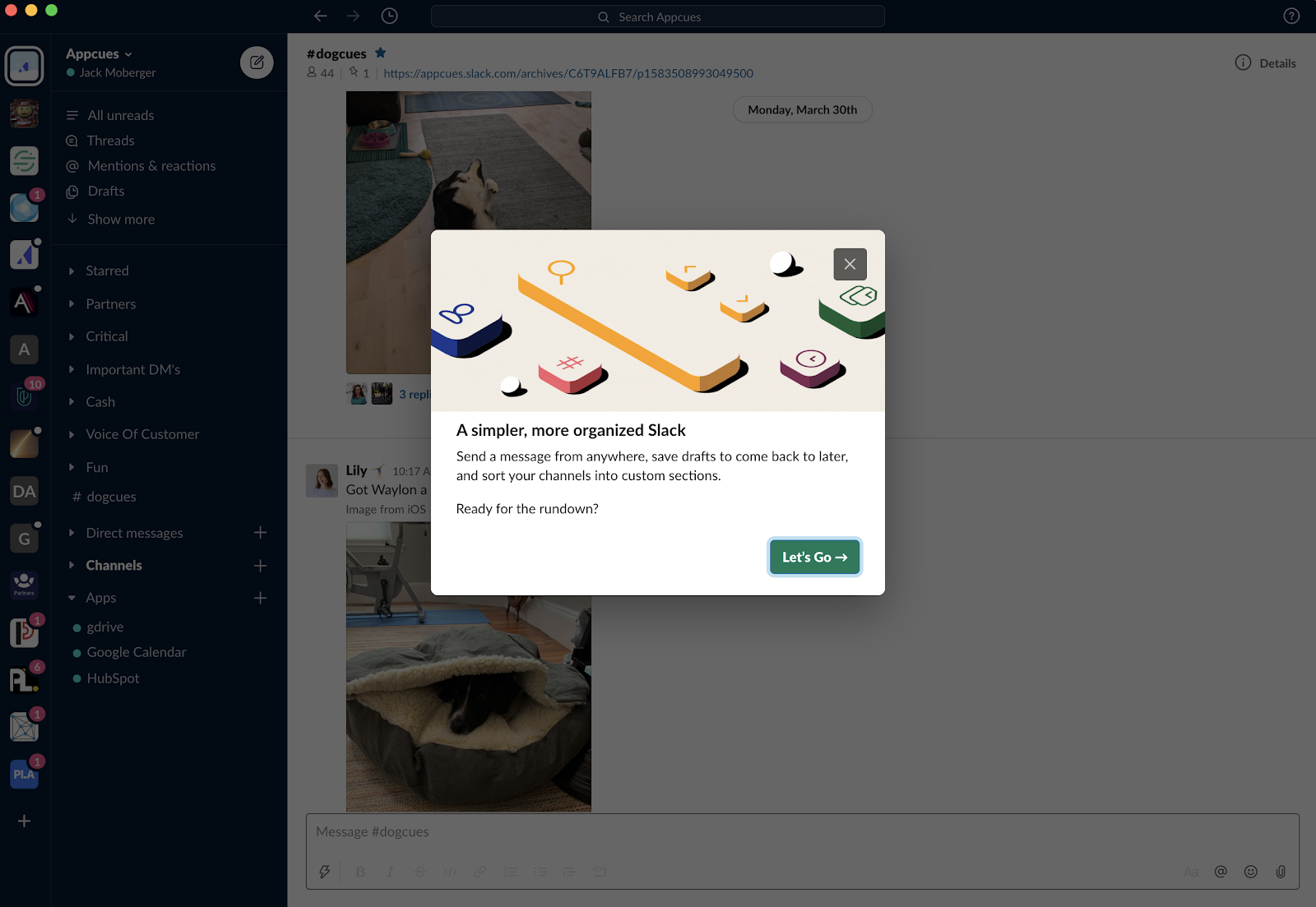
slack redesign product tour modal with upfront value prop

To strike the right chord, you have to know your users. Why are they using your product? What problem are they trying to solve? How does your product solve that problem? How will the features you point out help them achieve their goals? Use the answers to these questions to craft your messaging and keep your product tours focused on the path to value.

Wha to do if users finish a product tour but don't take action

If your users completed the last step of the product tour, but didn’t take the desired action, that’s a sign that your product tour was engaging, but  not optimized for the desired outcome.

Your analytics data would reflect a drop in usage after the last step of the product tour:
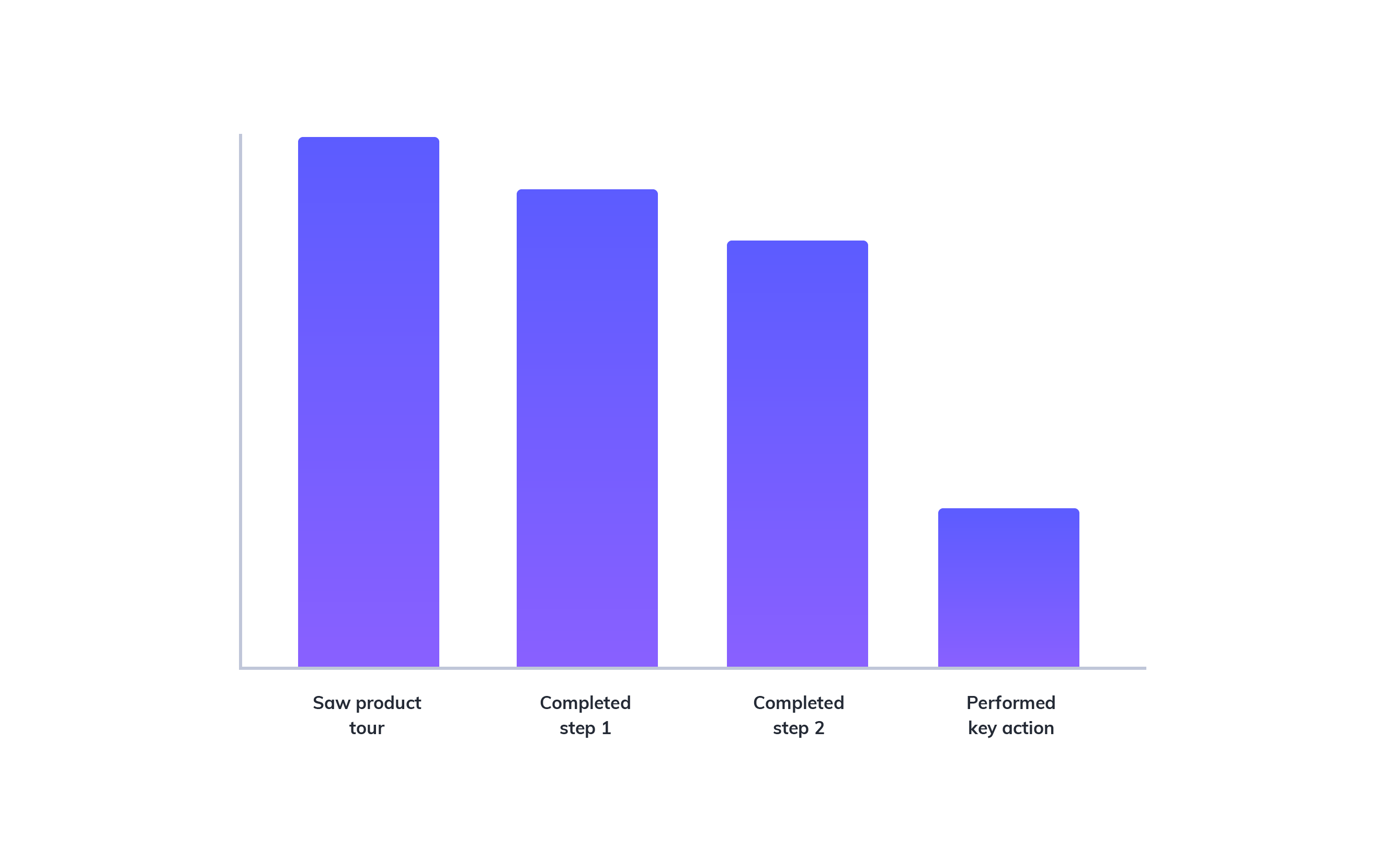
this is a bar graph showing the analytics result of an example product tour in which users abandon the product tour flow after completing the second step

How to make your product tour more effective:

8. Make key actions easier

While it’s tempting to drive users toward a key conversion metric, doing so too early can come off as pushy and turn users off before they have a chance to discover your product offerings.

Vintage marketplace Chairish, for example, uses a single tooltip tour to show users how to save an item, a lower-effort activity that correlates to eventual purchase. Instead of trying to get users to complete a complex or high-stakes action in one fell swoop, use your product tour to reduce friction on the path to conversion by encouraging smaller commitments.
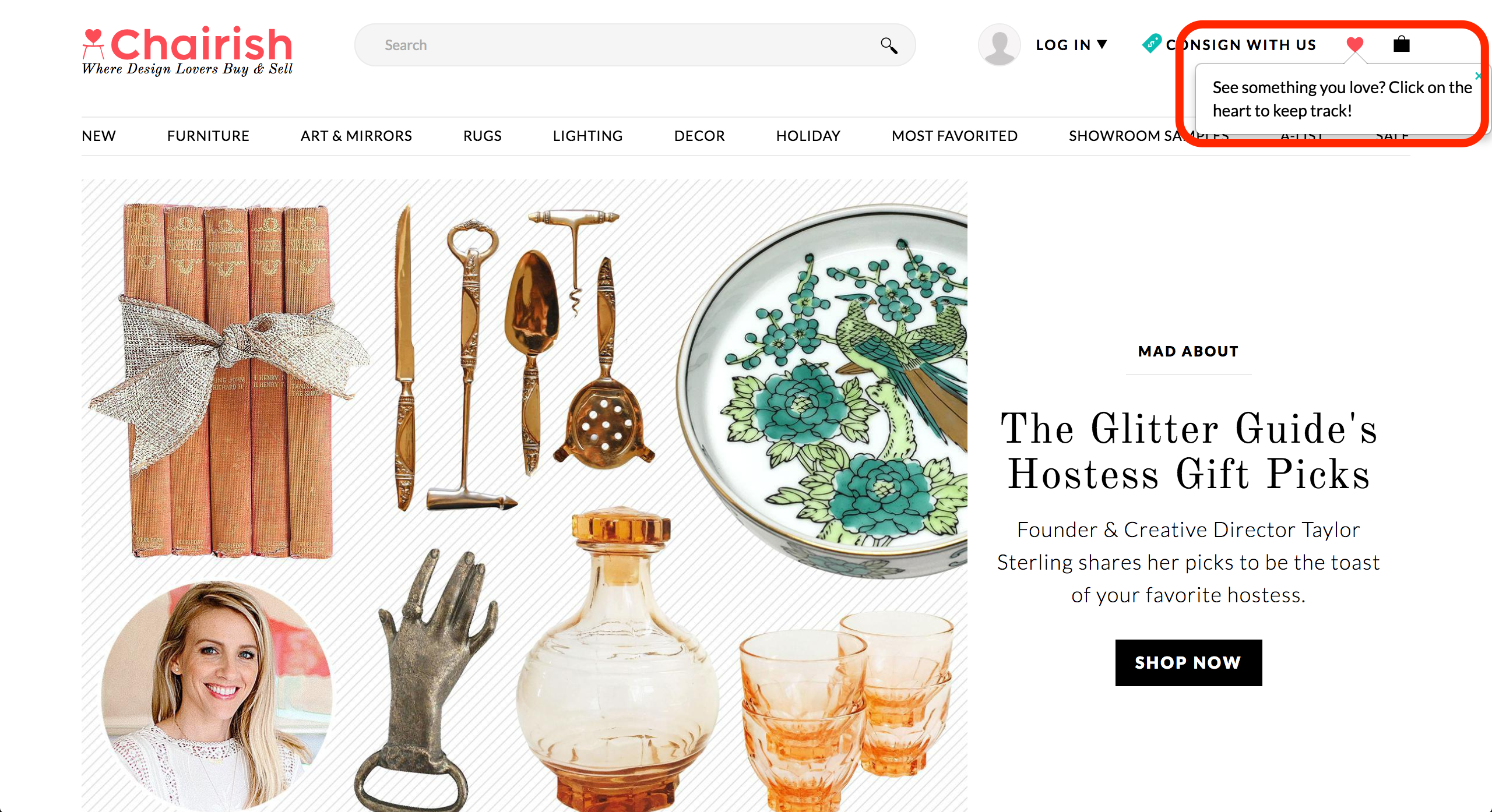
this is an image of ecommerce site chairish. this is an example of a tooltip showing how to add a favorite item. the tooltip is outlined in a red box for emphasis

9. Explain why the action is important

Don’t overlook the importance of explaining why an action matters to the user. Instead of merely pointing to key features, explain why each one is relevant.

This tooltip from is a great example of how being prescriptive can add value:
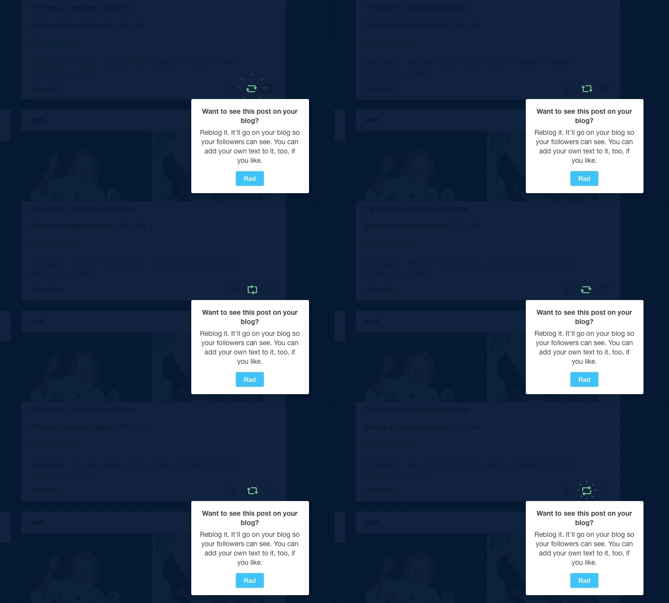
tumblr animated tooltip product tour

No matter how intuitive you think your product is, or how obvious its value, you can’t expect every user to just “get it.” Set clear expectations about the value users can expect to achieve upon completing the product tour.

Effective product tours = a better user experience

The act of building a product tour alone won’t create value. User onboarding is rarely a set it and forget it solution.

Like all user onboarding experiences, the best product tours focus on goals, not features. Build yours with consideration, creativity, and an in-depth understanding of how you can help your users solve a problem. Monitor user behavior to identify bottlenecks, roadblocks, and points of friction that may not have been apparent when you first published your product tour.  Then go back and fix your product tour where it’s broken.

You won’t just be solving a product tour problem—you’ll be solving a much bigger user engagement problem before it starts.

Katryna Balboni
Content and Community Director at User Interviews
Katryna is the Content and Community Director at User Interviews. Before User Interviews, she made magic happen with all things content at Appcues. Her non-work time is spent traveling to new places, befriending street cats, and baking elaborate pies.
Skip to section:

Skip to section:

Product tours do the important job of introducing users to your product or new feature. When done well, they improve UX, motivate users to take key actions, and shorten new users’ time to value—improving activation, conversion, and retention rates. Really, what’s not to love?

Quite a bit, actually.

When they’re used with a heavy hand, product tours can quickly start to feel overbearing and annoying. The additional friction could even block users from discovering your product's aha moment. (Turns out that nice, leisurely 32-step walkthrough wasn't such a good idea!)

And if users don’t find your product tour valuable, you don’t just have a product tour problem—you have the beginnings of a much larger user engagement problem.

That's why it’s so important to continuously monitor the performance of your product tour, analyze your data, and repeatedly iterate on the experience to make sure you’re not just educating users, but also steering them toward desired actions. Without clear goals for your product tour in place, you risk squandering your users' attention and motivation—which, once lost, can be almost impossible to regain.

But don’t despair just yet! The following guide will help you diagnose common product tour issues and give you actionable next steps for fixing each problem and turning your product tour into the effective user onboarding experience it should be.

Read on to learn about what to do if users:

  • Dismiss your product tour immediately
  • Start a tour but don't finish
  • Finish a product tour but don't take action

What to do if users dismiss your product tour immediately

If your users saw your product tour but didn’t opt in, there could be problems with the targeting or design.

Note that opting in can mean slightly different things for different UI patterns. For tooltips, modals, and slideouts that are triggered by landing on the page, this means that the user clicked out of the first element immediately. For hotspots, which are opt-in by nature, it means that the user never clicked the hotspot.

If you’ve set up analytics to track your product tour, you’ll see a drop-off after the initial product tour prompt.

this is a bar graph showing the analytics result of an example product tour in which users abandon the product tour flow after seeing the first prompt

How to make your product tours more effective:

1. Improve targeting

Consider where your product tour appears and why users are navigating there.

New feature announcements are often targeted to appear upon login, when users expect to see their dashboard. If users log into your product regularly to perform specific and quick tasks—such as looking up a customer’s phone number in a CRM—a product tour prompt at login may get in the way.

If the product tour is triggered by an action, it’s worth questioning whether or not that action—visiting a certain page or clicking a button—is meaningful enough or shows enough intent to warrant a product tour.

2. Motivate the right users

If your product tour’s goal is to onboard new users, it’s clear who you should target. But what about improving feature adoption for all users? New users may not know your product enough to care about new features in the same way that power users would.

For example, this new feature walkthrough was shown to returning GoToWebinar users, which makes plenty of sense. But if this message had town to new users who don’t yet know their way around the core UI, his information may not provide the same value and might actually overwhelm and deter action.

go to webinar new feature walkthrough

3. Choose the best UI pattern for the job

The most well-intended product tours can fall flat because they use the wrong UI pattern. A less invasive slideout or a series of well-placed hotspots may be more effective than an attention-grabbing modal window, especially if your users are trying to perform an important task.

If you are going to monopolize users' attention, be quick about it. LinkedIn used a hard spotlight and a single tooltip to effectively draw attention to their new reaction feature. They were walking a fine line, though— any more than one step like this would have felt jarring.

this is a mobile screenshot of linkedIn's new reaction feature being highlighted by a spotlight and tooltip on a mobile device

(Psst: We actually wrote up a whole guide to choosing the right UI pattern for your product tour. Check it out.)

4. Improve design and copy

Users are people and people like pretty things. Folks are more likely to engage with your product tour if it’s well-designed and looks native to your product (as opposed to an obvious third-party integration). If you’re building in-house, that won’t be an issue. Appcues also allows you create native-looking onboarding flows like Qordoba's. (Just sayin’. )

qordoba user onboarding modal made with Appcues

And the importance of good UX copy can’t be overstated. Put some thought into how you’re communicating with users during your product tours. Use clear, concise copy and try to integrate UX power words wherever possible.

What to do if users start a product tour but don’t finish

Your users started a product tour but dropped off somewhere in the middle. This means that your first step was intriguing enough for users to opt in, but the next few steps couldn’t hold their attention.

If this is the case, your user data will show a dip somewhere in the middle of your product tour:

this is a bar graph showing the analytics result of an example product tour in which users abandon the product tour flow after completing the first step

How to make your product tours more effective:

5. Reduce the number of steps

The more steps your product tour contains, the more drop-off points users have.

While some users will surely enjoy the guidance, it’s worth testing different product tour lengths if you do see a dip in the middle of the product tour. Hone in on your product’s core value and eliminate steps that users can discover for themselves at a later time. Remember, effective product tours should reduce time to value, not “time to discovering every feature.”

InVision does a good job of limiting the number of steps in their product tour to 6, even though their toolbar is packed with features. The result is focused onboarding that gives new users the essential information without exhausting their patience:

invision product tour number of steps

6. Avoid information overload

If you read the last point and thought “oh great, I’ll just smush all the information in my 9-step product tour into 3 tooltips”—think again! Condensing a ton of information into a short amount of space puts cognitive strain on your users.

Remember back in grade school, when your creative writing teacher told you to “show, not tell” with your writing? Well, the same goes for product tours.

7. Hook users in with upfront value

Your users might have dropped off during the product tour because you didn’t hook them in with a convincing narrative at the start.

For instance, Slack kicked off it's brief product redesign tour with a compelling, straight-forward modal. In 3 short lines, the modal lets users know exactly what kind of information they stand to learn by completing the tour.

slack redesign product tour modal with upfront value prop

To strike the right chord, you have to know your users. Why are they using your product? What problem are they trying to solve? How does your product solve that problem? How will the features you point out help them achieve their goals? Use the answers to these questions to craft your messaging and keep your product tours focused on the path to value.

Wha to do if users finish a product tour but don't take action

If your users completed the last step of the product tour, but didn’t take the desired action, that’s a sign that your product tour was engaging, but  not optimized for the desired outcome.

Your analytics data would reflect a drop in usage after the last step of the product tour:

this is a bar graph showing the analytics result of an example product tour in which users abandon the product tour flow after completing the second step

How to make your product tour more effective:

8. Make key actions easier

While it’s tempting to drive users toward a key conversion metric, doing so too early can come off as pushy and turn users off before they have a chance to discover your product offerings.

Vintage marketplace Chairish, for example, uses a single tooltip tour to show users how to save an item, a lower-effort activity that correlates to eventual purchase. Instead of trying to get users to complete a complex or high-stakes action in one fell swoop, use your product tour to reduce friction on the path to conversion by encouraging smaller commitments.

this is an image of ecommerce site chairish. this is an example of a tooltip showing how to add a favorite item. the tooltip is outlined in a red box for emphasis

9. Explain why the action is important

Don’t overlook the importance of explaining why an action matters to the user. Instead of merely pointing to key features, explain why each one is relevant.

This tooltip from is a great example of how being prescriptive can add value:

tumblr animated tooltip product tour

No matter how intuitive you think your product is, or how obvious its value, you can’t expect every user to just “get it.” Set clear expectations about the value users can expect to achieve upon completing the product tour.

Effective product tours = a better user experience

The act of building a product tour alone won’t create value. User onboarding is rarely a set it and forget it solution.

Like all user onboarding experiences, the best product tours focus on goals, not features. Build yours with consideration, creativity, and an in-depth understanding of how you can help your users solve a problem. Monitor user behavior to identify bottlenecks, roadblocks, and points of friction that may not have been apparent when you first published your product tour.  Then go back and fix your product tour where it’s broken.

You won’t just be solving a product tour problem—you’ll be solving a much bigger user engagement problem before it starts.

Katryna Balboni
Content and Community Director at User Interviews
Katryna is the Content and Community Director at User Interviews. Before User Interviews, she made magic happen with all things content at Appcues. Her non-work time is spent traveling to new places, befriending street cats, and baking elaborate pies.
You might also like...