← Visit Appcues.com
×
×

User Onboarding Checklists: 6 Examples and How-to Guide
Checklists break complex processes into simple steps and keep users motivated during onboarding.
Skip to section:

Skip to section:

Using a new product can be intimidating or even frustrating for everyone involved. With a great checklist, you can not only help new users through your product and those early frustrations, but also get them to their aha moment faster and more reliably.

In this article, we'll explore the psychology that makes onboarding checklists so effective, look at 6 different in-app implementations, and offer a step-by-step look at how to create them for yourself.

Let's dive in!

4 Steps to Create a User Onboarding Checklist

Creating awesome (and effective) user onboarding checklists is all about careful planning with a sprinkle of creativity. Let's break down the steps involved in designing one.

Step 1: Determine the goal of the checklist

First things first, you need to figure out what you want to achieve with your onboarding checklist. Ask yourself:

  • Besides getting users to adopt your product, what's the ultimate goal you want them to reach?
  • How can your checklist address the specific needs and expectations of your users the first time they open your product?
  • Are there any key milestones or actions users should complete to experience the true value of your product?

Having a crystal-clear goal in mind ensures your checklist hits the mark, combats churn and keeps users on the right track to product adoption.

Step 2: Define the actions users should take

Now that you know where you're headed, it's time to map out the ideal user journey. Here's what you can do:

  • Dive into customer research like Ideal Customer Profiles (ICPs) or user personas to understand your users inside out. Go a step further by adding the key features each type of user would benefit the most from using in their walkthroughs to each persona.
  • Identify the essential tasks users need to complete to achieve the value you promised. Leave no stone unturned, from the tiniest clicks to the grandest achievements.
  • Put yourself in their shoes––observe how users tackle the onboarding process and spot any pain points or areas where they might stumble. Remove as much friction as possible from their workflow to ensure customer satisfaction.

Pre-defining the actions users might take or should take will give you the direction to create a comprehensive checklist that guides them smoothly through the onboarding process.

Check out this comprehensive guide to creating persona-based user experiences.

Step 3: Design a sequential experience

Now comes the fun part—designing a seamless onboarding experience. The main purpose of a checklist is to guide users to their “aha” moment as quickly as possible. So when designing, you need to take into account not only the items that will get them there but the things that might trip them up as well. 

  • Organize the checklist items in a logical order that mirrors the user's journey through onboarding. Nobody likes jumping from one unrelated task to another. If you’re worried that you’re not giving a proper overview of each item on the checklist, use tooltips to collect multiple complex tasks into one cohesive item. 
  • Keep it simple by using clear language for each checklist item so users can easily understand what's expected of them. Simplicity should also show up in how many actions you include in the onboarding flow. Focus on the most important things that can be completed quickly so users can see immediate results.
  • Add a touch of visual flair with icons, progress indicators or animations to give users that warm fuzzy, feeling of progress as they complete each task. Some companies offer rewards (“Complete this checklist in 7 days for another week in your free trial”) while others gamify the process like Duolingo.

With a well-structured and visually appealing checklist, you'll provide users with a roadmap to their jobs to be done (JTBD) that keeps them engaged and excited to explore your product.

Step 4: Tweak, improve, and repeat

Creating user onboarding checklists is an ongoing process of learning and improvement. Make reviewing and analysing the effectiveness of your checklist a formal part of your design process to get the most out of it. 

  • Get feedback from your users. Ask them for their thoughts through surveys or friendly chats. Their insights are gold.
  • Keep an eye on user behavior and important metrics like completion rates, time to value, and retention. This data will tell you if your checklist is hitting the mark or needs a little TLC.
  • Don't be afraid to tinker with everything––the copy, flow or visual style. Continuously refine and iterate your checklist based on the feedback and data you gather.

By continuously tweaking and perfecting your checklist, you'll create an onboarding experience that users love and keep them coming back for more.

Remember, creating user onboarding checklists is an art, not a science. Embrace the process, and experiment with different approaches for optimum product satisfaction.

5 Elements of a Good User Onboarding Checklist

The best user onboarding checklists are extremely detailed and great at getting users to realize why your tool is the best for their needs. If you want yours to be as effective, here are some elements to look out for:

Extremely clear with achievable tasks

The backbone of any great checklist lies in its tasks. Each item should be clear, concise, and easy to understand. The end goal of the checklist should be clear to the user from the first item to better ensure activation.

Clarity also means that unless your user base is highly technical, you should avoid jargon or technical terms that might confuse them. Guide them through the necessary actions step by step in the simplest language possible.

Check out this article for a more in-depth look at how to write great copy for your checklists.

Logical and visual flow

Designing a good checklist requires two things: simple logic for customer success and eye-catching visuals for a good first impression. 

A well-designed checklist follows a logical progression that mirrors the user's journey. Start with the foundational tasks and gradually introduce more advanced ones. This allows users to build their knowledge and skills progressively instead of overwhelming them with complex actions right from the start.

Visuals go hand in hand with logic. Incorporate visual cues, such as icons, progress indicators, and gamification, to guide users and provide a sense of progress. Visual elements not only enhance the checklist's appearance but also make it more engaging and intuitive.

Personalized to each user

Every user is unique, and their onboarding experience should reflect that. Consider offering customization or optional paths within the checklist to accommodate different user preferences or needs.

Better yet, allow users to personalize their onboarding journey by selecting the tasks that align with their specific goals or interests. Headspace takes this approach for new users, allowing them to segment themselves based on where they are in their meditation journey. This flexibility fosters a sense of ownership and ensures a more tailored user onboarding experience.

Celebrates milestones

We all love celebrating accomplishments, and your users are no exception. Break down the onboarding process into milestones or key achievements. 

When users complete a milestone, acknowledge their progress and celebrate their success. It could be a cheerful message, a virtual high-five, or even a small reward. These celebratory moments keep users motivated and eager to continue their onboarding journey.

Constant improvements

Creating a user onboarding checklist is not a one-and-done task. Collect feedback specific to the onboarding experience and use the insights to iterate and improve your checklist over time.

Continuously refine and optimize the checklist based on user feedback, overall analytics (“Which checklist item led to the most drop-offs?”), and evolving user needs. As your tool and users evolve, make the necessary adjustments to deliver an exceptional onboarding experience.

Callout: Apply these elements to your checklists with Appcues’ Checklists

6 User Onboarding Checklist Examples for Inspiration

Here are some onboarding checklists to inspire you.
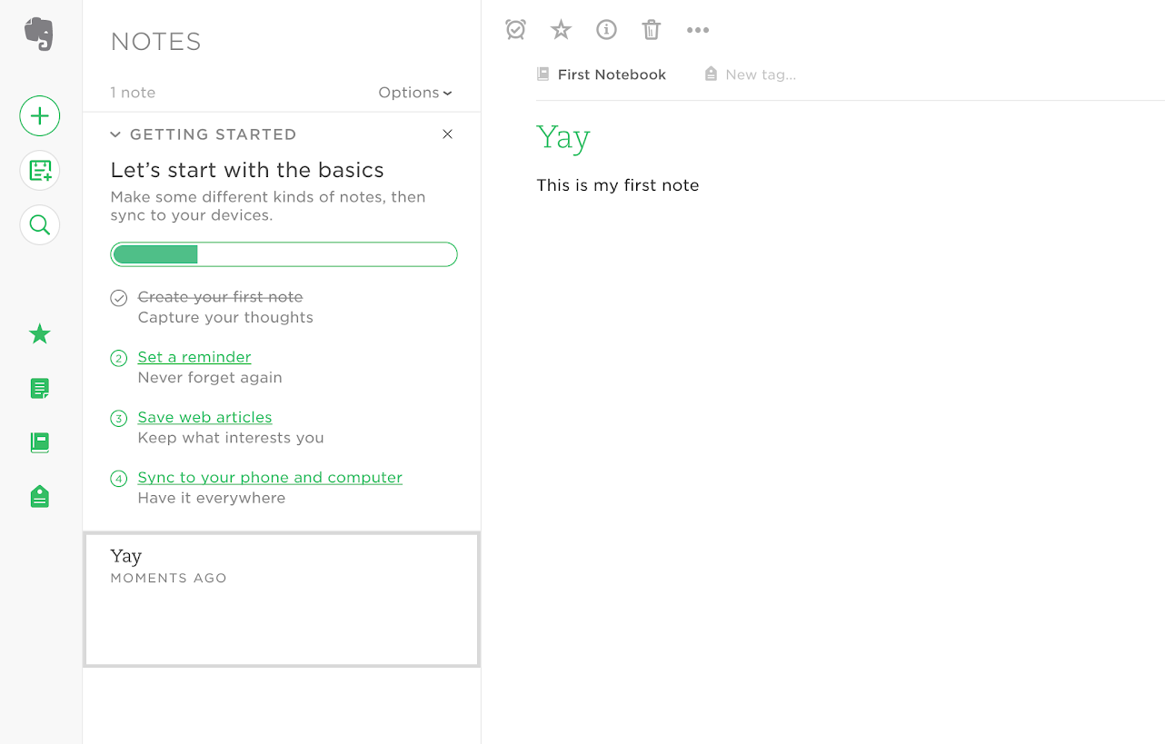
✅ 1. A quick-win checklist to keep motivation high

evernote user onboarding basics checklist

Evernote's onboarding checklist kicks off with a simple, easy-to-complete task: create a new note. 

Within seconds of launching the app, new users can click a single button and tick off the first step in the onboarding process, unlocking the “feel good” factor that comes from a job well done. 

But this quick win does more than offer a rush of dopamine; it also builds on the psychological principle of commitment and consistency. When we commit to a course of action, we become psychologically invested in seeing our decision through to the end. Evernote's checklist sucks us in with a quick and simple first step and, in doing so, gives an incentive to continue through the setup process. 

The “Quick Win” checklist works particularly well for Evernote because that first step highlights the product’s core value—simple, organized note taking. It demonstrates how quick and easy it is to get your ideas out of your head and into a notebook that's accessible from anywhere in the world. In a single step, new users have both committed to the onboarding process and reached a valuable aha moment

Best used by: Products with a simple, easy-to-reach aha moment—an in-app action that demonstrates immediate value.
✅ 2. A partially completed checklist to drive feature adoption

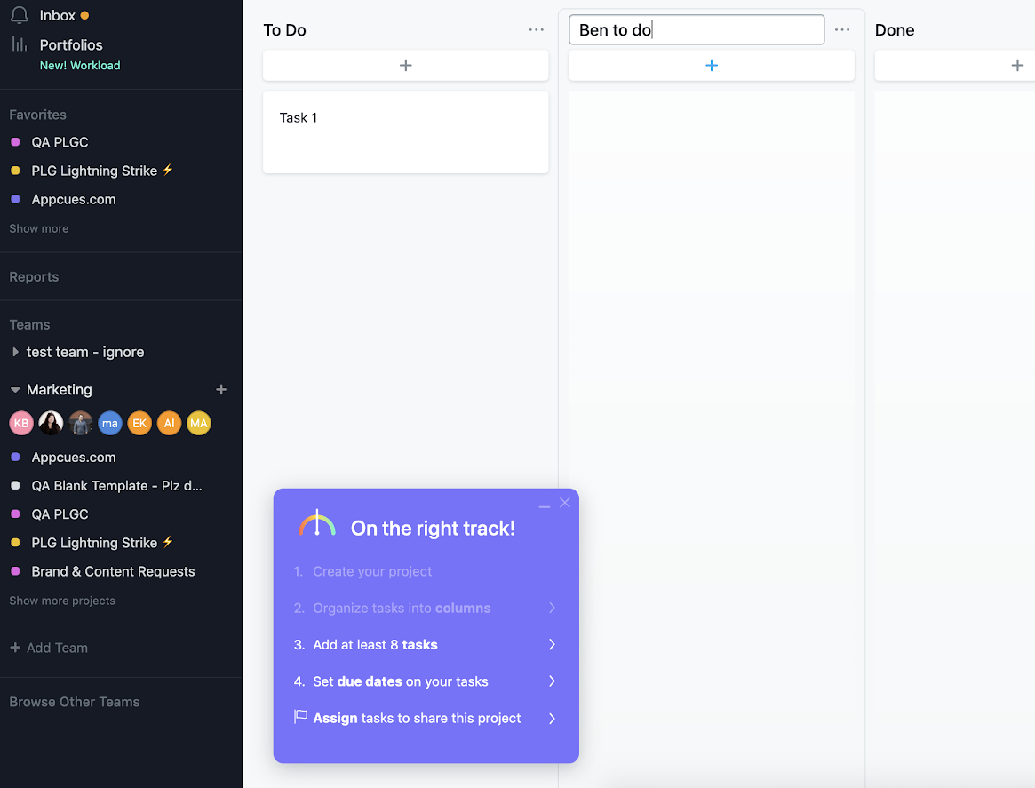
Asana feature adoption checklist

Getting users to explore and adopt new features is an important part of creating product stickiness and improving retention. But it’s easier said than done. 

Asana’s project board onboarding process, for example, consists of several steps that are essential to getting a user up and running with the feature.

But if left to their own devices, there is a strong likelihood that users would bypass the onboarding and jump right into using the feature without understanding the fundamentals. As a result, there’s a much higher likelihood users miss the “aha moment” and drop the feature—or even the entire product—itself..

To motivate more users to adopt the feature, Asana used a punchy onboarding checklist that opens up with the first task already marked off as complete.

The checklist sits on top of the main dashboard, acting as a persistent reminder of where users are in the process. A combination of visual cues like faded and bolded text alongside “On the right track!” copy, emphasizes incomplete tasks. Since the list is of to-dos is short, that incompleteness is motivating, rather than discouraging.  

That’s because Asana’s checklist harnesses the principles of the Zeigarnik Effect, which states objectives left incomplete will overwhelm a person’s thoughts overtime and drive them to complete them. If you’ve ever ended an episode or book chapter on  a cliff-hanger, you know the feeling all too well. Just like the viewer that clicks “next episode” or the reader that turns the page, users want to see a checklist finished. 

Best used by: Products that require lots of small tasks to get set up.
✅ 3. The subtle checklist that lets users go at their own pace 

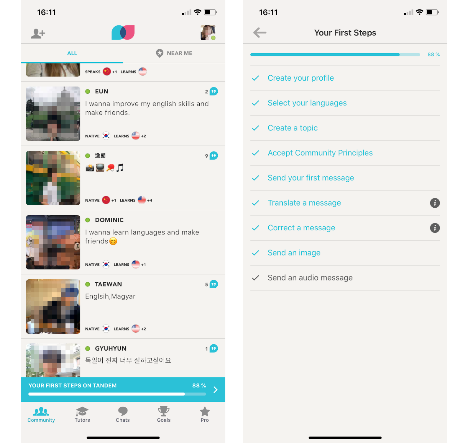
tandem language learning app subtle mobile checklist

Tandem is a language exchange app that lets users practice their language skills with native speakers.

The app opts for a more subtle approach to the onboarding checklist. Tandem uses a progress bar just above the navigation bar to alert new users to the fact that they have unfinished tasks but that the finish line is in sight.

Tapping on the banner opens up the full onboarding checklist, while scrolling up hides the progress bar. This tactic is effective because it reminds users that they’ve left something incomplete without disrupting their in-app experience. 

Tandem’s approach to the classic onboarding checklist is effective because it lets the user drive the pace at which they explore the app’s various features without letting important tasks fall by the wayside. 

Best used by: Apps that have onboarding tasks that are non-essential for functionality but still important to getting users to experience maximum value.
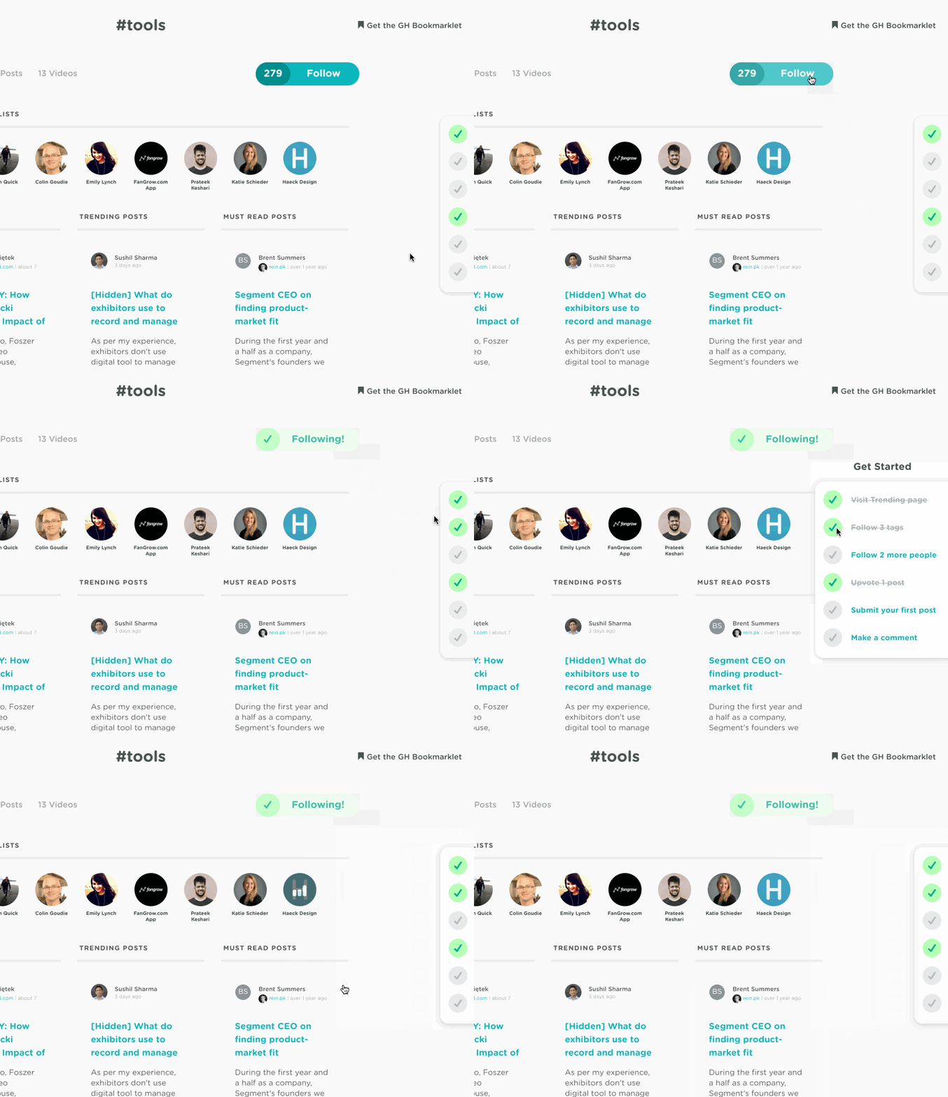
✅ 4. A "network effect" checklist that kickstarts engagement

user onboarding animated checklist from growth hackers

For unfamiliar with the term , let’s quickly define what a  network effect is:

Network effect = similar to virality, but defined by team-led growth that is primarily contained within an organization and usually driven by the pursuit of productivity and efficiency

GrowthHackers understands that a network effect, which begins by inviting and interacting with other users,  can drive up adoption and retention within a product. They use their onboarding checklist to kickstart the network effect and get new users active in the GH community as quickly as possible.

The milestones set by the checklist center around connection and contribution. GrowthHackers aims to inspire user engagement by creating connections amongst like-minded peers and colleagues. 

We like that this checklist example uses deep-links for easy task completion and updates in real-time. The side-bar onboarding experience follows users along on their journey without being overly intrusive. 

Best used by: Products with a social element that measure successful user engagement in terms of user interaction, collaboration, and communication. 

✅ 5. An interactive tutorial checklist for flexible onboarding

airtable user onboarding checklists animated minimizing

Airtable is a powerful tool that's used in thousands of different ways, from managing UX research to categorizing cheeses. But the more flexible a product is, the harder it can be to create a one-size-fits-all onboarding process. Even if you can cater to the most common use cases, you still risk alienating users who have a different vision. 

Airtable sidesteps the traditionally prescriptive onboarding process by using a simple six-step checklist to launch short, visual tutorials. Instead of requiring new users to engage in complex tasks that might not be relevant to their needs, the Airtable highlights a handful of key product features, such as creating custom views to sort data and adding collaborators to a project. 

New users are free to engage with each tutorial as much as they like, effectively personalizing the onboarding process to focus only on the parts of the tool that match interests. Each tutorial minimizes down to a color-coded icon, with a friendly little check mark appearing as users complete each lesson.  

Best used by: Powerful products with dozens of different use cases that require a flexible, opt-in approach to onboarding. 
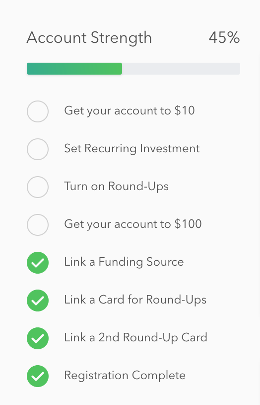
✅ 6. An "account strength" checklist that fast-tracks power usage

acorns user onboarding account strength checklist

Acorns is a popular mobile app that lets you automatically invest your spare change. There are at least 8 steps to become a fully activated user, so Acorns created a straight-forward onboarding checklist to let users see exactly what's left in the process.

The nice thing about this checklist is that it indicates a long-term vision for user success. The first threshold (getting your account to $10) is achievable, giving users a feeling of success before embarking on the the more challenging task of getting to $100. But until that goalpost is reached, the prominent progress bar at the top nudges the user to continue on.

Best used by: Products that have high levels of engagement and want to get activated users to become power users.

User onboarding checklist FAQ

Why are user onboarding checklists important?

In the simplest terms, user onboarding checklists reduce churn and drive conversions. More broadly, checklists:

  • Minimize confusion and guide users through the onboarding process, reducing frustration and friction.
  • Provide a structured roadmap, ensuring users don't miss crucial steps or features and helping them understand the product's value.
  • Encourage user participation, increasing engagement and motivation during the onboarding phase.
  • Help users reach their "aha" moments faster, improving satisfaction and retention.
  • Set users up for long-term success by equipping them with the knowledge and skills needed to maximize product usage and benefits.

What makes a good user onboarding checklist?

A good checklist drives user activation by helping them realize where and how this new tool fits into their workflow and addresses their needs.

Set customers up for success

The onboarding checklist brings a much-needed dose of simplicity to products that are growing more complex by the day. It provides a clear structure to help users navigate even the most involved setup processes and taps into potent psychological principles to make the tedious process of onboarding a bit more enjoyable. 

Most importantly, it clears the way for a great customer experience. It provides new users with the knowledge they need to use your product to its full potential, setting them up for months and years of success, long after the onboarding process is finished.

👉Want to add an onboarding checklist to your own product? Appcues Checklists lets you build, publish, and iterate on checklists—no coding needed. Check it out!
Go to the ultimate guide to user onboarding. Discover user onboarding definitions, examples, best practices, and resources.
Katryna Balboni
Content and Community Director at User Interviews
Katryna is the Content and Community Director at User Interviews. Before User Interviews, she made magic happen with all things content at Appcues. Her non-work time is spent traveling to new places, befriending street cats, and baking elaborate pies.
Skip to section:

Skip to section:

Using a new product can be intimidating or even frustrating for everyone involved. With a great checklist, you can not only help new users through your product and those early frustrations, but also get them to their aha moment faster and more reliably.

In this article, we'll explore the psychology that makes onboarding checklists so effective, look at 6 different in-app implementations, and offer a step-by-step look at how to create them for yourself.

Let's dive in!

4 Steps to Create a User Onboarding Checklist

Creating awesome (and effective) user onboarding checklists is all about careful planning with a sprinkle of creativity. Let's break down the steps involved in designing one.

Step 1: Determine the goal of the checklist

First things first, you need to figure out what you want to achieve with your onboarding checklist. Ask yourself:

  • Besides getting users to adopt your product, what's the ultimate goal you want them to reach?
  • How can your checklist address the specific needs and expectations of your users the first time they open your product?
  • Are there any key milestones or actions users should complete to experience the true value of your product?

Having a crystal-clear goal in mind ensures your checklist hits the mark, combats churn and keeps users on the right track to product adoption.

Step 2: Define the actions users should take

Now that you know where you're headed, it's time to map out the ideal user journey. Here's what you can do:

  • Dive into customer research like Ideal Customer Profiles (ICPs) or user personas to understand your users inside out. Go a step further by adding the key features each type of user would benefit the most from using in their walkthroughs to each persona.
  • Identify the essential tasks users need to complete to achieve the value you promised. Leave no stone unturned, from the tiniest clicks to the grandest achievements.
  • Put yourself in their shoes––observe how users tackle the onboarding process and spot any pain points or areas where they might stumble. Remove as much friction as possible from their workflow to ensure customer satisfaction.

Pre-defining the actions users might take or should take will give you the direction to create a comprehensive checklist that guides them smoothly through the onboarding process.

Check out this comprehensive guide to creating persona-based user experiences.

Step 3: Design a sequential experience

Now comes the fun part—designing a seamless onboarding experience. The main purpose of a checklist is to guide users to their “aha” moment as quickly as possible. So when designing, you need to take into account not only the items that will get them there but the things that might trip them up as well. 

  • Organize the checklist items in a logical order that mirrors the user's journey through onboarding. Nobody likes jumping from one unrelated task to another. If you’re worried that you’re not giving a proper overview of each item on the checklist, use tooltips to collect multiple complex tasks into one cohesive item. 
  • Keep it simple by using clear language for each checklist item so users can easily understand what's expected of them. Simplicity should also show up in how many actions you include in the onboarding flow. Focus on the most important things that can be completed quickly so users can see immediate results.
  • Add a touch of visual flair with icons, progress indicators or animations to give users that warm fuzzy, feeling of progress as they complete each task. Some companies offer rewards (“Complete this checklist in 7 days for another week in your free trial”) while others gamify the process like Duolingo.

With a well-structured and visually appealing checklist, you'll provide users with a roadmap to their jobs to be done (JTBD) that keeps them engaged and excited to explore your product.

Step 4: Tweak, improve, and repeat

Creating user onboarding checklists is an ongoing process of learning and improvement. Make reviewing and analysing the effectiveness of your checklist a formal part of your design process to get the most out of it. 

  • Get feedback from your users. Ask them for their thoughts through surveys or friendly chats. Their insights are gold.
  • Keep an eye on user behavior and important metrics like completion rates, time to value, and retention. This data will tell you if your checklist is hitting the mark or needs a little TLC.
  • Don't be afraid to tinker with everything––the copy, flow or visual style. Continuously refine and iterate your checklist based on the feedback and data you gather.

By continuously tweaking and perfecting your checklist, you'll create an onboarding experience that users love and keep them coming back for more.

Remember, creating user onboarding checklists is an art, not a science. Embrace the process, and experiment with different approaches for optimum product satisfaction.

5 Elements of a Good User Onboarding Checklist

The best user onboarding checklists are extremely detailed and great at getting users to realize why your tool is the best for their needs. If you want yours to be as effective, here are some elements to look out for:

Extremely clear with achievable tasks

The backbone of any great checklist lies in its tasks. Each item should be clear, concise, and easy to understand. The end goal of the checklist should be clear to the user from the first item to better ensure activation.

Clarity also means that unless your user base is highly technical, you should avoid jargon or technical terms that might confuse them. Guide them through the necessary actions step by step in the simplest language possible.

Check out this article for a more in-depth look at how to write great copy for your checklists.

Logical and visual flow

Designing a good checklist requires two things: simple logic for customer success and eye-catching visuals for a good first impression. 

A well-designed checklist follows a logical progression that mirrors the user's journey. Start with the foundational tasks and gradually introduce more advanced ones. This allows users to build their knowledge and skills progressively instead of overwhelming them with complex actions right from the start.

Visuals go hand in hand with logic. Incorporate visual cues, such as icons, progress indicators, and gamification, to guide users and provide a sense of progress. Visual elements not only enhance the checklist's appearance but also make it more engaging and intuitive.

Personalized to each user

Every user is unique, and their onboarding experience should reflect that. Consider offering customization or optional paths within the checklist to accommodate different user preferences or needs.

Better yet, allow users to personalize their onboarding journey by selecting the tasks that align with their specific goals or interests. Headspace takes this approach for new users, allowing them to segment themselves based on where they are in their meditation journey. This flexibility fosters a sense of ownership and ensures a more tailored user onboarding experience.

Celebrates milestones

We all love celebrating accomplishments, and your users are no exception. Break down the onboarding process into milestones or key achievements. 

When users complete a milestone, acknowledge their progress and celebrate their success. It could be a cheerful message, a virtual high-five, or even a small reward. These celebratory moments keep users motivated and eager to continue their onboarding journey.

Constant improvements

Creating a user onboarding checklist is not a one-and-done task. Collect feedback specific to the onboarding experience and use the insights to iterate and improve your checklist over time.

Continuously refine and optimize the checklist based on user feedback, overall analytics (“Which checklist item led to the most drop-offs?”), and evolving user needs. As your tool and users evolve, make the necessary adjustments to deliver an exceptional onboarding experience.

Callout: Apply these elements to your checklists with Appcues’ Checklists

6 User Onboarding Checklist Examples for Inspiration

Here are some onboarding checklists to inspire you.

✅ 1. A quick-win checklist to keep motivation high

evernote user onboarding basics checklist

Evernote's onboarding checklist kicks off with a simple, easy-to-complete task: create a new note. 

Within seconds of launching the app, new users can click a single button and tick off the first step in the onboarding process, unlocking the “feel good” factor that comes from a job well done. 

But this quick win does more than offer a rush of dopamine; it also builds on the psychological principle of commitment and consistency. When we commit to a course of action, we become psychologically invested in seeing our decision through to the end. Evernote's checklist sucks us in with a quick and simple first step and, in doing so, gives an incentive to continue through the setup process. 

The “Quick Win” checklist works particularly well for Evernote because that first step highlights the product’s core value—simple, organized note taking. It demonstrates how quick and easy it is to get your ideas out of your head and into a notebook that's accessible from anywhere in the world. In a single step, new users have both committed to the onboarding process and reached a valuable aha moment

Best used by: Products with a simple, easy-to-reach aha moment—an in-app action that demonstrates immediate value.

✅ 2. A partially completed checklist to drive feature adoption

Asana feature adoption checklist

Getting users to explore and adopt new features is an important part of creating product stickiness and improving retention. But it’s easier said than done. 

Asana’s project board onboarding process, for example, consists of several steps that are essential to getting a user up and running with the feature.

But if left to their own devices, there is a strong likelihood that users would bypass the onboarding and jump right into using the feature without understanding the fundamentals. As a result, there’s a much higher likelihood users miss the “aha moment” and drop the feature—or even the entire product—itself..

To motivate more users to adopt the feature, Asana used a punchy onboarding checklist that opens up with the first task already marked off as complete.

The checklist sits on top of the main dashboard, acting as a persistent reminder of where users are in the process. A combination of visual cues like faded and bolded text alongside “On the right track!” copy, emphasizes incomplete tasks. Since the list is of to-dos is short, that incompleteness is motivating, rather than discouraging.  

That’s because Asana’s checklist harnesses the principles of the Zeigarnik Effect, which states objectives left incomplete will overwhelm a person’s thoughts overtime and drive them to complete them. If you’ve ever ended an episode or book chapter on  a cliff-hanger, you know the feeling all too well. Just like the viewer that clicks “next episode” or the reader that turns the page, users want to see a checklist finished. 

Best used by: Products that require lots of small tasks to get set up.

✅ 3. The subtle checklist that lets users go at their own pace 

tandem language learning app subtle mobile checklist

Tandem is a language exchange app that lets users practice their language skills with native speakers.

The app opts for a more subtle approach to the onboarding checklist. Tandem uses a progress bar just above the navigation bar to alert new users to the fact that they have unfinished tasks but that the finish line is in sight.

Tapping on the banner opens up the full onboarding checklist, while scrolling up hides the progress bar. This tactic is effective because it reminds users that they’ve left something incomplete without disrupting their in-app experience. 

Tandem’s approach to the classic onboarding checklist is effective because it lets the user drive the pace at which they explore the app’s various features without letting important tasks fall by the wayside. 

Best used by: Apps that have onboarding tasks that are non-essential for functionality but still important to getting users to experience maximum value.

✅ 4. A "network effect" checklist that kickstarts engagement

user onboarding animated checklist from growth hackers

For unfamiliar with the term , let’s quickly define what a  network effect is:

Network effect = similar to virality, but defined by team-led growth that is primarily contained within an organization and usually driven by the pursuit of productivity and efficiency

GrowthHackers understands that a network effect, which begins by inviting and interacting with other users,  can drive up adoption and retention within a product. They use their onboarding checklist to kickstart the network effect and get new users active in the GH community as quickly as possible.

The milestones set by the checklist center around connection and contribution. GrowthHackers aims to inspire user engagement by creating connections amongst like-minded peers and colleagues. 

We like that this checklist example uses deep-links for easy task completion and updates in real-time. The side-bar onboarding experience follows users along on their journey without being overly intrusive. 

Best used by: Products with a social element that measure successful user engagement in terms of user interaction, collaboration, and communication. 

✅ 5. An interactive tutorial checklist for flexible onboarding

airtable user onboarding checklists animated minimizing

Airtable is a powerful tool that's used in thousands of different ways, from managing UX research to categorizing cheeses. But the more flexible a product is, the harder it can be to create a one-size-fits-all onboarding process. Even if you can cater to the most common use cases, you still risk alienating users who have a different vision. 

Airtable sidesteps the traditionally prescriptive onboarding process by using a simple six-step checklist to launch short, visual tutorials. Instead of requiring new users to engage in complex tasks that might not be relevant to their needs, the Airtable highlights a handful of key product features, such as creating custom views to sort data and adding collaborators to a project. 

New users are free to engage with each tutorial as much as they like, effectively personalizing the onboarding process to focus only on the parts of the tool that match interests. Each tutorial minimizes down to a color-coded icon, with a friendly little check mark appearing as users complete each lesson.  

Best used by: Powerful products with dozens of different use cases that require a flexible, opt-in approach to onboarding. 

✅ 6. An "account strength" checklist that fast-tracks power usage

acorns user onboarding account strength checklist

Acorns is a popular mobile app that lets you automatically invest your spare change. There are at least 8 steps to become a fully activated user, so Acorns created a straight-forward onboarding checklist to let users see exactly what's left in the process.

The nice thing about this checklist is that it indicates a long-term vision for user success. The first threshold (getting your account to $10) is achievable, giving users a feeling of success before embarking on the the more challenging task of getting to $100. But until that goalpost is reached, the prominent progress bar at the top nudges the user to continue on.

Best used by: Products that have high levels of engagement and want to get activated users to become power users.

User onboarding checklist FAQ

Why are user onboarding checklists important?

In the simplest terms, user onboarding checklists reduce churn and drive conversions. More broadly, checklists:

  • Minimize confusion and guide users through the onboarding process, reducing frustration and friction.
  • Provide a structured roadmap, ensuring users don't miss crucial steps or features and helping them understand the product's value.
  • Encourage user participation, increasing engagement and motivation during the onboarding phase.
  • Help users reach their "aha" moments faster, improving satisfaction and retention.
  • Set users up for long-term success by equipping them with the knowledge and skills needed to maximize product usage and benefits.

What makes a good user onboarding checklist?

A good checklist drives user activation by helping them realize where and how this new tool fits into their workflow and addresses their needs.

Set customers up for success

The onboarding checklist brings a much-needed dose of simplicity to products that are growing more complex by the day. It provides a clear structure to help users navigate even the most involved setup processes and taps into potent psychological principles to make the tedious process of onboarding a bit more enjoyable. 

Most importantly, it clears the way for a great customer experience. It provides new users with the knowledge they need to use your product to its full potential, setting them up for months and years of success, long after the onboarding process is finished.

👉Want to add an onboarding checklist to your own product? Appcues Checklists lets you build, publish, and iterate on checklists—no coding needed. Check it out!

Go to the ultimate guide to user onboarding. Discover user onboarding definitions, examples, best practices, and resources.
Katryna Balboni
Content and Community Director at User Interviews
Katryna is the Content and Community Director at User Interviews. Before User Interviews, she made magic happen with all things content at Appcues. Her non-work time is spent traveling to new places, befriending street cats, and baking elaborate pies.
You might also like...