
.png)
Some of your most important UX decisions will be the things you don't do. Not building that hamburger menu, not changing your scrolling direction, or not adding an all-meme messaging system could be the decision that makes it easier for people to stay engaged with your product for longer.
%252520(1).jpeg)
If you make mistakes along the road to product perfection, that's okay—these mistakes are opportunities to understand what your users really need. But just because they're okay doesn't mean you need to make every single one, and a really bad UX decision—when overlooked for too long—can frustrate and alienate users. Instead, learn from experts (like us), so you can avoid the most common UI and UX mistakes that far too many products fall victim to.
Below, we break down some of the most common UX mistakes that show up even in popular products with talented teams. Learn from these mistakes so that you can avoid them in your own product. If some of these look a little too familiar, you’ll learn how to fix your bad UX and develop a user experience that’s as easy as child’s play.
Symbols are great for UX because they save space and don’t rely on language skills, but they can also be incredibly confusing if they aren’t properly designed. When people can’t figure out what a certain symbol represents and decide not to click it, you have a discoverability problem. Low discoverability means that your users aren’t finding your features, and they can’t adopt what they don’t know about.
This isn't just an aspect of bad digital design—bad discoverability plagues everyday analog objects, too. Design consultant Don Norman coined the term “Norman door” to refer to a door that doesn't signal how someone should open it with its design.
%252520(1).jpeg)
Some products become digital “Norman Doors” by building buttons or features that may as well be written in ancient Sumerian. For example, to someone who has never used Google Translate before, this symbol beside the microphone is really bad UX design. Is it a snake? A lasso? Nope. It’s a symbol that allows you to write words with your finger on the touch screen.
%252520(1).jpeg)
Over time, people will discover this function for themselves on commonly used products like Google Translate. However, that won’t work in larger products with more features. Users won’t put in that effort and will instead stick to the functions they can more easily discover and make use of.
More discoverable UX begins with smart development and is refined over time with user feedback. Each symbol and feature doesn't need to be instantly recognizable on its own (though that helps). However, the average user should come out of your onboarding with all of the tools they need to discover your features on their own.
If you find you have to over-explain your features’ functions, they're probably too complex. On the flip side, not offering an explanation to new users should be an informed decision—not an oversight based on assumptions about your users’ inherent product intuition.
Menus can be the ultimate timesaving tool. They allow users to zip around a site or product with only a click or two, but they become inoperable messes when they’re implemented poorly.
It’s often easier to stick everything in your menu than to take the time to simplify your offerings or site structure to improve your UX. The well-intentioned clean design you start with at launch can quickly become bloated as new features get tacked on to an ever-growing monster that lives at the top of your screen.
.jpeg)
Two of the worst offenders are dropdown menus and hamburger menus because they both sacrifice user experience for design simplicity. Dropdown menus are not only annoying (they make users click multiple times to perform a single action), but they also make it easy for users to make a mistake by clustering choices so close together in horizontal lines. Similarly, hamburger menus hide your brilliant features (where they might get forgotten) and force users to tap or click multiple times to get anywhere.
Fixing these crimes-against-UX is as easy as a simple redesign, and the results can be dramatic. When Facebook changed their iOS mobile design to include a tab bar on the bottom instead of a hamburger menu in the top left corner, they saw increased engagement, user satisfaction, revenue, and speed perception.
.jpeg)
The change is subtle, but by creating a more intuitive UI design that showcases your features instead of hiding them in dropdowns or hamburgers, you give your users a better experience overall.
Instead of falling back on the most convenient option (convenient for designers, not users, that is), look for alternative menu designs that show users what they want and make it hard for them to mess up:
Oftentimes, these so-called simple menu styles aren’t simple at all—they’re just hiding their complexities. They’re the equivalent of shoving all your junk into a closet and calling your room clean. Creating intuitive menus isn’t easy, but that doesn’t mean you should shift the burden onto users with a lazy design. So if you’re guilty of this design faux pas, start experimenting with new interface designs and see how you can create a visible, intuitive menu that puts users and usability front and center.
When you use data about your user to build genuine, personalized recommendations, it goes so much further than a “Hi there, {customer.first_name}}!” True product personalization takes a little more effort but yields a much higher payoff in terms of UX and engagement.
Everyone's inbox is full of subject lines with their name. This was once a useful tactic for building better relationships with customers by adding in an element of personalization that they could connect to. But nowadays, first-name tokens feel like shallow attempts at personalization (even when people don't mess them up).
.jpeg)
The real value of personalization lies in using what is unique about a person and their product usage to help them reach their goals and increase engagement faster. It’s about making each user feel like your product has been tailored to their individual needs.
One area where personalization is always appreciated is onboarding. A user wants to know how a product will help them, not someone else with an entirely different use case. And it’s not that hard to do. A simple onboarding survey where you ask users how they plan on using your product is often all you need. With this data, you can send users on an individualized onboarding flow that gives them the product features and benefits they’re looking for. Headspace takes this tact with their onboarding by asking users why they want to meditate to give them personalized help later on.
%25252520(2).jpeg)
Really good UX is about more than a well-designed interface—it's about optimizing every single interaction your user has with your brand. Data-driven personalization helps you do this by forging a deeper connection with your users and providing them with genuinely helpful ways to reach their unique goals.
To really provide value and increase engagement, look for ways to use the data you have about your customers to offer personalized advice and recommendations:
There's a huge variety of data that you can use to make personalization genuine and helpful—such as behavioral, locational, and industry-related. Your users don’t want to settle for superficial personalizations anymore—and neither should you.
The first thing that people notice about your app is its speed—or lack thereof. No matter how much time you spend perfecting your navigation menu or color scheme, people will never applaud your design if they leave before a screen loads.
According to Jakob Nielsen, the big wig over at the Nielsen Norman Group, responsiveness is so important because humans have strict needs around attention and control:
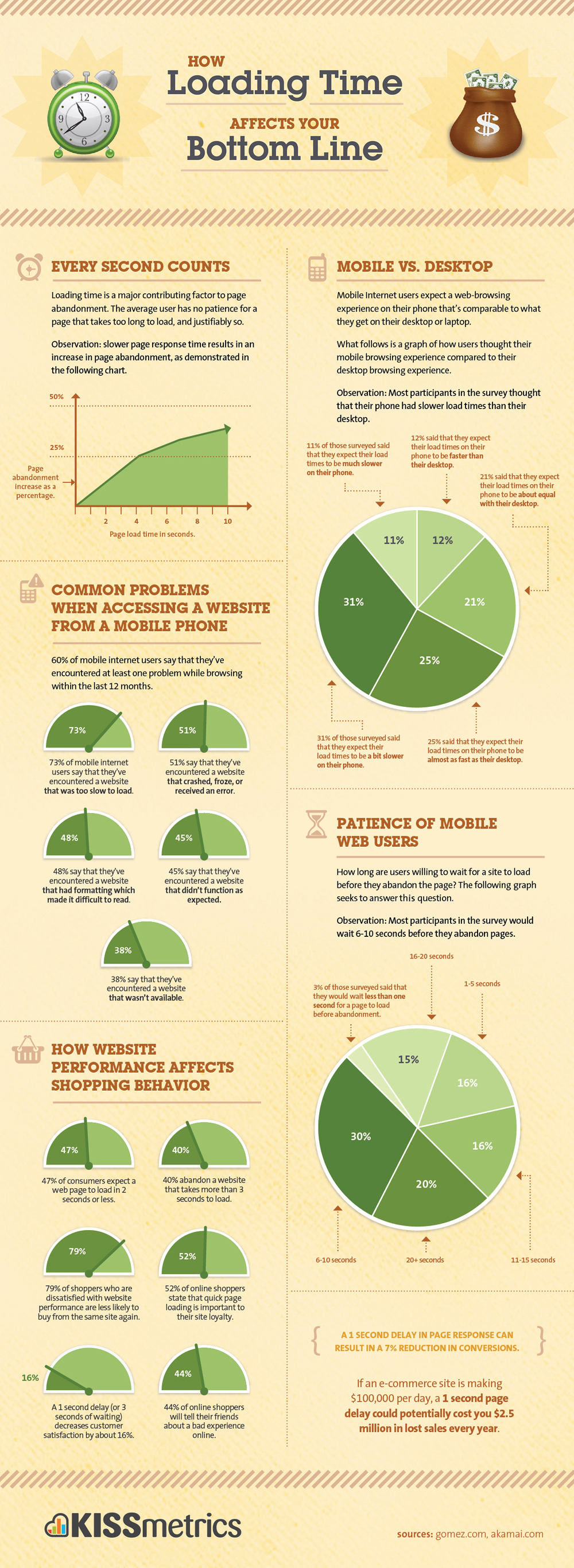
Kissmetrics published an infographic detailing how a slow response time will sentence your product to death—but the most alarming and noteworthy observation was that, literally, every second of slowness counts.
.jpeg)
After just two seconds of waiting, over 10% of users have already abandoned your site. And the frustration with waiting is so visceral that the consequences aren't isolated—poor performance will leave such a lasting memory on your user that they can even come to associate slowness with your brand.
Optimizing your page for quicker load speeds is one of the most important UX improvements you can make on your site. CNN.com is a major news network, but it has notoriously bad load speeds.
.jpeg)
When tested on Google PageSpeed Insights, CNN’s homepage took 3.7 seconds to load on mobile. It might not be a deal-breaker for everyone, but as we’ve seen, two seconds is all it takes for people to start jumping ship. So if you care about UX, it's time to take your load time seriously.
Even though it's much less sexy than user interface optimizations, improvements to your product's performance can have big payoffs. Improve your page load times by:
Small improvements matter here. Even just a 0.1 second improvement in response time can improve conversion rates. So put your product on a diet and give your users the experience they expect.
When you're too attached to your product's features or design elements, it's difficult to get rid of them. But this can be detrimental to UX because adding complexity can overwhelm and confuse your users.
Like many things in life, simplicity in product design is difficult. True simplicity requires you to identify what's most important and ruthlessly prioritize it—which is often much more work than adding everything you can think of.
.gif)
This is made more difficult because some digital products are just genuinely complex. Imposing a hierarchy of importance on features and actions is like choosing between your children for product managers who genuinely think each one of their features is the bee's knees.
Two of the biggest contributors to complexity are content overload and visual overload. For example, look at these two currency exchange programs. The first seems to shove every feature it has in its users’ faces (no wonder it has a “HELP” button). The second product cuts features, focusing on what is important so users can process what it’s telling them.
.jpeg)
.jpeg)
These two interfaces do the same thing, but how they give people this data is like night and day. The lesson here: be like Interface #2—do less to be more. With less content and visual overload from countless features, users can find what is important, allowing them to use your product to create value for themselves.
There are a couple of ways to overcome the disparity between what a product designer or engineer wants to build and actual user needs:
To actually execute on simplicity within your product, you need a strong product vision at the foundation of your team, supported by an understanding of real user experiences and preferences that will drive you toward your most important elements. You also need ruthlessness, but no one ever said UX was going to be easy.
As your market and product evolve, your UX should always be changing. That's why you can't think of really good UX as a single good element or achievement. You have to deliver great experiences to your users over and over again.
Understanding the significance of really bad UX mistakes and realizing the effects of a negative experience on user satisfaction, adoption, and retention rates is the first step toward designing a product that people will love.

