← Visit Appcues.com
×
×

4 examples of bad user onboarding that will ruin your UX

Chances are that your onboarding process is a problem. Here are four elements that make for a bad onboarding experience and how to fix them.
Skip to section:

Skip to section:

Of all the tools available for improving user experience, onboarding is the most powerful. Get the introduction and process wrong and users will question why they even bothered signing up. 

The problem is that somewhere between product concept and user sign-up—something goes wrong. Instead of engaging users and getting them excited about your product, they churn and never come back. 

Chances are that your user onboarding process is causing the bottleneck. You've been elbow-deep in your product, but what makes sense to you might not make sense to users. 

So, we've researched four examples of elements that make for a bad onboarding experience and will show you how to fix them.

1. Invasive tooltips that obscure information

Instead of directing new users to instructional videos for product tours, FAQs, and resource pages, more sites and apps are using tooltip as a quick way to introduce new users to a product. Tooltips look like callout bubbles that show users how to use the product and where to find information. There are two types: action driven and nonaction driven.

  • Action driven: Users have to perform the actions being shown in order to move onto the next tip.
  • Nonaction driven: Users don't have to perform an action—like add information or click on a feature—but they can still follow the sequence step by step.

Tooltips are best used for information that users don't have to refer back to regularly. For example, they only need to be shown where the Create button is or where the Edit button is once. 

Despite all their benefits, tooltips can impede user onboarding when they're designed poorly and obscure important information. 

a tooltip blocks text, limiting the app's functionality

In this example, we see that the tooltip is showing the user how to select who receives messages. The downside is that the tip blocks the text field, and the prompt within it. Think about how annoying it can be for users when they've seen the tip and want to take action, but can't. It's especially frustrating if there isn't an obvious way to close the tip. Some tooltips don't have an “X” to close them or a CTA (call to action) button to take users to another part of the product.

Discreet design is a must

Marc Schenker over at Web Design Depot explains tooltip design this way: “Good tooltips are designed to be so discreet that, sometimes, you’d swear they were never there. . . . You only really miss them if they’re not there all of a sudden to help you achieve a task.” 

An effective design means tooltips aren't invasive; they complement the product and don't hinder use. They're there if users choose to interact with them, but they don't take away from the experience. 

Here are three design elements to include in your design:

  • Copy: You can include a header along with the body text. But get to the point quickly, and keep it simple.
  • Exit(s): Make it clear how users exit the tip. Include an “X” or a button like “Next” or “End Tor” to let users know how to close the tip.
  • Progress bar: Give users an idea of how many tips are in the sequence. Keep it to no more than four steps, and put “Step 1 of 4” or “1/4” at the bottom of the tips.

Combined, these elements help you create a flow that keeps the focus on your product and doesn't ruin users' experience.

2. New user sign-ups that don't include single sign-on

Let's say you run a display ad on Facebook, your audience members click on it, and they make their way to the sign-up page to create an account. In order to secure that sign-up, creating an account has to be as easy as possible. 

Granted, more businesses have caught on to the fact that short forms with a few fields are more appealing to visitors than long, complicated forms. But even then, visitors don't want to have to manually enter information. This is especially true for visitors on mobile devices, where they're used to quick clicks, scrolls, and swipes. 
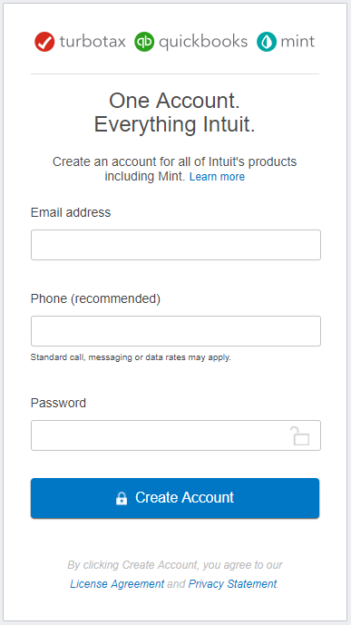
A screenshot of Intuit's log in screen without a single sign-on option

What these sign-up pages are missing is an option for single sign-on, where, instead of manually entering information like name, email, and password, users log on using one of their social media profiles. This example of Intuit works, in that new users can sign up for multiple services at once, but they still have to fill in three fields of data before they create their accounts.

Make sign-up as easy as one click

With new users, simplicity is key. To increase the likelihood that they'll take the next step within your product to buy, create, or upload something, make it as simple as possible to move forward. With single sign-on, users can choose between social media sites such as Facebook, Twitter, or Google and get instant access to your product. 
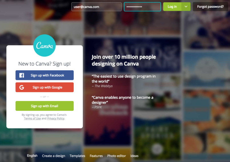
Canva's log in page with single sign on options including facebook and google
]Source‍[

This is great for users because it doesn't involve creating a new password or waiting for a confirmation email before they can use your product. But note that even if you offer single sign-on, you can still give users the option to sign up with an email address. 

For you, single sign-on provides access to data already tracked on users' social media accounts. For example, in addition to their email addresses, you can see their general preferences, their locations, their birthdays, and their friends.

3. Your welcome email feels like it's from a bot

Receiving an email address from a new user is like getting an invitation. By handing over this information, users are giving you permission to talk with them after they've been onboarded. Your value proposition resonates, and they want to hear more about what you have to offer. 

After this initial sign-up, the welcome email sets the stage for what type of interaction users can expect from you. They know that you've created an email campaign that sends an email at set intervals. Even though users know this, it doesn't mean that your emails have to feel robotic and impersonal. Users want to feel as though they're getting an email from the person on the “From” line. 

That's why sending an email without a profile picture makes the content seem less personal. 

A screenshot of a welcome email without an avatar

This email example gets two things right:

  • There's a real person's name in the sender field.
  • There's a real email address rather than a long, impossible-to-remember email address.

Where it falls short is in the lack of profile picture. This email is likely part of an automated sequence, but it doesn't have to feel that way.

Add some personality

An easy fix is to add an avatar to your emails. It's a simple tactic, but look at the example from Intercom, below. Emails feel more personal when recipients can put a face to a name.

A screenshot of a personalized email that has an avatar

Whether you're using Gmail or an email marketing platform to send emails, it's easy to personalize the sender information and upload an avatar. Remember, the purpose of sending emails is to keep users engaged and informed. Also use your emails to show audience members that they can relate to you and trust you to improve their experience.

4. New users are greeted with an empty dashboard

Lots of attention is given to the onboarding flow, but what happens after users sign up, create an account, and complete the product tour? Onboarding doesn't stop there. Consider the initial use a part of the onboarding process. 

Think about it: After users have gone through all the steps to get started, they're excited and want to start using your product. But this excitement can turn to uncertainty if users are greeted with an empty dashboard, as in this LinkedIn Groups feature: 
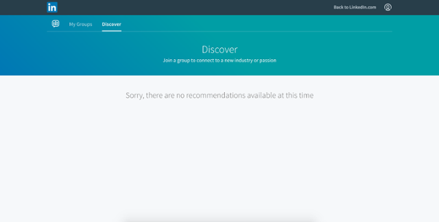
LinkedIn's Groups feature's empty dashboard

Because it's their first time using your product, it's understandable that users would feel discouraged after spending the time to go through the onboarding process, only to be greeted with a blank space with no clear direction of what to do next.

In this example, the comment “Sorry, there are no recommendations available at this time” doesn't do anything to tell users what they have to do to get recommendations. The menu at the top of the screen is clean and uncluttered, but it doesn't give any indication of next steps.

Create a clear path forward

You can approach this fix in a few ways. For starters, use the onboarding process to help users set up their account. For example, a task-management tool can use onboarding to show new users how to create a project, add content to it, and then share it. 

This way, when users land on their dashboards, there's a new project waiting for them. The point is to highlight the value your product offers, show users hands-on how to experience the value, and then reinforce the message by giving them something to start with. 

Another option is to include a CTA button on the dashboard to make it clear what users are expected to do next. 
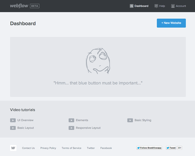
Webflow's welcome dashboard that includes a clear next step of adding a new website
]Source‍[

Two things are working in this example:

  • The blue CTA button stands out. And instead of saying something generic like “Click here” or “Get started,” it says “+ new website.” This makes the next step obvious.
  • The graphic at the top of the page “points” to the CTA button. Plus, the statement under it directs users to the CTA button. In case users miss the CTA button when they first land on the dashboard, the graphic leads them to it.

To increase the chances of retention after the initial sign-up (you'll automatically lose somewhere around 75 percent of users in the first week), give users something to work with, or tell them what to do. You can even include demo data to show users what a fully utilized dashboard will look like. Users can test the features until they're ready to upload their own information.

Making things right to improve user onboarding

As your product evolves and your user base grows, you'll learn more about what works and what doesn't. Be proactive, and look for new ways to wow new users. Don't wait to see large churn or abandon rates before you make changes. Look for new ways to engage your users, and do A/B testing to see what works best for your particular audience. 

Also, be open to feedback, either from customers or from data your team shares about product use. This will tell you exactly where the breakdown is happening in your onboarding flow and what you need to do to fix it.
The ultimate guide to user onboarding. Discover user onboarding definitions, examples, best practices, and resources.

Ty Magnin
Skip to section:

Skip to section:

Of all the tools available for improving user experience, onboarding is the most powerful. Get the introduction and process wrong and users will question why they even bothered signing up. 

The problem is that somewhere between product concept and user sign-up—something goes wrong. Instead of engaging users and getting them excited about your product, they churn and never come back. 

Chances are that your user onboarding process is causing the bottleneck. You've been elbow-deep in your product, but what makes sense to you might not make sense to users. 

So, we've researched four examples of elements that make for a bad onboarding experience and will show you how to fix them.

1. Invasive tooltips that obscure information

Instead of directing new users to instructional videos for product tours, FAQs, and resource pages, more sites and apps are using tooltip as a quick way to introduce new users to a product. Tooltips look like callout bubbles that show users how to use the product and where to find information. There are two types: action driven and nonaction driven.

  • Action driven: Users have to perform the actions being shown in order to move onto the next tip.
  • Nonaction driven: Users don't have to perform an action—like add information or click on a feature—but they can still follow the sequence step by step.

Tooltips are best used for information that users don't have to refer back to regularly. For example, they only need to be shown where the Create button is or where the Edit button is once. 

Despite all their benefits, tooltips can impede user onboarding when they're designed poorly and obscure important information. 

a tooltip blocks text, limiting the app's functionality

In this example, we see that the tooltip is showing the user how to select who receives messages. The downside is that the tip blocks the text field, and the prompt within it. Think about how annoying it can be for users when they've seen the tip and want to take action, but can't. It's especially frustrating if there isn't an obvious way to close the tip. Some tooltips don't have an “X” to close them or a CTA (call to action) button to take users to another part of the product.

Discreet design is a must

Marc Schenker over at Web Design Depot explains tooltip design this way: “Good tooltips are designed to be so discreet that, sometimes, you’d swear they were never there. . . . You only really miss them if they’re not there all of a sudden to help you achieve a task.” 

An effective design means tooltips aren't invasive; they complement the product and don't hinder use. They're there if users choose to interact with them, but they don't take away from the experience. 

Here are three design elements to include in your design:

  • Copy: You can include a header along with the body text. But get to the point quickly, and keep it simple.
  • Exit(s): Make it clear how users exit the tip. Include an “X” or a button like “Next” or “End Tor” to let users know how to close the tip.
  • Progress bar: Give users an idea of how many tips are in the sequence. Keep it to no more than four steps, and put “Step 1 of 4” or “1/4” at the bottom of the tips.

Combined, these elements help you create a flow that keeps the focus on your product and doesn't ruin users' experience.

2. New user sign-ups that don't include single sign-on

Let's say you run a display ad on Facebook, your audience members click on it, and they make their way to the sign-up page to create an account. In order to secure that sign-up, creating an account has to be as easy as possible. 

Granted, more businesses have caught on to the fact that short forms with a few fields are more appealing to visitors than long, complicated forms. But even then, visitors don't want to have to manually enter information. This is especially true for visitors on mobile devices, where they're used to quick clicks, scrolls, and swipes. 

A screenshot of Intuit's log in screen without a single sign-on option

What these sign-up pages are missing is an option for single sign-on, where, instead of manually entering information like name, email, and password, users log on using one of their social media profiles. This example of Intuit works, in that new users can sign up for multiple services at once, but they still have to fill in three fields of data before they create their accounts.

Make sign-up as easy as one click

With new users, simplicity is key. To increase the likelihood that they'll take the next step within your product to buy, create, or upload something, make it as simple as possible to move forward. With single sign-on, users can choose between social media sites such as Facebook, Twitter, or Google and get instant access to your product. 

Canva's log in page with single sign on options including facebook and google
]Source‍[

This is great for users because it doesn't involve creating a new password or waiting for a confirmation email before they can use your product. But note that even if you offer single sign-on, you can still give users the option to sign up with an email address. 

For you, single sign-on provides access to data already tracked on users' social media accounts. For example, in addition to their email addresses, you can see their general preferences, their locations, their birthdays, and their friends.

3. Your welcome email feels like it's from a bot

Receiving an email address from a new user is like getting an invitation. By handing over this information, users are giving you permission to talk with them after they've been onboarded. Your value proposition resonates, and they want to hear more about what you have to offer. 

After this initial sign-up, the welcome email sets the stage for what type of interaction users can expect from you. They know that you've created an email campaign that sends an email at set intervals. Even though users know this, it doesn't mean that your emails have to feel robotic and impersonal. Users want to feel as though they're getting an email from the person on the “From” line. 

That's why sending an email without a profile picture makes the content seem less personal. 

A screenshot of a welcome email without an avatar

This email example gets two things right:

  • There's a real person's name in the sender field.
  • There's a real email address rather than a long, impossible-to-remember email address.

Where it falls short is in the lack of profile picture. This email is likely part of an automated sequence, but it doesn't have to feel that way.

Add some personality

An easy fix is to add an avatar to your emails. It's a simple tactic, but look at the example from Intercom, below. Emails feel more personal when recipients can put a face to a name.

A screenshot of a personalized email that has an avatar

Whether you're using Gmail or an email marketing platform to send emails, it's easy to personalize the sender information and upload an avatar. Remember, the purpose of sending emails is to keep users engaged and informed. Also use your emails to show audience members that they can relate to you and trust you to improve their experience.

4. New users are greeted with an empty dashboard

Lots of attention is given to the onboarding flow, but what happens after users sign up, create an account, and complete the product tour? Onboarding doesn't stop there. Consider the initial use a part of the onboarding process. 

Think about it: After users have gone through all the steps to get started, they're excited and want to start using your product. But this excitement can turn to uncertainty if users are greeted with an empty dashboard, as in this LinkedIn Groups feature: 

LinkedIn's Groups feature's empty dashboard

Because it's their first time using your product, it's understandable that users would feel discouraged after spending the time to go through the onboarding process, only to be greeted with a blank space with no clear direction of what to do next.

In this example, the comment “Sorry, there are no recommendations available at this time” doesn't do anything to tell users what they have to do to get recommendations. The menu at the top of the screen is clean and uncluttered, but it doesn't give any indication of next steps.

Create a clear path forward

You can approach this fix in a few ways. For starters, use the onboarding process to help users set up their account. For example, a task-management tool can use onboarding to show new users how to create a project, add content to it, and then share it. 

This way, when users land on their dashboards, there's a new project waiting for them. The point is to highlight the value your product offers, show users hands-on how to experience the value, and then reinforce the message by giving them something to start with. 

Another option is to include a CTA button on the dashboard to make it clear what users are expected to do next. 

Webflow's welcome dashboard that includes a clear next step of adding a new website
]Source‍[

Two things are working in this example:

  • The blue CTA button stands out. And instead of saying something generic like “Click here” or “Get started,” it says “+ new website.” This makes the next step obvious.
  • The graphic at the top of the page “points” to the CTA button. Plus, the statement under it directs users to the CTA button. In case users miss the CTA button when they first land on the dashboard, the graphic leads them to it.

To increase the chances of retention after the initial sign-up (you'll automatically lose somewhere around 75 percent of users in the first week), give users something to work with, or tell them what to do. You can even include demo data to show users what a fully utilized dashboard will look like. Users can test the features until they're ready to upload their own information.

Making things right to improve user onboarding

As your product evolves and your user base grows, you'll learn more about what works and what doesn't. Be proactive, and look for new ways to wow new users. Don't wait to see large churn or abandon rates before you make changes. Look for new ways to engage your users, and do A/B testing to see what works best for your particular audience. 

Also, be open to feedback, either from customers or from data your team shares about product use. This will tell you exactly where the breakdown is happening in your onboarding flow and what you need to do to fix it.

The ultimate guide to user onboarding. Discover user onboarding definitions, examples, best practices, and resources.

Ty Magnin
You might also like...