Keep ‘em waiting: 7 loading page designs that make waiting (almost) fun
.png)

.png)
Whether you're sitting in rush hour traffic, stuck in limbo at the RMV, or waiting for your Instagram feed to load, there's just no way around it—waiting sucks.
But at some point, users will inevitably have to wait for something in your product to load. How you handle that waiting experience can make a huge difference to your users (and your retention rates).
Some products have found a way to make waiting more bearable by utilizing their loading pages to add value to the overall user experience. While often treated as an afterthought in product design, the loading page is an important indication to your users that their patience matters, and it provides a confirmation that what they’ve submitted or clicked on will lead to something great just around the corner.
At a minimum, loading pages reassure users that their interactions with your product carry weight. Scott Hurff, former product designer and lead manager at Tinder, writes about the loading state in the UI stack:
“It’s easy to overlook this state, and many product designers insert it as an afterthought. But there’s a very real burden that comes with setting expectations. When your app is loading data, waiting for an Internet connection, or transitioning to another screen, you must take great care to be mindful of how you represent situations where you’re fetching data.”
When done well, loading pages can reinforce your brand, boost user motivation, and delight users.
Here’s a look at 7 loading pages that make waiting (almost) fun:
Slack’s commitment to teams and collaboration is evident throughout their product, and their loading page is no exception.
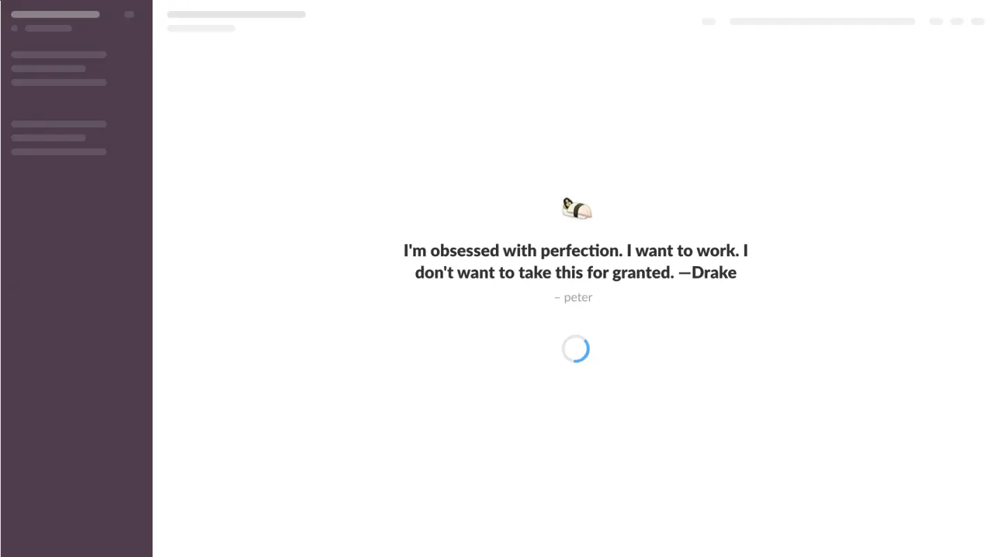
When users log into Slack and wait for their dashboard to load, they're greeted with quotations from their teammates. If you work with a group of jokesters like we do, Slack's loading pages will always make you chuckle or give you something to ponder.
The skeleton screen—the gray bars that indicate where content will show up—is another nice touch. Seeing the screen pre-populate with placeholders is a great way to build momentum for users (it also gives the impression that the page is loading faster than it truly is).
When TurboTax users start importing their tax information, they're shown an animated loading page that promises to help users quickly pull in all their relevant financial details for their tax return.
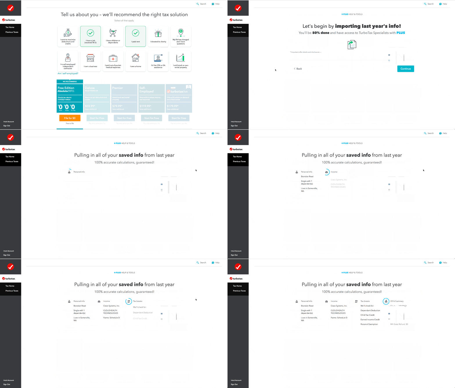
The data import takes about 5 to 10 seconds. But TurboTax can actually perform this task much faster—they've intentionally designed the interface to appear to run slower.
While this might seem counterintuitive, TurboTax believes (and has no doubt verified through user testing) that the added time helps reassure users that their accounts are actually being checked, and that the information is being accurately imported.
This ties back to the idea of letting users know that their actions have meaning—if a user knows they're importing a large amount of data, they expect it to take a fair amount of time. Sure, the import could happen immediately, but it'd diminish the meaning behind the action.
Ueno, the branding agency behind well-known names like Slack and Copper, needed fresh new faces on their team. To optimize their hiring process and showcase their existing talent, they created a one-of-a-kind interactive 3D interview tool and took advantage of the loading screen to introduce the members of their team:
The final six employee characters were chosen from each Ueno office (NY, SF, Iceland, and LA). We also picked people from different areas within the company (ops, design, development, content, etc.). This created a good mix of people that give the user the chance to get a real (or, you know, sort of real) behind-the-scenes look into our culture.

Ueno's unique approach to loading screens helps humanize their brand and attract the right kinds of candidates.
Medium's entire website is built around content, which makes delivering content quickly a rather essential part of the user experience.
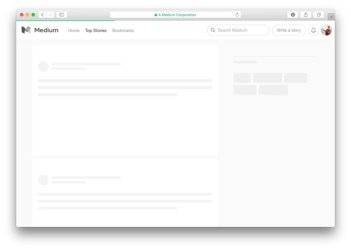
To give the impression that content is loading quickly, Medium—like Slack, LinkedIn, Facebook, among others—uses skeleton screens. They also load a low-res preview version of images within posts as the user scrolls, reassuring users that the content is indeed being loaded. While these tweaks to the loading experience might seem small, they help turn the content-heavy site into an easy-to-use experience for users.
Customer.io’s mascot is an adorable animated pigeon named Ami, who keeps users company throughout the product experience.

It’s a fun play on the traditional loading circle design, and Ami's familiarity helps create a friendly, consistent brand experience.
If we have one criticism, it's that the animation doesn't indicate how much time is left in the loading process. On principle, apps that take less than one second to load don't need to provide feedback on progress. Any longer, though, and indicators like progress bars become more important to reassure users.
Travel booking site Hipmunk brings together most of the tactics we've already seen into one delightful example of a loading page:
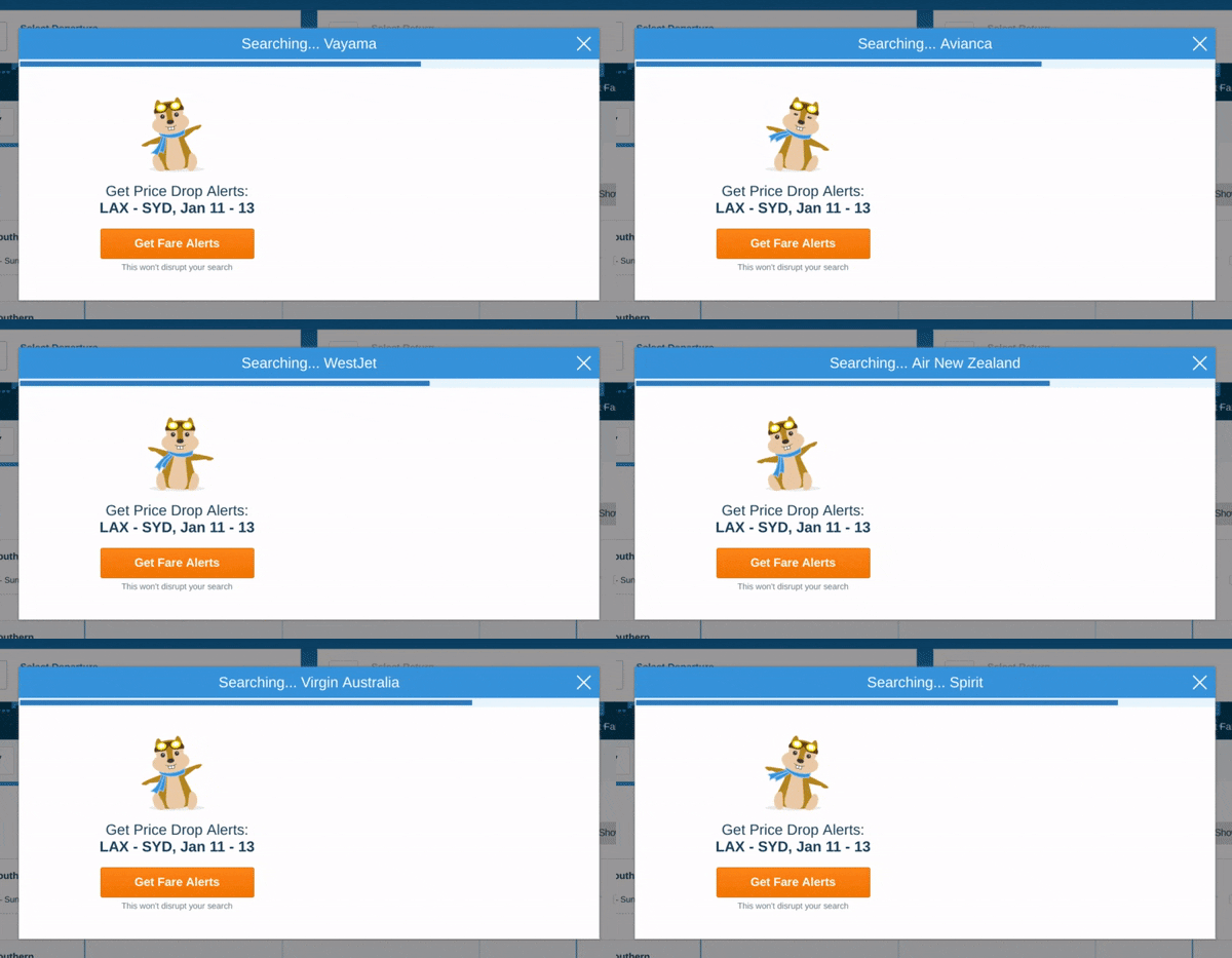
Research studies have shown that loading screens with interactive animations are perceived as faster and provide a better user experience than passive animations or simple progress bars. By combining the most effective elements of each approach, Hipmunk helps users make the most out of waiting while they crawl for flight data.
Sometimes your network goes down, and even the most well-designed loading page won't save you.
It's not technically a loading page, but the Chrome browser's hidden mini-game is too delightful not to include. The simple platform game appears for users unfortunate enough to be experiencing network problems. To try it out, simply turn off your Wi-Fi and open any page in Chrome—you should encounter an error page with a lonely T-Rex at the top. Hit the spacebar key, and he'll start running.

Including a mini-game like this might not exactly help your users reach their goals, but it will certainly surprise and delight them for a few minutes.
Sometimes (rarely) a longer loading time can be good UX, as in the case of TurboTax. But if those extra seconds aren't intentional—and have't been proven to improve the user experience through user testing—they're probably killing conversions and frustrating your users.
Skeleton screens, animation, lazy loading, humorous microcopy, and other loading design patterns help keep users engaged when delays are unavoidable—but they're all merely masking the true problem: Waiting makes for a bad experience.
Ultimately, you should focus on optimizing your product to become leaner, faster, and quicker to load.
But in the meantime, a friendly pigeon or two can't hurt.