GROW ENGAGEMENT
Engagement doesn’t end at activation. Keep customers curious, heard, and coming back with messages that make every interaction count.
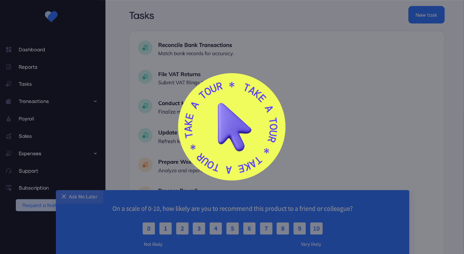

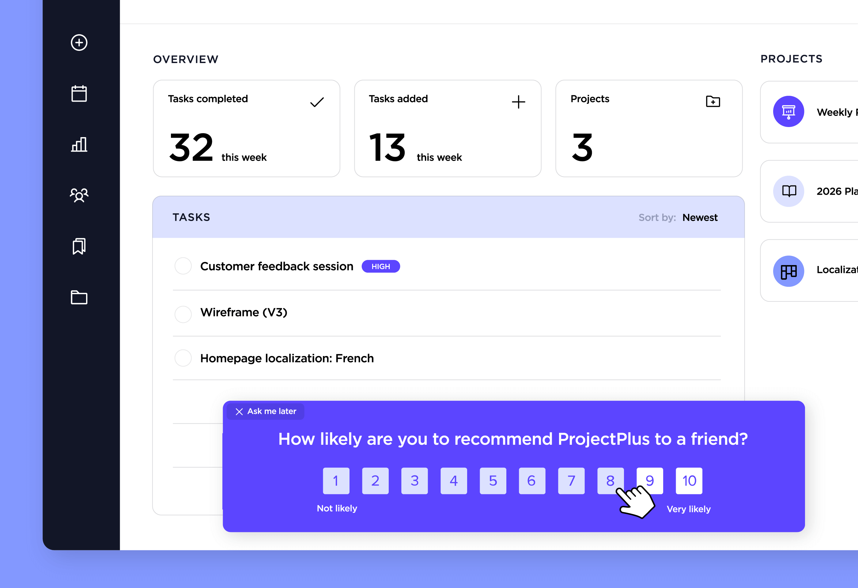
Gather input inside your product so you can understand what’s working and what’s not while customers are most engaged.
Follow up on positive feedback with messages that invite referrals, reviews, or expansions that drive lasting growth.
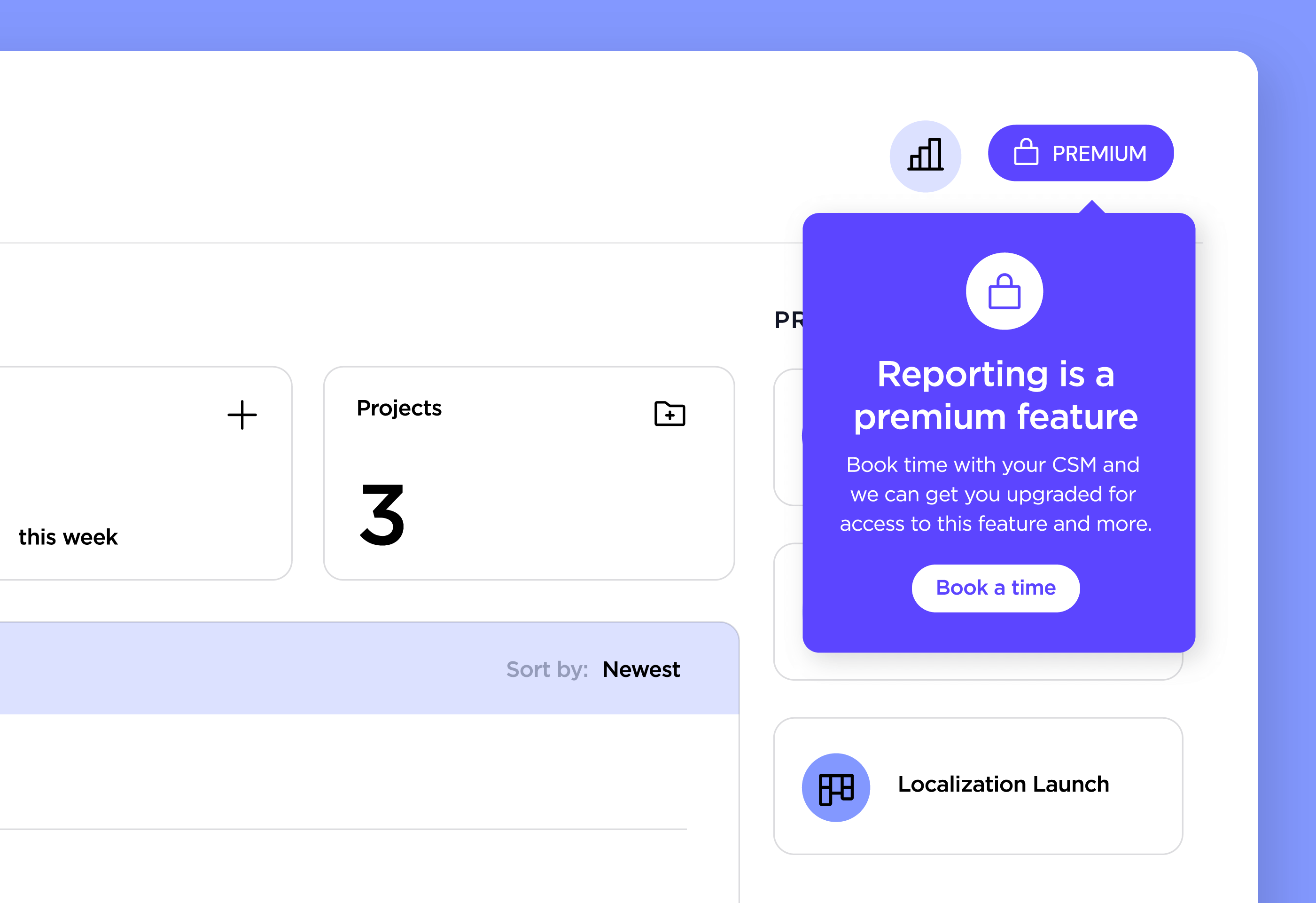
When users take action, make it easy for your team to follow up with the context that keeps the relationship growing.