← Visit Appcues.com
×
×

Shortening your time to wow

In the last lesson, we covered the importance of finding your WOW moment. That moment when a user say “WOW, this is awesome” ...
Skip to section:

Skip to section:

In the last lesson, we covered the importance of finding your WOW moment. That moment when a user say “WOW, this is awesome” and decide that your product is a must have experience. But identifying your WOW—or aha moment is just the beginning. Now we have to bring it to the surface and ensure users discover it as quickly as possible.

But what if your WOW or aha moment is hard to find? Perhaps it’s revealed through a long, high touch sales cycle or hidden behind high-friction steps like installing software, embedding code, or paying (gasp!). Here are four techniques that you can use to shorten your time to WOW (and eight companies that use these techniques particularly well).

1. Create a Reverse Funnel

The goal of user onboarding is to get users to their WOW moment before high friction steps or distractions that will cause dropoff. So why not make your WOW moment step #1? This is exactly what several companies have started doing by building a Reverse Funnel.

A reverse funnel is when users can use a product’s core features, and thus discover its core value, before even signing up for the product. It can be a powerful tactic; Neil Patel reported that Hello Bar’s reverse funnel increased signups by 52.11%.

Examples of the Reverse Funnel

optimizely logo

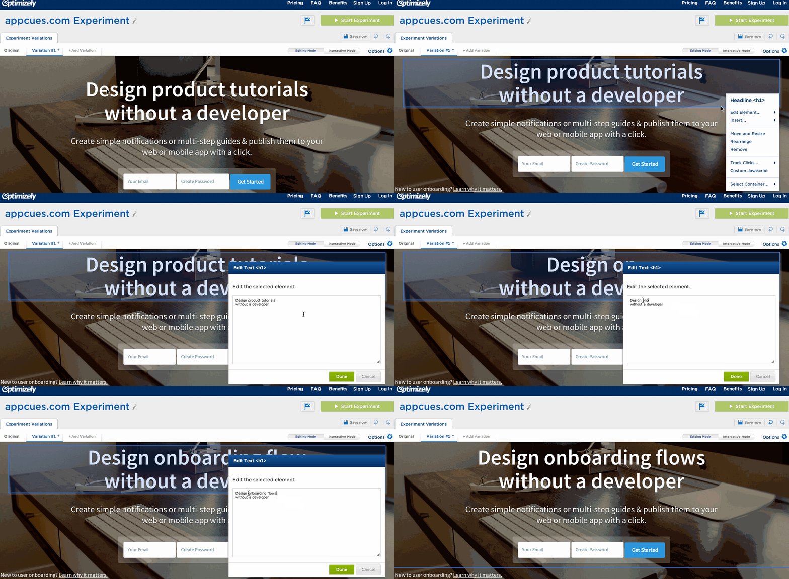
A/B testing without a 3rd party toolkit requires companies to build their own testing framework, deploy new code every time they want to launch a test, and track the data themselves. So you can imagine the feeling of joy a digital marketer or growth hacker experiences when they realize they can launch, manage and track A/B tests by embedding only a single line of code.
Optimizely's user onboarding wow moment

Instead of hiding this WOW moment behind a typical SaaS signup process, Optimizely allows users to create their first A/B test (on the user’s actual website) without even providing an email address. From there, it’s easy to understand Optimizely’s core value: you get all the benefits of A/B testing without the headaches usually required. 
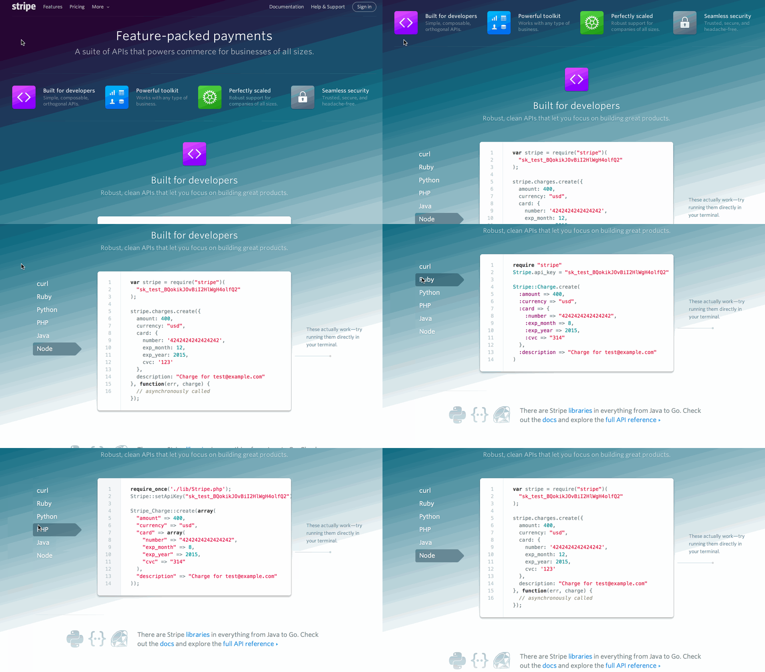
Stripe knows who their customer is: developers. They know what their customer cares about: easy, secure, and reliable payment integrations. And they know what language their customer speaks: code.
Stripe's user onboarding wow moment

That’s why Stripe doesn’t require users to register an account before they start talking code. Rather, potential customers can explore Stripe’s APIs and embed code (that developers can actually use) right on their publicly facing website. In exploring the code, Stripe makes it crystal clear that stripe.js allows websites to collect payment information without actually storing it or redirecting their users. To a developer, that’s a huge WOW moment that solves two major pain points. It builds credibility right away, and makes getting started with Stripe a no brainer.

2. WOW or Aha Moment Vignettes

Companies sometimes have a WOW moment that occurs after full adoption, but for one reason or another is incredibly difficult (or impossible) to completely reverse the funnel. This is when most will revert to copywriting to describe the benefits the user will receive by staying engaged.

But there’s a better option. You can create a WOW moment vignette, a lightweight version of a WOW moment that can be duplicated where much less user effort is required. It’s not quite as powerful as the reverse funnel, but can still shorten your time to WOW quite a bit.

Examples of the WOW Moment Vignette

For Product Managers, good user feedback can mean the difference between a highly confusing and a highly engaging UX. UserTesting.com makes getting feedback easy by providing 15 minute videos of potential users in the right target demographic interacting with the product. But in order to get to started with UserTesting, Product Managers must create an account, specify demographics of their testers, create tasks and surveys, and, of course, wait for the videos to be filmed. Not to mention, they have to pay $49 for each video they order. That’s a lot of friction, but each of the steps is seemingly necessary for a Product Manager to get the right feedback. After all, bad feedback can be much more costly than good feedback is beneficial.
UserTesting.com's user onboarding wow moment

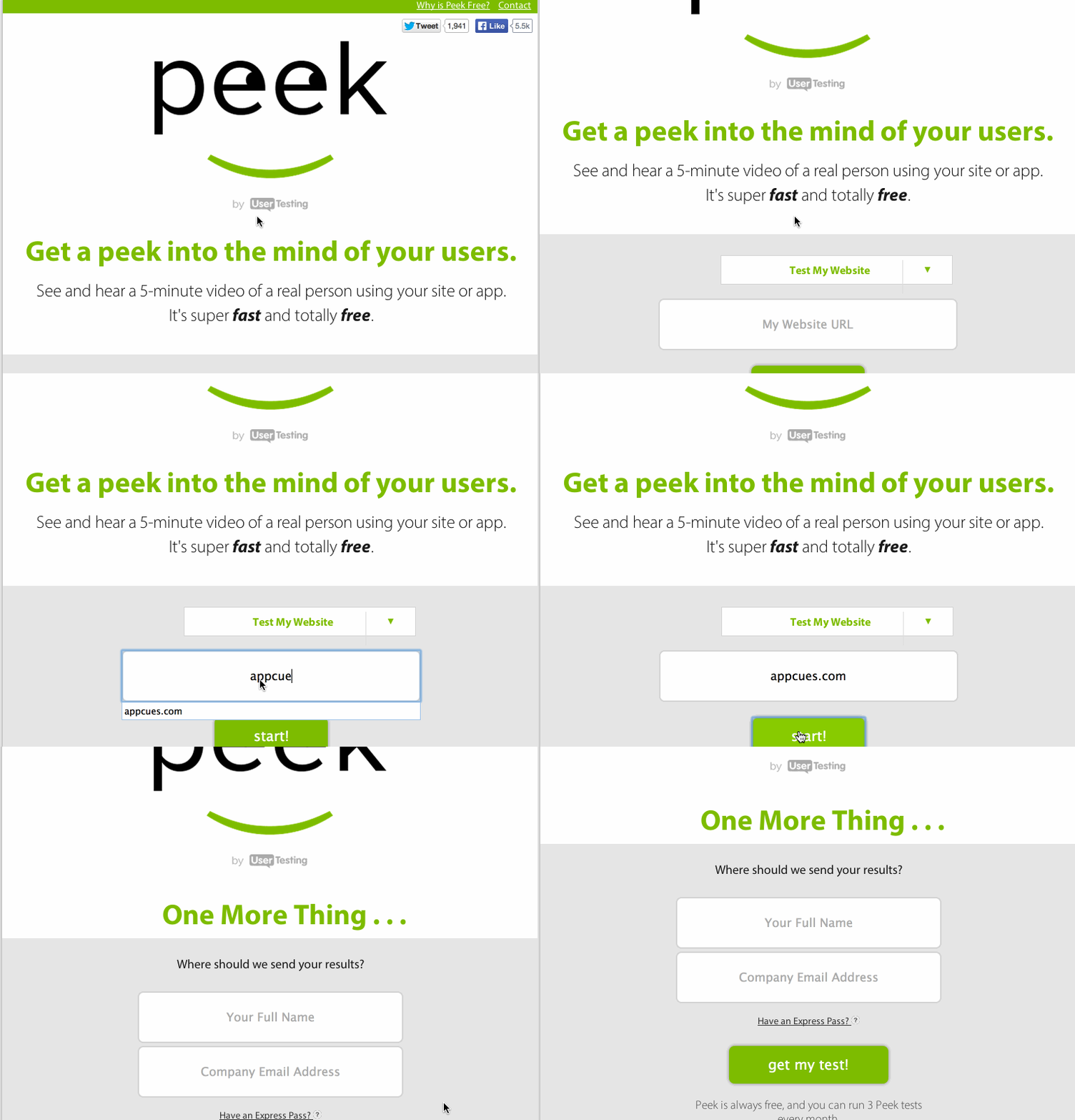
So instead of building a reverse funnel, UserTesting built Peek, a WOW vignette that allows users to get a 5-minute video of someone using their website or app for free. All users have to provide is their email address and a URL to receive a Peek video within 24 hours. It may not provide the WOW moment a Product Manager experiences when he gets good, actionable feedback that makes him better at this job. But nonetheless, it helps him understand how this is a powerful tool and makes the effort required to becoming a regular customer seem irrelevant. 
Testive is a personalized online platform for students to improve their SAT or ACT score. Students get detailed performance analytics that allow them to take a data-driven approach to learning, which can improve scores faster & higher. But there’s a problem: the analytics aren’t that useful until a student had done about ~90 minutes of work on the platform.

So Testive created a WOW vignette in the student user onboarding flow. Students are asked to answer a simple SAT question, and then are given a teaser into the data being collected: how long they spent on the question, how long the average Testive user spent on the question, and the question difficulty.
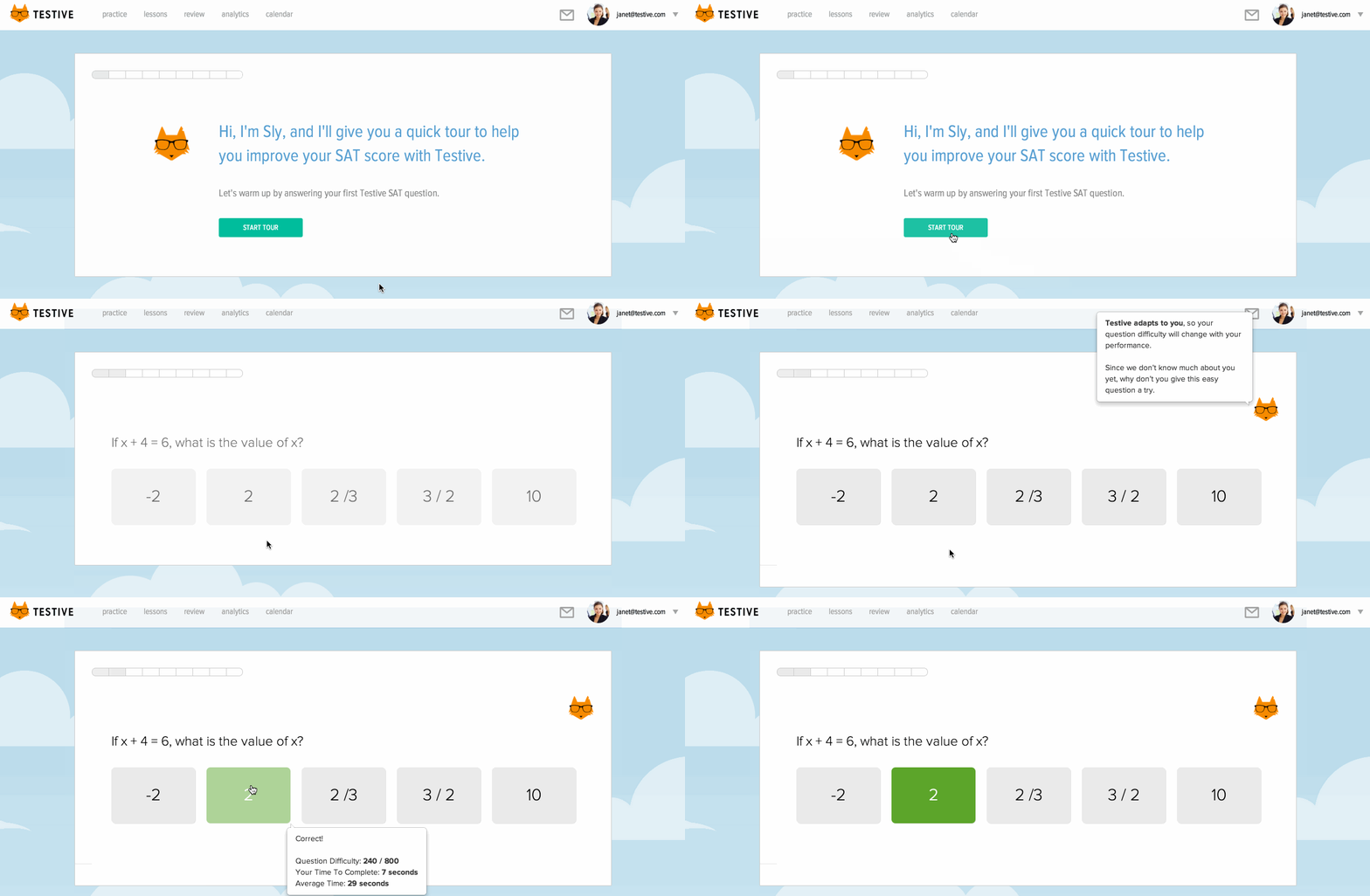
Testive's user onboarding wow moment

Just like UserTesting, this vignette does not provide the full value of using Testive’s analytics later on, but it helps students understand how the capabilities of the product will benefit them through real interaction, not just words on a page. And the results for Testive were staggering. After creating the vignette, the percentage of users who returned and engaged with the product in the week following singup doubled.

3. Personalize Your WOW Moment

For some products, particularly those that are content related, the value a user gets is far more dependent on the preferences of that user than the features of the product. Thus, there is no ‘one size fits all’ WOW moment. When this is the case, it’s important to personalize a user’s onboarding experience to ensure she quickly finds exactly what she values most.

Examples of Personalized WOW Moments

When Foursquare 8.0 launched this month, the user experience started with analyzing a user’s past check-ins and asking each user to validate their preferences. Once complete, the user gets a highly curated experience based on her choices, not to mention the time of day, user location, and suggestions from friends.
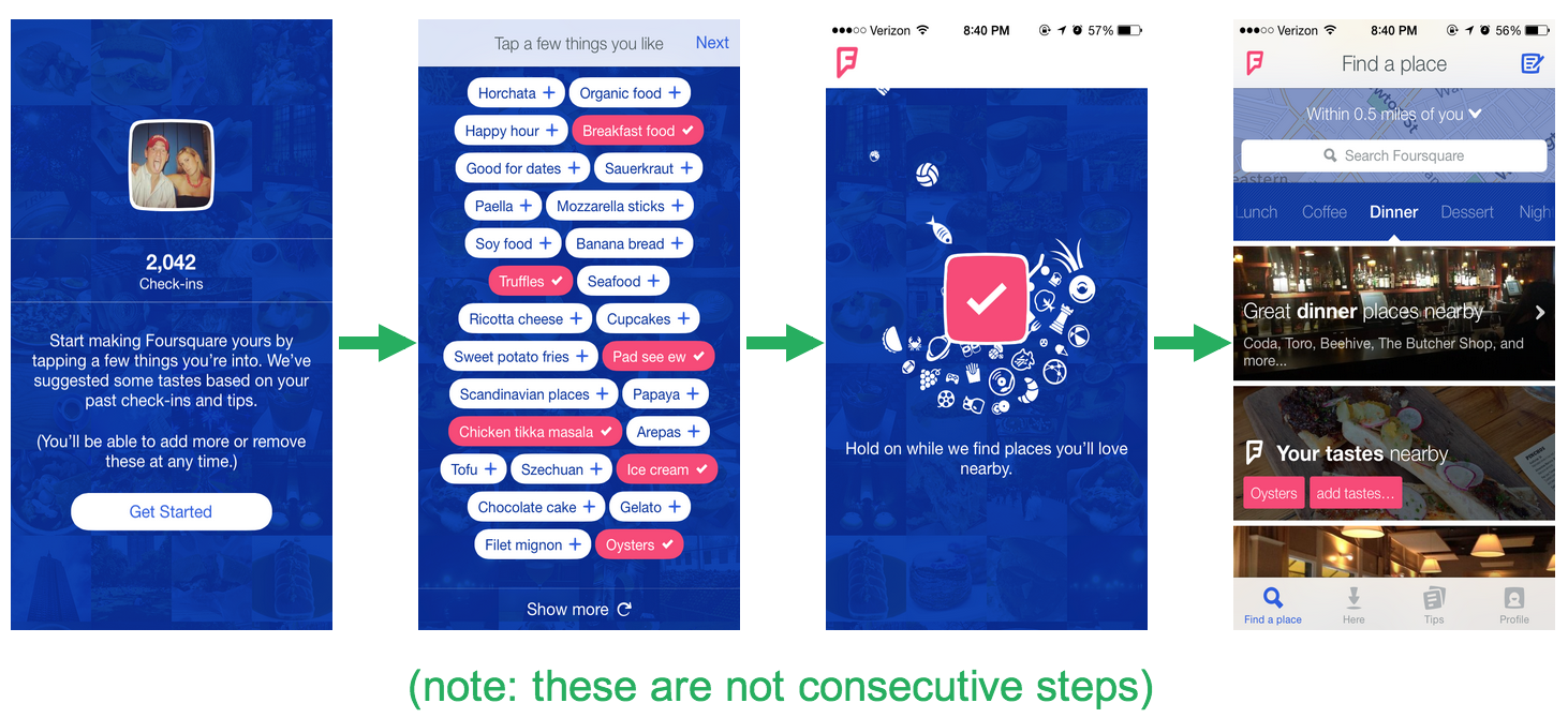
Foursquare's user onboarding wow moment

This helps ensure that a coffee-obsessed hipster in Brooklyn and a chardonnay-drinking soccer mom in the suburbs of Dallas both find the value that is right for them. It builds a deeply personalized and contextual experience that will increase the likelihood of each user coming back and engaging with the app regularly. For Foursquare, this also means an increase in advertising opportunities. 

Do you ever think that your Netflix account can read your mind? That’s not just a cute little trick that Netflix wanted to build for its millions of users. Creating a personalized and contextual user experience is a business strategy that has helped the company grow into a $27B enterprise. Like Foursquare, Netflix believes that personalizing the experience helps ensure users with different preferences find and benefit from Netflix’s core value as quickly and regularly as possible.
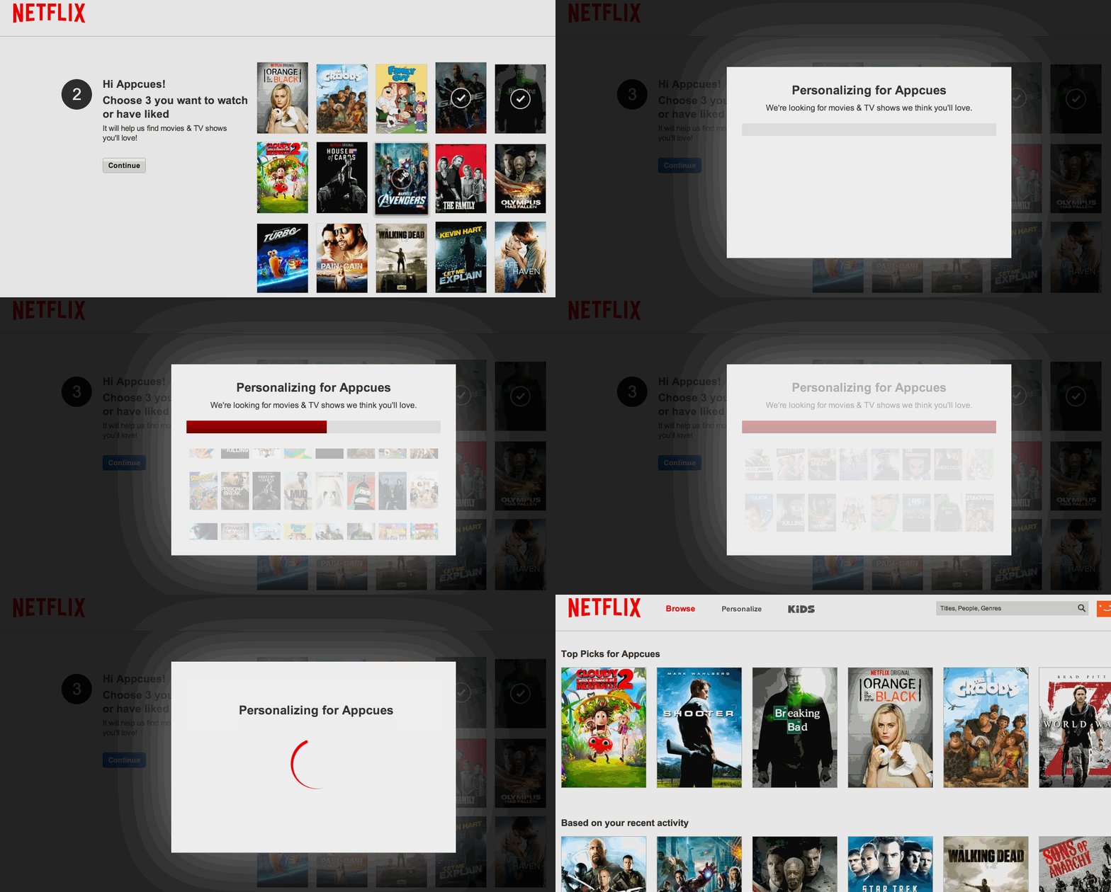
Netflix's user onboarding wow moment

But what happens when you just create an account and Netflix doesn’t know your viewing history yet? In order to ensure its first time users get content recommendations that are relevant, Netflix asks them to identify three movies they like from a list of about 20. Once a user does, Netflix builds them their custom interface.

Bonus: Check out Samuel Hulick’s teardowns of the user onboarding experiences for Netflix and Foursquare.

4. Be Your Own Best User

One of the best ways to showcase the value of your product is to put prospective users on the receiving end of it. They signed up looking looking for how your product can solve a particular pain point, so now’s the opportunity to demonstrate that your product is so slick that that pain point no longer exists at your company.

If you’re a Marc Benioff fan, you might also be a fan of this tactic. In his book, Behind the Cloud, Marc Benioff talked about how useful it was to be building a sales tool (Salesforce) because the company was able to use it themselves.

Examples of Being Your Own Best User
HubSpot practices what they preach, and what they preach is inbound marketing. After a user signs up for a HubSpot trial, the company inundates her with with a number of resources. Part of it is very much out of the inbound marketing playbook: use content to become a credible, indispensable authority on exactly what your customer cares about, and to give the company (Hubspot in this case) actionable data about what prospects are interested in and who is most engaged.
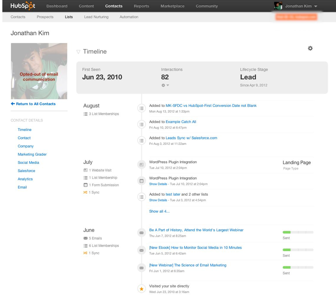
Hubspot's user onboarding wow moment

But Hubspot doesn’t just use that data internally, they showcase it so users can see exactly what data Hubspot has on themselves. When users see it they immediately find a brief history of Hubspot activity—emails they opened, blog posts they read, webinars they registered for, guides they downloaded, etc. It’s then when the benefit of using Hubspot becomes abundantly clear. 

Retargeting ads have some of the best ROIs in paid advertising, so digital marketers have every reason to check out a service like AdRoll. But there are a number of friction-filled steps before you can experience the ROI of these ads: you need to create an account, embed retargeting pixels, build creatives, specify a budget and provide payment information. On top of all of that, how is a user supposed to know if this even works?

AdRoll's user onboarding wow moment

AdRoll makes great use of their own system. Immediately after a potential user lands on the AdRoll website, her internet browser automagically becomes a walking, talking AdRoll billboard. Sure, this isn’t an aha moment that is directly tied to higher advertising ROIs or faster growth rates. But prospective clients may think, “Wow. It just worked on me. I had forgotten about AdRoll and here I am 5 hours (or days!) later being dragged back in.”

Pulling It All Together

These are just a handful of strategies some companies have used to shorten their time to WOW. There are others out there that are certainly effective, and even more that have yet to be invented. What can you do to shorten your time to WOW?

Jackson Noel
Co-Founder and CEO at Appcues
Skip to section:

Skip to section:

In the last lesson, we covered the importance of finding your WOW moment. That moment when a user say “WOW, this is awesome” and decide that your product is a must have experience. But identifying your WOW—or aha moment is just the beginning. Now we have to bring it to the surface and ensure users discover it as quickly as possible.

But what if your WOW or aha moment is hard to find? Perhaps it’s revealed through a long, high touch sales cycle or hidden behind high-friction steps like installing software, embedding code, or paying (gasp!). Here are four techniques that you can use to shorten your time to WOW (and eight companies that use these techniques particularly well).

1. Create a Reverse Funnel

The goal of user onboarding is to get users to their WOW moment before high friction steps or distractions that will cause dropoff. So why not make your WOW moment step #1? This is exactly what several companies have started doing by building a Reverse Funnel.

A reverse funnel is when users can use a product’s core features, and thus discover its core value, before even signing up for the product. It can be a powerful tactic; Neil Patel reported that Hello Bar’s reverse funnel increased signups by 52.11%.

Examples of the Reverse Funnel

optimizely logo

A/B testing without a 3rd party toolkit requires companies to build their own testing framework, deploy new code every time they want to launch a test, and track the data themselves. So you can imagine the feeling of joy a digital marketer or growth hacker experiences when they realize they can launch, manage and track A/B tests by embedding only a single line of code.

Optimizely's user onboarding wow moment

Instead of hiding this WOW moment behind a typical SaaS signup process, Optimizely allows users to create their first A/B test (on the user’s actual website) without even providing an email address. From there, it’s easy to understand Optimizely’s core value: you get all the benefits of A/B testing without the headaches usually required. 

Stripe knows who their customer is: developers. They know what their customer cares about: easy, secure, and reliable payment integrations. And they know what language their customer speaks: code.

Stripe's user onboarding wow moment

That’s why Stripe doesn’t require users to register an account before they start talking code. Rather, potential customers can explore Stripe’s APIs and embed code (that developers can actually use) right on their publicly facing website. In exploring the code, Stripe makes it crystal clear that stripe.js allows websites to collect payment information without actually storing it or redirecting their users. To a developer, that’s a huge WOW moment that solves two major pain points. It builds credibility right away, and makes getting started with Stripe a no brainer.

2. WOW or Aha Moment Vignettes

Companies sometimes have a WOW moment that occurs after full adoption, but for one reason or another is incredibly difficult (or impossible) to completely reverse the funnel. This is when most will revert to copywriting to describe the benefits the user will receive by staying engaged.

But there’s a better option. You can create a WOW moment vignette, a lightweight version of a WOW moment that can be duplicated where much less user effort is required. It’s not quite as powerful as the reverse funnel, but can still shorten your time to WOW quite a bit.

Examples of the WOW Moment Vignette

For Product Managers, good user feedback can mean the difference between a highly confusing and a highly engaging UX. UserTesting.com makes getting feedback easy by providing 15 minute videos of potential users in the right target demographic interacting with the product. But in order to get to started with UserTesting, Product Managers must create an account, specify demographics of their testers, create tasks and surveys, and, of course, wait for the videos to be filmed. Not to mention, they have to pay $49 for each video they order. That’s a lot of friction, but each of the steps is seemingly necessary for a Product Manager to get the right feedback. After all, bad feedback can be much more costly than good feedback is beneficial.

UserTesting.com's user onboarding wow moment

So instead of building a reverse funnel, UserTesting built Peek, a WOW vignette that allows users to get a 5-minute video of someone using their website or app for free. All users have to provide is their email address and a URL to receive a Peek video within 24 hours. It may not provide the WOW moment a Product Manager experiences when he gets good, actionable feedback that makes him better at this job. But nonetheless, it helps him understand how this is a powerful tool and makes the effort required to becoming a regular customer seem irrelevant. 

Testive is a personalized online platform for students to improve their SAT or ACT score. Students get detailed performance analytics that allow them to take a data-driven approach to learning, which can improve scores faster & higher. But there’s a problem: the analytics aren’t that useful until a student had done about ~90 minutes of work on the platform.

So Testive created a WOW vignette in the student user onboarding flow. Students are asked to answer a simple SAT question, and then are given a teaser into the data being collected: how long they spent on the question, how long the average Testive user spent on the question, and the question difficulty.

Testive's user onboarding wow moment

Just like UserTesting, this vignette does not provide the full value of using Testive’s analytics later on, but it helps students understand how the capabilities of the product will benefit them through real interaction, not just words on a page. And the results for Testive were staggering. After creating the vignette, the percentage of users who returned and engaged with the product in the week following singup doubled.

3. Personalize Your WOW Moment

For some products, particularly those that are content related, the value a user gets is far more dependent on the preferences of that user than the features of the product. Thus, there is no ‘one size fits all’ WOW moment. When this is the case, it’s important to personalize a user’s onboarding experience to ensure she quickly finds exactly what she values most.

Examples of Personalized WOW Moments

When Foursquare 8.0 launched this month, the user experience started with analyzing a user’s past check-ins and asking each user to validate their preferences. Once complete, the user gets a highly curated experience based on her choices, not to mention the time of day, user location, and suggestions from friends.

Foursquare's user onboarding wow moment

This helps ensure that a coffee-obsessed hipster in Brooklyn and a chardonnay-drinking soccer mom in the suburbs of Dallas both find the value that is right for them. It builds a deeply personalized and contextual experience that will increase the likelihood of each user coming back and engaging with the app regularly. For Foursquare, this also means an increase in advertising opportunities. 

Do you ever think that your Netflix account can read your mind? That’s not just a cute little trick that Netflix wanted to build for its millions of users. Creating a personalized and contextual user experience is a business strategy that has helped the company grow into a $27B enterprise. Like Foursquare, Netflix believes that personalizing the experience helps ensure users with different preferences find and benefit from Netflix’s core value as quickly and regularly as possible.

Netflix's user onboarding wow moment

But what happens when you just create an account and Netflix doesn’t know your viewing history yet? In order to ensure its first time users get content recommendations that are relevant, Netflix asks them to identify three movies they like from a list of about 20. Once a user does, Netflix builds them their custom interface.

Bonus: Check out Samuel Hulick’s teardowns of the user onboarding experiences for Netflix and Foursquare.

4. Be Your Own Best User

One of the best ways to showcase the value of your product is to put prospective users on the receiving end of it. They signed up looking looking for how your product can solve a particular pain point, so now’s the opportunity to demonstrate that your product is so slick that that pain point no longer exists at your company.

If you’re a Marc Benioff fan, you might also be a fan of this tactic. In his book, Behind the Cloud, Marc Benioff talked about how useful it was to be building a sales tool (Salesforce) because the company was able to use it themselves.

Examples of Being Your Own Best User

HubSpot practices what they preach, and what they preach is inbound marketing. After a user signs up for a HubSpot trial, the company inundates her with with a number of resources. Part of it is very much out of the inbound marketing playbook: use content to become a credible, indispensable authority on exactly what your customer cares about, and to give the company (Hubspot in this case) actionable data about what prospects are interested in and who is most engaged.

Hubspot's user onboarding wow moment

But Hubspot doesn’t just use that data internally, they showcase it so users can see exactly what data Hubspot has on themselves. When users see it they immediately find a brief history of Hubspot activity—emails they opened, blog posts they read, webinars they registered for, guides they downloaded, etc. It’s then when the benefit of using Hubspot becomes abundantly clear. 

Retargeting ads have some of the best ROIs in paid advertising, so digital marketers have every reason to check out a service like AdRoll. But there are a number of friction-filled steps before you can experience the ROI of these ads: you need to create an account, embed retargeting pixels, build creatives, specify a budget and provide payment information. On top of all of that, how is a user supposed to know if this even works?

AdRoll's user onboarding wow moment

AdRoll makes great use of their own system. Immediately after a potential user lands on the AdRoll website, her internet browser automagically becomes a walking, talking AdRoll billboard. Sure, this isn’t an aha moment that is directly tied to higher advertising ROIs or faster growth rates. But prospective clients may think, “Wow. It just worked on me. I had forgotten about AdRoll and here I am 5 hours (or days!) later being dragged back in.”

Pulling It All Together

These are just a handful of strategies some companies have used to shorten their time to WOW. There are others out there that are certainly effective, and even more that have yet to be invented. What can you do to shorten your time to WOW?

Jackson Noel
Co-Founder and CEO at Appcues
You might also like...