← Visit Appcues.com
×
×

6 proven strategies to increase user engagement and fuel growth
Without consistent user engagement, you don't really have a viable SaaS business—and you certainly won't achieve product-led growth.
Skip to section:

Skip to section:

Engagement looks different across products—a travel app will always be used less frequently than email—and there isn’t one engagement metric that is passed around from product person to product person as the golden standard.

But when it comes down to it, engagement involves users taking meaningful actions in your product, again and again.

Active and engaged users are the foundation of every successful SaaS company—without a steady stream of users regularly using your product, you don't really have a viable SaaS business. And you certainly won't achieve product-led growth.

That's because subscription revenue from SaaS products is generated over months, or even years. Even the healthiest SaaS companies can take upwards of 5 to 7 months to start generating positive revenue. It's critical that your users continue engaging with your product for as long as possible.

What does user engagement mean for SaaS?

Before we jump into strategies for increasing user engagement, let's clarify what it really means from a product perspective—and why it's such an important metric for your SaaS company.

User Engagement is defined by how actively involved and interested users are in your software. It refers to the level of interaction and response that users have with the content and features of the software, and can be measured by metrics like the number of clicks, likes, shares, comments, or time spent. 

It’s important because more engaged users lead to higher retention rates, increased conversions, and, ultimately, business growth.

In a nutshell, the user engagement rate represents the percentage of users who remain active within your product over a defined period of time. Tracking how many users remain truly engaged with your product is a great indicator of overall product health, and any changes in this metric can be a leading indicator of potential problems down the road.

The main challenge with tracking product engagement is that the definition of “active” can be quite different between products. While a social media automation tool might have users logging in every day, a budgeting tool might have users logging in only once or twice a month, and still count that as high engagement.
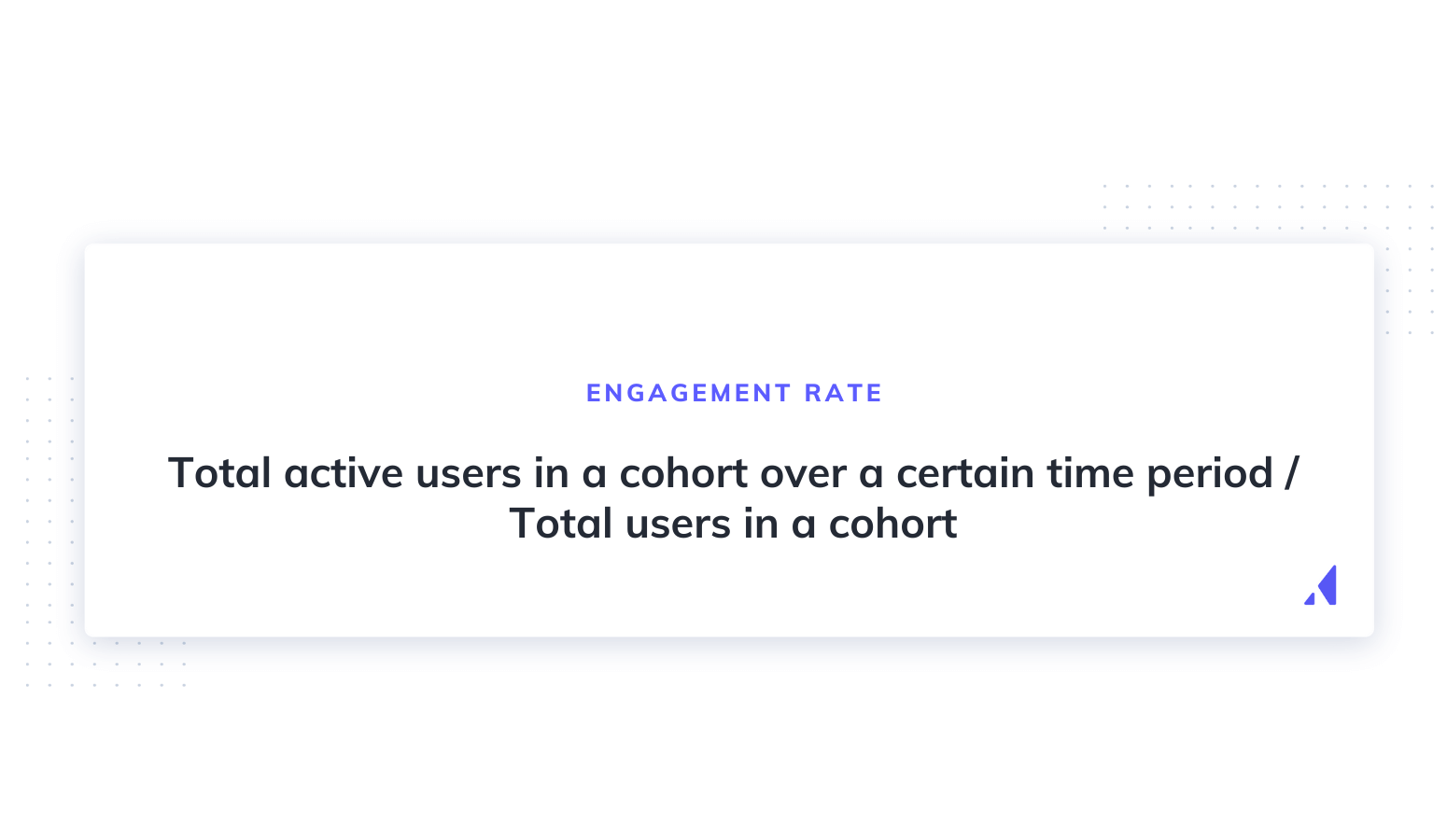
user engagement rate formula

The main challenge with tracking product engagement is that the definition of “active” can be quite different between products. While a social media automation tool might have users logging in every day, a budgeting tool might have users logging in only once or twice a month, and still count that as high engagement.

Lincoln Murphy defined engagement as a state:

"Engagement is when your customer is realizing value from your SaaS."

Most SaaS companies  see the number of users drop off after just a single use of the free trial. It's critical to keep customer engagement high during this period to maximize your conversion rate and retention. But to truly increase user engagement, you need to optimize the customer experience and help your users get value from your product over time.


Since user engagement evolves over the user journey, an earnest attempt at optimizing it means boosting habitual product usage at every turn. A strong focus on communication and user engagement can help combat churn within your existing customer base, keeping your customers up to date on product changes, and helping you identify issues before they become bigger problems.

Now, let's take a look at 6 proven ways to increase SaaS product engagement:

1. Early “aha” moments improve user engagement 

User onboarding has a powerful ripple effect on the entire customer journey and customer experience. Your onboarding sequence is the first hands-on experience your users' will have with your product, so it's important to make a good impression. Think of user onboarding as the hook to long-term engagement and conversion to active users.

Since user motivation is typically at a high during onboarding, it's a good time to get users to accomplish meaningful actions and obtain immediate value. Walk each new user through key features of your product, with the goal of helping them find your product's core value proposition as quickly as possible. 

In other words, help them find their aha moment fast.

Language learning tool Duolingo does this wonderfully. Their onboarding flow guides visitors through a quick translation exercise, showing how quick and easy it is to learn a new language—before asking users to commit to the product with a signup.
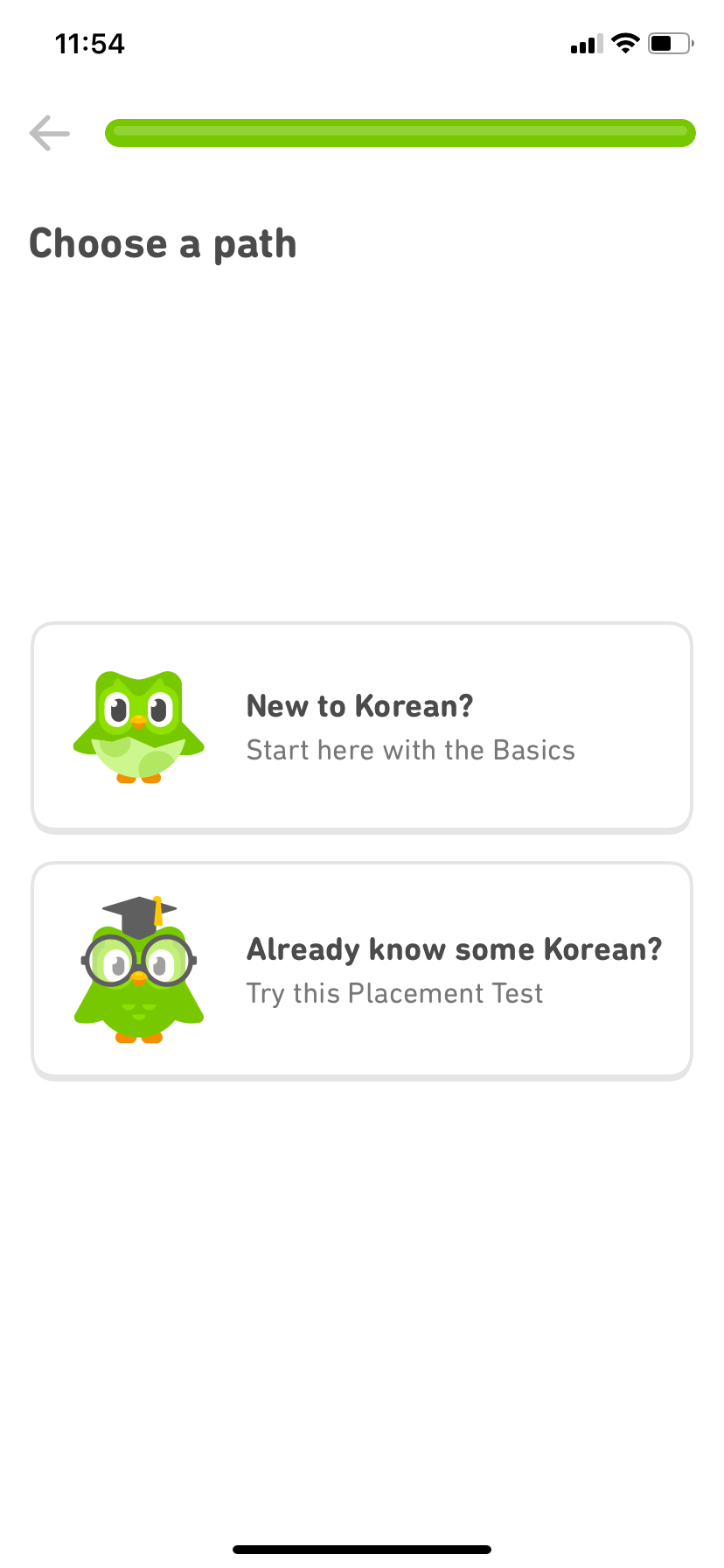
duolingo onboarding choose a path mobile screen that asks users to select their experience level

Users are prompted to choose a learning goal. Getting users to commit to a mission before even signing up has a huge impact on how likely the user will be to stick with the platform. That's because humans have an inherent completion bias, or the desire to get things done.
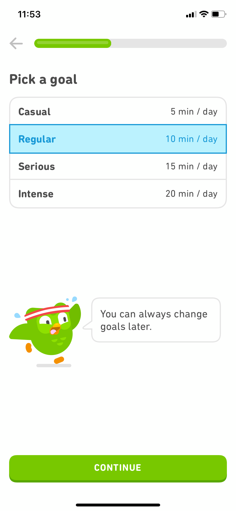
duolingo mobile app screen pick a language learning goal

By the time Duolingo gives users the opportunity to sign up, they've already made progress towards their goal, by going through a short lesson:
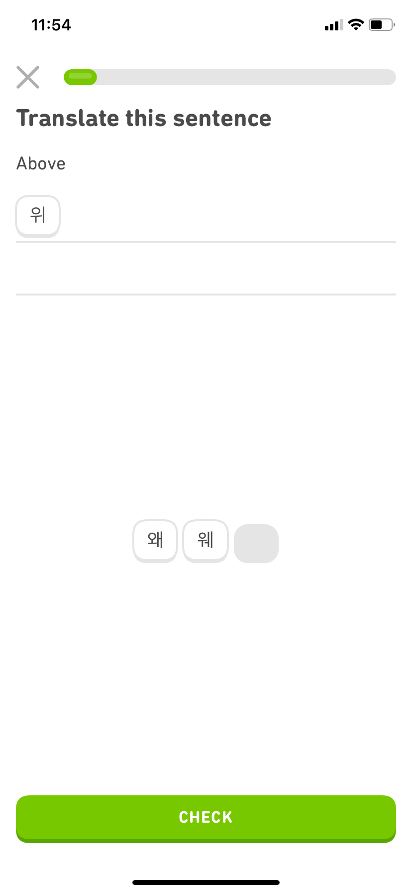
duolingo user onboarding language lesson mobile app ux example

By flipping the onboarding process on its head—starting with the product and finishing with a signup form—Duolingo is able to demonstrate the value of their product before even asking users to register:
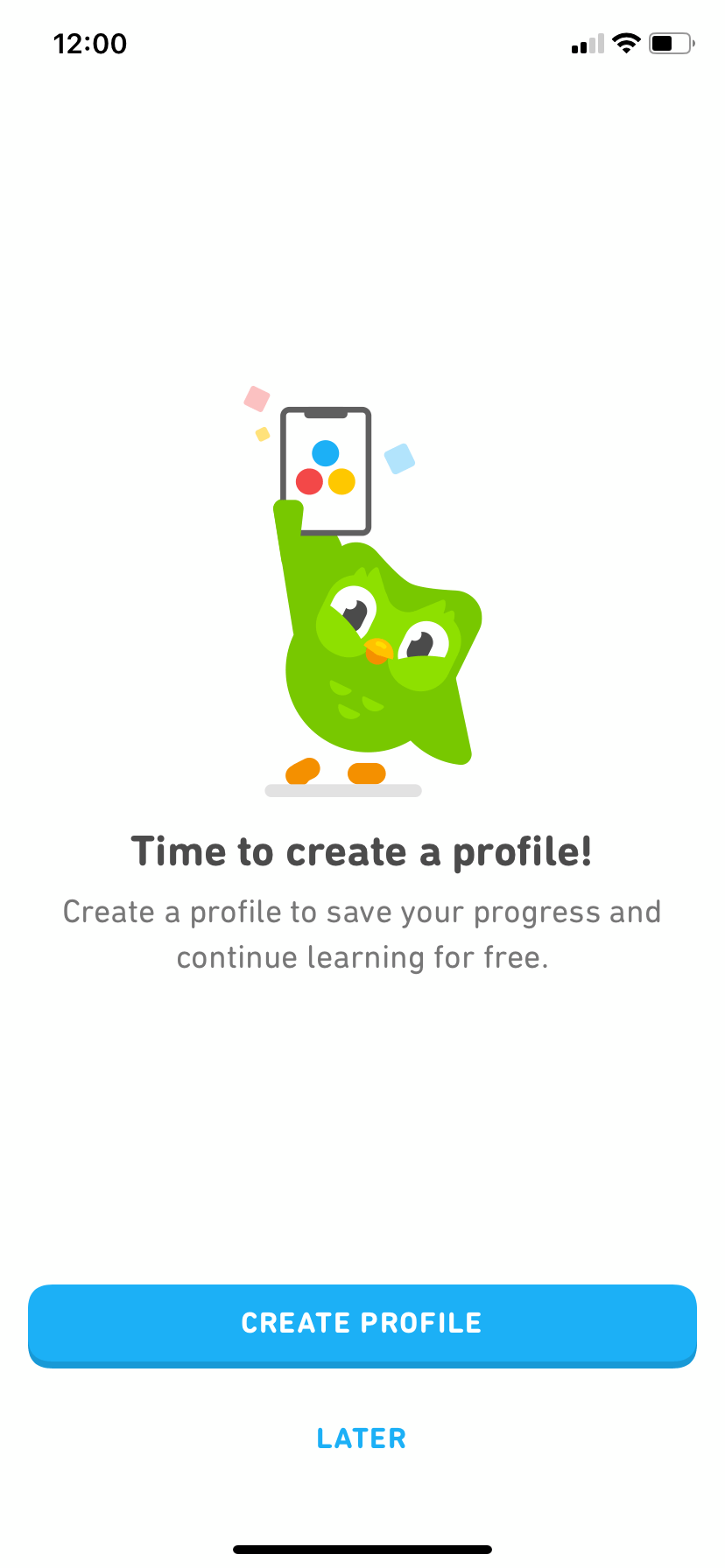
duolingo screen that says "time to create a profile" account creation prompt

Takeaways from Duolingo's onboarding:

  • Don't be coy. Create a user onboarding flow that welcomes users and drives them towards your product's “aha moment” early. You can use a progress-based approach like Duolingo, but a simple onboarding checklist can be very effective as well.
  • Segment your users by activities they've performed in-app, then use that data to personalize the onboarding experience. In Duolingo's case, segmenting allows them to easily direct users to lessons of varying difficulty depending on the users' language proficiency.

2. Optimize UX writing to provide contextual and effective messaging

Don't treat UX writing as an afterthought. The microcopy you use throughout your product—like CTA buttons, form descriptions, and modal dialogs—can help users successfully complete actions, explain technical details in everyday language, and encourage them to keep engaging with your product. And of course, effective copy can also help drive trial users towards upgrading to becoming active users with paid accounts, increasing your revenue.

Mailchimp offers a prime example of effective, well-written microcopy that nudges users toward taking action. The friendly, personalized welcome text helps to capture users' attention every time they log in, and Mailchimp's feature descriptions and calls-to-action are short and descriptive, helping users quickly identify and understand the features they're looking for.
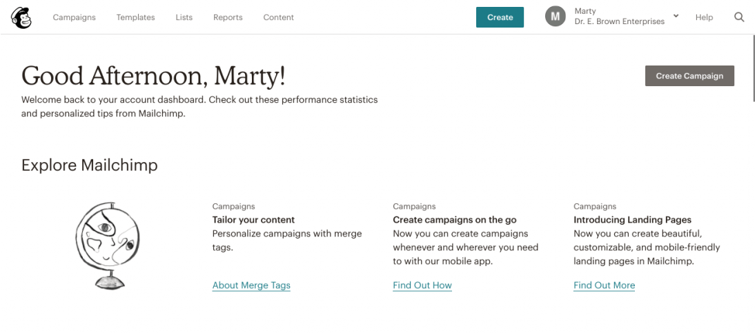
This is a screenshot of mailchimp's welcome screen that says good afternoon, with a personalized message, simple graphics and a lot of white space around crucial CTAs

Takeaways from Mailchimp's UX writing:

  • Write like a human. Avoid using technical jargon, keep sentences short and straightforward, and, wherever possible, employ users' own words to describe your product.
  • Use power words and design elements like white space to create urgency and help your CTAs stand out.
  • If your brand allows it, inject some personality. If your brand is fun and friendly, don't be afraid to include that into your microcopy.

3. Gradually expose users to new and helpful product features

That shiny new feature you're adding might be incredibly useful, but only if users know it exists. Emails and blog posts are effective customer engagement tools for announcing new product features. But if you really want to guide your active users to discover and adopt your new feature, you need to communicate with them within your app as well.

When email marketing tool Litmus rolled out their Process HTML feature, they used Appcues to create a simple tooltip letting users know about the update.
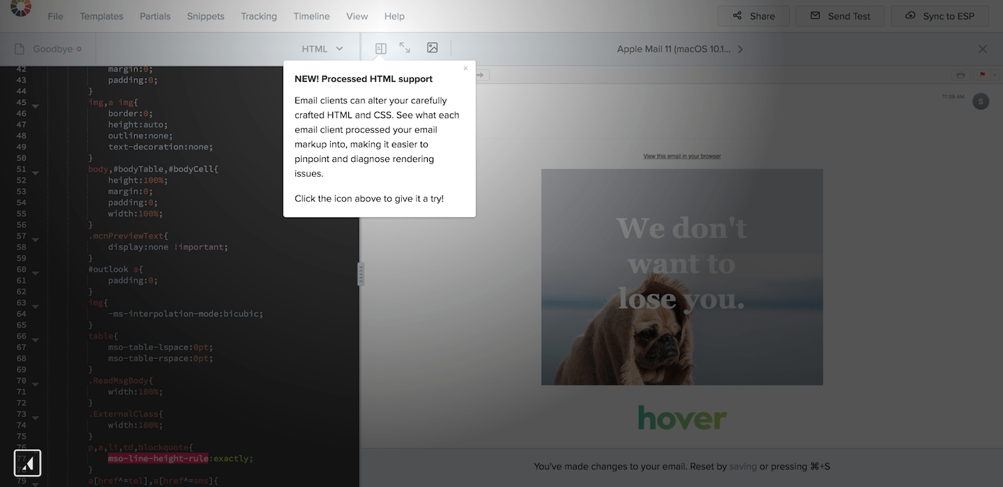
feature announcement tooltip message example from litmus

Of the users who saw the tooltip, 62% became active users of the feature, compared to only 2% in the control group. That’s a whopping 22X increase in feature adoption.

Takeaways from Litmus' new feature announcement:

  • Treat every new feature announcement like a miniature product launch—use in-app callouts to guide users towards your new feature. Complex rollouts may benefit from a short walkthrough or modal dialog to clearly explain how the feature works and how it will benefit users.
  • Keep new feature announcements short and sweet. You want to facilitate feature adoption to improve your users' experience—lengthy or heavy-handed interruptions defeat the purpose by disrupting their workflows.

4. Automatically trigger emails based on in-app behavior

User engagement happens outside your product, too. Setting certain events to trigger a timely email can be a great way to reinforce the guidance you're providing within the product through another channel, making it more likely that users will take action. That's because people have a preference for ideas that are familiar. It’s a phenomenon called the mere-exposure effect.

Some examples of behavioral emails that you can send include:
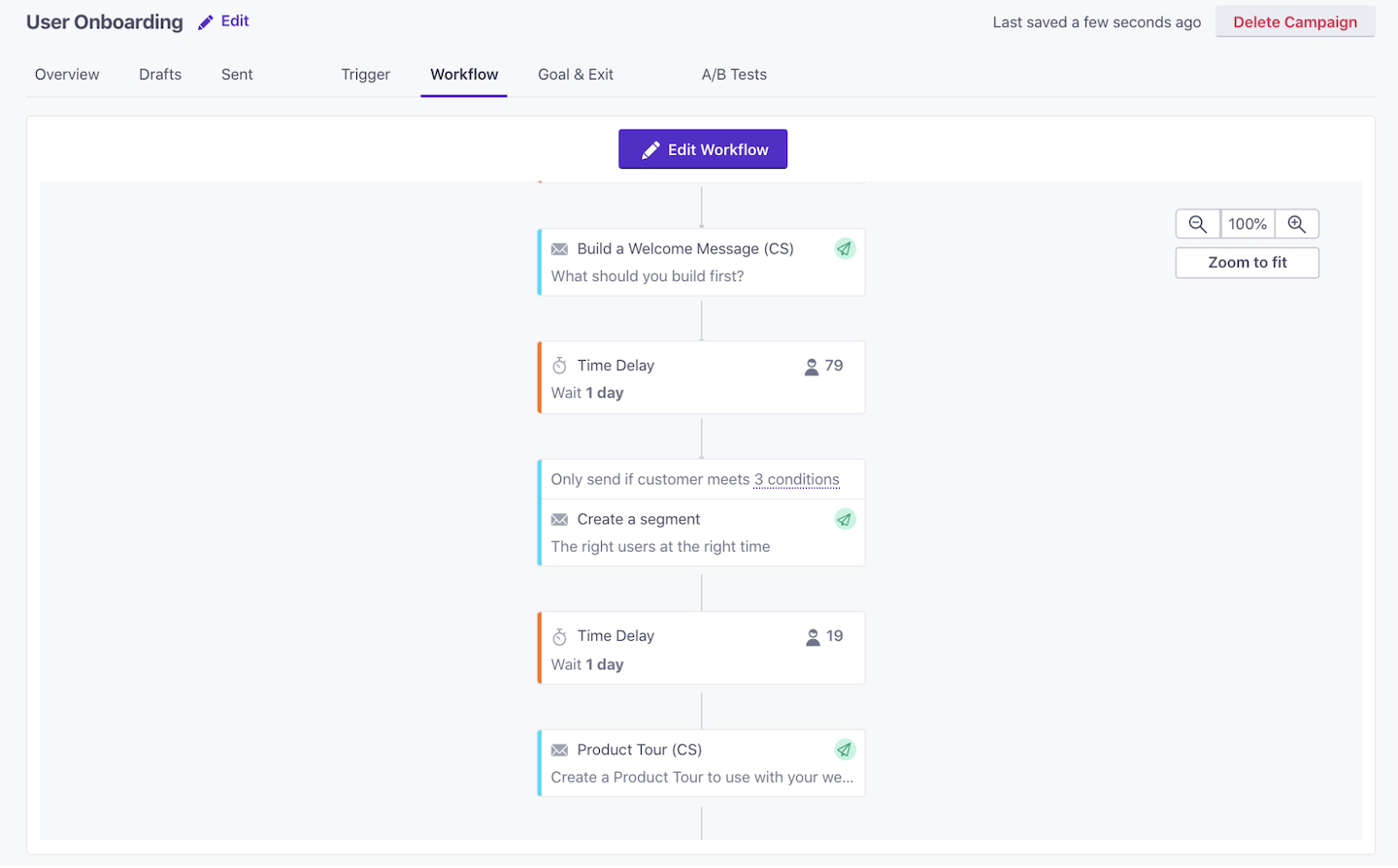
  • Activation/sign-up emails. Welcome emails have some of the highest activation rates of any type of email— so they're the perfect opportunity to introduce your brand and start building a personal connection with your users.
  • One-off emails for specific events. You can set specific in-app events to trigger emails that offer more detailed explanations about certain features that the customer is already using without interrupting their work.
  • Educational drip sequences. Teaching your users about product features and benefits over time can nurture habitual use and help customers to get the most out of your product.
  • Customer feedback surveys. Show your users you value their input, and collect valuable feedback through in-app surveys and feedback forms. Follow-up with users via email based on their response, like Appointlet did using the Appcues <> Zapier Integration.
appcues customer io multichannel in-app and email onboarding

Use your behavioral email sequence to guide your users through your product's features, ensuring that every action is followed up with a logical next step. You can find out more about creating multichannel onboarding with Appcues + Customer.io over at The Growth Lab:

Takeaways from this Growth Lab formula:

  • Timing is critical. Use in-app triggers to automatically send the right email at the right time.
  • Create a seamless flow of emails, making sure each email guides users toward the logical next step in your product.
  • Make sure you're rewarding users for completing each step. This reward can be as simple as a checkmark in an onboarding checklist, or as splashy as an animated modal window.

5. Collect qualitative feedback to find opportunities for improvement

Quantitative data and analytics tools can give you the metrics for what is not working in your product. But it can't tell you why. For that, you need to ask your active users.

Collecting qualitative data from live chat tools, user surveys, NPS scores, and session recordings can provide critical insights about how to better engage active users within your product. Using session recording tools like FullStory, product managers can observe exactly what their users are doing within the product: what they're clicking on (or not clicking on), where they're getting stuck, and so on.

Help desk software Help Scout utilized FullStory to find out where their users were running into roadblocks during their onboarding experience. They discovered that users were getting tripped up when inviting other users to join them in the software:

Using FullStory, Help Scout observed people not seeing the account owner user above (because it was greyed out), and they’d attempt to add a duplicate user. Most people would catch this in time, but it’s unneeded friction, and something that we’re improving in a future iteration.
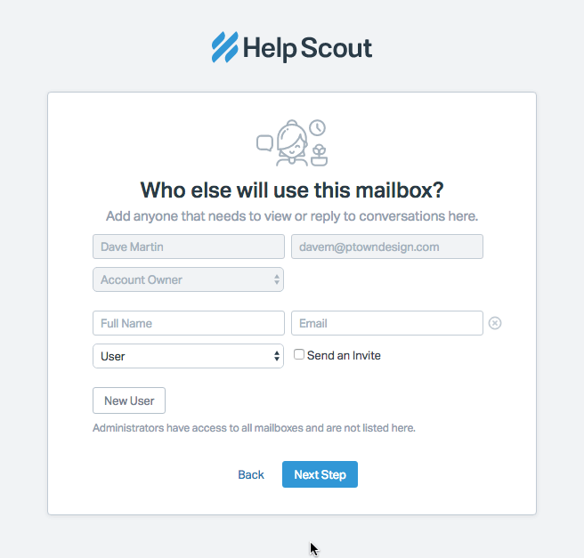
This is a screenshot of HelpScout's invite another user screen. Some users were confused by the grayed out account owner field.
Image courtesy of FullStory

Takeaways from Help Scout's feedback collection:

  • Monitor feedback on a regular basis. It's easy to get lost in your own product; setting aside time to observe your customers or listen to feedback can help you build empathy and identify bugs early on.
  • Look for trends in the data. While individual user feedback can be useful, it's often more helpful to look for multiple users reporting the same problem—this helps you avoid the “squeaky wheel syndrome” and concentrate on the most important changes you can make to increase engagement among the majority.

6. Optimize software by ruthlessly cutting under-used features

Sometimes, knowing what users don't need is just as important as knowing what they do need.

Rolling out too many features that don't add value creates product debt that can drag your core product down and lead users to believe you've lost focus on the critical features that they signed up for in the first place.

Removing features is a hard decision, especially when you've put in significant time and development effort. But if your analytics data shows that customers simply aren't using that shiny new feature you rolled out last year, you have 2 choices: You can ask customers why they're not using it and devote more resources to improving the underused feature, or you can cut your losses and scrap the feature entirely.
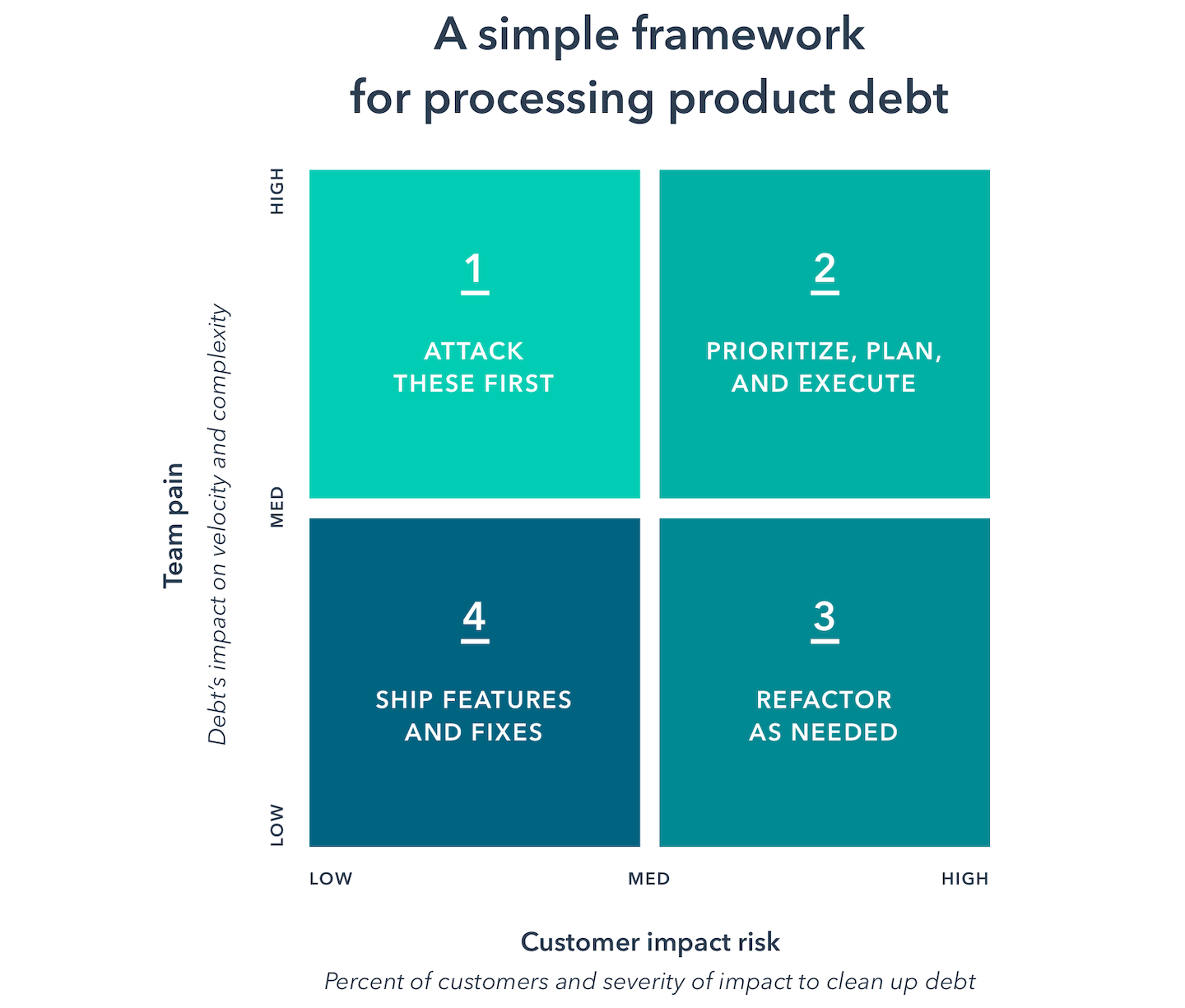
a framework for processing product debt in 4 quadrants, image from hubspot
Source

In his book Lost and Founder, former Moz CEO Rand Fishkin candidly discusses how diversifying their products outside their core focus of SEO led to massive revenue losses and layoffs for the company:

When you’re building a company from the ground up, for the first time, in a new field, with a new team, you need all the simplicity you can get. Everything is going to be uniquely challenging because you and your team haven’t seen it or done it before, and because market forces are inherently structured to benefit incumbents. The great strength startups usually have is that they can uniquely focus all their energy on just one thing, whereas their incumbent competitors have diverse efforts and responsibilities that impede progress. Losing focus and asking your small team(s) to take on more tasks rather than do one thing better costs you this critical advantage.

After regaining focus on their core SEO product in 2017, Moz returned to profitability and is back to being one of the leading SEO tools in the industry.

Takeaways from Moz's regained product focus:

  • Removing unused features can help users focus on the most important and useful parts of your product. The fewer options you provide users, the faster they'll find the core value.
  • Large, complicated feature sets also create additional development and maintenance costs for your team, reducing how much time you have to work on improving the core features.

There's no one-size-fits-all solution for product engagement

Every product and every user is different. Understanding the best ways to keep users engaged will take some trial and error. And the fact is, even if your product meets expectations, some users may change brands just for variety’s sake. Which is a pretty scary thought!

The good news is that the opportunities for increasing user engagement are endless. Every improvement you make—whether you're optimizing your onboarding, tweaking your microcopy, announcing new features, or collecting feedback from your users—can improve user experience, create sustainable growth, and keep your churn rate in check.

And if you're thinking "gosh, I wish there was a comprehensive framework for growing a business by optimizing the user experience," then look no further! We've got you covered with the Product-Led Growth Flywheel, which you can read all abut here.
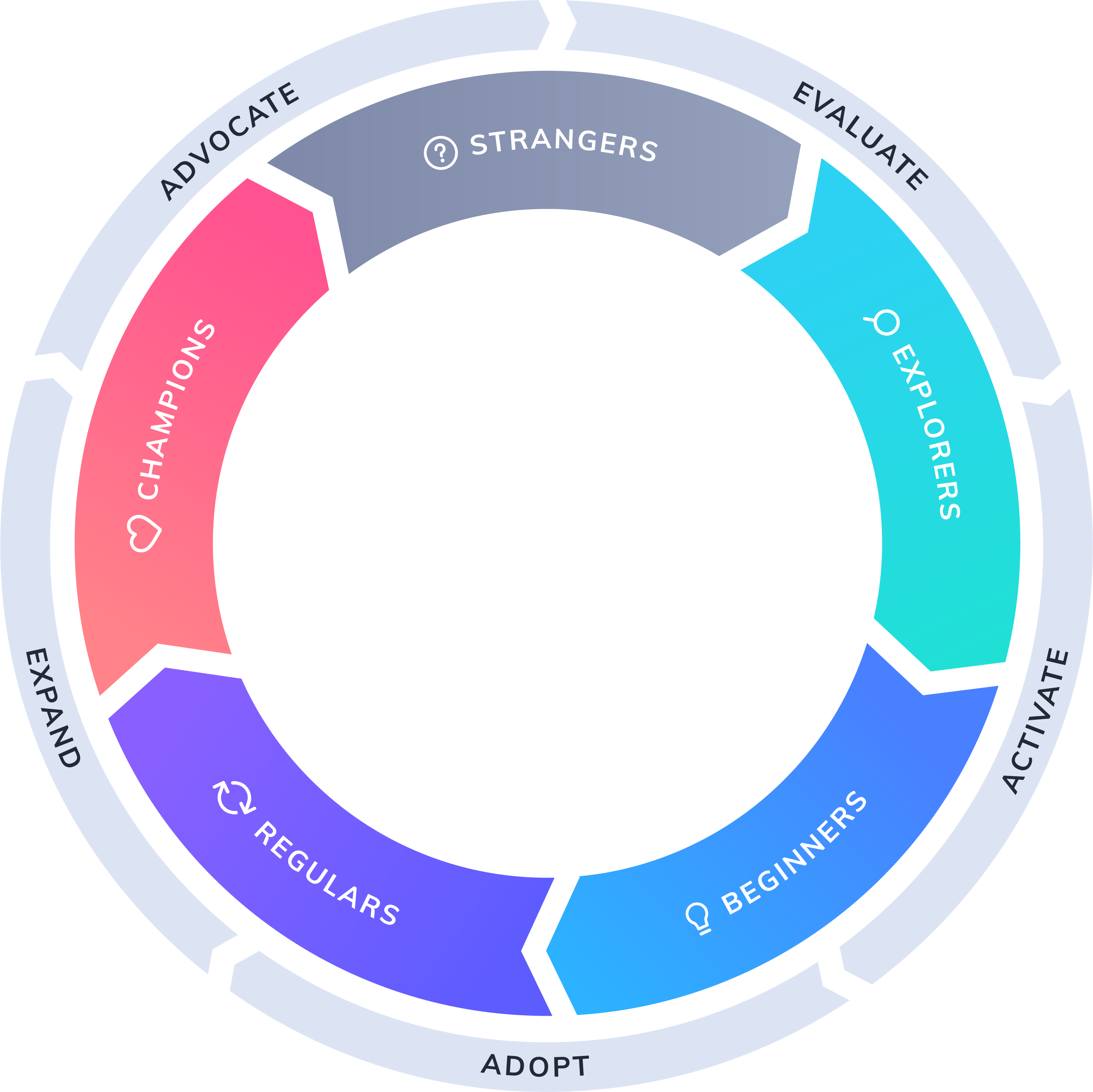
product-led growth flywheel

User Engagement FAQ’s

What is the role of user engagement?

User Engagement refers to the level of interaction and response that users have with the content and features of the software, and can be measured by metrics like the number of clicks, likes, shares, comments, or time spent. 

How do you build user engagement?

You can build user engagement through six strategies: provide early “aha” moments, optimize UX writing, expose users to new features, trigger emails based on in-app behavior, collect feedback, and cut under-used features.

What is a good user engagement?

The definition of “active” can be quite different between products. While a social media automation tool might have users logging in every day, a budgeting tool might have users logging in only once or twice a month, and still count that as high engagement.

Eric Keating
VP, Marketing at Appcues
Eric heads up Marketing at Appcues. When he isn't helping companies become more product-led, he’s likely to be found keeping up with his wife and two children, exploring the White Mountains, or fermenting things at home.
Skip to section:

Skip to section:

Engagement looks different across products—a travel app will always be used less frequently than email—and there isn’t one engagement metric that is passed around from product person to product person as the golden standard.

But when it comes down to it, engagement involves users taking meaningful actions in your product, again and again.

Active and engaged users are the foundation of every successful SaaS company—without a steady stream of users regularly using your product, you don't really have a viable SaaS business. And you certainly won't achieve product-led growth.

That's because subscription revenue from SaaS products is generated over months, or even years. Even the healthiest SaaS companies can take upwards of 5 to 7 months to start generating positive revenue. It's critical that your users continue engaging with your product for as long as possible.

What does user engagement mean for SaaS?

Before we jump into strategies for increasing user engagement, let's clarify what it really means from a product perspective—and why it's such an important metric for your SaaS company.

User Engagement is defined by how actively involved and interested users are in your software. It refers to the level of interaction and response that users have with the content and features of the software, and can be measured by metrics like the number of clicks, likes, shares, comments, or time spent. 

It’s important because more engaged users lead to higher retention rates, increased conversions, and, ultimately, business growth.

In a nutshell, the user engagement rate represents the percentage of users who remain active within your product over a defined period of time. Tracking how many users remain truly engaged with your product is a great indicator of overall product health, and any changes in this metric can be a leading indicator of potential problems down the road.

The main challenge with tracking product engagement is that the definition of “active” can be quite different between products. While a social media automation tool might have users logging in every day, a budgeting tool might have users logging in only once or twice a month, and still count that as high engagement.

user engagement rate formula

The main challenge with tracking product engagement is that the definition of “active” can be quite different between products. While a social media automation tool might have users logging in every day, a budgeting tool might have users logging in only once or twice a month, and still count that as high engagement.

Lincoln Murphy defined engagement as a state:

"Engagement is when your customer is realizing value from your SaaS."

Most SaaS companies  see the number of users drop off after just a single use of the free trial. It's critical to keep customer engagement high during this period to maximize your conversion rate and retention. But to truly increase user engagement, you need to optimize the customer experience and help your users get value from your product over time.


Since user engagement evolves over the user journey, an earnest attempt at optimizing it means boosting habitual product usage at every turn. A strong focus on communication and user engagement can help combat churn within your existing customer base, keeping your customers up to date on product changes, and helping you identify issues before they become bigger problems.

Now, let's take a look at 6 proven ways to increase SaaS product engagement:

1. Early “aha” moments improve user engagement 

User onboarding has a powerful ripple effect on the entire customer journey and customer experience. Your onboarding sequence is the first hands-on experience your users' will have with your product, so it's important to make a good impression. Think of user onboarding as the hook to long-term engagement and conversion to active users.

Since user motivation is typically at a high during onboarding, it's a good time to get users to accomplish meaningful actions and obtain immediate value. Walk each new user through key features of your product, with the goal of helping them find your product's core value proposition as quickly as possible. 

In other words, help them find their aha moment fast.

Language learning tool Duolingo does this wonderfully. Their onboarding flow guides visitors through a quick translation exercise, showing how quick and easy it is to learn a new language—before asking users to commit to the product with a signup.

duolingo onboarding choose a path mobile screen that asks users to select their experience level

Users are prompted to choose a learning goal. Getting users to commit to a mission before even signing up has a huge impact on how likely the user will be to stick with the platform. That's because humans have an inherent completion bias, or the desire to get things done.

duolingo mobile app screen pick a language learning goal

By the time Duolingo gives users the opportunity to sign up, they've already made progress towards their goal, by going through a short lesson:

duolingo user onboarding language lesson mobile app ux example

By flipping the onboarding process on its head—starting with the product and finishing with a signup form—Duolingo is able to demonstrate the value of their product before even asking users to register:

duolingo screen that says "time to create a profile" account creation prompt

Takeaways from Duolingo's onboarding:

  • Don't be coy. Create a user onboarding flow that welcomes users and drives them towards your product's “aha moment” early. You can use a progress-based approach like Duolingo, but a simple onboarding checklist can be very effective as well.
  • Segment your users by activities they've performed in-app, then use that data to personalize the onboarding experience. In Duolingo's case, segmenting allows them to easily direct users to lessons of varying difficulty depending on the users' language proficiency.

2. Optimize UX writing to provide contextual and effective messaging

Don't treat UX writing as an afterthought. The microcopy you use throughout your product—like CTA buttons, form descriptions, and modal dialogs—can help users successfully complete actions, explain technical details in everyday language, and encourage them to keep engaging with your product. And of course, effective copy can also help drive trial users towards upgrading to becoming active users with paid accounts, increasing your revenue.

Mailchimp offers a prime example of effective, well-written microcopy that nudges users toward taking action. The friendly, personalized welcome text helps to capture users' attention every time they log in, and Mailchimp's feature descriptions and calls-to-action are short and descriptive, helping users quickly identify and understand the features they're looking for.

This is a screenshot of mailchimp's welcome screen that says good afternoon, with a personalized message, simple graphics and a lot of white space around crucial CTAs

Takeaways from Mailchimp's UX writing:

  • Write like a human. Avoid using technical jargon, keep sentences short and straightforward, and, wherever possible, employ users' own words to describe your product.
  • Use power words and design elements like white space to create urgency and help your CTAs stand out.
  • If your brand allows it, inject some personality. If your brand is fun and friendly, don't be afraid to include that into your microcopy.

3. Gradually expose users to new and helpful product features

That shiny new feature you're adding might be incredibly useful, but only if users know it exists. Emails and blog posts are effective customer engagement tools for announcing new product features. But if you really want to guide your active users to discover and adopt your new feature, you need to communicate with them within your app as well.

When email marketing tool Litmus rolled out their Process HTML feature, they used Appcues to create a simple tooltip letting users know about the update.

feature announcement tooltip message example from litmus

Of the users who saw the tooltip, 62% became active users of the feature, compared to only 2% in the control group. That’s a whopping 22X increase in feature adoption.

Takeaways from Litmus' new feature announcement:

  • Treat every new feature announcement like a miniature product launch—use in-app callouts to guide users towards your new feature. Complex rollouts may benefit from a short walkthrough or modal dialog to clearly explain how the feature works and how it will benefit users.
  • Keep new feature announcements short and sweet. You want to facilitate feature adoption to improve your users' experience—lengthy or heavy-handed interruptions defeat the purpose by disrupting their workflows.

4. Automatically trigger emails based on in-app behavior

User engagement happens outside your product, too. Setting certain events to trigger a timely email can be a great way to reinforce the guidance you're providing within the product through another channel, making it more likely that users will take action. That's because people have a preference for ideas that are familiar. It’s a phenomenon called the mere-exposure effect.

Some examples of behavioral emails that you can send include:

  • Activation/sign-up emails. Welcome emails have some of the highest activation rates of any type of email— so they're the perfect opportunity to introduce your brand and start building a personal connection with your users.
  • One-off emails for specific events. You can set specific in-app events to trigger emails that offer more detailed explanations about certain features that the customer is already using without interrupting their work.
  • Educational drip sequences. Teaching your users about product features and benefits over time can nurture habitual use and help customers to get the most out of your product.
  • Customer feedback surveys. Show your users you value their input, and collect valuable feedback through in-app surveys and feedback forms. Follow-up with users via email based on their response, like Appointlet did using the Appcues <> Zapier Integration.
appcues customer io multichannel in-app and email onboarding

Use your behavioral email sequence to guide your users through your product's features, ensuring that every action is followed up with a logical next step. You can find out more about creating multichannel onboarding with Appcues + Customer.io over at The Growth Lab:

Takeaways from this Growth Lab formula:

  • Timing is critical. Use in-app triggers to automatically send the right email at the right time.
  • Create a seamless flow of emails, making sure each email guides users toward the logical next step in your product.
  • Make sure you're rewarding users for completing each step. This reward can be as simple as a checkmark in an onboarding checklist, or as splashy as an animated modal window.

5. Collect qualitative feedback to find opportunities for improvement

Quantitative data and analytics tools can give you the metrics for what is not working in your product. But it can't tell you why. For that, you need to ask your active users.

Collecting qualitative data from live chat tools, user surveys, NPS scores, and session recordings can provide critical insights about how to better engage active users within your product. Using session recording tools like FullStory, product managers can observe exactly what their users are doing within the product: what they're clicking on (or not clicking on), where they're getting stuck, and so on.

Help desk software Help Scout utilized FullStory to find out where their users were running into roadblocks during their onboarding experience. They discovered that users were getting tripped up when inviting other users to join them in the software:

Using FullStory, Help Scout observed people not seeing the account owner user above (because it was greyed out), and they’d attempt to add a duplicate user. Most people would catch this in time, but it’s unneeded friction, and something that we’re improving in a future iteration.
This is a screenshot of HelpScout's invite another user screen. Some users were confused by the grayed out account owner field.
Image courtesy of FullStory

Takeaways from Help Scout's feedback collection:

  • Monitor feedback on a regular basis. It's easy to get lost in your own product; setting aside time to observe your customers or listen to feedback can help you build empathy and identify bugs early on.
  • Look for trends in the data. While individual user feedback can be useful, it's often more helpful to look for multiple users reporting the same problem—this helps you avoid the “squeaky wheel syndrome” and concentrate on the most important changes you can make to increase engagement among the majority.

6. Optimize software by ruthlessly cutting under-used features

Sometimes, knowing what users don't need is just as important as knowing what they do need.

Rolling out too many features that don't add value creates product debt that can drag your core product down and lead users to believe you've lost focus on the critical features that they signed up for in the first place.

Removing features is a hard decision, especially when you've put in significant time and development effort. But if your analytics data shows that customers simply aren't using that shiny new feature you rolled out last year, you have 2 choices: You can ask customers why they're not using it and devote more resources to improving the underused feature, or you can cut your losses and scrap the feature entirely.

a framework for processing product debt in 4 quadrants, image from hubspot
Source

In his book Lost and Founder, former Moz CEO Rand Fishkin candidly discusses how diversifying their products outside their core focus of SEO led to massive revenue losses and layoffs for the company:

When you’re building a company from the ground up, for the first time, in a new field, with a new team, you need all the simplicity you can get. Everything is going to be uniquely challenging because you and your team haven’t seen it or done it before, and because market forces are inherently structured to benefit incumbents. The great strength startups usually have is that they can uniquely focus all their energy on just one thing, whereas their incumbent competitors have diverse efforts and responsibilities that impede progress. Losing focus and asking your small team(s) to take on more tasks rather than do one thing better costs you this critical advantage.

After regaining focus on their core SEO product in 2017, Moz returned to profitability and is back to being one of the leading SEO tools in the industry.

Takeaways from Moz's regained product focus:

  • Removing unused features can help users focus on the most important and useful parts of your product. The fewer options you provide users, the faster they'll find the core value.
  • Large, complicated feature sets also create additional development and maintenance costs for your team, reducing how much time you have to work on improving the core features.

There's no one-size-fits-all solution for product engagement

Every product and every user is different. Understanding the best ways to keep users engaged will take some trial and error. And the fact is, even if your product meets expectations, some users may change brands just for variety’s sake. Which is a pretty scary thought!

The good news is that the opportunities for increasing user engagement are endless. Every improvement you make—whether you're optimizing your onboarding, tweaking your microcopy, announcing new features, or collecting feedback from your users—can improve user experience, create sustainable growth, and keep your churn rate in check.

And if you're thinking "gosh, I wish there was a comprehensive framework for growing a business by optimizing the user experience," then look no further! We've got you covered with the Product-Led Growth Flywheel, which you can read all abut here.

product-led growth flywheel

User Engagement FAQ’s

What is the role of user engagement?

User Engagement refers to the level of interaction and response that users have with the content and features of the software, and can be measured by metrics like the number of clicks, likes, shares, comments, or time spent. 

How do you build user engagement?

You can build user engagement through six strategies: provide early “aha” moments, optimize UX writing, expose users to new features, trigger emails based on in-app behavior, collect feedback, and cut under-used features.

What is a good user engagement?

The definition of “active” can be quite different between products. While a social media automation tool might have users logging in every day, a budgeting tool might have users logging in only once or twice a month, and still count that as high engagement.

Eric Keating
VP, Marketing at Appcues
Eric heads up Marketing at Appcues. When he isn't helping companies become more product-led, he’s likely to be found keeping up with his wife and two children, exploring the White Mountains, or fermenting things at home.
You might also like...