

How do I know if onboarding is working?
You know what they say: Always Be Testing. But seriously, when it comes to user onboarding, your work is never done. Sorry. This lesson will teach you how to test, measure, and iterate your way to onboarding glory.


How do I know if onboarding is working?
There’s so much pressure to create beautiful onboarding experiences, it’s easy to forget why we’re building them. What were we aiming to get out of this, again? As you plan out your onboarding program, keep the conversation centered around outcomes and goals versus the mechanics of what you’re building. Fostering this mindset helps you come up with smart experiments and measure the right metrics.
Before we dive into ideas for experiments, let’s align on the numbers. There are a million metrics we could measure, with an equal number of acronyms and initialisms (keep your CAC low, increase MRR, while optimizing for LTV) but for this lesson, we’re focusing on product data.
Activation
As we’ve discussed in previous lessons, activation is the guiding light of onboarding experiences. So it’s no surprise that your activation rate will be a key metric to track.
It’s not rocket science, it’s just the number of people who performed the activation activity divided by the total number of people who signed up in a given time period x 100 to get the percentage. Lots of product analytics tools will even calculate this for you if you’re using a funnel report.

If this sounds too simplistic for your product, don’t worry. Many products have multiple user journeys and activation moments. The best place is to start at the very beginning with your leakiest bucket--the places where people are finding the least success and abandoning your product.
Drop-off
Drop-off is the ying to the activation yang. A more intuitively named metric than activation rate, drop-off looks at where you’re losing folks in your user journey. Learning where new users fall out of your happy path is a great way to start generating ideas for experiments, and understanding the baseline drop-off rates for each of those points can help you learn when things you’re doing are making a difference.
Finding drop-off points is a bit easier once you’ve got your user journey ready to go. You’ll need to run some product analytics for this one, or export some data from your database and start going hog wild in spreadsheets.
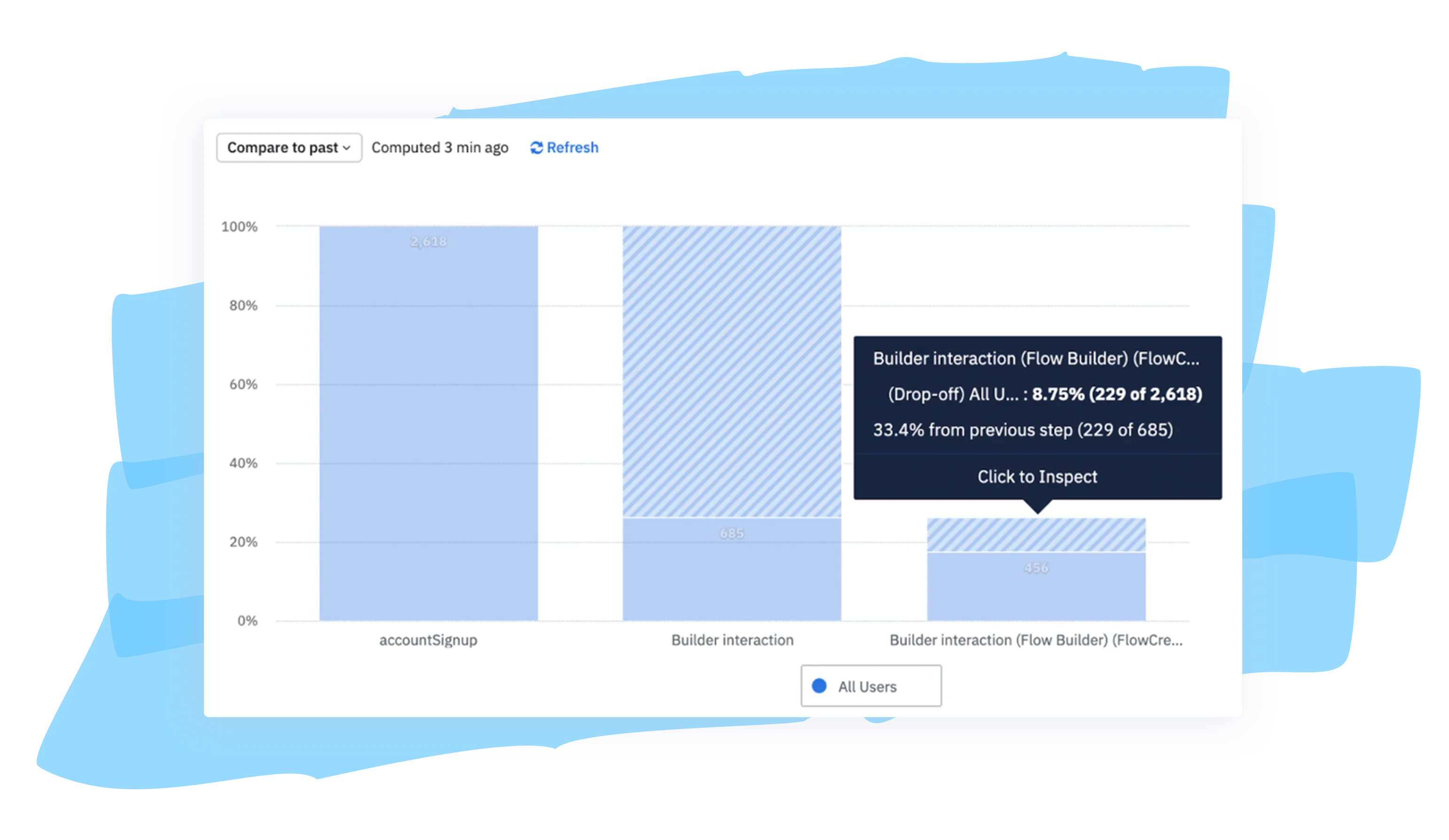
At this point, there’s a bunch of numbers and charts floating around. How do you make sense of it all? Here’s where you’ll want to bust out a journey mapping tool, your favorite spreadsheet, or pen and paper (why not?), and start building your top-down view.
User engagement
Tracking the number of daily, weekly, or monthly active users (whatever makes the most sense for your product) is a pretty obvious measure of success—usually the more, the better. But here’s the thing: You’ll need to determine which time interval makes the most sense for your product. Daily active users sounds great, but do your best users actually need to log in every single day to get value out of your product? There are ways to increase how frequently folks use your product, but first you’ll want to make sure you’re getting users in the door and immediately finding value.
Baselines
Lots of us start personal hobbies or goals with no baseline. We just know we don’t like how we are right now, and we’ll know when we’re feeling better. Right? Onboarding can work like that too, but in personal journeys, we only have ourselves to answer for. Proving the impact of your work on the user journey is not only gratifying on a personal level, but helps you learn what’s working and how to do more of that (and less of the other stuff). Oh, and documenting your wins also means you can share something tangible with your team!
Once you have your user journey mapped out (don’t forget, just a few actions is okay), record each step in order. Then add drop-off rates between each step. So it could look something like:

It’s even better if you can map this out with visuals of the experiences associated with each action, like the emails or messages someone would receive at each step.
You’ll also want to calculate your current activation rate and include this as your baseline KPI. Ready for some quick math? Let’s say “Rider gets in car” is when someone is considered activated, and 1,000 users signed up in the past 6 months. Now let’s say 200 of those users actually got a ride. That would give you an activation rate of… 20%!
It would be great if we could confidently say that 20% is a good or a bad number. The reality is it depends. This is the beauty of building your baselines! You will know what a good or bad number is to your company, and you’ll know when you’ve improved. One thing we’ll note is that your activation rate shouldn’t be shocking to you one way or another. Did you end up with a 50% activation rate, but you absolutely know you have a leaky funnel problem earlier in the user journey? Or maybe you ended up with a very low number, but you know you have a steady stream of folks paying and signing up?
Be sure you record this baseline and set yourself some reasonable goals. If your current activation rate is 10%, and you’re a team of 1—responsible for building, analyzing, and evolving onboarding—set a reasonable, achievable goal, like a 5% uplift in the first 6 months. Don’t disappoint yourself by shooting for the moon and missing.
Brainstorming
These things you spent so much time working on—mapping the user journey, determining your activation and drop-off rates, and putting them all together—was not in vain. All this work is building on itself and setting you up to start layering experiments into your onboarding.
At this point, you should have some idea of where there are noticeable drop-off points in your onboarding. Now, here’s when you’ll start to feel like a real magician. Drop-off will always happen, but you can start to watch those numbers get smaller and smaller while growing your activation rate by constantly tweaking and evolving your onboarding. (It’s way easier to iterate when you have a third-party tool vs. building in house, just sayin’.)

It’s easy to say “generate ideas… NOW!”, but there are endless resources out there to help you facilitate productive brainstorming sessions.
Don’t just invite marketers and product people to these sessions—include sales and customer experience teams. They have the voice of the customer in their heads all the time, and could pinpoint issues you may miss entirely or only find through hours of research.
Experimenting
At this point, after you’ve thoroughly read and applied all the material so far (😁), you’ve got a good idea of your funnel, baselines, and where you want to improve. Now’s the fun part—coming up with the experiments!
There’s a variety of ways to run experiments and test your theories. Let’s list em:
A/B(C):
A/B tests compare apples to apples to see which version, A or B, performed better. Performance generally means clicks or engagement on the particular content piece, but as we’ve covered, you’ll want to dig in deeper and see which versions actually lead to product adoption. In most simple experiments, A is the control, or the baseline version. B is the version you’re testing. You can also play with A/B/C testing which tests that baseline (A) against two different versions (B or C).
A/B tests are best when you have lots of traffic or users, otherwise it can take quite a while to get any statistically significant results. A/B tests gets a lot of press, but there are plenty of other ways to test your ideas.
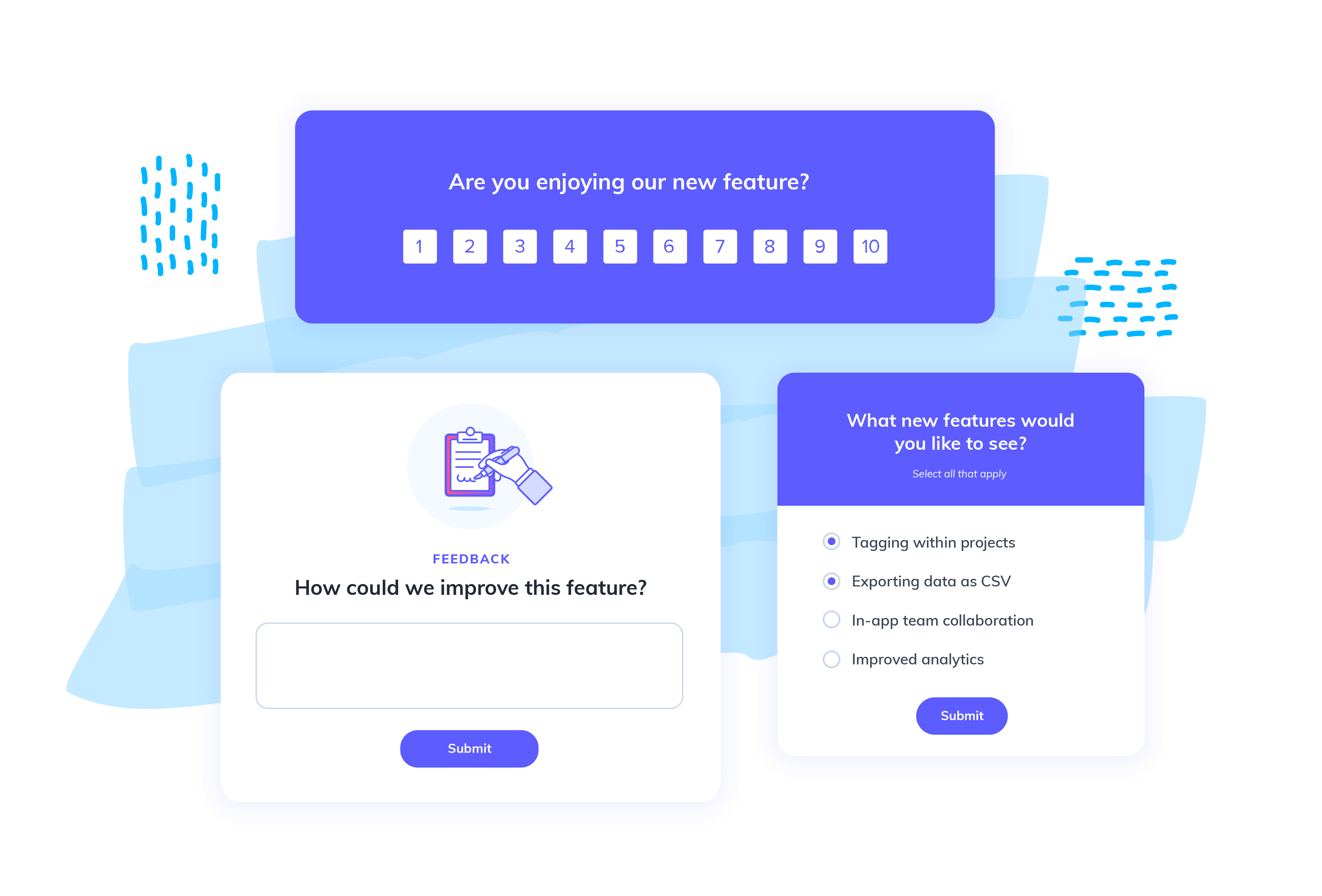
Microsurveys:
Ask a direct, explicit question about a feature, or request users to rate a particular experience. If you’re asking the question via an in-app experience, then be sure it’s clear how to respond and not intrusive. You’re aiming to get that snap judgment and speedy response. If you’re using email, you can link to a longer survey and potentially elicit more detailed responses. Using a combo of both, you can get those snap judgments and request more details through an email or call.


Be super explicit in how you phrase your questions. What exactly do you need to know? And how much information do you need? Is just an emoji reaction alright, or do you need a few sentences?
Testing services:
It might sting to shell out for feedback, but it’s worth it to pay up and get insights before you make huge swings that might be in the wrong direction. There are lots of options for vendors across industries and specialities—it’s not all just reviewing prototypes on a phone call. You can work with testing vendors to get recorded sessions of folks using and responding to your prototypes, get feedback on just copy, or send out a survey to a group of people.
What to test?
When numbers aren’t going the way you want, it’s tough to decide where to begin. It could be anything and everything! Using previous prioritization work, your newfound understanding of where your leakiest parts of your funnel are, plus that crafty brainstorming session, you should have at least some broad strokes of where to start. Here are a handful of examples of tests we’ve run in the past to hopefully get your wheels turning:

Dark vs. light?
Are your communications giving off the right vibe? An experience that doesn’t gel with your product or your brand can put people off and make things feel disconnected or sloppy. Particularly with in-app experiences, if it doesn’t feel like it’s built right into your product, you might lose trust among your users. Experiment with the colors and branding you use. Does it perform better when it pops out more from your product? Or does a tooltip that blends in like any other component in your product make more of an impact?

Emoji vs. no emoji?
This might seem minor, but when you need every eyeball possible on your content, the little things can add up. Test whether or not adding emoji to your flows, emails, or other communications is actually hurting you or helping you.

Personalized or hands-off?
We’re getting more and more sensitive to companies snooping on us, and even as marketers, we can admit that it’s gotten borderline invasive. A personalized experience is certainly better, but how explicit should you be? The last thing you want to do is scare off users, but where is the line? Try building content or experiences that call out specific demographic or usage info and test that against more generic messaging. You might be surprised.

Choose your own adventure or guided?
Along the lines of personalization, we’re seeing lots more questions when we research or make purchases. Consumer brands offer “quizzes” to determine the right product for you, software products present you with welcome modals offering a few choices based on your goals or your role. It sounds great. Who wouldn’t want a customized product? Careful though—this sets high expectations, and we’ve seen this pattern fail in testing.

Results, rinse, and repeat
Following the same logic you used to obtain your activation rate, find your drop-off points, and determine how many people use your app—start tracking when you launch specific experiments to see if there’s an impact (and keep your eye on your support tickets). If you feel like getting fancy, break folks out into cohorts based on what experiences they received, and analyze on a cohort by cohort basis. Even better if you have product analytics at the ready to get super nitty gritty.
Once you’ve analyzed the results of your first experiment, you’ll want to share your learnings with your team and start planning for your next test. Remember: you should never wipe your hands clean and walk away from your user onboarding. There will always be room for improvement, and your users (and your business) deserve the very best!

