


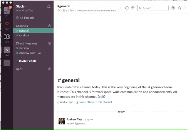
When you open up Slack it isn't exactly hard to figure out what to do next. Even without Slack's new onboarding flow, when a user is presented with this screen its pretty obvious what you're supposed do:
Start typing. Switch channels. Invite some friends so you don't just have Slackbot to talk to.
It is intuitive. The holy grail of any UI. Every product team wants their UI to be intuitive to users. An intuitive UI helps you fundamentally understand how your users are going to use your product and how you can help them achieve that use.
Yet, the entire concept of intuition is vague. Outside UIs, you really only ever hear the word intuition in the context of crystal balls, dubious relationship advice, and the odd Jewel song. So how do you build an intuitive product when you don't actually know what intuitive means?
For product managers and designers, this issue is real. Slack is a success not only because of its features, but also because of its design. A new team can get started with the app with no friction. A new team member can easily join and understand exactly what to do and where to do it. Slack makes team communication easy—and is now valued at $7+ billion for doing so.
So how does Slack—or any number of other products with intuitive UIs—craft such an intuitive interface when the concept itself is so vague?
Answer: They don't.
You can't design something just to be intuitive. Intuition is too ephemeral to be a design goal. What you can do, as Slack and other successful companies do, is split the idea of an intuitive UI into its component parts.
What do we really mean by an intuitive UI?
Everett McKay of UX Design Edge first started exploring this question in 2010 to understand why, when he was at Microsoft, everyone would tell him how intuitive Macs were.
When he pressed, they didn't have an answer. They were just...easier to understand, easier to like, easier to use. You could just figure out everything more quickly with a Mac. Even though , users were more satisfied with the end result.
In his book Intuitive Design, McKay suggests there are 8 steps that a user takes through an app, each one of which contributes to an intuitive experience. Below, we take a look at each of these steps and how different products are using these concepts to build intuition in their UI.
1. Discoverability lets your users find what they need
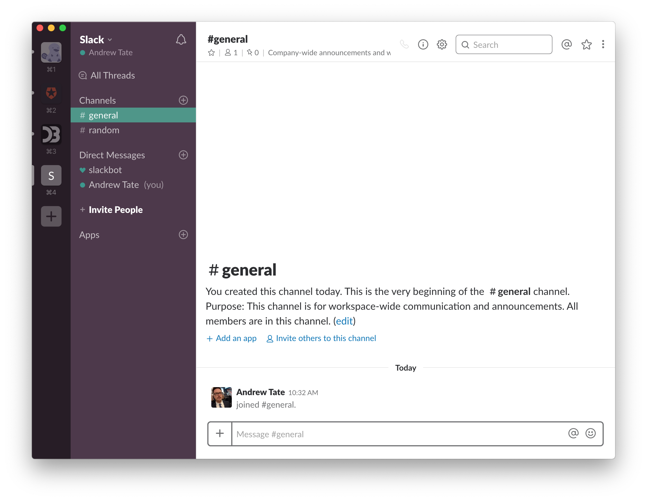
Slack makes discoverability easy. If we go back to that first screen, we can see that all the features are ready to discover, even though at first glance it looks like a blank, white page:
It's easy to discover different features of the product from a single screen:
- Messages are right there
- Channels are right there
- Direct messages are right there
- Apps are right there
- Teams are right there
Notifications, settings, channel purposes, calls, invites, search, emojis, starred/pinned items are all within easy reach of this single start screen—yet thanks to the clean design, it doesn't overwhelm. A new user can intuitively find what they need to pretty much immediately. They don't have to go down a menu warren.
2. Affordance tells your users what the UI is going to do
Affordance refers to an interface's visual clues about a particular element and how it can be used by the user. A user doesn't need to experiment to find out what happens if they do a particular action—it is intuitive that if you click a + button, you are going to add something.
Menu bars commonly use affordance. For example, check out project management tool Redbooth's mobile app UI:
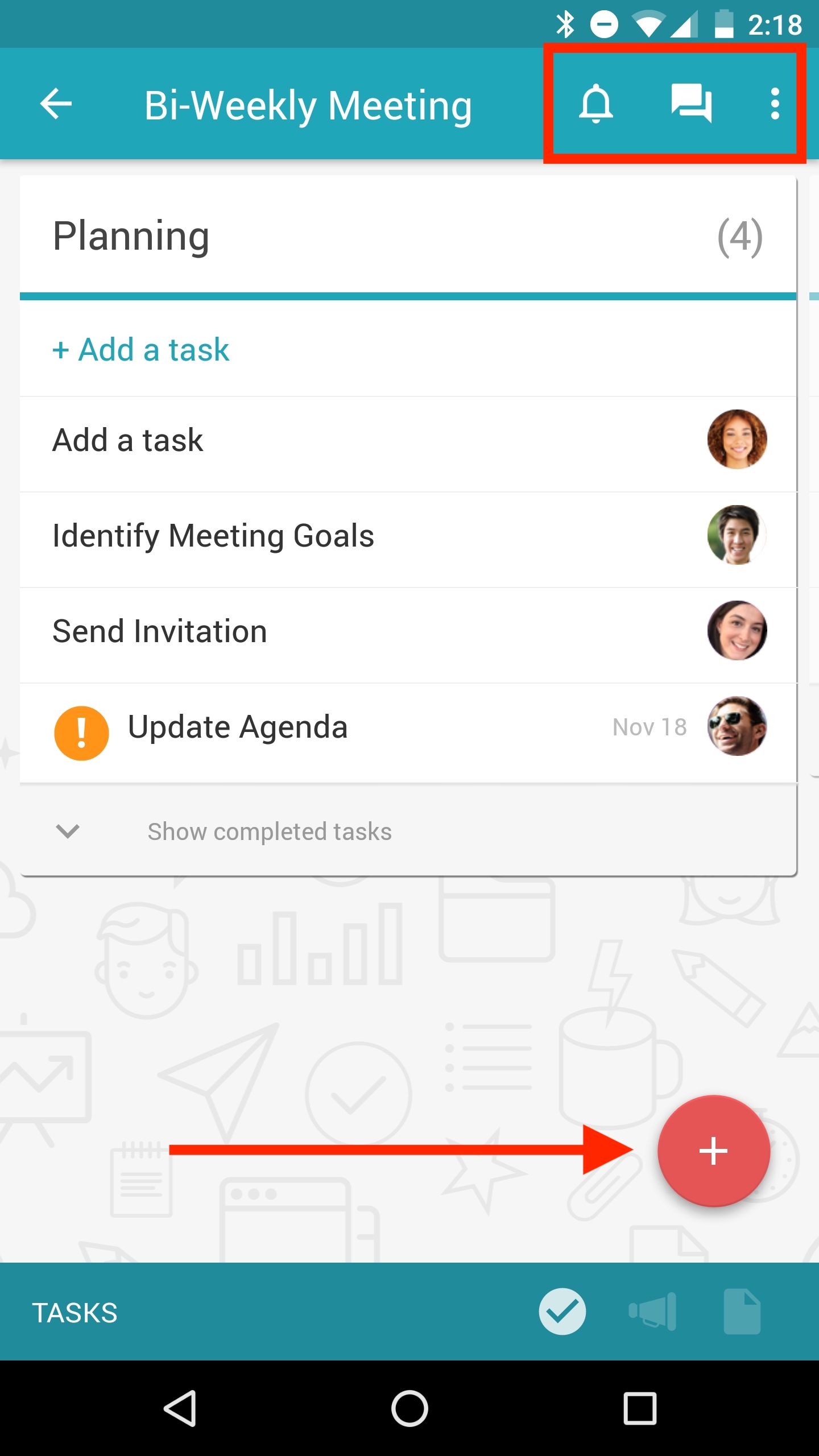
Familiar icons indicate what these buttons do in the context of the Redbooth app. The + symbol is used to add a new task. The bell icon is for notifications. The chat bubbles are for your messages.
Redbooth's icons employ the concept of skeuomorphism, wherein design objects mimic their real-world counterparts. The bell denotes notifications because in real life, bells tell you something is up; calls are denoted by an old-style rotary phone, because that was what was intuitive for early designers when thinking about calls.
3. Expectation allows your users to predict results
When you tap on an icon, expectation follows. You think a + sign will add something—it is intuitive to expect that clicking on the icon does exactly that.
Here is an example from file-sharing app WeTransfer's UI:
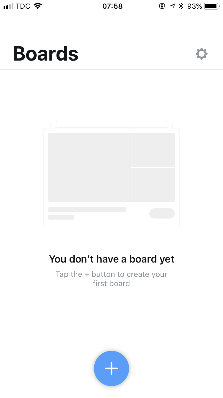
You click on the cross and, as expected, you are immediately asked to “add item”:
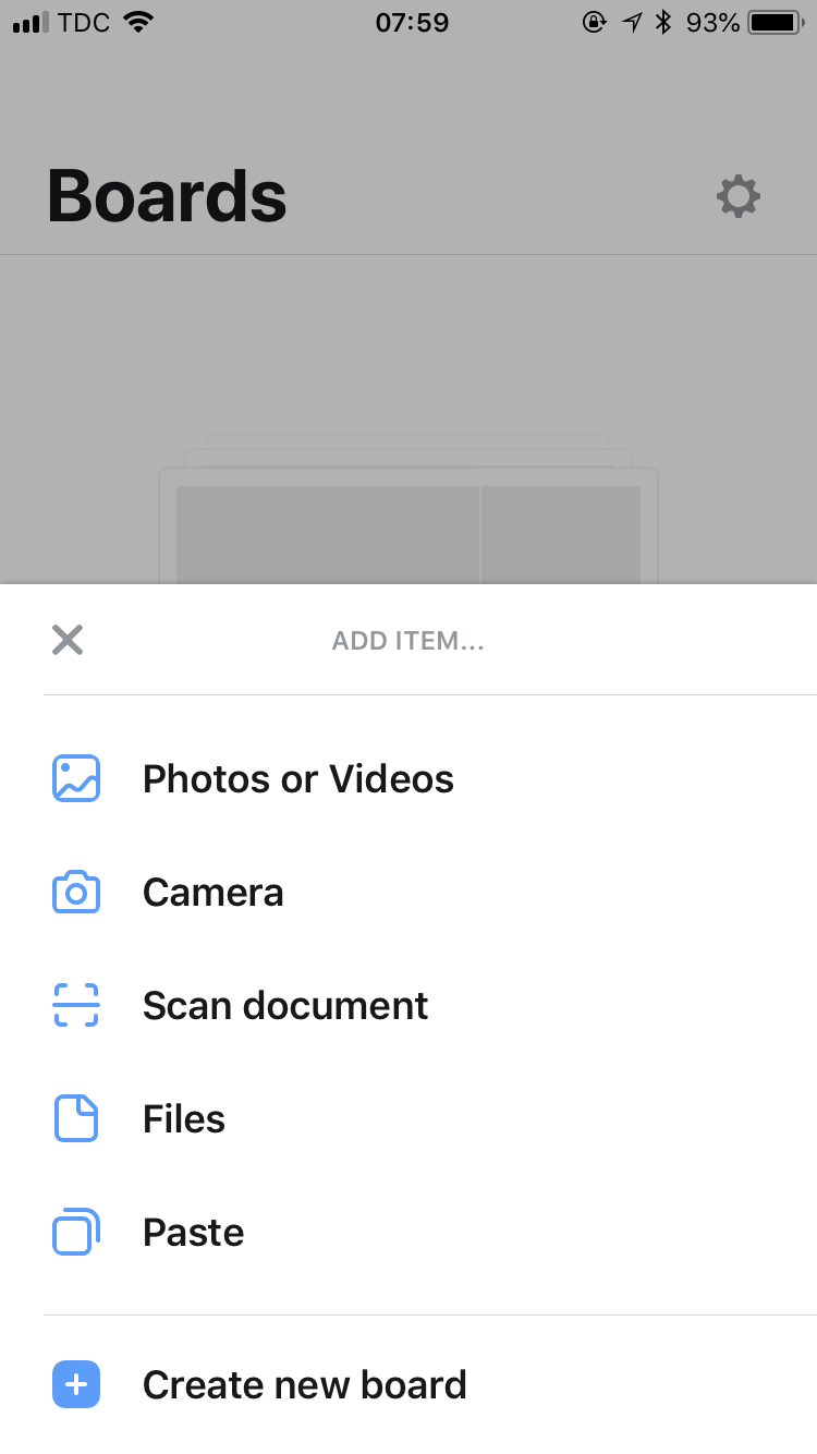
You do so and, as expected, an item is added to your board:

This may seem obvious, but that's because it is—it's intuitive because it is expected. Designers have to beware of adding any extraneous detail to flows that are unexpected.
4. Efficiency means your users can perform an action with minimal effort
Efficiency follows expectation. In the WeTransfer app, when you add to a board it does exactly what you would expect. It is intuitive that it offers nothing more, nothing less. Think about all the apps you've used that put you through awkward flows—like extra questions or screens—before you can complete the task you want. Intuitive UIs keep the flow efficient.
Here is a more novel example from Gmail:
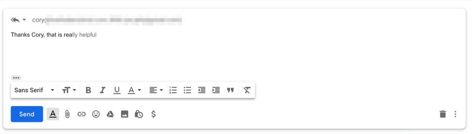
The Gmail UI is trying to be as efficient as possible. Google has learned common sentences and offers to complete them for you. In this case, the novelty and unexpectedness of this UI almost makes it feel unintuitive. Users aren't used to being able to complete their sentence just by typing “tab.”
But over time, this efficiency—and others built on machine learning—will become more natural to users. Eventually, apps without at least some AI will feel non-intuitive.
5. Responsiveness gives your users immediate feedback
Users need to know whether the action they performed succeeded or not. If they are left waiting, then they may repeat the action and accidentally end up doing they didn't intend, leading to frustration. An intuitive UI gives the user immediate feedback regarding the success of their actions.
The way Instagram's UI works as you move through Stories is an excellent example of immediate feedback:
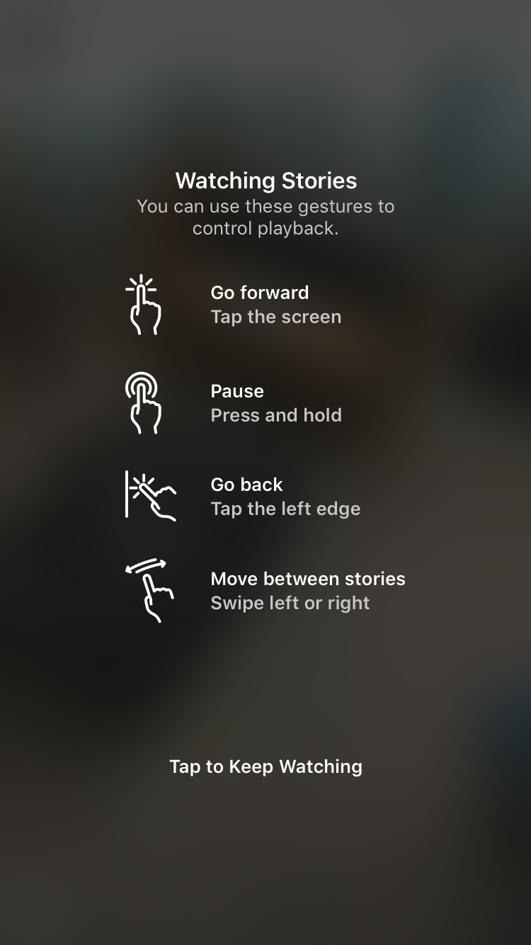
The entire screen is responsive to the inputs of the user. The whole image moves as you swipe left and right as if you were leafing through the pages of a book. The responsiveness is intuitive because the user is making such a natural motion—swipe and the screen moves with you.
6. Forgiveness allows your users to make mistakes
Forgiveness refers to the ability of a UI to fix or undo an incorrect action made by the user. Google offers one of the best examples of forgiveness:
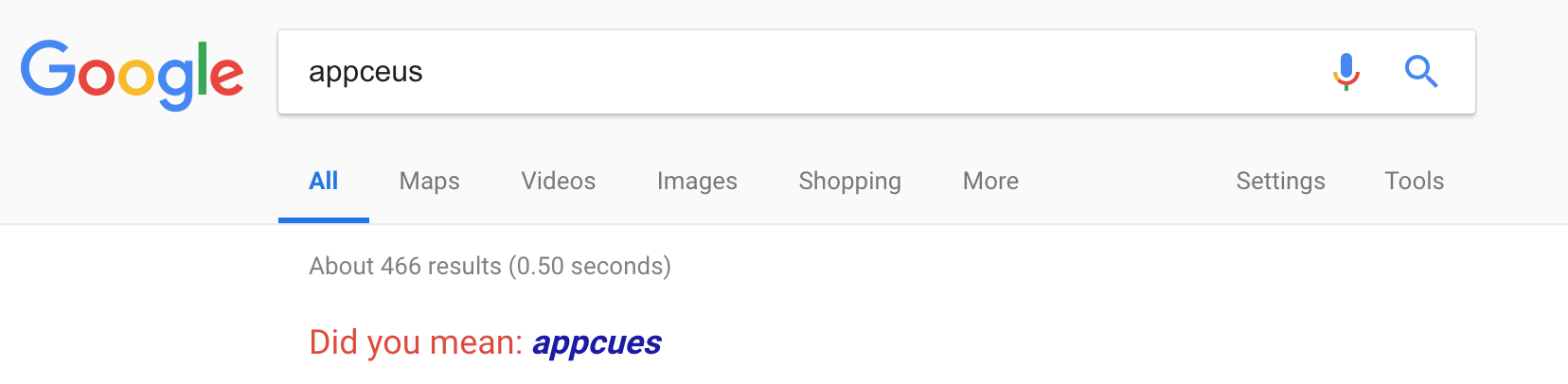
You can type the wrong thing into the Google search field and they'll somehow make it right. It is intuitive to you that “appcues” is what you meant to type, so it needs to be intuitive to the product as well.
Products can take advantage of autocorrect or ambiguity in search as well. Adbeat is a competitive intelligence tool that helps people analyze their competitors' ad campaigns. The forgiving format of their online app allows users to key in keywords, advertisers, publishers, and even campaign names:
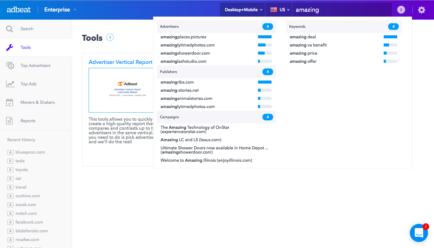
Once they start typing, suggestions appear segregated by type. With so much similarly worded data available, Adbeat tries to make it as clear as possible what all the possible options are.
7. Explorability means your users can navigate as they wish
Good apps have great features. Great apps have great features in the right places. Often, biggest UI challenge is packaging. If things get too complex or overwhelming, people will simply stop using your product before they've had a chance to experience its full value.
Above, we showed the discoverability of Slack—how everything was within easy reach. In reality, only the features you really need to get going are right there in front of you. The hundreds of other features that Slack offers are all hidden within easily navigable submenus:
Once you start using Slack and send those first few messages, you can begin exploring. And that exploration is intuitive. You can navigate and always find your way back home (just click the X), everything is well signposted (so you know what you are changing), and nothing is too dangerous (that is all within the admin menus).
8. Zero frustration means your users are satisfied with how the product interacts
The final part of intuition is perhaps the most vital for any product, and is really a combination of all the above. If you satisfy each of those other concepts, the user will have an intuitive sense of your product and come away feeling satisfied.
Get them through their usage—whether that is during onboarding, their first few WOW moments, or regular daily use—without any frustrations and you have an intuitive UI.
They may not know why they like your app so much, but that is the intuitive part.


