.png)
User onboarding, whether on mobile or desktop, represents the first experience that new users have with your product itself. This introduction often takes the form of a tutorial, walkthrough, or brief demo that teaches users how to use your app. It’s a series of welcome screens and UI patterns that guide new users them through app functionality and introduce key features.
At the end of the onboarding experience, users should have all the key information they need to successfully navigate your app and achieve real value from it within the first session. The first time a user achieves value is called the aha moment, and onboarding’s job is to minimize the time it takes users to get there.
Want more specific tactics? Check out The Ultimate Guide to User Onboarding!
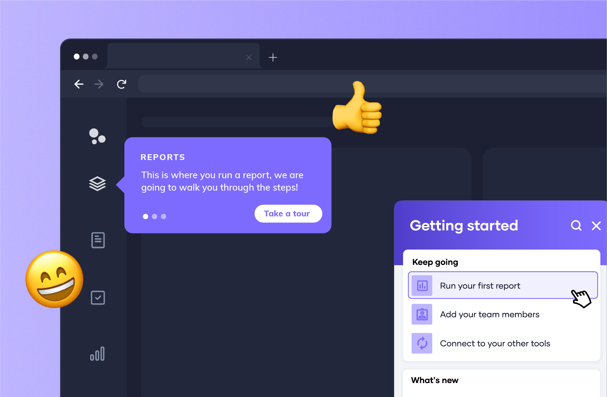
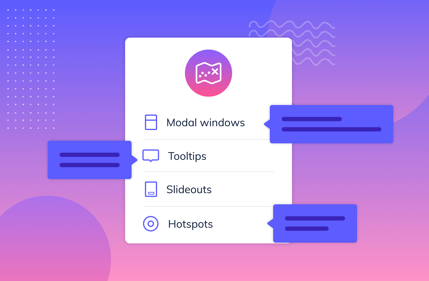
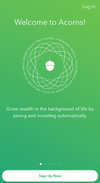
Mobile onboarding UI/UX can take many different forms, but the basic components tend to be pretty standard across apps. The welcome experience typically consists of overlays or full-screen modals that give a high-level view of app features and value propositions. After the welcome experience, the onboarding patterns expand to include things like tooltips, hotspots, slideouts, and modals designed to serve as helpful tips along the user journey.
Let’s take a closer look at these UI/UX patterns in a mobile context, and go over some best practices for creating an exceptional mobile app onboarding experience.
Mobile app users are notoriously impatient and fickle. An app that doesn’t get its point across quickly is an app that doesn’t succeed.
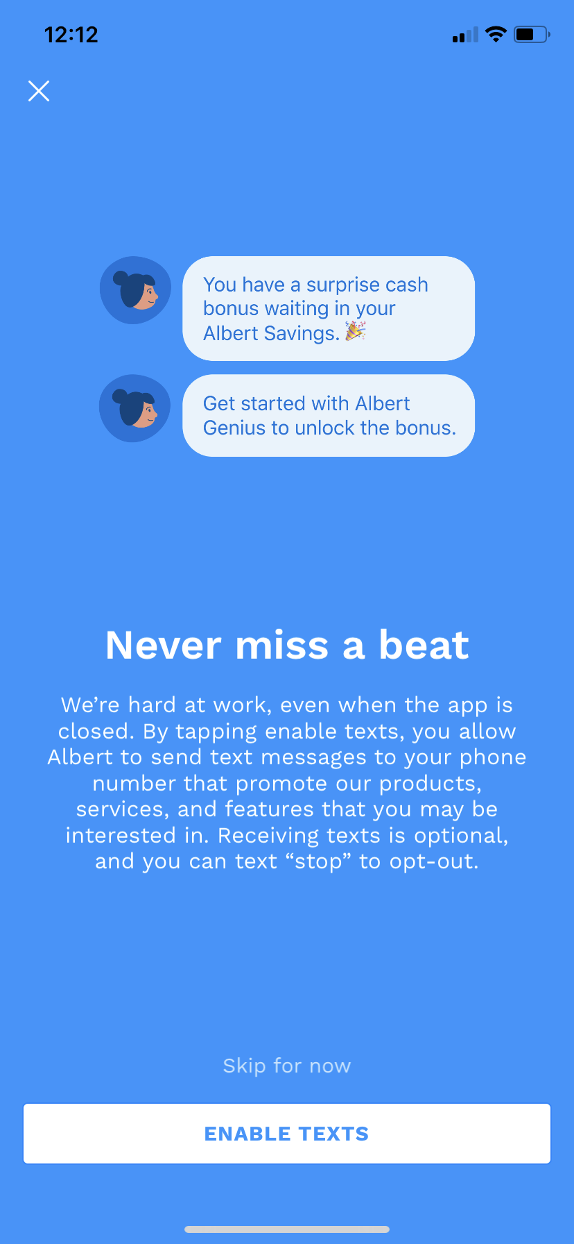
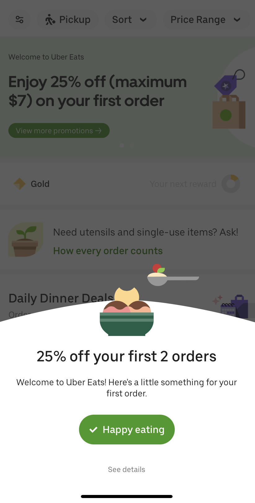
Many apps rely on customer data in order to function properly. The need to collect data doesn’t have to be a hinderance—in many cases it can be a great opportunity to provide a more personalized user experience, and let users know that you’re doing so. Take advantage of the declared data users provide as quickly as possible to provide instant feedback and let users know that their inputs are being used to create a more tailored experience—not just harvest information.
And tailoring the experience right out of the gate gives users more incentive to stick around, since they know the content in your app will be relevant to them.

.png)
Mobile modals—which can be partial overlays (also called popups) or full-screen takeovers—are an extremely versatile UI pattern. Beyond the initial onboarding welcome message, modals can come in handy for any number important announcements you may have for existing users. This includes new feature announcements, product upsells, marketing campaigns, or essential permissions requests. Basically, anything really high-stakes or high-profile.
Mobile modals are an important part of any app interface, ensuring important messages get across to users loud and clear. A few tips for optimizing modals for mobile:

Further reading: 8 examples of great mobile modals that will delight and engage your app users
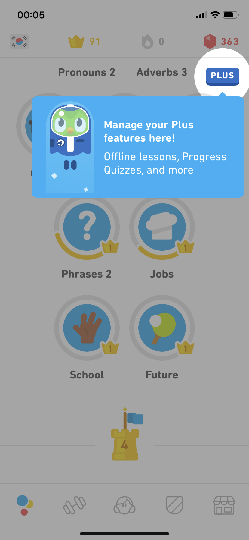
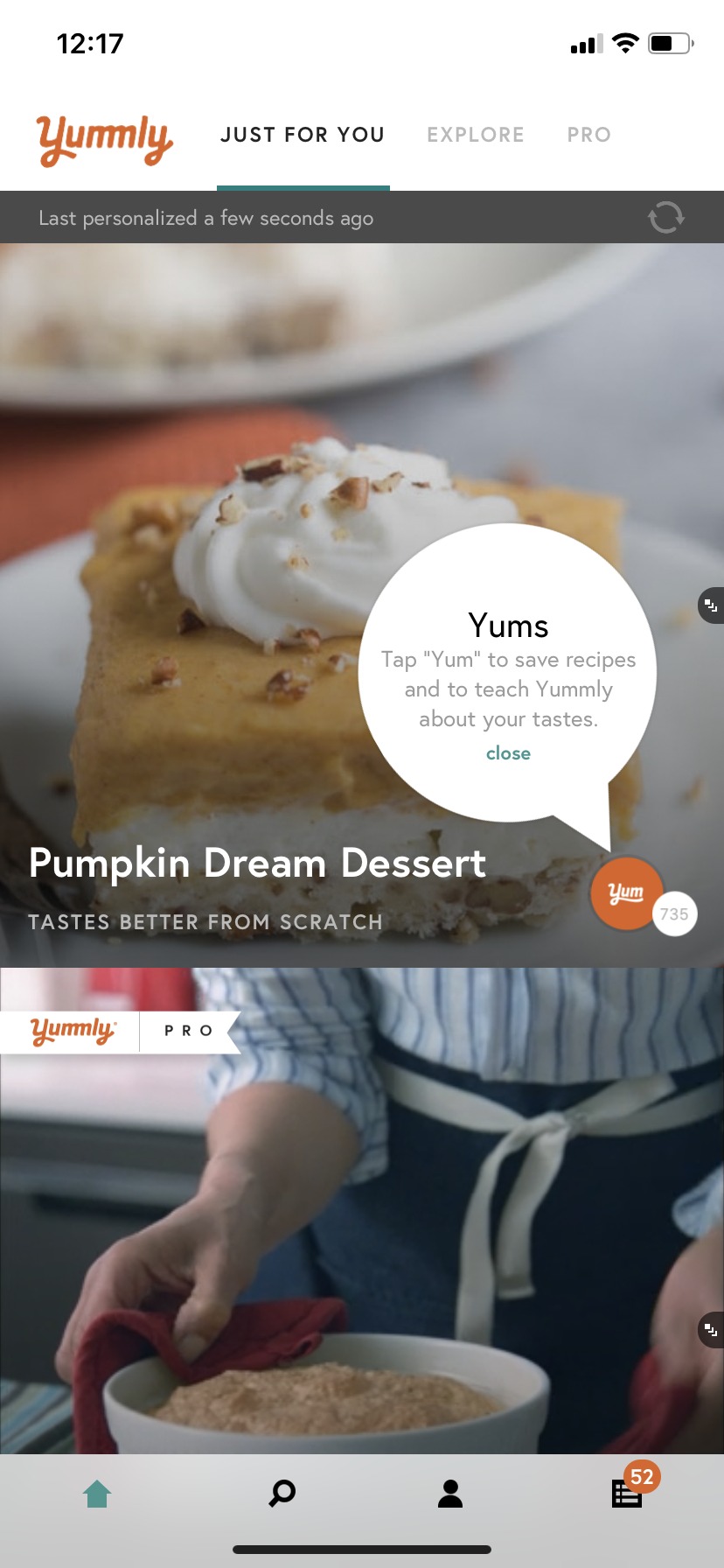
Mobile tooltips keep the learning state alive after the initial welcome flow has ended. They are great at providing contextual help while a user is actively engaged with your app.
Tooltips can highlight an interface change, help with the discovery of new features, or get users to complete an important action. From a metrics perspective, tooltips can be used to boost engagement so that both session length and overall retention increases.
.png)
Further reading: 5 unique ways to use tooltips for mobile apps

Hotspots are similar to notification badges, but have a wider range of use cases. . They’re a subtle, non-intrusive UI pattern that can be used for secondary alerts like new message alerts, to draw attention to new features, or to gently guide users through an app as a series of beacons
At the moment, hotspots are more commonly found in desktop and web apps, but we expect more mobile apps to start experimenting with this pattern as the quest for more novel experiences continues.
Hotspots need to toe the line between being unobtrusive yet attention-grabbing. Basically, the design should be noticeable but not take front and center stage within the app. Since they are small, many apps give their hotspots subtle animations to better catch the user’s eye.
Banners, slides, and cards aren’t exclusive to mobile, but this category is much more ubiquitous in mobile interfaces than on web or desktop. Banners and slides overlay the base UI of the app, whereas cards are in-line messages appear amidst core app content.
When used correctly, these patterns are great at notifying users about important information in real time without disrupting their entire app experience. Banners or slides can also be used to provide instant feedback to let users know that their actions have been successful.
The size and visual boldness of your banners, slides, and cards should be directly related to how critical the information they contain is.
When you want to provide instant feedback about a user action, a small banner or slide works perfectly. You may want to have these patterns automatically fade out after a few seconds, or use a simple X button to let users dismiss the message.

For task reminders, or to nudge users toward non-critical actions, an in-line card strikes the right balance between being obvious and non-disruptive. Cards should feel consistent with the rest of your app’s design—often a simple border and a few minor font adjustments is all you need to help them stand out. Include a clear CTA that lets users take action.

When you have something exciting to say, a large slide can function much like a partial overlay modal on mobile. Use high-contrast, on-brand colors, bold title or header text, and eye-catching images where appropriate.
.png)
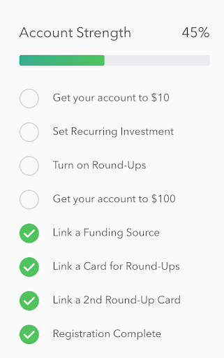
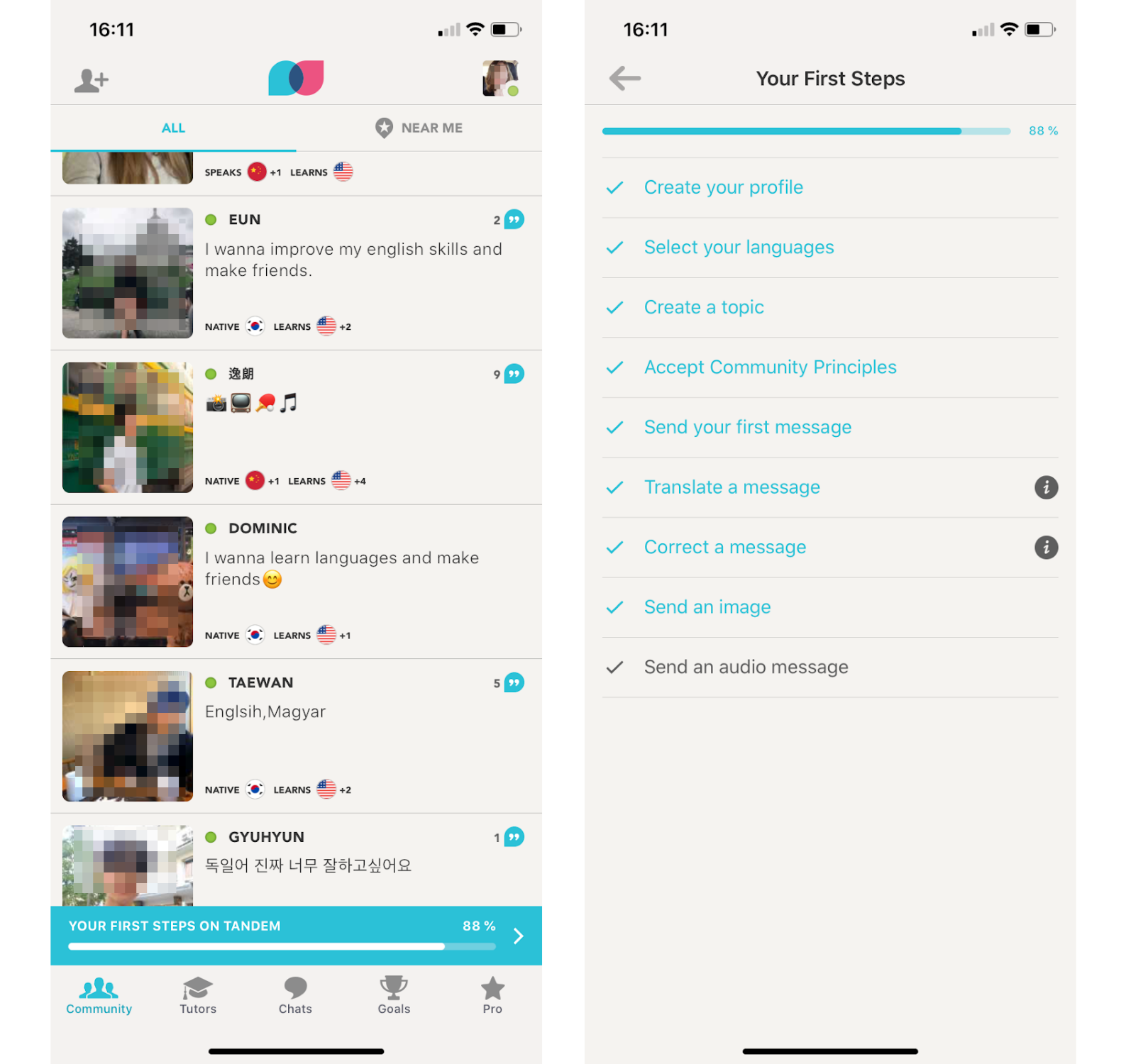
Onboarding checklists help users complete important tasks within your app. This UI pattern is perfect for injecting a dose of gamification into your app and can provide the motivation users need to finish multi-step onboarding processes.
Checklists are effective because they break complex processes down into easy to accomplish tasks. And the familiar list format helps users visualize exactly how many steps left before they to the finish line.
By the end of your user onboarding flow, your mobile users should have the information they need to navigate your app, and you should have the data you need to provide users with an exceptional experience.
Ultimately, your aim is to leave a lasting first impression that sets users up for success on their next login and combats app abandonment in the long term. (In fact, studies have found that mobile app onboarding can improve user retention by upwards of 50%.)
Understanding how to use onboarding UX/UI patterns effectively can mitigate app abandonment, reduce support tickets, and greatly improve user retention and revenue.
You can dive deeper into user onboarding best practices at The Ultimate Guide to User Onboarding.