.png)

Once, after having fasted for a couple of days, I took myself to a steakhouse for a delicious 21-ounce ribeye steak. Unfortunately, my enthusiasm got the better of me, and I started choking on my first bite. 😲
Luckily, a quick gulp of water was enough to clear my airways—and I avoided causing a scene by needing a stranger to perform the Heimlich maneuver.

Moral of the story: it’s possible to have too much of a good thing. (Especially when you’re cramming a lot of goodness into a compressed amount of time.)
The same rule applies to onboarding.
Too many user onboarding experiences are based on the all-you-can-eat model. They force users into consuming large chunks of information in a short period of time—which can result in the digital equivalent of a user choking, getting frustrated, or abandoning an app altogether.
Fortunately, there’s a better way: breaking your onboarding experience up into bite-sized servings that you can deliver to users over time in a non-overwhelming way.
Imagine you’re a gourmet chef who has earned 3 Michelin Stars. You know your cuisine is the best, and you can’t wait to serve it to your patrons. Likewise, your patrons can’t wait to enjoy your famous dishes.
Now in your excitement, imagine that you serve dish after dish of a 15-course meal in quick succession. Your patrons hardly have time to take a bite before the next plate is presented. The scene is one of overwhelming chaos—and leaves diners confused, irritated, and unable to enjoy a single dish.
A Michelin chef would never do such a thing. A Michelin chef understands the importance of pacing in a good meal—how to treat each dish as its own masterpiece, one deserving of breathing room.
If your user onboarding experience makes users feel like you’re trying to cram a 15-course meal down their throats in one sitting, you’re doing it wrong. It’s understandable to feel eager to share everything you know. You want to get them up to speed as soon as possible so they can start getting value out of your app.
But—trust me—trying to do everything at once is not the right approach.
Instead, channel your inner Michelin chef and serve up your onboarding in bite-sized, digestible portions. Make your selections carefully, pair them perfectly with the various stages of the user experience, and then pace your delivery so your user has time to savor each dish at the moment.
By applying this bite-sized approach to your user onboarding experience, you increase the likelihood of new users of experiencing the product's "Aha!" moment.
Let’s take a look at 3 ways you can apply the bite-sized user onboarding approach:
Our first example comes right from our Appcues onboarding experience. By breaking down our user onboarding checklist into two separate parts, we saw double-digit gains in our completion rate—from less than 2% to about 25%.
Initially, the checklist included several steps and was the same for all user groups.
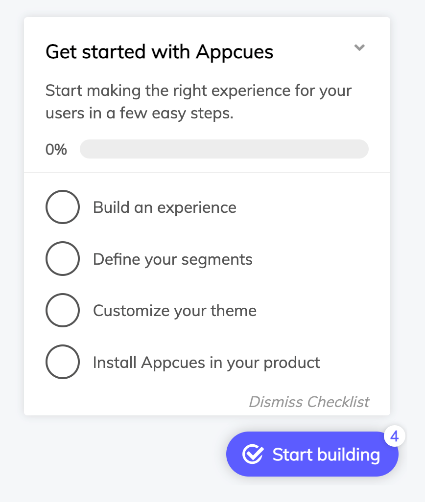
Lyla Rozelle, Appcues' Director of Customer Enablement, decided to split the list out across post-purchase and trial, creating separate lists for each phase of the experience. The first checklist now focuses on installing the Appcues Builder. Once the first checklist has been completed, that triggers the second checklist, which includes 3 items: create a flow, track an event, and create a goal.

“The concept is to daisy-chain the checklists together,” Rozelle explains, “so that folks don’t have a 45-page to-do list. They have just a couple little setup tasks—truly bite-sized tasks; teeny little things. This makes each step more palatable and easy to complete.”
This simple change resulted in an enormous improvement in the checklist competition rate. So if you’re using checklists in your user onboarding, experiment with breaking it up into bite-sized lists.
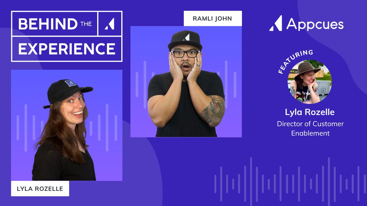
Watch to the Behind The Experience show episode featuring Appcues' bite-sized checklists.
The bite-sized approach is also extremely effective with forms. Rather than having all the signup fields on one page, you can break it up into smaller chunks of information across multiple pages.
As with a checklist, breaking things into smaller steps is typically done to streamline the user experience—making it less intimidating and easier to get through. One case study run by Conversion Fanatics found that a new streamlined page leveraging multiple steps improved conversion rates by 52.9%.
You’ve probably experienced many multi-step forms when shopping online. Next time you’re checking out on a website, take notice of how the checkout experience is presented. Often, online retailers take consumers through the checkout process via a series of separate steps—for example, entering payment info, entering shipping info, choosing a shipping method, applying coupons, opting into a newsletter, reviewing the order, and placing the order.
Each step in the form must be completed before the buyer is allowed to move on to the next step. This helps avoid the frustration of a consumer filling out one long form—only to get to the end and have the form rejected for an unspecified reason.
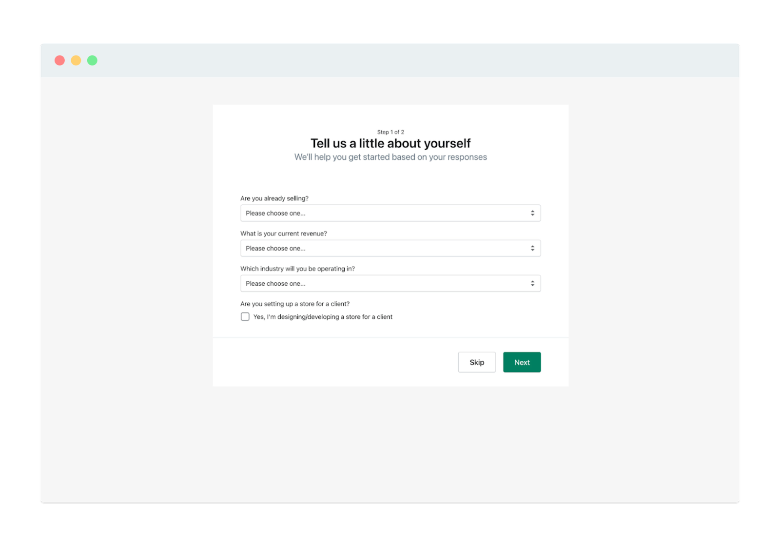
Shopify provides a brilliant example of this by breaking up their account setup into 2 pages.
The first page has 4 fields.
Once you complete these fields, the next step is to answer 10 additional questions related to the business address.
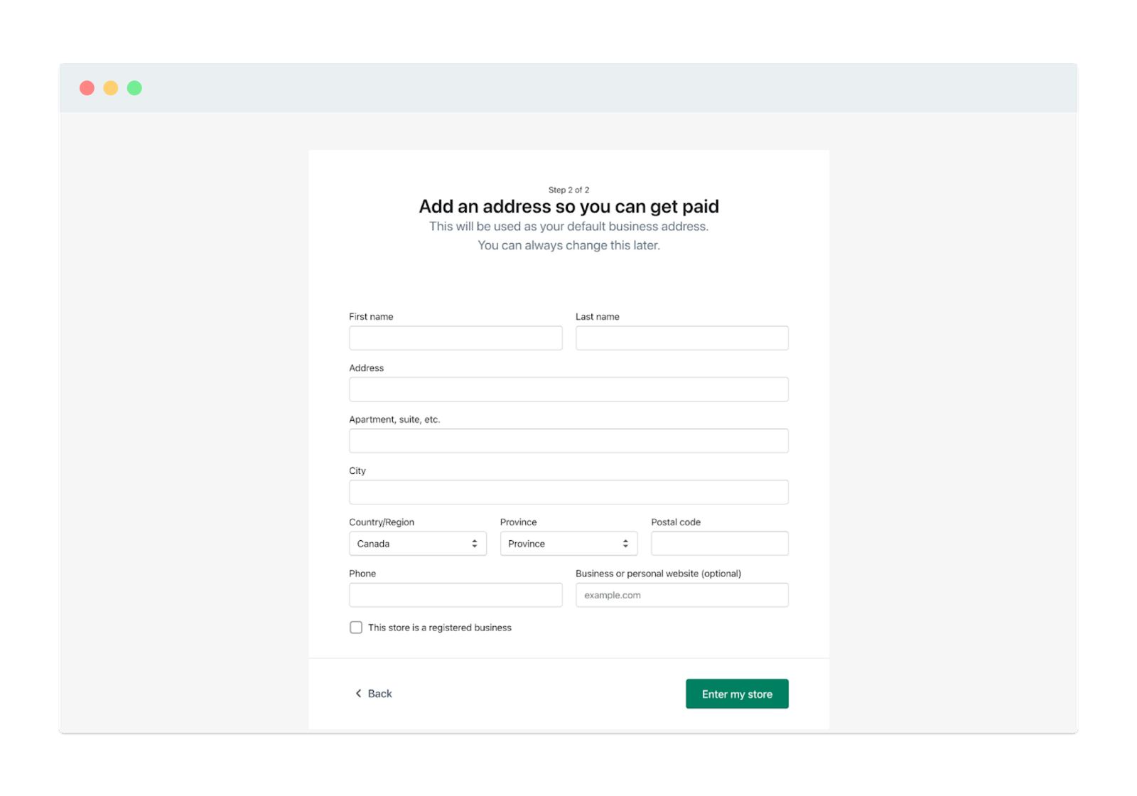
With a multi-step signup process, users only see a few fields on the page at a time—rather than the 14 required fields needed to complete it. Notice there are almost double the number of fields in the second step (10) than in the first step (4).
Similarly, if new users have to fill up several fields to sign up for your product and you’ve done all you can to remove unnecessary ones, consider breaking it up into multiple pages. It’ll be less overwhelming for users and will likely improve your signup completion rate.
Another place you can apply the bite-size approach is with product tours. Unfortunately, most product tours fall short because all they do is point out a product’s bells and whistles without any context. They tell you what the button or feature does (i.e.g., “Click here to do X.”), but they fail to explain why each feature is important— which is a crucial part of helping users achieve their desired outcome with your product. What you end up with is a product tour that goes on for way too long and annoys new users.
A more effective approach is to provide contextualized, bite-sized product tours that are focused on a single user action as the goal. Having many smaller tours rather than a single long tour increases the likelihood of users taking action.
To put these pixels into context, let’s look Grove HR’s approach. Grove HR provides new users with several tours to update relevant settings, create an employee profile, and set up their accounts. New users can launch each tour straight from their onboarding checklist.

By giving users a checklist to go through, Grove HR increases the chances of onboarding completion while also keeping the onboarding flow compact. It also lets new users decide if they want to take the tour or not. Grove HR’s tour also enjoys interactivity and highlighting that makes everything faster and easier for the users.
If you’re using product tours for your user onboarding, don’t teach everything all at once. Applying the bite-sized approach gives new users a chance to take action and experience your product’s “Aha” moment.
When it comes to UX, applying the bite-size approach to your user onboarding can improve nearly any element. From checklists and signup flows to product tours and self-serve upgrades, breaking a process down into smaller, more manageable steps is an easy way to avoid overwhelming users, simplify tasks, and improve completion rates.
While it’s tempting to give your users everything at once—laying it all out on the table in one vast cornucopia of a feast—it’s better to serve things up in bits and pieces. How? By pacing yourself, allowing your user time to digest and appreciate each bit, and smoothing the way toward the next step in a way that is inviting and stress-free.
If you’d like to learn more secrets to stellar user onboarding that not only make a difference in your user’s experience but move the needle on business impact, check out our free User Onboarding 101 certification course. It’s full of all the best tips, tricks, and proven practices—all delivered in easy-to-swallow chunks of UX goodness.