Best tooltip plugins and libraries for jQuery, CSS, and JavaScript

May 26, 2026
Tooltip plugins
TL;DR
  • 12 tooltip libraries covered: JavaScript, jQuery, and CSS options organized by language, with GitHub stars, key features, and install details for each.
  • Best overall pick: Tippy.js for general JavaScript use; Shepherd.js for product tours; Hint.css if you want zero JavaScript overhead.
  • No engineering bandwidth? Low-code tools like Appcues let product and CS teams create, target, and measure tooltips through a visual editor - without waiting on a dev cycle.
  • What is a tooltip?

    A tooltip is a small, contextual overlay that appears when a user hovers over, clicks, or focuses on a UI element. It provides a brief explanation, hint, or label without forcing the user to leave the page or open documentation.

    In SaaS products, tooltips are one of the most versatile UI patterns you'll reach for. They show up across:

    • Onboarding flows - guiding new users through key actions during their first session
    • App walkthroughs - stepping users through a multi-part workflow or feature
    • Feature releases - drawing attention to newly shipped capabilities without interrupting the user's workflow
    • Field definitions - explaining what a form field, metric, or setting means right where the user encounters it

    Here's a concrete example: imagine your team just shipped a new dashboard filter in your analytics product. Rather than sending an email that most users won't read, you attach a tooltip to the filter icon. When a user hovers over it, they see: "New: Filter results by date range, team, or custom segment." It's timely and contextual - the user gets the hint right when they need it, without doing anything extra.

    JavaScript tooltip libraries

    JavaScript libraries give you the most flexibility and the largest ecosystem. These five are actively maintained, well-documented, and cover everything from lightweight positioning to full product tour frameworks.

    1. Tippy.js

    Tippy.js is the most popular general-purpose tooltip library in the JavaScript ecosystem. Built on top of Floating UI (formerly Popper.js), it provides a complete tooltip, popover, dropdown, and menu solution with sensible defaults and deep customization.

    • Language/framework: Vanilla JS, React, Vue, Angular
    • GitHub stars: 12k+
    • Key differentiator: Full-featured out of the box with animations, themes, and accessibility built in. If you need one library that handles tooltips and popovers cleanly, this is it.
    • Install: npm install tippy.js
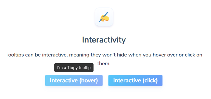
    This is an image from a javascript tooltip plugin demo page showing different types of tooltip interactivity. The two interaction options are hover and click.

    2. Floating UI

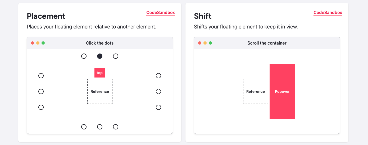
    Floating UI is the successor to Popper.js and the positioning engine that powers Tippy.js, among others. It's a low-level library that handles the hard part of tooltip development: keeping floating elements anchored to their reference elements regardless of scroll, resize, or overflow.

    • Language/framework: Framework-agnostic (vanilla JS, React, Vue)
    • GitHub stars: 24k+
    • Key differentiator: Ultra-lightweight at 0.6 KB minified. Not a tooltip library per se, but the best positioning primitive to build your own.
    • Install: npm install @floating-ui/dom

    3. Shepherd.js

    Shepherd.js is a guided-tour library that uses tooltips as its primary interface. If your goal is to walk users through a multi-step flow rather than show a standalone hint, Shepherd is purpose-built for that.

    • Language/framework: Vanilla JS, React, Vue, Angular, Ember
    • GitHub stars: 13k+
    • Key differentiator: Focused on product tours and step-by-step guides with built-in accessibility (a11y) compliance and keyboard navigation.
    • Install: npm install shepherd.js

    4. Intro.js

    Intro.js is a mature product tour library that combines tooltip-style hints with step-by-step onboarding sequences. It has no dependencies and a simple API, which makes it a solid pick if you want something battle-tested with minimal setup.

    • Language/framework: Vanilla JS (framework wrappers available)
    • GitHub stars: 22k+
    • Key differentiator: Zero dependencies, long track record, and a dual-mode API (tours and standalone hints). Well-suited for teams that want tooltip capabilities alongside guided tours.
    • Install: npm install intro.js
    This is a feature introduction tour with spotlights and tooltips. It is a step by step guide made using javascript tooltips. It has numbered tooltips and focus areas.

    5. Bootstrap Tooltip

    Bootstrap Tooltip is the tooltip component built into the Bootstrap framework. If your project already uses Bootstrap, this is the path of least resistance - no extra dependencies, consistent styling, and solid documentation.

    • Language/framework: Bootstrap (HTML/CSS/JS), built on Popper
    • GitHub stars: Part of the Bootstrap framework (168k+ total)
    • Key differentiator: Seamless integration with Bootstrap's design system. If you're in the Bootstrap ecosystem, there's no reason to add another tooltip library.
    • Install: Already included with Bootstrap 5

    jQuery tooltip plugins

    jQuery isn't the default choice for new projects, but plenty of production codebases still rely on it. If you're working in a jQuery environment, these three plugins handle tooltips well without requiring a framework migration.

    1. jQuery UI Tooltip

    jQuery UI Tooltip is the official tooltip widget from the jQuery UI library. It replaces native browser tooltips with customizable, themeable overlays and integrates smoothly with the rest of jQuery UI's widget ecosystem.

    • Key strength: Simple setup if you're already using jQuery UI. Works out of the box with jQuery UI themes.
    • Best for: Teams maintaining existing jQuery UI projects that need basic tooltip functionality without adding new dependencies.

    2. JBox

    JBox is a versatile jQuery plugin that handles tooltips, modal windows, notices, and confirmations in a single package. It's lightweight, customizable, and responsive.

    • Key strength: One plugin covers multiple UI patterns (tooltips, modals, alerts), which reduces the number of dependencies in your project.
    • Best for: jQuery projects that need more than just tooltips and want a single, well-maintained library for multiple overlay types.
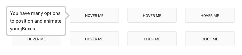
    This is a screenshot of a tooltip that says "you have many options to position and animate your jboxes". This is a jquery tooltip plugin that is fully responsive.

    3. Popper.js

    Popper.js is the positioning library that powered Bootstrap's tooltips and spawned Floating UI as its successor. It's still widely used in jQuery projects and older codebases.

    • Key strength: Rock-solid positioning logic with a small footprint. If you're maintaining a project that already uses Popper, it still works well.
    • Best for: Legacy projects. For new work, consider Floating UI, which carries the same approach forward with a smaller bundle and modern API.

    CSS tooltip plugins

    If you want tooltips without adding any JavaScript to your page, CSS-only solutions are as lightweight as it gets. These four libraries use pseudo-elements, data- attributes, and aria-label to render tooltips with zero runtime overhead.

    1. Hint.css

    Hint.css is one of the most widely adopted CSS-only tooltip libraries. It uses aria-label for tooltip content, which means your tooltips are accessible by default.

    • GitHub stars: 8.3k
    • Size: 1.5 KB
    • Key differentiator: Accessibility-first approach via aria-label, so screen readers get the tooltip content without extra work.

    2. Microtip

    Microtip is a modern, minimal CSS-only tooltip library that emphasizes clean design and tiny file size.

    • Size: Under 1 KB
    • Key differentiator: Modern aesthetic with smooth animations and a minimal API. Great for projects where you want good-looking tooltips with zero configuration.
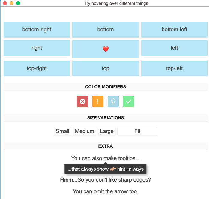
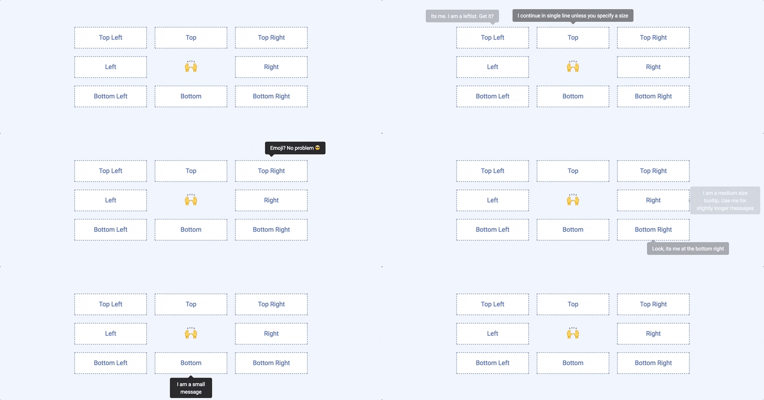
    this is an animated gif of a very simple tooltip's demo page. It shows the positioning of a css tooltip with top right left bottom etc options available in this lightweight tooltip library.

    3. Tootik

    Tootik is a pure CSS tooltip library with built-in support for CSS, SCSS, and LESS, making it easy to integrate with whatever preprocessor your project uses.

    • Key differentiator: Straightforward customization through SCSS/LESS variables. Supports multiple positions and can handle multiline content.
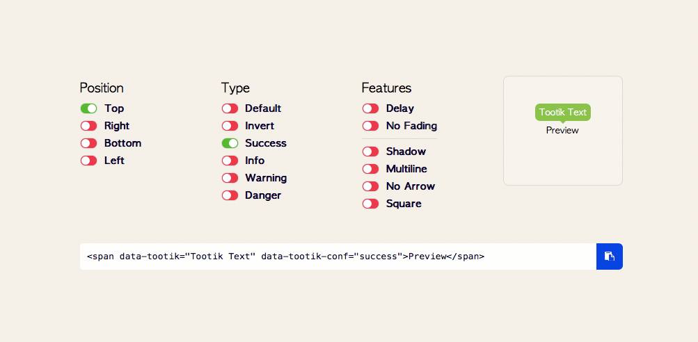
    tootik css tooltip library sampler

    4. Balloon.css

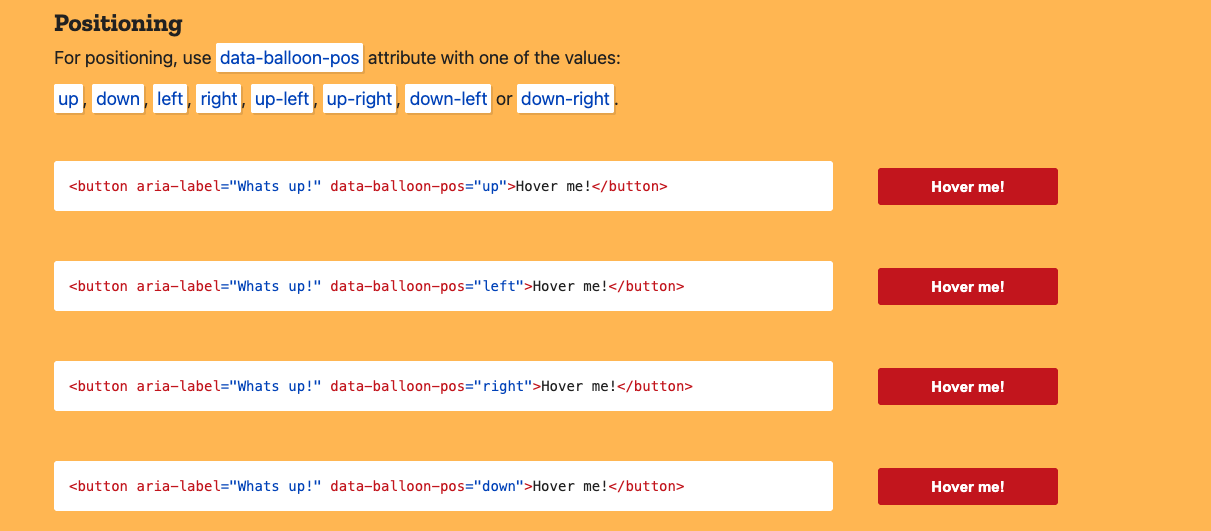
    Balloon.css is a CSS-only tooltip library that uses HTML5 data- attributes to define tooltip content and positioning.

    • GitHub stars: 5.5k
    • Key differentiator: Simple, declarative API via data-balloon attributes. Easy to adopt incrementally across existing HTML.Balloon.css is a CSS-only tooltip library that uses HTML5 data- attributes to define tooltip content and positioning.
      • GitHub stars: 5.5k
      • Key differentiator: Simple, declarative API via data-balloon attributes. Easy to adopt incrementally across existing HTML.

    Tooltip plugin comparison table

    Tooltip plugins comparison — preview

    Styled mockup. Your live blog CSS will override these styles.

    Plugin Language/Framework GitHub Stars Key Feature Effort Level
    Tippy.js JS, React, Vue, Angular 12k+ Full-featured tooltips and popovers Low
    Floating UI Framework-agnostic JS 24k+ Ultra-lightweight positioning (0.6 KB) Medium
    Shepherd.js JS, React, Vue, Angular, Ember 13k+ Product tours with a11y compliance Low–Medium
    Intro.js Vanilla JS 22k+ Tours and hints, zero dependencies Low
    Bootstrap Tooltip Bootstrap (HTML/CSS/JS) 168k+ (framework) Native Bootstrap integration Low
    jQuery UI Tooltip jQuery Part of jQuery UI Simple, themeable jQuery widget Low
    JBox jQuery 1.4k+ Tooltips + modals in one plugin Low
    Popper.js JS (jQuery-compatible) Evolved into Floating UI Battle-tested positioning Medium
    Hint.css CSS only 8.3k Accessible via aria-label (1.5 KB) Very Low
    Microtip CSS only Modern, minimal, under 1 KB Very Low
    Tootik CSS/SCSS/LESS Preprocessor variable customization Very Low
    Balloon.css CSS only 5.5k Declarative data-attribute API Very Low

    Note: The plain HTML I gave you in chat has no inline styling — your CMS/blog theme will style it automatically. This preview just shows one possible look with Appcues-style purple branding.
    Key takeaways

    Twelve plugins is a lot to sort through. Here's the short version to help you pick the right one for your project.

    • Best general-purpose JavaScript tooltip library: Tippy.js. It handles tooltips, popovers, and dropdowns out of the box with built-in accessibility and framework bindings for React, Vue, and Angular.
    • Best positioning primitive for custom builds: Floating UI. At 0.6 KB, it gives you precise anchor-based positioning without any tooltip opinions layered on top.
    • Best for product tours: Shepherd.js. If you need multi-step guided flows rather than standalone tooltips, Shepherd is purpose-built for that use case.
    • Best zero-dependency option: Intro.js. Battle-tested with a simple API that covers both tours and standalone hints, all with no external dependencies.
    • Best CSS-only option: Hint.css. Accessible by default via aria-label, tiny at 1.5 KB, and requires zero JavaScript.
    • When to skip plugins entirely: If your team doesn't have engineering bandwidth to build and maintain tooltip implementations, a low-code tool like Appcues lets product, marketing, and CS teams ship tooltips through a visual editor - no code required.

    The right choice depends on your stack, your team, and how much control you need. Start with the comparison table above to narrow the field, then check the "How to choose" section for a deeper breakdown of the trade-offs.

    How to choose the right tooltip plugin

    With a dozen solid options on the table, the right choice depends on your project's constraints more than any single feature. Here's how to narrow the field.

    Framework compatibility

    Start with what your app already uses. If you're in a React or Vue project, Tippy.js and Shepherd.js both offer first-class framework bindings. If you're on Bootstrap, use the built-in tooltip component. If your codebase is jQuery-heavy, JBox or jQuery UI Tooltip will integrate with the least friction. Picking a library that fights your framework creates maintenance headaches down the road.

    Bundle size and performance

    If you're shipping a lightweight marketing site or a performance-sensitive SPA, every kilobyte counts. CSS-only options like Hint.css (1.5 KB) and Microtip (under 1 KB) add virtually nothing to your bundle. Floating UI is the leanest JavaScript option at 0.6 KB. On the other end, tour-focused libraries like Shepherd.js and Intro.js carry more weight because they do more. Match the library's scope to your actual needs.

    Maintenance and community

    Check the last commit date and open issue count before you commit. Libraries like Tippy.js, Floating UI, and Shepherd.js have active maintainers and responsive communities. Popper.js, by contrast, has officially transitioned to Floating UI. A library that hasn't seen a commit in 12+ months is a risk, especially if you're building features that depend on it.

    Accessibility

    Tooltips that aren't accessible are tooltips that exclude a portion of your users. Look for libraries that support ARIA attributes, keyboard navigation, and screen reader compatibility out of the box. Hint.css uses aria-label by design. Shepherd.js includes a11y compliance as a core feature. If your library doesn't handle accessibility natively, you'll need to layer it in yourself, and that's where things tend to get missed.

    Customization needs

    Think about what you actually need the tooltip to do. If you just want a hover label, a CSS-only library will get you there in minutes. If you're building a multi-step product tour that guides users to their aha moment, you'll want Shepherd.js or Intro.js. And if you need precise control over positioning logic to build something custom, Floating UI gives you the primitives without the opinions.

    Tooltip best practices

    A good tooltip plugin is only half the equation. How you design and deploy tooltips matters just as much as the library behind them. Here are the practices that separate helpful tooltips from annoying ones. For a deeper dive, check out our guide on tooltip best practices.

    Keep content short

    Tooltips should be scannable in under five seconds. Stick to one or two sentences, and avoid cramming paragraphs into a tooltip container. If you need to explain something in depth, link to a help doc or use a modal instead.

    Use appropriate triggers

    Hover works for desktop, but touch devices don't have a hover state. Use click or focus triggers for mobile, and make sure your library supports both. A tooltip that never appears on mobile is a tooltip that doesn't exist for a growing portion of your users.

    Position to avoid covering content

    A tooltip that hides the thing the user is trying to interact with defeats its own purpose. Use smart positioning (most JavaScript libraries handle this automatically) and test edge cases, especially near the edges of the viewport or inside scrollable containers.

    Make tooltips accessible

    Use ARIA attributes (aria-describedby, role="tooltip") so screen readers can surface tooltip content. Support keyboard dismissal with the Escape key. Ensure sufficient color contrast between tooltip text and background.

    Don't hide essential information

    Tooltips are supplementary by nature. If a piece of information is required for the user to complete a task, it should be visible on the page, not tucked behind a hover state. Use tooltips for nice-to-know context, not need-to-know instructions.

    Test on mobile

    Touch interactions, smaller screens, and virtual keyboards all change how tooltips behave. Test your tooltips on real devices (not just responsive mode in your browser) to catch positioning quirks and interaction gaps. For multi-step tooltip flows, make sure the experience holds up as part of your broader product tours strategy.

    What about low-code tooltips?

    Open-source plugins are a great fit for engineering teams that have the bandwidth to build, style, and maintain tooltip implementations. But if you're on a product, marketing, or customer success team, waiting for a dev cycle to ship a tooltip can mean missed opportunities.

    That's where low-code tooltip software comes in.

    Appcues lets you create and deploy tooltips, product tours, and in-app messages through a visual editor - without writing code. You build directly on top of your live product, targeting specific users, pages, or behaviors.

    Here's what that looks like in practice:

    • Visual builder: Point, click, and publish. Design tooltips that match your brand without writing CSS.
    • Behavioral targeting: Show tooltips based on user properties, event history, or lifecycle stage. Appcues AI helps you build and validate targeting segments in plain language.
    • Multi-step flows: Chain tooltips into guided tours, onboarding sequences, or feature release announcements.
    • Analytics built in: Track tooltip engagement, completion rates, and impact on activation and retention without stitching together a separate analytics setup.
    • Cross-channel delivery: Extend tooltip-style guidance into email and mobile push to reach users wherever they are in their journey.

    The trade-off is straightforward: open-source plugins give you full control and zero licensing cost, but they require engineering time to build and maintain. Low-code tools like Appcues give product and CS teams a faster path to shipping, iterating, and measuring - without adding to the engineering backlog.

    Ready to ship tooltips without the engineering overhead? Book a demo and see how Appcues makes it easy to create, target, and measure in-app experiences.

    Facts & Questions

    What is the best JavaScript tooltip library?
    Can I create tooltips with only CSS?
    What's the difference between a tooltip plugin and tooltip software?
    Is jQuery still a good choice for tooltips?
    How do I make tooltips accessible?
    What is the difference between a tooltip and a popover?
    Appcues logo

    Ready to see what your journey could look like with Appcues?

    See how your team can remove friction, move faster, and deliver experiences that are easy for users... and safe for your systems. We’ll walk through your workflows, your governance needs, and the outcomes that matter most to your business.