.png)
.png)
Most onboarding advice assumes that you’re still building out a product tour. Pick your five features that matter, write a tooltip for each of them, throw in a progress bar, and ship it.
But when you look at what launched in 2025 and 2026, almost none of the biggest onboarding experiences work that way:
This comes down to an agreement between all these teams on something fundamental. The first thing a user does should produce something real, and everything that stands between signup and moment is cost.
There’s a few different reasons behind this: the first being that product-led growth is still the most widely accepted channel and strategy for growth (and for good reason). The second is that acquisition, now more costly than ever, is where retention is really decided. And for those measured on retention with few levers to pull, onboarding is one of the most important areas to lock into.
Below are twelve onboarding flows worth studying, all of them current as of August 2026. Each entry covers what the company does, why it works, what’s worth copying, and what makes each of these tactics tricky. They’re ordered roughly by how much of the setup burden the product takes off the user, and each is listed with the pattern that represents it so you can quickly find the ones that fit your product.
The best user onboarding gets a user to a real outcome in their own account as fast as possible. Instead of touring an interface, the flows that move the needle deliver value before signup, use AI to pre-build the workspace, and make the first task the user’s actual job.
Here are the shared traits that make a user onboarding experience truly great:
%20(1)%20(1).png)
Pattern: Value before signup
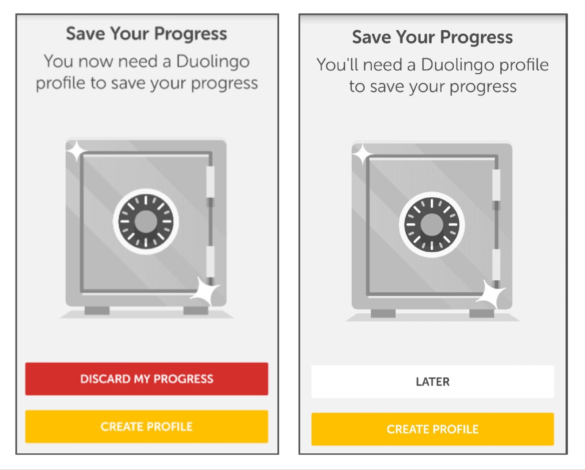
What they do: Duolingo runs your first lesson before it asks for an account. When the walls do arrive, they escalate: dismissible prompts first, blocking gates later. New users also land in a fourteen-day reverse trial that drops them into premium and steps them down at the end.
Why this works: The sequencing is the whole trick. By the time Duolingo asks for anything, you've answered questions, gotten some right, and watched a streak counter turn over. The request lands on a user who has already invested effort and seen a result, which is a completely different person from the one who hit the homepage. The reverse trial works on the same logic in reverse. Losing premium after two weeks is a sharper motivator than gaining it ever was.
The proof: Delaying signup on its own drove a 20% lift in daily active users. Compounded across the full system, Duolingo converts roughly 8.9% of free users to paid, against a consumer app norm closer to 2%.
The part people miss: The 8.9% isn't a clever screen. It's the accumulated result of running onboarding as a permanent experiment, hundreds of small tests deep. The tactics might be copyable, but it's the testing cadence behind them you want to lean into.
Steal this: Find the one action in your product that produces a visible result, and move it in front of your signup form.
The hard part: This strategy requires an anonymous session-state and an experimentation culture most teams haven’t built out yet.
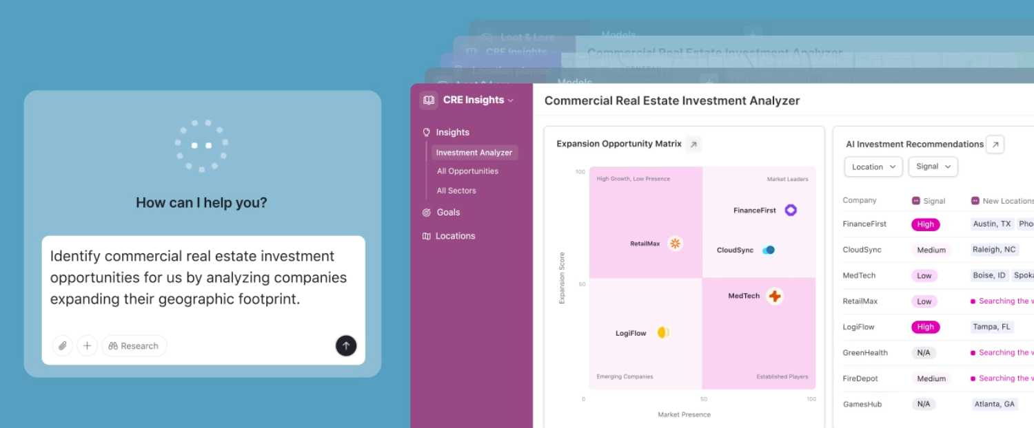
What they do: Since its AI-native relaunch in July 2025, Airtable's onboarding centers on Omni. You describe what you're trying to track, and Omni builds a working base around it. There's no template gallery to browse. Instead, you start by editing an AI-suggested workspace that already has your fields in it.
Why it works: This solves two problems at once: the blank canvas problem and template gallery paralysis. Generating one imperfect starting point beats offering a dozen abstract ones, because editing is a much easier cognitive task than choosing.
Steal this: Replace your template gallery with one input box. Generating a wrong-but-close starting point beats offering twelve right-but-abstract ones.
The hard part: Your product needs enough underlying structure for a model to generate into. Airtable has bases, fields, and views, all clean objects with clear schemas. If your product's core artifact is fuzzier, this is a tall order.
Pattern: Personalization that changes the product
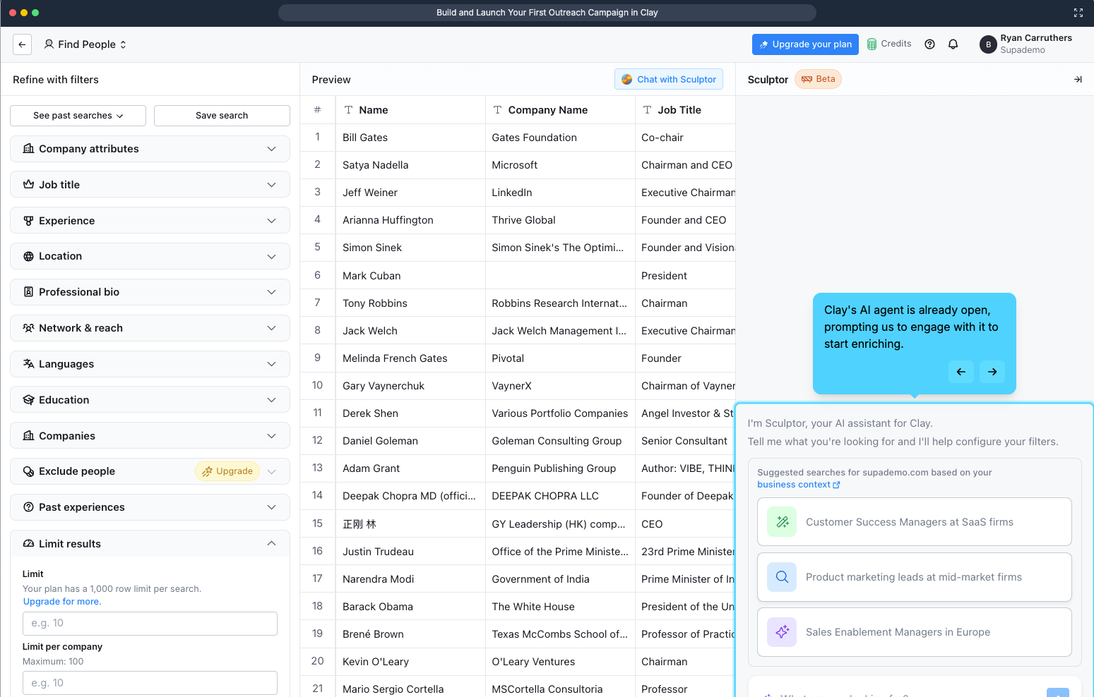
What they do: Clay asks what you're working on, then feeds your answers to Sculptor AI, which generates a context-aware first workflow from your signup data. It hyperlinks the business context it inferred, so you can click through and check what it thinks it knows about you. Then it runs a first enrichment on ten rows and awards a credits milestone.
Why it works: This is the smartest use of a welcome survey we’'ve found anywhere for one simple reason: most welcome surveys are a tax. The user answers four questions, the answers become segment labels in someone's CRM, and the next screen looks identical no matter what they said. Clay's survey changes the product in front of you within seconds, which makes answering carefully worth the effort.
The inspectable inference deserves particular attention. Showing its work (“here's what we concluded about your business, click to verify”) turns a black box into something the user can correct. Most products would hide that. Clay makes it a feature, and in doing so converts an unsettling moment in AI onboarding into a trust-building one.
Steal this: Audit your welcome survey. If the answers don’t visibly change the next screen, you’re taxing users for your team’s benefit.
The hard part: This requires your AI layer to be genuinely good. A bad inference that you show transparently is worse than none at all, so this requires some gut checking and internal testing.
(Check out Supademo’s walkthrough of the full process!)
Pattern: Get out of the way
What they do: ~7 steps at ~60 seconds, with no tours, progress bars, or tooltips. Onboarding tasks arrive as real issues in your queue so you learn Linear by doing your real work in Linear.
Why it works: This proves out the opposite of onboarding wisdom! But that comes down to knowing your audience. For a high-intent, technically fluent user, guidance is friction. The onboarding-as-real-work tactic skips the throwaway tutorial state and gets straight to business.
Steal this: If your users arrive with high intent and domain fluency, cut your flow in half and measure. Your tour might be costing you more than you think.
The hard part: This only works when paired with a genuinely intuitive product and a narrow, sophisticated ICP. Most teams reach for this strategy because it's cheap without regard for fit, and then are surprised when it backfires.
Here’s a great video breakdown by Mike Bal!
Pattern: Personalization that changes the product
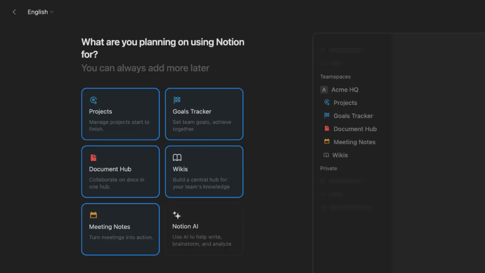
What they do: Notion pairs its welcome survey with a live UI preview that updates as you answer. Pick a use case and the workspace behind the question visibly rearranges. Nobody lands on a blank page. Since September 2025, onboarding also doubles as a demo of Notion Agents.
Why it works: The live preview solves the credibility problem every welcome survey has. "What do you use Notion for?" is an abstract question with no visible consequence, so users pick whatever gets them to the next screen fastest, which poisons your segmentation data at the same time it wastes their time. Showing the payoff during the survey turns it into cause and effect. Completion goes up, and so does the honesty of the answers.
Steal this: Show the payoff of the survey during the survey itself. Even a low-fidelity preview is better than a progress bar.
The hard part: This is real engineering work applied to a screen most teams treat as a form. Budget accordingly.
Pattern: AI does the setup.
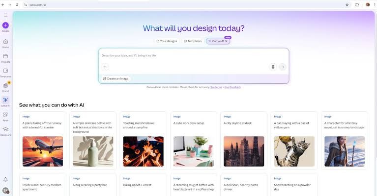
What they do: Canva made its own homepage the onboarding flow. You type or speak an idea into Canva AI and get personalized drafts back, instead of scrolling a template grid trying to find something close to what's in your head.
Why it works: The search-and-browse step got deleted, which, for a new user, is where most of the confusion lives. Browsing templates requires you to translate your intent into Canva's categories. Typing your intent in your own words removes the translation entirely, and the output arrives before you've learned a single piece of the interface.
Steal this: Move the first meaningful action onto the surface users already land on. Routing people into a separate onboarding container adds a step and signals that the real product is somewhere else.
The hard part: Generation quality becomes the entire first impression. A mediocre AI draft is worse than a good template, because the template never promised to understand you.
Pattern: The product learns you
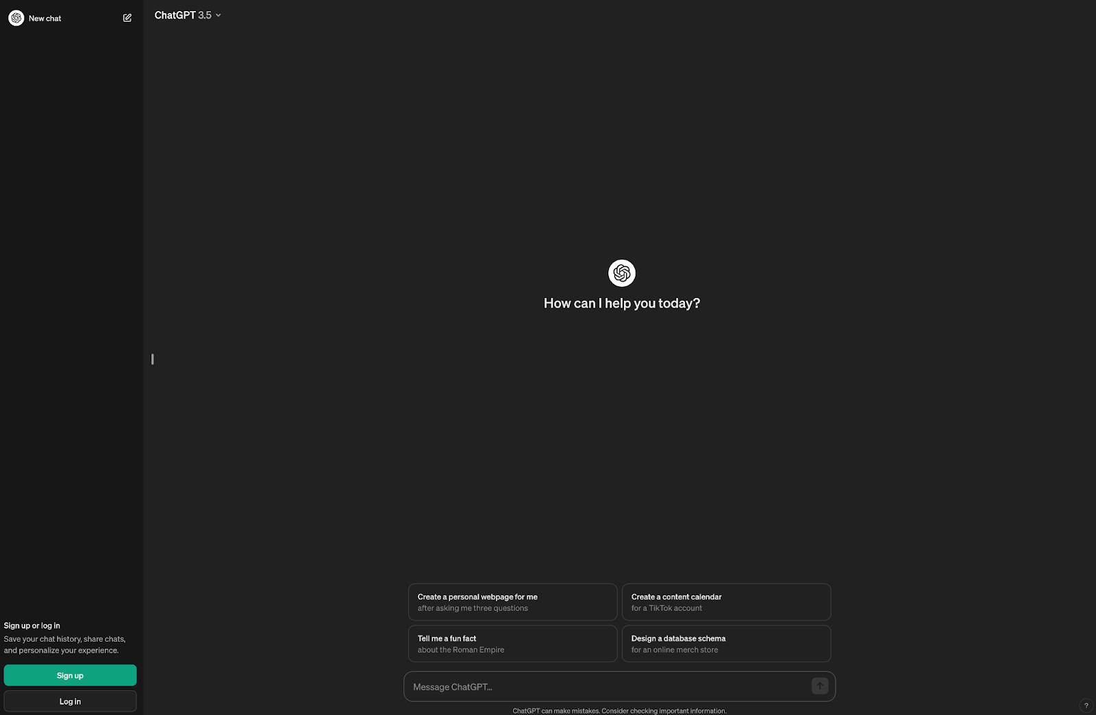
What they do: This is the extreme case. There’s no onboarding interface at all. As of June 2026, memory and personalization are default across all tiers.
Why it works: The model here is inverted. Instead of the user learning the product, the product learns the user, and it does it passively. There's nothing to configure, which means there's nothing to skip, abandon, or get wrong.
Steal this: Go through your setup questions and ask which could be inferred from behavior instead. Every question you delete is friction removed and a data point you'll collect more accurately anyway.
The hard part: This needs an interface with essentially one input and trust you may not have yet. Defaults-on memory is a consent decision, not just a UX one: it means users are enrolled in data retention without choosing it. OpenAI can carry that; a B2B tool heading into a security review usually can't. Copy the principle (infer instead of ask), not necessarily the default.
Pattern: Migration as onboarding.
What they do: Cursor imports your extensions, themes, and keybindings from VS Code in a single click. You open it for the first time and it already looks and behaves like the editor you've spent years configuring.
Why this works: Two things happen at once. Switching cost collapses to roughly zero, and the first-run experience happens on your own setup rather than a sample project. Demo data is always a little unconvincing because it's chosen to make the product look good. Your own configuration is the opposite so if the product works there, it works.
Steal this: If you're competing against an incumbent, build the importer before you build the tour. In a switching market, migration is the most valuable onboarding feature you can ship.
The hard part: Import fidelity is unforgiving. A half-working import is a worse first impression than no import at all, because you've now demonstrated a failure at the exact moment you promised ease.
Pattern: Migration as onboarding
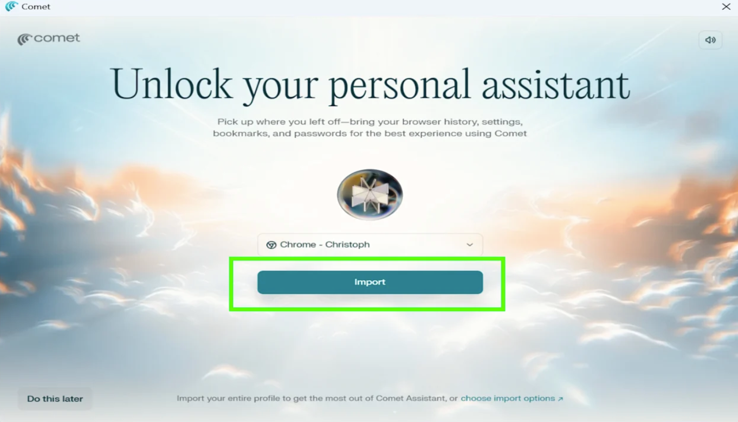
What it does: Comet imports your existing browser profile in one click with all your tabs, bookmarks, and settings so the product is populated with your real context from the first second.
Why it works: Same mechanic as Cursor, applied to a category where switching cost is essentially the entire barrier. Nobody wants an empty browser, and no amount of feature messaging overcomes the friction of rebuilding a bookmark bar. Importing it sidesteps the argument.
Steal this: The pattern generalizes further than most teams assume. Ask what your users already have somewhere else that you could pull in like their accounts, contacts, files, settings, or their history. If the answer is anything, that's your onboarding.
Credit to Chrisoph over at Tech Yahoo!
Pattern: First outcome as the finish line
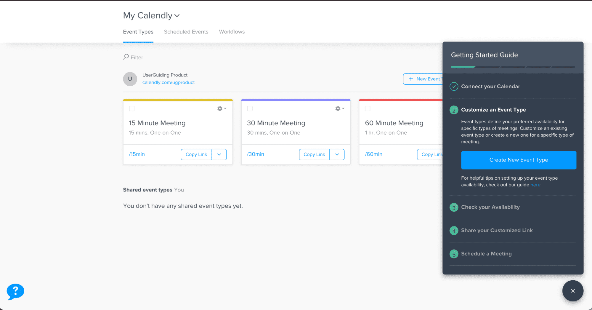
What it does: Calendly's onboarding ends when you have a real, shareable meeting link so you leave holding something you can paste into an email.
Why it works: The completion criterion is the design decision worth noting. Because the finish line is an artifact the user actually wanted, there's an obvious reason to reach the end and an clear reason to come back.
Steal this: Define "onboarding complete" as something the user possesses, not something your system records.
Shout out to User Onboarding Academy for their breakdown!
Pattern: Endowed progress
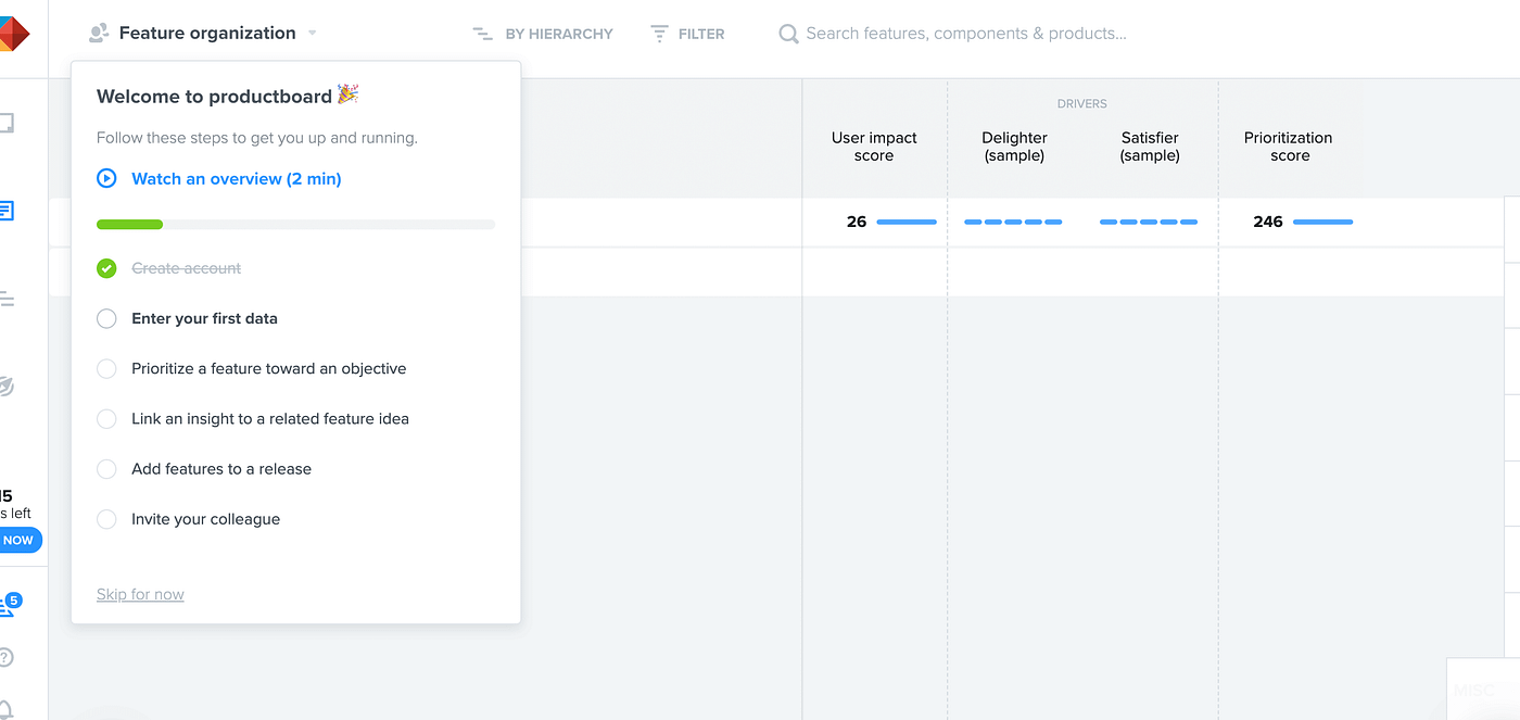
What it does: Productboard hands you a pre-built workspace with the first checklist item already marked complete.
Why it works: That second detail is the endowed progress effect. People are measurably more likely to finish a task they didn't start from zero. A checklist showing one of five done reads as momentum while the same checklist showing zero of four reads as more work.
Steal this: This is the cheapest win on the entire list. Pre-complete your first checklist item, even if the "completed" step is just signing up, which they already did.
Pattern: Segment-specific paths
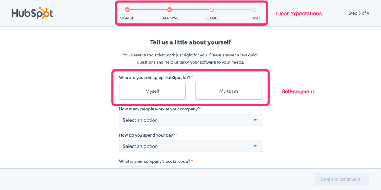
What it does: HubSpot branches its onboarding checklists by role, so an admin and a marketer get different first tasks. The flow now pairs with Breeze agents.
The proof: Role-based checklists drove a 4x lift on their target metric.
Why it works: In a product serving several job titles, a single onboarding path is wrong for almost everyone since it's built for an average user who doesn't exist, making every persona wades through steps that belong to someone else. Role-based branching is the minimum viable version of personalization, and it's available to teams who have no AI layer at all.
Steal this: If your product serves more than one job title, one checklist is quietly costing you activation.
The hard part: Every branch multiplies what you maintain. Start with two paths, not six, and let the data tell you whether a third is worth it.
If you’ve been paying attention, you’ll notice by now that the same idea keeps surfacing in different ways. The first action is the product. Every flow here ends with the user holding something real like a completed lesson, a working base, an enriched list, or a shareable link.
There’s been an inflection point for how we build and consider onboarding, starting between 2025 and 2026 where the setup work is moving from the user to the model. And sometimes, closing that gap means an AI builds the workspace. Or importing a setup from a competitor. Sometimes it means deleting the tour you spent an entire quarter building. The right move really depends on two things:
Copying a specific flow rarely works, because the flow is downstream of a product decision you didn't make. Copying the reasoning works better, and you can do it yourself in four steps:
1. Name your activation moment precisely. This is a step deeper than a "user explores the dashboard." This is the specific thing a user does that predicts they'll still be here in ninety days. If you can't name it, pull your retention data by first-week action before you touch onboarding.
2. Count the steps between signup and that moment. Write them out. Most teams find twice as many as they expected, and about a third exist because someone needed a field populated rather than because the user needed anything.
3. Remove one step per cycle. Duolingo's 8.9% came from doing exactly this on repeat for years.
4. Measure to the outcome, not to completion. Checklist completion rate is a vanity metric since it tells you people finished your flow, not that your flow was worth finishing. Measure the activation moment itself, and the ninety-day retention behind it.
Some of these patterns need close work with product engineering: AI generation, migration importers, or live previews. Others are configuration work a lifecycle or product marketing team can ship on their own like role-based paths, endowed progress, soft walls before hard walls, or checklists tied to real outcomes. Start there. The cheap patterns on this list are cheap because they're built on sequencing and psychology, not on new infrastructure.
Most of the patterns on this list — role-based paths, endowed progress, soft walls, checklists tied to real outcomes — are sequencing and targeting decisions, not engineering projects. Appcues lets marketing and product teams build, target, and measure them without waiting on a release cycle.
Book a demo to see how it works on your product.
Product Adoption
Personalization
User Onboarding & Adoption Metrics
Upsell & Cross-sell
TL;DR
Most onboarding advice assumes that you’re still building out a product tour. Pick your five features that matter, write a tooltip for each of them, throw in a progress bar, and ship it.
But when you look at what launched in 2025 and 2026, almost none of the biggest onboarding experiences work that way:
This comes down to an agreement between all these teams on something fundamental. The first thing a user does should produce something real, and everything that stands between signup and moment is cost.
There’s a few different reasons behind this: the first being that product-led growth is still the most widely accepted channel and strategy for growth (and for good reason). The second is that acquisition, now more costly than ever, is where retention is really decided. And for those measured on retention with few levers to pull, onboarding is one of the most important areas to lock into.
Below are twelve onboarding flows worth studying, all of them current as of August 2026. Each entry covers what the company does, why it works, what’s worth copying, and what makes each of these tactics tricky. They’re ordered roughly by how much of the setup burden the product takes off the user, and each is listed with the pattern that represents it so you can quickly find the ones that fit your product.
The best user onboarding gets a user to a real outcome in their own account as fast as possible. Instead of touring an interface, the flows that move the needle deliver value before signup, use AI to pre-build the workspace, and make the first task the user’s actual job.
Here are the shared traits that make a user onboarding experience truly great:
Pattern: Value before signup
What they do: Duolingo runs your first lesson before it asks for an account. When the walls do arrive, they escalate: dismissible prompts first, blocking gates later. New users also land in a fourteen-day reverse trial that drops them into premium and steps them down at the end.
Why this works: The sequencing is the whole trick. By the time Duolingo asks for anything, you've answered questions, gotten some right, and watched a streak counter turn over. The request lands on a user who has already invested effort and seen a result, which is a completely different person from the one who hit the homepage. The reverse trial works on the same logic in reverse. Losing premium after two weeks is a sharper motivator than gaining it ever was.
The proof: Delaying signup on its own drove a 20% lift in daily active users. Compounded across the full system, Duolingo converts roughly 8.9% of free users to paid, against a consumer app norm closer to 2%.
The part people miss: The 8.9% isn't a clever screen. It's the accumulated result of running onboarding as a permanent experiment, hundreds of small tests deep. The tactics might be copyable, but it's the testing cadence behind them you want to lean into.
Steal this: Find the one action in your product that produces a visible result, and move it in front of your signup form.
The hard part: This strategy requires an anonymous session-state and an experimentation culture most teams haven’t built out yet.
What they do: Since its AI-native relaunch in July 2025, Airtable's onboarding centers on Omni. You describe what you're trying to track, and Omni builds a working base around it. There's no template gallery to browse. Instead, you start by editing an AI-suggested workspace that already has your fields in it.
Why it works: This solves two problems at once: the blank canvas problem and template gallery paralysis. Generating one imperfect starting point beats offering a dozen abstract ones, because editing is a much easier cognitive task than choosing.
Steal this: Replace your template gallery with one input box. Generating a wrong-but-close starting point beats offering twelve right-but-abstract ones.
The hard part: Your product needs enough underlying structure for a model to generate into. Airtable has bases, fields, and views, all clean objects with clear schemas. If your product's core artifact is fuzzier, this is a tall order.
Pattern: Personalization that changes the product
What they do: Clay asks what you're working on, then feeds your answers to Sculptor AI, which generates a context-aware first workflow from your signup data. It hyperlinks the business context it inferred, so you can click through and check what it thinks it knows about you. Then it runs a first enrichment on ten rows and awards a credits milestone.
Why it works: This is the smartest use of a welcome survey we’'ve found anywhere for one simple reason: most welcome surveys are a tax. The user answers four questions, the answers become segment labels in someone's CRM, and the next screen looks identical no matter what they said. Clay's survey changes the product in front of you within seconds, which makes answering carefully worth the effort.
The inspectable inference deserves particular attention. Showing its work (“here's what we concluded about your business, click to verify”) turns a black box into something the user can correct. Most products would hide that. Clay makes it a feature, and in doing so converts an unsettling moment in AI onboarding into a trust-building one.
Steal this: Audit your welcome survey. If the answers don’t visibly change the next screen, you’re taxing users for your team’s benefit.
The hard part: This requires your AI layer to be genuinely good. A bad inference that you show transparently is worse than none at all, so this requires some gut checking and internal testing.
(Check out Supademo’s walkthrough of the full process!)
Pattern: Get out of the way
What they do: ~7 steps at ~60 seconds, with no tours, progress bars, or tooltips. Onboarding tasks arrive as real issues in your queue so you learn Linear by doing your real work in Linear.
Why it works: This proves out the opposite of onboarding wisdom! But that comes down to knowing your audience. For a high-intent, technically fluent user, guidance is friction. The onboarding-as-real-work tactic skips the throwaway tutorial state and gets straight to business.
Steal this: If your users arrive with high intent and domain fluency, cut your flow in half and measure. Your tour might be costing you more than you think.
The hard part: This only works when paired with a genuinely intuitive product and a narrow, sophisticated ICP. Most teams reach for this strategy because it's cheap without regard for fit, and then are surprised when it backfires.
Here’s a great video breakdown by Mike Bal!
Pattern: Personalization that changes the product
What they do: Notion pairs its welcome survey with a live UI preview that updates as you answer. Pick a use case and the workspace behind the question visibly rearranges. Nobody lands on a blank page. Since September 2025, onboarding also doubles as a demo of Notion Agents.
Why it works: The live preview solves the credibility problem every welcome survey has. "What do you use Notion for?" is an abstract question with no visible consequence, so users pick whatever gets them to the next screen fastest, which poisons your segmentation data at the same time it wastes their time. Showing the payoff during the survey turns it into cause and effect. Completion goes up, and so does the honesty of the answers.
Steal this: Show the payoff of the survey during the survey itself. Even a low-fidelity preview is better than a progress bar.
The hard part: This is real engineering work applied to a screen most teams treat as a form. Budget accordingly.
Pattern: AI does the setup.
What they do: Canva made its own homepage the onboarding flow. You type or speak an idea into Canva AI and get personalized drafts back, instead of scrolling a template grid trying to find something close to what's in your head.
Why it works: The search-and-browse step got deleted, which, for a new user, is where most of the confusion lives. Browsing templates requires you to translate your intent into Canva's categories. Typing your intent in your own words removes the translation entirely, and the output arrives before you've learned a single piece of the interface.
Steal this: Move the first meaningful action onto the surface users already land on. Routing people into a separate onboarding container adds a step and signals that the real product is somewhere else.
The hard part: Generation quality becomes the entire first impression. A mediocre AI draft is worse than a good template, because the template never promised to understand you.
Pattern: The product learns you
What they do: This is the extreme case. There’s no onboarding interface at all. As of June 2026, memory and personalization are default across all tiers.
Why it works: The model here is inverted. Instead of the user learning the product, the product learns the user, and it does it passively. There's nothing to configure, which means there's nothing to skip, abandon, or get wrong.
Steal this: Go through your setup questions and ask which could be inferred from behavior instead. Every question you delete is friction removed and a data point you'll collect more accurately anyway.
The hard part: This needs an interface with essentially one input and trust you may not have yet. Defaults-on memory is a consent decision, not just a UX one: it means users are enrolled in data retention without choosing it. OpenAI can carry that; a B2B tool heading into a security review usually can't. Copy the principle (infer instead of ask), not necessarily the default.
Pattern: Migration as onboarding.
What they do: Cursor imports your extensions, themes, and keybindings from VS Code in a single click. You open it for the first time and it already looks and behaves like the editor you've spent years configuring.
Why this works: Two things happen at once. Switching cost collapses to roughly zero, and the first-run experience happens on your own setup rather than a sample project. Demo data is always a little unconvincing because it's chosen to make the product look good. Your own configuration is the opposite so if the product works there, it works.
Steal this: If you're competing against an incumbent, build the importer before you build the tour. In a switching market, migration is the most valuable onboarding feature you can ship.
The hard part: Import fidelity is unforgiving. A half-working import is a worse first impression than no import at all, because you've now demonstrated a failure at the exact moment you promised ease.
Pattern: Migration as onboarding
What it does: Comet imports your existing browser profile in one click with all your tabs, bookmarks, and settings so the product is populated with your real context from the first second.
Why it works: Same mechanic as Cursor, applied to a category where switching cost is essentially the entire barrier. Nobody wants an empty browser, and no amount of feature messaging overcomes the friction of rebuilding a bookmark bar. Importing it sidesteps the argument.
Steal this: The pattern generalizes further than most teams assume. Ask what your users already have somewhere else that you could pull in like their accounts, contacts, files, settings, or their history. If the answer is anything, that's your onboarding.
Credit to Chrisoph over at Tech Yahoo!
Pattern: First outcome as the finish line
What it does: Calendly's onboarding ends when you have a real, shareable meeting link so you leave holding something you can paste into an email.
Why it works: The completion criterion is the design decision worth noting. Because the finish line is an artifact the user actually wanted, there's an obvious reason to reach the end and an clear reason to come back.
Steal this: Define "onboarding complete" as something the user possesses, not something your system records.
Shout out to User Onboarding Academy for their breakdown!
Pattern: Endowed progress
What it does: Productboard hands you a pre-built workspace with the first checklist item already marked complete.
Why it works: That second detail is the endowed progress effect. People are measurably more likely to finish a task they didn't start from zero. A checklist showing one of five done reads as momentum while the same checklist showing zero of four reads as more work.
Steal this: This is the cheapest win on the entire list. Pre-complete your first checklist item, even if the "completed" step is just signing up, which they already did.
Pattern: Segment-specific paths
What it does: HubSpot branches its onboarding checklists by role, so an admin and a marketer get different first tasks. The flow now pairs with Breeze agents.
The proof: Role-based checklists drove a 4x lift on their target metric.
Why it works: In a product serving several job titles, a single onboarding path is wrong for almost everyone since it's built for an average user who doesn't exist, making every persona wades through steps that belong to someone else. Role-based branching is the minimum viable version of personalization, and it's available to teams who have no AI layer at all.
Steal this: If your product serves more than one job title, one checklist is quietly costing you activation.
The hard part: Every branch multiplies what you maintain. Start with two paths, not six, and let the data tell you whether a third is worth it.
If you’ve been paying attention, you’ll notice by now that the same idea keeps surfacing in different ways. The first action is the product. Every flow here ends with the user holding something real like a completed lesson, a working base, an enriched list, or a shareable link.
There’s been an inflection point for how we build and consider onboarding, starting between 2025 and 2026 where the setup work is moving from the user to the model. And sometimes, closing that gap means an AI builds the workspace. Or importing a setup from a competitor. Sometimes it means deleting the tour you spent an entire quarter building. The right move really depends on two things:
Copying a specific flow rarely works, because the flow is downstream of a product decision you didn't make. Copying the reasoning works better, and you can do it yourself in four steps:
1. Name your activation moment precisely. This is a step deeper than a "user explores the dashboard." This is the specific thing a user does that predicts they'll still be here in ninety days. If you can't name it, pull your retention data by first-week action before you touch onboarding.
2. Count the steps between signup and that moment. Write them out. Most teams find twice as many as they expected, and about a third exist because someone needed a field populated rather than because the user needed anything.
3. Remove one step per cycle. Duolingo's 8.9% came from doing exactly this on repeat for years.
4. Measure to the outcome, not to completion. Checklist completion rate is a vanity metric since it tells you people finished your flow, not that your flow was worth finishing. Measure the activation moment itself, and the ninety-day retention behind it.
Some of these patterns need close work with product engineering: AI generation, migration importers, or live previews. Others are configuration work a lifecycle or product marketing team can ship on their own like role-based paths, endowed progress, soft walls before hard walls, or checklists tied to real outcomes. Start there. The cheap patterns on this list are cheap because they're built on sequencing and psychology, not on new infrastructure.
Most of the patterns on this list — role-based paths, endowed progress, soft walls, checklists tied to real outcomes — are sequencing and targeting decisions, not engineering projects. Appcues lets marketing and product teams build, target, and measure them without waiting on a release cycle.
Book a demo to see how it works on your product.

Sign up for Quickcues and get our monthly updates!
.svg)