← Visit Appcues.com
×
×

11 User onboarding email examples & best practices
Find out how to craft the perfect user onboarding emails with best practices and real-life examples
Skip to section:

Skip to section:

Imagine this: You’ve fine-tuned your user onboarding process until it’s as short and simple as possible. You’ve included helpful UI/UX patterns that gently push users toward the most important features of your app. You’ve A/B tested, beta tested, and usability tested your onboarding process to distill it to its purest and most friction-free form.

Then you release it to the masses and a large percentage of your customer base still fails to complete their onboarding. 🥺

People subscribe to your product with every intention of using it to transform their day-to-day—but then their lives distract them from what they’re doing. That’s because we often forget that our products exist in the real world. Sometimes even the most focused users need a reminder to pick up where they left off—so sending them a friendly user onboarding email can help them get them back on track.

What is a user onboarding email?

A user onboarding email is the first step in the customer onboarding journey, aimed at bringing recently subscribed users back to your product after their initial sign-up. Each year, an incredible 21-25% of users only use an app once before abandoning it. And that's not counting the ones who drop off after a couple of tries, way before they've gotten into the groove of your app. User onboarding emails are like friendly nudges, encouraging users to dive back in and explore your product rather than leaving it to chance.

These emails aren't just informative—they pack a punch with a call to action (CTA) that leads users straight to your product's 'aha moment.' This is the game-changer, the point where users see the immediate value and the long-term wow factor of your product. Getting users to this moment quickly can be the difference between a one-time visitor and a loyal customer who sticks around for the whole customer lifecycle. And best of all, you can use automation to ensure your onboarding email sequence is set up to reach your users when they need it most.

Why user onboarding emails are important

User onboarding emails are crucial because they bridge new users to your product's full potential. They're the friendly signposts that guide users through the maze of features and functionalities. 

Each email is a step in the customer journey, enhancing the user experience and deepening their engagement with your product. It's an essential part of your email marketing strategy, designed to increase product adoption and decrease the likelihood of customer churn. These emails are your way of saying, "We see you, we understand you, and we've got exactly what you need." They transform the customer journey from a simple interaction into a meaningful, long-term relationship.

The qualities of a great onboarding email

Let’s face it: marketing emails are tricky. There’s a fine line between being interesting and being downright spammy. Ensure your onboarding emails fall into the former category by making them:

  1. Personalized and timely
  2. Complementary to your in-app onboarding experience
  3. Reiterative of your app’s value propositions

71% of customers expect personalized communications. In the case of onboarding emails, this means more than just adding a recipient’s first name to the subject line. It means ensuring that each email is relevant to where a user currently is in the onboarding flow. 

A “Thanks for signing up!” email won’t make a lot of sense if a customer receives it six months into their subscription. Base your onboarding email schedule on the actions users take inside your product to ensure that you're delivering a timely and relevant message.

Effective onboarding emails keep users on track and turn them into engaged, long-term users. The more helpful your early emails are, the more likely your users are to trust and engage with your email outreach in the future. This sets your future marketing efforts up for better success down the line.

Benefits of email onboarding

Think of email onboarding as your secret toolkit for not just saying hello to new users but really rolling out the red carpet for them. Here’s what makes these emails pack a punch:

Turning newbies into pros

When new users first encounter your product, they're just getting their toes wet. This is where an onboarding email sequence kicks in, turning that toe-dipping into a full-on cannon ball. It brings them beyond the basics, shining a light on those less-obvious (yet valuable!) features and functionalities. It transforms guides into keys, unlocking your product's full potential for users. This process isn't just a tour—it's an empowerment journey, equipping users to become adept and confident in leveraging your product to its fullest.

Making every message count

Engaged customers are six times more likely to try out new offerings from a brand they trust. That's where the power of email onboarding comes into play. It's all about delivering timely, relevant messages that strike a chord with your audience. Each email in your onboarding sequence is an opportunity to strengthen that trust, fostering a dialogue that deepens loyalty and trust with every interaction.

Boosting long-term user engagement

Every user wants to feel like they're more than just a number. That's where your onboarding emails shine. These messages serve as reminders and reconnections to the value your product offers, highlighting overlooked features and benefits. You can even include links to customer support options and a direct email for your support team as a way to provide an extra layer of dependability. A well-executed onboarding process is a proven way to boost user loyalty, keeping them connected and engaged with your product over time.

The 3 essential types of user onboarding emails

Every day, users sift through dozens of bland marketing emails. This gives particularly creative emails (and those who write them) power in the campaign for a customer’s attention. Don’t settle for cookie-cutter onboarding emails. Use these three formats to engage your users and break up their inbox monotony.

1. The warm welcome email

The first email in your onboarding sequence is crucial. It sets the tone for the new customer's journey. Welcome emails have a 63.91% open rate. That’s because new users are excited about your product. They’ve made the decision to engage with your brand and are highly receptive to hearing from you at that moment, especially because it’s most likely the first time they’re receiving emails from you.

Don’t waste this opportunity by turning it into a hard sell. Instead, use this email to lay the foundation for a meaningful relationship with your users. Be genuine and welcome them to the community while highlighting how your product benefits them. Not all of us have big imaginations so you want to help users connect the dots on how your product can actually improve their day-to-day. This practice helps drive new users to their aha moment and keeps them excited about what’s to come. (Win-win!)

Let’s take a peek at Headspace’s simple (but warm!) welcome email. It reiterates its core value without overwhelming new users with too much information. The use of a single CTA keeps the email focused and makes it easy for users to take the next step. Headspace provides more context for users who need that extra push, including compelling, science-based testimonials

.‍📖 Read more: Write a welcome email that grabs readers (with tips from Campaign Monitor)

welcome to headspace user onboarding email example
(Source)

2. The social proof email

People trust people. That's why emails showcasing customer love stories are invaluable. If you’re not telling stories about how your current customers love your product, then you’re definitely missing out on a high-impact content opportunity. 

People expect you to think your product is great, but they won’t know how customers feel about it unless you tell them. Testimonials use successful case studies and IRL customer experiences to convince new or reluctant users to give you a shot.

Thumbtack does this well—using a video to showcase a specific customer experience. Thumbtack follows the video up with more reasons explaining why they’re worth a second look, giving this email a powerful pitch from start to finish.
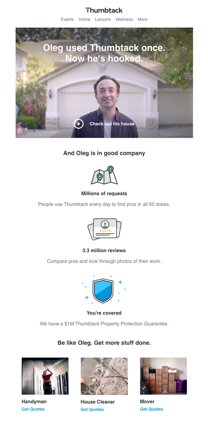
thumbtack user onboarding email video example
(Source)

3. The early re-engagement email

Customer churn and app abandonment are some of the biggest challenges marketers face today. That’s why using a re-engagement email to motivate new or lapsed users is crucial to your onboarding strategy. This method gives people the gentle nudge they need to pick up where they left off and continue down the path to adoption.

Slack’s re-engagement email cleverly entices lapsed users with a FOMO-play. The email encourages users to to see what convos their teammates are having by exploring Slack channels they’re not a part of. It provides a short synopsis of the three conversation types that happen within Slack below the CTA. It also links to their Essentials guide to provide curious users an avenue to learn more. When it comes to hesitant users, providing more (FOMO-driven) context is a great way to get more engagement.
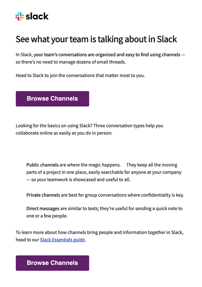
slack welcome email example
(Source)

Best practices for creating engaging user onboarding email strategies

Onboarding emails work wonders at minimizing onboarding churn and fostering engagement. However, even a well-designed email can perform poorly with bad execution. To get the most out of your user onboarding emails, you must:

Reach out to most users more than once

Onboarding emails are most effective when deployed frequently. Your initial welcome email that greets new users is a great start! But in a perfect world, 100% of these users would open your email, click on the CTA, and jump back into your product. (Alas, 100% open rates will always be a pipe dream.)

But even email-openers aren’t guaranteed to move further along in your onboarding process. Some may open the link and bail if they realize they don’t have the time the progression requires. And if they’re too busy for that, what are the odds they’ll remember to return on their own to finish onboarding?

Your welcome email should be one of the several messages sent during your onboarding process. The number of emails you send to a new customer should depend entirely on that customer’s behaviors and touchpoints within your app. If a single welcome email is enough to get your customer to their aha moment (and beyond), then great! But if a glance at your product data shows that certain users exhibit lackluster usage, we recommend reaching out to them with follow-up emails to reignite their interest.

Example of an onboarding email campaign:

Let’s take a hypothetical SaaS company with a 14-day free trial period. Their onboarding email campaign might look something like this:

  • Day 0: Confirmation email/Welcome email—the first hello, setting the stage.
  • Day 1 & 2: Product feature highlights—diving into what makes your product stand out.
  • Day 3: Case study—real-world customer success stories that resonate and inspire.
  • Day 5: Check-up email—a friendly nudge to see how they’re doing and if they need any help.
  • Day 7: Halfway through the trial—a reminder of the trial progress and encouragement to explore more.
  • Day 10: Upgrade email (for those who haven't upgraded yet)—presenting the value of upgrading.
  • Day 14: Trial expires—last call for action, with a sense of urgency.

A/B test for maximum impact

In the race to win customer hearts, think of A/B testing as your pit stop for fine-tuning. Just like how a racer tweaks their car for optimum performance, A/B testing your onboarding emails ensures they're performing at their best. It's all about experimenting with different elements to see what truly resonates with your audience.

a/b testing meme declaring "run a test on all the pages"
(Source)

The Essence of A/B Testing:

It’s a simple concept: create two versions of your email, each with a slight variation. This could be anything from the subject line, the content, the images used, or even the call-to-action (CTA) button. Maybe one is filled with visuals and the other is plain text. Send these variants to similar audiences and see which one performs better. 

But what exactly are you measuring? Here's where metrics like open rates, click-through rates, conversion rates, and ultimately, customer retention come into play. These metrics are your scoreboard, telling you which version of your email is winning the race.

Metrics to Measure Success:

  • Open Rate: How many subscribers are opening your email. It’s your first hurdle to cross.
  • Click-Through Rate (CTR): The percentage of readers who clicked on a link or CTA in your email. This shows if your content is compelling enough to prompt action.
  • Conversion Rate: The percentage of users who took the desired action after clicking through. This could be signing up for a trial, making a purchase, or any other goal you’ve set.
  • Customer Retention: Over time, how your onboarding emails contribute to retaining customers. Are users sticking around because of the valuable content you’re delivering?

Remember, the ultimate goal is to understand what works best for your audience. It's about continuously improving the journey for your subscribers, leading to better engagement, higher customer retention, and a stronger relationship between your brand and your audience.

Catchy subject lines

A subject line is like the cover of a book—it needs to be intriguing enough to make users want to open it. Think of it as the first impression. A catchy subject line is your ticket to getting noticed in a crowded inbox. It should be clear, concise, and compelling, sparking curiosity or offering value that's hard to ignore.

Leverage personalization

Personalization is like calling someone by their name in a crowded room—it instantly grabs attention. Tailoring your emails to include the user's name, mentioning specific actions they've taken, or addressing their unique needs can significantly increase engagement. Personalized emails show users that you understand and care about their individual experience.

Optimize for mobile-first

In today's world, most emails are first opened on a mobile device. Hence, optimizing your onboarding emails for mobile is non-negotiable. This means ensuring that the emails look good and are easily readable on smaller screens, with clear call-to-action buttons that are easy to tap.

Show readers how to use your product/service

Finally, your onboarding emails should educate users about your product or service. Use screenshots, short videos, or step-by-step guides to visually demonstrate how users can benefit from different features. This not only helps in reducing the initial learning curve but also showcases the value of your product in a practical, easy-to-understand way.

Align onboarding emails to in-app messaging

Email onboarding is rarely a stand alone solution. SaaS apps are well-known for offering users a seamless, cross-channel experience that’s essential to user onboarding success. It’s important your in-app onboarding experience aligns with and complements your onboarding emails.

When a user clicks through to your application from an onboarding email, your in-app messaging should be primed to take over and continue the process. Use an omnichannel approach to reinforce core value props, repeat essential information in new contexts, and maintain user engagement both inside and outside your app.

📖 Read more: The ultimate guide to aligning your lifecycle emails and in-app messaging

Examples of onboarding emails

The best onboarding emails balance the need to engage wayward users with the ability to capture their attention. This balance is often hard to strike, but luckily, examples of onboarding emails done right are littered across the interwebs. Some of the best onboarding email examples include:

Todoist

Todoist’s approach to potential customer churn problems involve showcasing just how much they have to offer. Their point is simple: Todoist makes work life easier through countless integrations that streamline a user’s workflow. This compelling pitch reminds unengaged users of what they’re missing out on when they don’t use the app every day.

todoist user onboarding email example
(Source)

Squarespace

Squarespace’s re-engagement email offers encouragement to lapsed users. It states, “It’s not as hard as you think.” The email provides a wealth of resources and a sense of empathy to help hesitant users feel more inspired and confident to take the next steps in their content creation journey.

squarespace user onboarding email example
(Source)

Asana

Asana uses its own team as a case study. This shows the company trusts its product enough to use it to accomplish its own business goals. And to add the cherry on top, they also include an eBook with one of their notable partners Eventbrite that serves as a secondary testimonial.

asana user onboarding email example
(Source)

Invision

Invision takes a straightforward approach to their customer testimonial email with a featured image showcasing all the brands and designers that use their product. A short paragraph below the image and CTA invites users to get inspired by these stories. This results in a powerful testimonial email that sticks with Invision’s underlying theme of an aesthetically pleasing and understated design.
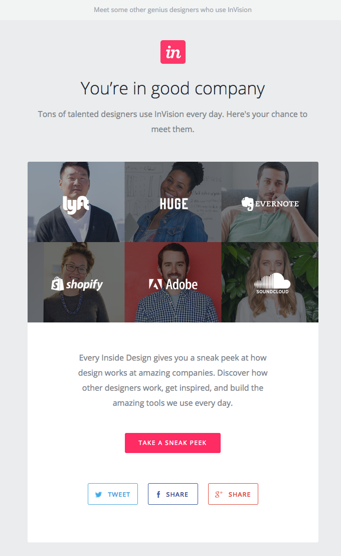
invision user onboarding email example
(Source)

HomeAway

HomeAway’s welcome email uses the header to highlight its mission. The body of the email drives home the point with three key features to help accomplish this. The email functions like an in-app onboarding experience that helps users understand the benefits that HomeAway provides.

HomeAway user onboarding email example
(Source)

Zapier

Zapier takes the welcome message a step further by tailoring it to the end user and how they signed up. Since this user signed up with Google, Zapier provides helpful tips about how to integrate Zapier with a Google account for a more seamless workflow. The welcome email is highly personalized to the recipient, so the user is far more likely to engage with the product meaningfully.
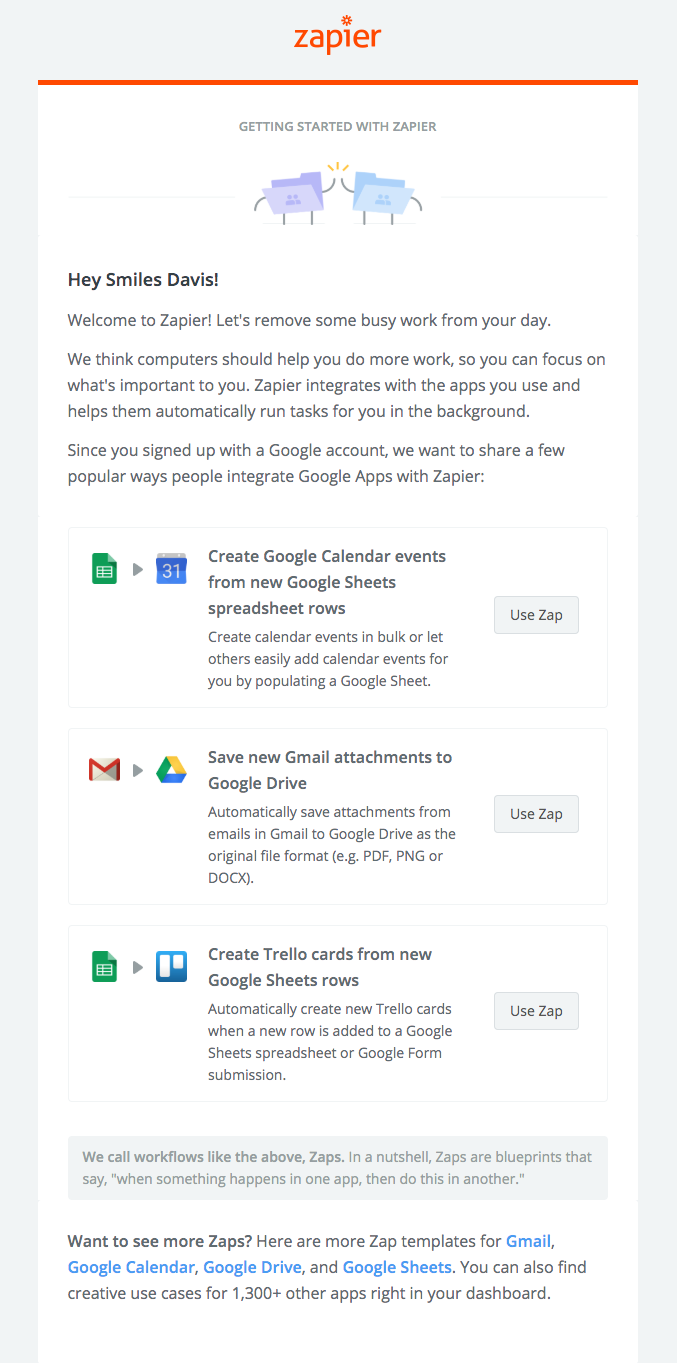
zapier user onboarding email example
(Source)

Wix.com: Simplifying the user journey

Wix.com knows that a journey of a thousand miles begins with a single step—and their onboarding emails are the map. Their emails are like those little breadcrumbs Hansel and Gretel should have used: easy to follow and leading right where you need to go. Wix's emails are a blend of simplicity and utility, offering just the right amount of guidance without overwhelming users. 
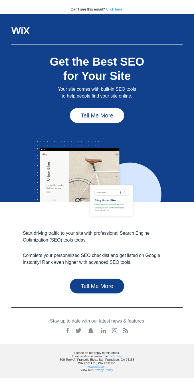
Wix user onboarding email
Source: Really Good Emails

Each email is a mini-masterclass in making your online presence shine, using short, crisp tips that resonate with 'aha' moments. The secret sauce? Their CTAs are like a friendly nudge to explore just one more thing, ensuring users are always one step closer to realizing the full potential of their website.

Ascend: Celebrating user milestones

Remember when you got a gold star in kindergarten and felt like you could conquer the world? That's the feeling Ascend's onboarding emails evoke. They're not just emails—they're virtual high-fives for hitting milestones within their tool. 
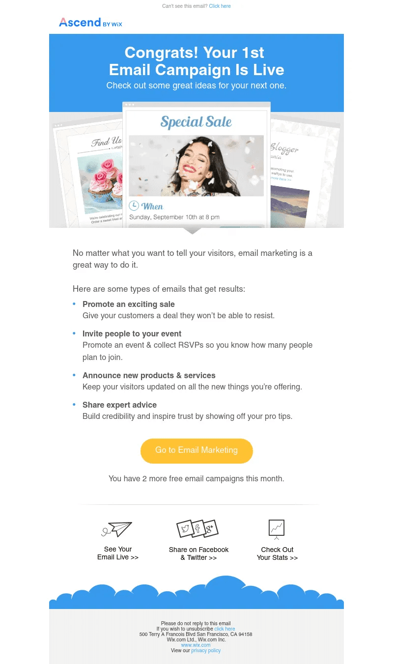
Ascend user onboarding email
Source: CDN

These emails give users a taste of success and gently coax them onto the next phase, effectively turning milestones into stepping stones. The result? Users don’t just feel recognized—they feel motivated. And just when you think it can't get better, Ascend serves up a list of related actions, like a dessert menu of what’s next. It's a rewarding experience that celebrates achievements and also fuels the journey ahead.

Maximize the impact of your user onboarding emails

To truly ace your user onboarding email strategy, it's all about research, timing, and personalization. Crafting compelling onboarding emails is an art, but the science of understanding your users makes them effective. Sending the wrong message at the wrong time is like a missed high-five—awkward and unproductive. And let's be real, generic, one-size-fits-all emails are about as engaging as yesterday's news.

Get into the nitty-gritty of how your users interact with your product. Identify those moments when they're most likely to drift away. This insight is gold—it lets you tailor your email programs to meet your users right where they are. Address their potential drop-offs with targeted, situation-specific content. Your goal? To create emails that stand out in their crowded inbox and remind them of that 'aha' moment when they realized they needed your product.

Remember, your users are inundated with emails every day. Make yours the one they look forward to opening. Remind them why they chose your product and keep them hooked with content that speaks directly to their needs and experiences.

Want to dive deeper into crafting an unforgettable user experience?

📖 Read more: Onboarding UX: Ultimate guide to designing for user experience
Go to the ultimate guide to user onboarding. Discover user onboarding definitions, examples, best practices, and resources.
Meg Gowell
Director, Growth Marketing
Skip to section:

Skip to section:

Imagine this: You’ve fine-tuned your user onboarding process until it’s as short and simple as possible. You’ve included helpful UI/UX patterns that gently push users toward the most important features of your app. You’ve A/B tested, beta tested, and usability tested your onboarding process to distill it to its purest and most friction-free form.

Then you release it to the masses and a large percentage of your customer base still fails to complete their onboarding. 🥺

People subscribe to your product with every intention of using it to transform their day-to-day—but then their lives distract them from what they’re doing. That’s because we often forget that our products exist in the real world. Sometimes even the most focused users need a reminder to pick up where they left off—so sending them a friendly user onboarding email can help them get them back on track.

What is a user onboarding email?

A user onboarding email is the first step in the customer onboarding journey, aimed at bringing recently subscribed users back to your product after their initial sign-up. Each year, an incredible 21-25% of users only use an app once before abandoning it. And that's not counting the ones who drop off after a couple of tries, way before they've gotten into the groove of your app. User onboarding emails are like friendly nudges, encouraging users to dive back in and explore your product rather than leaving it to chance.

These emails aren't just informative—they pack a punch with a call to action (CTA) that leads users straight to your product's 'aha moment.' This is the game-changer, the point where users see the immediate value and the long-term wow factor of your product. Getting users to this moment quickly can be the difference between a one-time visitor and a loyal customer who sticks around for the whole customer lifecycle. And best of all, you can use automation to ensure your onboarding email sequence is set up to reach your users when they need it most.

Why user onboarding emails are important

User onboarding emails are crucial because they bridge new users to your product's full potential. They're the friendly signposts that guide users through the maze of features and functionalities. 

Each email is a step in the customer journey, enhancing the user experience and deepening their engagement with your product. It's an essential part of your email marketing strategy, designed to increase product adoption and decrease the likelihood of customer churn. These emails are your way of saying, "We see you, we understand you, and we've got exactly what you need." They transform the customer journey from a simple interaction into a meaningful, long-term relationship.

The qualities of a great onboarding email

Let’s face it: marketing emails are tricky. There’s a fine line between being interesting and being downright spammy. Ensure your onboarding emails fall into the former category by making them:

  1. Personalized and timely
  2. Complementary to your in-app onboarding experience
  3. Reiterative of your app’s value propositions

71% of customers expect personalized communications. In the case of onboarding emails, this means more than just adding a recipient’s first name to the subject line. It means ensuring that each email is relevant to where a user currently is in the onboarding flow. 

A “Thanks for signing up!” email won’t make a lot of sense if a customer receives it six months into their subscription. Base your onboarding email schedule on the actions users take inside your product to ensure that you're delivering a timely and relevant message.

Effective onboarding emails keep users on track and turn them into engaged, long-term users. The more helpful your early emails are, the more likely your users are to trust and engage with your email outreach in the future. This sets your future marketing efforts up for better success down the line.

Benefits of email onboarding

Think of email onboarding as your secret toolkit for not just saying hello to new users but really rolling out the red carpet for them. Here’s what makes these emails pack a punch:

Turning newbies into pros

When new users first encounter your product, they're just getting their toes wet. This is where an onboarding email sequence kicks in, turning that toe-dipping into a full-on cannon ball. It brings them beyond the basics, shining a light on those less-obvious (yet valuable!) features and functionalities. It transforms guides into keys, unlocking your product's full potential for users. This process isn't just a tour—it's an empowerment journey, equipping users to become adept and confident in leveraging your product to its fullest.

Making every message count

Engaged customers are six times more likely to try out new offerings from a brand they trust. That's where the power of email onboarding comes into play. It's all about delivering timely, relevant messages that strike a chord with your audience. Each email in your onboarding sequence is an opportunity to strengthen that trust, fostering a dialogue that deepens loyalty and trust with every interaction.

Boosting long-term user engagement

Every user wants to feel like they're more than just a number. That's where your onboarding emails shine. These messages serve as reminders and reconnections to the value your product offers, highlighting overlooked features and benefits. You can even include links to customer support options and a direct email for your support team as a way to provide an extra layer of dependability. A well-executed onboarding process is a proven way to boost user loyalty, keeping them connected and engaged with your product over time.

The 3 essential types of user onboarding emails

Every day, users sift through dozens of bland marketing emails. This gives particularly creative emails (and those who write them) power in the campaign for a customer’s attention. Don’t settle for cookie-cutter onboarding emails. Use these three formats to engage your users and break up their inbox monotony.

1. The warm welcome email

The first email in your onboarding sequence is crucial. It sets the tone for the new customer's journey. Welcome emails have a 63.91% open rate. That’s because new users are excited about your product. They’ve made the decision to engage with your brand and are highly receptive to hearing from you at that moment, especially because it’s most likely the first time they’re receiving emails from you.

Don’t waste this opportunity by turning it into a hard sell. Instead, use this email to lay the foundation for a meaningful relationship with your users. Be genuine and welcome them to the community while highlighting how your product benefits them. Not all of us have big imaginations so you want to help users connect the dots on how your product can actually improve their day-to-day. This practice helps drive new users to their aha moment and keeps them excited about what’s to come. (Win-win!)

Let’s take a peek at Headspace’s simple (but warm!) welcome email. It reiterates its core value without overwhelming new users with too much information. The use of a single CTA keeps the email focused and makes it easy for users to take the next step. Headspace provides more context for users who need that extra push, including compelling, science-based testimonials

.‍📖 Read more: Write a welcome email that grabs readers (with tips from Campaign Monitor)

welcome to headspace user onboarding email example
(Source)

2. The social proof email

People trust people. That's why emails showcasing customer love stories are invaluable. If you’re not telling stories about how your current customers love your product, then you’re definitely missing out on a high-impact content opportunity. 

People expect you to think your product is great, but they won’t know how customers feel about it unless you tell them. Testimonials use successful case studies and IRL customer experiences to convince new or reluctant users to give you a shot.

Thumbtack does this well—using a video to showcase a specific customer experience. Thumbtack follows the video up with more reasons explaining why they’re worth a second look, giving this email a powerful pitch from start to finish.

thumbtack user onboarding email video example
(Source)

3. The early re-engagement email

Customer churn and app abandonment are some of the biggest challenges marketers face today. That’s why using a re-engagement email to motivate new or lapsed users is crucial to your onboarding strategy. This method gives people the gentle nudge they need to pick up where they left off and continue down the path to adoption.

Slack’s re-engagement email cleverly entices lapsed users with a FOMO-play. The email encourages users to to see what convos their teammates are having by exploring Slack channels they’re not a part of. It provides a short synopsis of the three conversation types that happen within Slack below the CTA. It also links to their Essentials guide to provide curious users an avenue to learn more. When it comes to hesitant users, providing more (FOMO-driven) context is a great way to get more engagement.

slack welcome email example
(Source)

Best practices for creating engaging user onboarding email strategies

Onboarding emails work wonders at minimizing onboarding churn and fostering engagement. However, even a well-designed email can perform poorly with bad execution. To get the most out of your user onboarding emails, you must:

Reach out to most users more than once

Onboarding emails are most effective when deployed frequently. Your initial welcome email that greets new users is a great start! But in a perfect world, 100% of these users would open your email, click on the CTA, and jump back into your product. (Alas, 100% open rates will always be a pipe dream.)

But even email-openers aren’t guaranteed to move further along in your onboarding process. Some may open the link and bail if they realize they don’t have the time the progression requires. And if they’re too busy for that, what are the odds they’ll remember to return on their own to finish onboarding?

Your welcome email should be one of the several messages sent during your onboarding process. The number of emails you send to a new customer should depend entirely on that customer’s behaviors and touchpoints within your app. If a single welcome email is enough to get your customer to their aha moment (and beyond), then great! But if a glance at your product data shows that certain users exhibit lackluster usage, we recommend reaching out to them with follow-up emails to reignite their interest.

Example of an onboarding email campaign:

Let’s take a hypothetical SaaS company with a 14-day free trial period. Their onboarding email campaign might look something like this:

  • Day 0: Confirmation email/Welcome email—the first hello, setting the stage.
  • Day 1 & 2: Product feature highlights—diving into what makes your product stand out.
  • Day 3: Case study—real-world customer success stories that resonate and inspire.
  • Day 5: Check-up email—a friendly nudge to see how they’re doing and if they need any help.
  • Day 7: Halfway through the trial—a reminder of the trial progress and encouragement to explore more.
  • Day 10: Upgrade email (for those who haven't upgraded yet)—presenting the value of upgrading.
  • Day 14: Trial expires—last call for action, with a sense of urgency.

A/B test for maximum impact

In the race to win customer hearts, think of A/B testing as your pit stop for fine-tuning. Just like how a racer tweaks their car for optimum performance, A/B testing your onboarding emails ensures they're performing at their best. It's all about experimenting with different elements to see what truly resonates with your audience.

a/b testing meme declaring "run a test on all the pages"
(Source)

The Essence of A/B Testing:

It’s a simple concept: create two versions of your email, each with a slight variation. This could be anything from the subject line, the content, the images used, or even the call-to-action (CTA) button. Maybe one is filled with visuals and the other is plain text. Send these variants to similar audiences and see which one performs better. 

But what exactly are you measuring? Here's where metrics like open rates, click-through rates, conversion rates, and ultimately, customer retention come into play. These metrics are your scoreboard, telling you which version of your email is winning the race.

Metrics to Measure Success:

  • Open Rate: How many subscribers are opening your email. It’s your first hurdle to cross.
  • Click-Through Rate (CTR): The percentage of readers who clicked on a link or CTA in your email. This shows if your content is compelling enough to prompt action.
  • Conversion Rate: The percentage of users who took the desired action after clicking through. This could be signing up for a trial, making a purchase, or any other goal you’ve set.
  • Customer Retention: Over time, how your onboarding emails contribute to retaining customers. Are users sticking around because of the valuable content you’re delivering?

Remember, the ultimate goal is to understand what works best for your audience. It's about continuously improving the journey for your subscribers, leading to better engagement, higher customer retention, and a stronger relationship between your brand and your audience.

Catchy subject lines

A subject line is like the cover of a book—it needs to be intriguing enough to make users want to open it. Think of it as the first impression. A catchy subject line is your ticket to getting noticed in a crowded inbox. It should be clear, concise, and compelling, sparking curiosity or offering value that's hard to ignore.

Leverage personalization

Personalization is like calling someone by their name in a crowded room—it instantly grabs attention. Tailoring your emails to include the user's name, mentioning specific actions they've taken, or addressing their unique needs can significantly increase engagement. Personalized emails show users that you understand and care about their individual experience.

Optimize for mobile-first

In today's world, most emails are first opened on a mobile device. Hence, optimizing your onboarding emails for mobile is non-negotiable. This means ensuring that the emails look good and are easily readable on smaller screens, with clear call-to-action buttons that are easy to tap.

Show readers how to use your product/service

Finally, your onboarding emails should educate users about your product or service. Use screenshots, short videos, or step-by-step guides to visually demonstrate how users can benefit from different features. This not only helps in reducing the initial learning curve but also showcases the value of your product in a practical, easy-to-understand way.

Align onboarding emails to in-app messaging

Email onboarding is rarely a stand alone solution. SaaS apps are well-known for offering users a seamless, cross-channel experience that’s essential to user onboarding success. It’s important your in-app onboarding experience aligns with and complements your onboarding emails.

When a user clicks through to your application from an onboarding email, your in-app messaging should be primed to take over and continue the process. Use an omnichannel approach to reinforce core value props, repeat essential information in new contexts, and maintain user engagement both inside and outside your app.

📖 Read more: The ultimate guide to aligning your lifecycle emails and in-app messaging

Examples of onboarding emails

The best onboarding emails balance the need to engage wayward users with the ability to capture their attention. This balance is often hard to strike, but luckily, examples of onboarding emails done right are littered across the interwebs. Some of the best onboarding email examples include:

Todoist

Todoist’s approach to potential customer churn problems involve showcasing just how much they have to offer. Their point is simple: Todoist makes work life easier through countless integrations that streamline a user’s workflow. This compelling pitch reminds unengaged users of what they’re missing out on when they don’t use the app every day.

todoist user onboarding email example
(Source)

Squarespace

Squarespace’s re-engagement email offers encouragement to lapsed users. It states, “It’s not as hard as you think.” The email provides a wealth of resources and a sense of empathy to help hesitant users feel more inspired and confident to take the next steps in their content creation journey.

squarespace user onboarding email example
(Source)

Asana

Asana uses its own team as a case study. This shows the company trusts its product enough to use it to accomplish its own business goals. And to add the cherry on top, they also include an eBook with one of their notable partners Eventbrite that serves as a secondary testimonial.

asana user onboarding email example
(Source)

Invision

Invision takes a straightforward approach to their customer testimonial email with a featured image showcasing all the brands and designers that use their product. A short paragraph below the image and CTA invites users to get inspired by these stories. This results in a powerful testimonial email that sticks with Invision’s underlying theme of an aesthetically pleasing and understated design.

invision user onboarding email example
(Source)

HomeAway

HomeAway’s welcome email uses the header to highlight its mission. The body of the email drives home the point with three key features to help accomplish this. The email functions like an in-app onboarding experience that helps users understand the benefits that HomeAway provides.

HomeAway user onboarding email example
(Source)

Zapier

Zapier takes the welcome message a step further by tailoring it to the end user and how they signed up. Since this user signed up with Google, Zapier provides helpful tips about how to integrate Zapier with a Google account for a more seamless workflow. The welcome email is highly personalized to the recipient, so the user is far more likely to engage with the product meaningfully.

zapier user onboarding email example
(Source)

Wix.com: Simplifying the user journey

Wix.com knows that a journey of a thousand miles begins with a single step—and their onboarding emails are the map. Their emails are like those little breadcrumbs Hansel and Gretel should have used: easy to follow and leading right where you need to go. Wix's emails are a blend of simplicity and utility, offering just the right amount of guidance without overwhelming users. 

Wix user onboarding email
Source: Really Good Emails

Each email is a mini-masterclass in making your online presence shine, using short, crisp tips that resonate with 'aha' moments. The secret sauce? Their CTAs are like a friendly nudge to explore just one more thing, ensuring users are always one step closer to realizing the full potential of their website.

Ascend: Celebrating user milestones

Remember when you got a gold star in kindergarten and felt like you could conquer the world? That's the feeling Ascend's onboarding emails evoke. They're not just emails—they're virtual high-fives for hitting milestones within their tool. 

Ascend user onboarding email
Source: CDN

These emails give users a taste of success and gently coax them onto the next phase, effectively turning milestones into stepping stones. The result? Users don’t just feel recognized—they feel motivated. And just when you think it can't get better, Ascend serves up a list of related actions, like a dessert menu of what’s next. It's a rewarding experience that celebrates achievements and also fuels the journey ahead.

Maximize the impact of your user onboarding emails

To truly ace your user onboarding email strategy, it's all about research, timing, and personalization. Crafting compelling onboarding emails is an art, but the science of understanding your users makes them effective. Sending the wrong message at the wrong time is like a missed high-five—awkward and unproductive. And let's be real, generic, one-size-fits-all emails are about as engaging as yesterday's news.

Get into the nitty-gritty of how your users interact with your product. Identify those moments when they're most likely to drift away. This insight is gold—it lets you tailor your email programs to meet your users right where they are. Address their potential drop-offs with targeted, situation-specific content. Your goal? To create emails that stand out in their crowded inbox and remind them of that 'aha' moment when they realized they needed your product.

Remember, your users are inundated with emails every day. Make yours the one they look forward to opening. Remind them why they chose your product and keep them hooked with content that speaks directly to their needs and experiences.

Want to dive deeper into crafting an unforgettable user experience?

📖 Read more: Onboarding UX: Ultimate guide to designing for user experience

Go to the ultimate guide to user onboarding. Discover user onboarding definitions, examples, best practices, and resources.
Meg Gowell
Director, Growth Marketing
You might also like...