4 copywriting principles that will make new users like you

.png)

.png)
It doesn’t matter if you’ve created a valuable product experience and a beautiful visual flow to help users get started. If you fill that flow with poor copywriting, your new users will get frustrated or bored and never come back.
In user onboarding, good copywriting should:
As we’ve mentioned before, your new user onboarding process should not be about your product, but rather about your user. Something in their life just got easier, faster, or more productive. And this is your opportunity to communicate that to them.
One of the best ways to do this is to find what actually excites your users directly from their voice. For instance, someone at Slack could quickly search twitter for people talking about them and find:
We’ve radically lowered our internal email traffic thanks to @SlackHQ http://t.co/Mo0aMUmOdi
— PEFunCast (@PEFunCast) March 6, 2015
I communicate through company email about 0 times a day now thanks to @SlackHQ
— Steven Lu (@StevenLu) March 6, 2015
.@SlackHQ is slowly but surely eliminating my need for email and i am forever grateful. so much :sloth: love your way.
— mlouttit (@mlouttit) March 5, 2015
Slack is the first real challenge to email overload nonsense. I'm happy to see the adoption at places I'm working. @SlackHQ
— Rebecca Sinclair (@sinclair) March 6, 2015
Boom. If you work at Slack, you now know that your user has a villain: email. And you can test new user onboarding copy that communicates how Slack is going to save their organization from cluttered inboxes and missed messages.
The masses aren’t tweeting about you yet? Don’t fret. Just ask your existing uses what they love about your product. Or even show your prototype to strangers on the street and ask ask them what would excite them about it.
The important part is that you borrow the vernacular from your user. Builders of a product and users of a product have two very different perspectives, and you’ll sound much more authentic if you do.
When someone is in the process of signing up, your product is still foreign territory. They likely have a lot of questions flowing through their heads: Is this worth my time? Why should I trust them? Are they going to steal my data? Are they going to post to my Facebook wall? When are they going to charge me money?
So what’s the best way to address these questions? Enter microcopy.
Microcopy is like a mother’s reassuring reminder that there are no monsters under the bed before turning off the lights. It’s perfectly timed, addresses a real concern, and is effective in getting its audience to comply.
It’s the subtle yet contextual way of putting your user’s mind at ease. You commonly see microcopy used with forms, because it’s easy to get anxious when giving up personal information: No credit card required, we won’t spam you, unsubscribe at any time, etc.
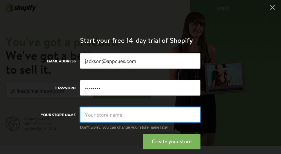
Shopify uses microcopy to address a user concern that would otherwise decrease signup volume:

Not sure where to put microcopy? Here are three ways to discover your users’ anxieties and make big user onboarding wins:
Users are intelligent, and will act with their best interests in mind. As such, they are motivated by the end goal and not the task. So it’s important that users know whatever you are asking them to do reasonably contributes to their motivation for signing up for your product.
Need to ask for their phone number? That’s okay, but give them a good reason: so you can confirm their identity to ensure privacy or so they can receive timely notifications. Need them to invite friends or colleagues? No biggie, but ensure your user knows how inviting other people will make their experience more valuable.
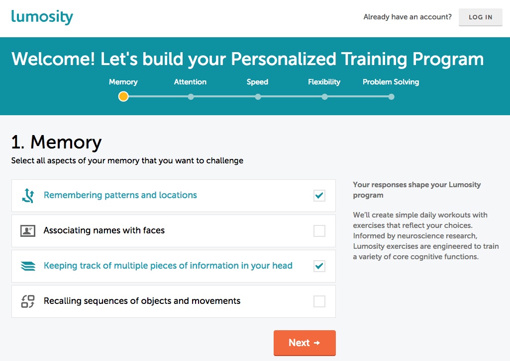
Lumosity uses its headline and microcopy to tell users that their first task is going to help the product personalize the user’s training program. It is very clear how this task is going to benefit the user.

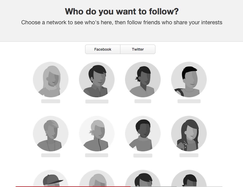
Pinterest, on the other hand, may want to test communicating why following people is important. Perhaps the headline could read “Get inspiration from those you admire most”.

Finally, good copywriting in new user flows should be a reflection of the people who write it and the mission they’re on.
You don’t want to be the enterprise cloud service that suddenly adopts a playful tone. On the other hand, you also wouldn’t want to be the hip new mobile app whose user onboarding flow reads like a Terms and Service agreement.
You’re not just introducing users to your product, but also to your vision. Your voice should represent who you are and why your users are signing up.
You don’t necessarily have to retool your entire user onboarding process in order to delight more users and improve activation rates.
Sometimes the most subtle change has the biggest impact.
Listen to what customers have to say. What are their motivations? What worries them? What do they care most about? How do they talk about your product? Once you get this insight, you’ll have plenty of ammo to start testing different messages and see what works.